Save
Successful social interaction relies on trust and connection-making, yet a key challenge in digital environments is the disconnected and faceless experience they can provide. This is where design can play a powerful role.
In my book Interface Design for Learning I look at how to design for users when they are in the process of learning something—be it a new software feature, a new skill, or as part of a community of practice. The edited excerpt below focuses on strategies for supporting community-building, collaborative learning, and successful social interaction online.
Design for Rich Identities
Communities are defined by the people in them, so allowing individuals to create identities online helps them express themselves, feel included, connect with others who are similar, and know where they have unique expertise. According to Tony Bingham and Marcia Conner, authors of The New Social Learning, “A core capability of any online community is its member profiles. Viewing a person’s profile should essentially provide the same feel as visiting his or her office—complete with pictures of the kids on the desk and certifications and awards on the walls.“
Perceiving people’s identities is also a key facet of trust. In order to be free to learn we have to trust others, both in terms of their competence as well as socially (that they won’t point and laugh when we ask questions.)
If user profile pages can be linked to other systems that already store user information (name, email, projects) then you can automatically populate those fields to save your learner time and avoid empty profile syndrome. Elements of identity can also exist beyond a profile or description page. One approach is allowing learners to highlight their best work in a portfolio or by pinning it to the top of their wall.
Another good reason to require some form of digital identity is to encourage participation. According to research, learners feel more obligated to participate when they can see each other.
Support Social Awareness with Visualization
There is much that goes unseen and unsaid in a virtual environment. Without the benefit of nods, smiles, movement, and gestures, we have to do a lot of precarious guess work about what people are thinking and feeling. This is where interface design decisions can help. You can bring out social concepts that might otherwise be missed online, by representing them graphically. For example, emoticons signal simple emotions, badges can be used to show levels of expertise, and co-presence (who’s online) can be communicated with icons or lists.
You could also visualize group activity (such as varying levels of participation or popular conversation topics) using a word cloud. Size in the cloud could be based on various things, like quantity, quality, or popularity of postings (ratings, shares, responses).
However, be careful what message your cues are sending. Visualizing quantity suggests that quantity is valued and could lead to a slew of poor quality posts in a forum. Likewise, popularity cues could lead to groupthink. Ideally, you can work iteratively, adjusting the design to meet the unique dynamics of each community.
Show the Network and its Connections
Group identity and social presence can both be supported by graphical representations of a community and its connections. Of course this is easier said than done and difficulty in doing this increases with the size of the group. For example, you might create an online marauder’s map (like the magic one in Harry Potter) that showed location for a small group of users, or more realistically, a geomapping widget could show each community member as a pin on the worldmap.
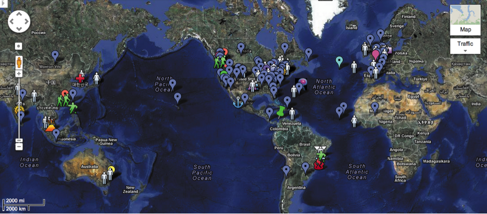
Of course once your community hits the hundreds or thousands, things get trickier. But it’s been done. The 10,000+ students in an open course offered by the MIT Media lab located themselves on a shared Google map which made it significantly easier for people to connect regionally while supporting a coherent sense of a diverse community (Figure 6.3).
A group at IBM research took data of 73 million relationships between 450,000 people to create a visual analytic tool they created, which supports expertise location, team building, team coordination, and workplace relationships. Naturally this is as much (or more) a programming job as it is a design job, but don’t underestimate the design challenge in making the graphics for a visualization of 73 million relationships useful.
Figure 6.3 Students in an MIT-based MOOC located themselves on the world map. Only a small segment of the participants are pictured as the total overflowed onto ten map pages.
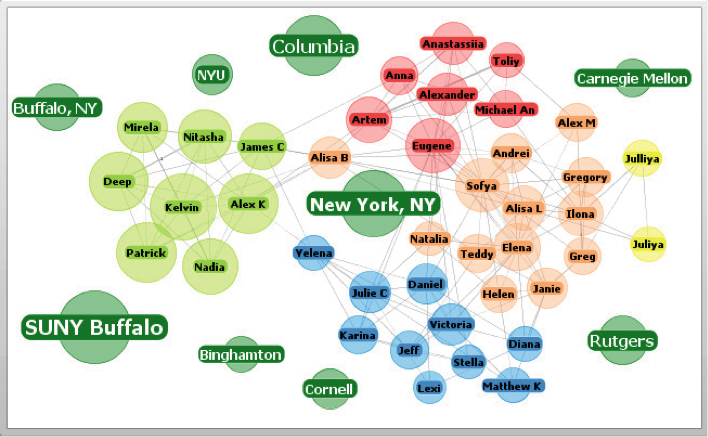
As another example, TouchGraph is a Facebook app that creates a map of your network and organizes it by categories. Graphics like these can include thumbnail pics or collective symbols of members in selected categories (country, discipline, interest, etc.). They might initially present a summary but allow zooming in or hotspots that reveal deeper information.
Letting users view others (and themselves in relation to others) in one map can reveal commonalities and diversity and support serendipitous interaction. It can also simply help give learners that sense of being all together in one place at one time for the same reason—something that is easy to miss in online learning but is so important to community.
TouchGraph creates a map of your network and organizes it by categories.
Leverage Social Influence
People are easily influenced by other people’s opinions and behaviors, especially when they are uncertain themselves. Knowing this, you can design for testimonials, ratings, and reviews to influence behavior. So if you want to encourage people to participate or contribute, but they’re wavering, presenting evidence that others are doing it and getting value from it can help.
For example, new users in a virtual community are more eager to share information if they find out their friends are already in the network and collaborating. Ratings and reviews are more influential when learners know more about the person behind them, so rich profiles linked to social validation features can make them more effective. But the desire for social validation can also go wrong when it funnels learners into a state of groupthink.
Design to Prevent Groupthink
Just as we can make better decisions together, we can also make poorer decisions together. Groupthink occurs when members of a group don’t express new ideas, opposing arguments, or opinions, because of the social pressures within a group.
Symptoms of groupthink include rationalization, peer pressure, complacency, moral high ground, stereotyping, censorship, and the illusion of unanimity.
The problem with groupthink is essentially a lack of alternatives or views being presented, which can hinder learning in classroom scenarios or have devastating consequences to high stakes decision-making. To help prevent groupthink, interface designers can include elements that encourage the antidotes:
- Give people a way to write down and share ideas ahead of time before a synchronous meeting.
- Include tools for brainstorming that reward quantity over quality of ideas.
- Include tools for friendly debate.
- Consider visualizing group participation to reveal overly dominant personalities or members on the periphery.
- Allow learners to rate how confident they are in their decision before they show that decision to others.
- Let users vote or comment anonymously.
- In more structured educational environments you might include facilities for listing pros and cons, other ideas, or for users to take on distinct roles (such as devil’s advocate).
There’s more excellent information, including a list of tools and techniques for avoiding group-think on mindtools.com.
Use Interface Cues to Encourage Contribution
One of the major issues around reaping the benefits of social collaboration and learning has to do with motivation—how do you get people to contribute? What are the conditions for fostering community online?
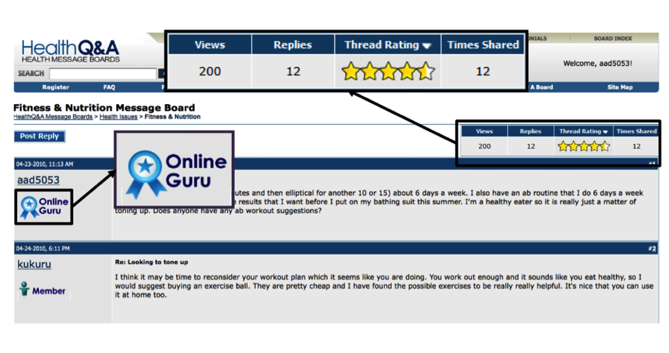
A study by Hyang-Sook Kim and S. Shyam Sundar, “Using Interface Cues in Online Health Community Boards to Change Impressions and Encourage User Contribution,” which tested interface cues in discussion forums shows that displaying cues for number of posts, views, replies, and ratings of usefulness (and by inference similar cues like shares, likes and reposts) encourages participation of two types: evaluation of content and contribution of content. They also found that popularity cues (likes, ratings) were more influential than authority cues (expert badges). They offer the following advice to interface designers:
- Consider including at least two cues—number of posts by a user (which communicates authority in the community) and ratings of helpfulness (which encourages a “bandwagon effect” or “everyone else thinks its good so it must be”). Both positively affect member attitudes toward the site and its content.
- Cues conveying the number of times posts are shared are powerful in reinforcing community bonds, thereby enhancing users’ contributions to message boards and energizing them to contribute more (Figure 6.7).
Figure 6.7 Displaying cues for number of posts, views, replies, and ratings of usefulness can encourage participation. This online message board has interface cues conveying authority (or expertise) and the level of community interest in the message thread.
Design to Prevent Trolling
Anonymity increases trolling and conflict behavior since users feel free from social repercussions. Therefore, including some form of identity, even if representative like an avataar will reduce these unwanted behaviors—more reason to design for rich learner profiles within learning communities. Likewise, the presence of a moderator in a group reduces the instance of negative interactions.
Design for Match-Making
The value of a network lies in its connections. In fact, research has shown that people who have more connections, do better at work, are better at learning, and make better decisions. For this reason, most social media present users with automatic suggestions of people with whom they might connect or subgroups they might want to join. Match-making occurs around artifacts as well as people at places like GoodReads (whose slogan is “Meet your next favorite book”) or at Amazon.com, where viewing one product leads you to “similar items” in three different ways: automatic suggestions, user-created lists, and via social influence “people who bought this also bought…”
At the multinational consulting firm Deloitte, organizational data is combined with user contributed information about projects, job roles, and interests in order to link people together who are otherwise separated all over the world. Bingham and Conner tell the story in The New Social Learning: “New hires can easily find five people who went to the same college they did, three who worked for the same company, and two who grew up in their small town. Whenever someone with a similar history joins the organization, he or she can get an alert with the ability to make these kinds of connections.”
Way to warm up a crowd.
To read more about how interface design can impact learning and how we design environments that support both the cognitive and emotional sides of learning experiences, check out Dorian Peters’ new book, Interface Design for Learning: Design Strategies for Learning Experiences.
Photo of red blood cells courtesy Shutterstock
Dorian is an author, tech designer and Creative Leader at the Wellbeing Technology Lab at the University of Sydney where she specialize in UX, IxD and UI design for learning and wellbeing. Her books include Positive Computing: Technology for Wellbeing and Human Potential (MIT Press), and Interface Design for Learning (New Riders). She enjoys plundering the smarts of philosophy and the social sciences to enrich design practice and rescues wombats in her spare time. You can find out more at her website: dorian-peters.com.


