Save
When we’re scanning titles on Netflix or Amazon, my kids will often reach out and tap the video they want to watch on the television screen. I tell them time and again that the screen isn’t going to do anything but smudge when the touch it, but they seem unwilling to believe me.
Every other screen in the house responds to touch. Why wouldn’t the TV? In fact—stuffy refrigerator interface aside—the screens in our house do more than respond to touch, they invite it by relating to the way whippersnappers interact with the world.
My kids want to pick stuff up. My kids want to mess with stuff. Once they know what something can do, they want to recreate enjoyable experiences with relative ease. They want to fill the cartoon moose’s antler in with color. They want to run family photos through filters. They want to hear what happens when you light up all of the squares on the beat sequencing app.
“As a designer, you’re responsible for understanding your audience and creating experiences based on the way that people prefer to complete tasks,” says Debra Levin Gelman in her new book, Design for Kids. “However, as a designer for kids, you’re responsible for understanding that kids prefer to complete their tasks, such as learning, through play.”
Hand Them the Keys to the Zoo
“Children want to interact with technology in the same way they have interacted with toys and nature in the past,” says Joshua Davidson, Managing Director of Night Zookeeper, winner of the Experience for Children category of the Design for Experience awards. “They want to hold ergonomic devices, see the ripples on water surfaces and throw cold snow balls. Technology needs to become increasingly closer to real life, enabling rather than restrictive.”
The team at Night Zookeeper wanted to design an app that could do more than lets kids drawn on a tablet screen with their fingers, so they worked to create an experience with a feeling of balance that challenges kids to expand their creative reach.
“Kids have such varying ability levels that getting the balance right was tough,” Davidson says, “but we didn’t want to lose the sophisticated clean interface or the narrative.”
Gelman, a judge in the category, was impressed with the way the app lets kids express themselves while also implementing constraints to help them get started, saying: “This is a great way to foster creativity in kids!”
“Creativity can be stimulated,” Davidson says. “By setting challenges such as ‘draw the ocean without the color blue’ and ‘turn this shoe into a magical animal,’ we are enabling children to see the world differently.”
Challenges like “turn this shoe into a magical animal” enable kids to see the world differently
Looking to the not-so-distant future, Davidson expects his users—the next generation—to build technologies and user experiences that fit seamlessly into their lives, but worries they might be stunted creatively by technology.
“So much is given to kids now. They are rarely bored and the pens and dice of my childhood, which were brought to life using my imagination, are things of the past. Night Zookeeper wants to bring them back but enhance them with technology, breathing new life into creative play.”
Shape Them
I’m still taken aback seeing my touch-savvy four-year-old swiping and pinching with freakish dexterity, but even though these skills develop quickly, they still have to be learned. A finalist in the DfE awards, Tiggly created an app employing plastic shapes that an iPad’s touchscreen can identify to create a meaningful gateway interface for toddlers.
“Younger kids often find it difficult to connect what they’re doing with a mouse with things that happen on the screen,” says Tiggly’s Co-founder and Chief Learning Officer, Azi Jamalian. “The disconnect between the virtual world and what controls the virtual world is not appropriate for them. One of the reasons iPad technology is very intuitive and easy to use for toddlers is that they can directly control things in the virtual world. They can touch an object and move it.”
“One concern with all virtual play is that young children will loose the connection between the physical activities they perform and how they are virtually coded on the screen,” says designer, writer, and teacher, Jason CranfordTeague (GeekDad), another judge in Experience for Children category. “Tiggly helps bridge that gap.”
Speaking of bridging gaps, Jamalian sees the real world and the digital world combining into one world for these young digital natives. “They don’t necessarily separate the two worlds nor do they have a preference for digital over real. The next generation of interfaces will have to do a better job in blending the two worlds.”
Surprise, You’re Learning!
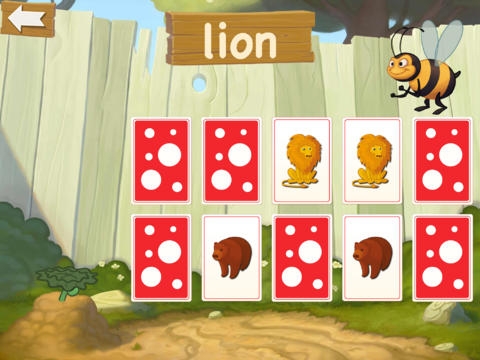
Both Gelman and CranfordTeague enjoyed the immersive world created by busuu, an app that teaches kids new languages in a way that is consistently fun and educational.
“[We wanted users to] feel like they are in their own little garden world, where they have full autonomy to move around their little plot (with no need for mum and dad to interfere!),” says Heather Bayfield, busuu’s Mobile Product Manager.
Fun was another must-have, and the team worked to stitch it into every aspect of the app, from a gnome’s smiling face showing you whether something is correct, to charting progress with the watering of a plant.
“The app was also designed to be gamified,” Bayfield says. “So as well as developing a love of learning the vocabulary, the child is also motivated by the desire to discover more crazy plants and complete their garden by watering plants through doing lessons.”
Bayfield thinks that kids have a way of interacting with devices that seems to reflect popular trends in UX at the moment, pointing to Direct Manipulation theory that suggest touch gestures should be as lifelike as possible in order for users to better predict and understand how they work.
“In one of their WWDC presentations this year, Apple highlighted the effectiveness of real-life interaction designs in apps, giving the example of ‘swipe to delete’ being like the real-life action of throwing something in the bin. They also showed examples of real-life environments, such as drawing apps, which have lifelike pens and tabletops. Just goes to show that kids can also teach us adults a thing or two!”
Follow Their Lead
When watching my kids breeze through interactions on my wife’s iPad, I’m always intrigued by how natural their actions appear. My wife, on the other hand, sometimes touches the same screen with mild hesitation, pinching with her fingers like she doesn’t really believe it’s going to take her to the home screen.
“I think that was really the breakthrough of the iPad,” says Davidson of Night Zookeeper. “To our generation it seems a little unnatural and magical. To kids it is actually behaves more like they would expect. They touch it and it moves, plus it’s mobile rather than tethered to a plug in the corner of the room.”
By harnessing this power and giving kids digital experiences they can really use today, we’re fueling the next wave of interfaces and interaction design. Hopefully the adults will be able to keep up.
There were other applications in the Experience for Children category that sought to make a mark in experience design for kids: With Mabell’s Zoo, Brenda Long and Studio 6th Ave deliver an app that lets kids learn to count using their fingers (on a touch screen). Crayon Kiosk provides a large colorful stand that puts tables at kid-height, plus a series of education apps. Developer and illustrator Jan Essig created the playground app with his five-year-old-daughter to help her learn her ABCs.
- Apple, Consumer products, Design, Design for Experience Awards, Development, Gaming, Gestures, Information Design and Architecture, Input devices, Interaction Design, Interface and Navigation Design, iPad, Mobile Applications, Mobile Technology, New and Emerging Technologies, Product design, Psychology and Human Behavior, Tablet, Technology, Touch, Usability, Visual Design
Josh Tyson
Josh Tyson is the co-author of the first bestselling book about conversational AI, Age of Invisible Machines. He is also the Director of Creative Content at OneReach.ai and co-host of both the Invisible Machines and N9K podcasts. His writing has appeared in numerous publications over the years, including Chicago Reader, Fast Company, FLAUNT, The New York Times, Observer, SLAP, Stop Smiling, Thrasher, and Westword.


