Save
UX design is a unique mix of art, craft, and science. Designing the interaction between a human and software requires intuition, attention to detail, and an analytic approach that facilitates both gathering and interpreting data. Until recently, app designers and developers only had to consider what’s happening on the screen of a device. With the advent of beacon technology, contextual computing, and the Internet of Things, it’s becoming much more complex.
Physical space is becoming a dimension UX designers have to start considering in their work.
The Art of Disappearing
One of the greatest changes location-based technologies like iBeacon introduce to interaction design is how much attention you want a user to be paying to your app. Of course simplicity and efficiency have always been at the very core of UX best practices, but now, in many cases simplicity and efficiency will mean something different.
The word we use at Estimote to describe the best experiences with beacon-enabled apps is uberization. Uber, the famous transport app, might not use beacons itself, but is a shining example of removing the friction from a given situation. Similar to Uber, rather than grabbing a user’s attention, the new design model is to drive that attention towards enjoying a real-life experience, enhancing it with as little additional effort required as possible.
A great example is the Downtown app, which you can enjoy at Coupa Cafe in downtown Palo Alto and some other venues around the Bay Area. Because there are beacons installed on each table, you can quickly place your order with just a few taps, instead of waiting in a long line (for which Coupa is famous). The same goes for payment: one click and you’re done, no asking or waiting for the check.
That’s only one very specific example, but there are many more, showcasing how you should approach building proximity-based apps to master the art of disappearing from users’ view, while enhancing their experience at the same time. Acumen Solutions released their Connect! app at this year’s Dreamforce conference in San Francisco. They placed beacons around their partners’ booths and throughout locations where the most interesting sessions from their field—enterprise-grade cloud solutions—would be happening. The app awarded badges to attendees who approached each ‘tagged’ location. It turned the conference experience into a bit of a game and challenge: the more badges collected, the greater your chance of winning the ultimate prize, a signed guitar from Bruno Mars. The effect? Acumen incentivized Connect! users to get more value from Dreamforce and rewarded them for it—plus, they barely had to take out their smartphones to take part.
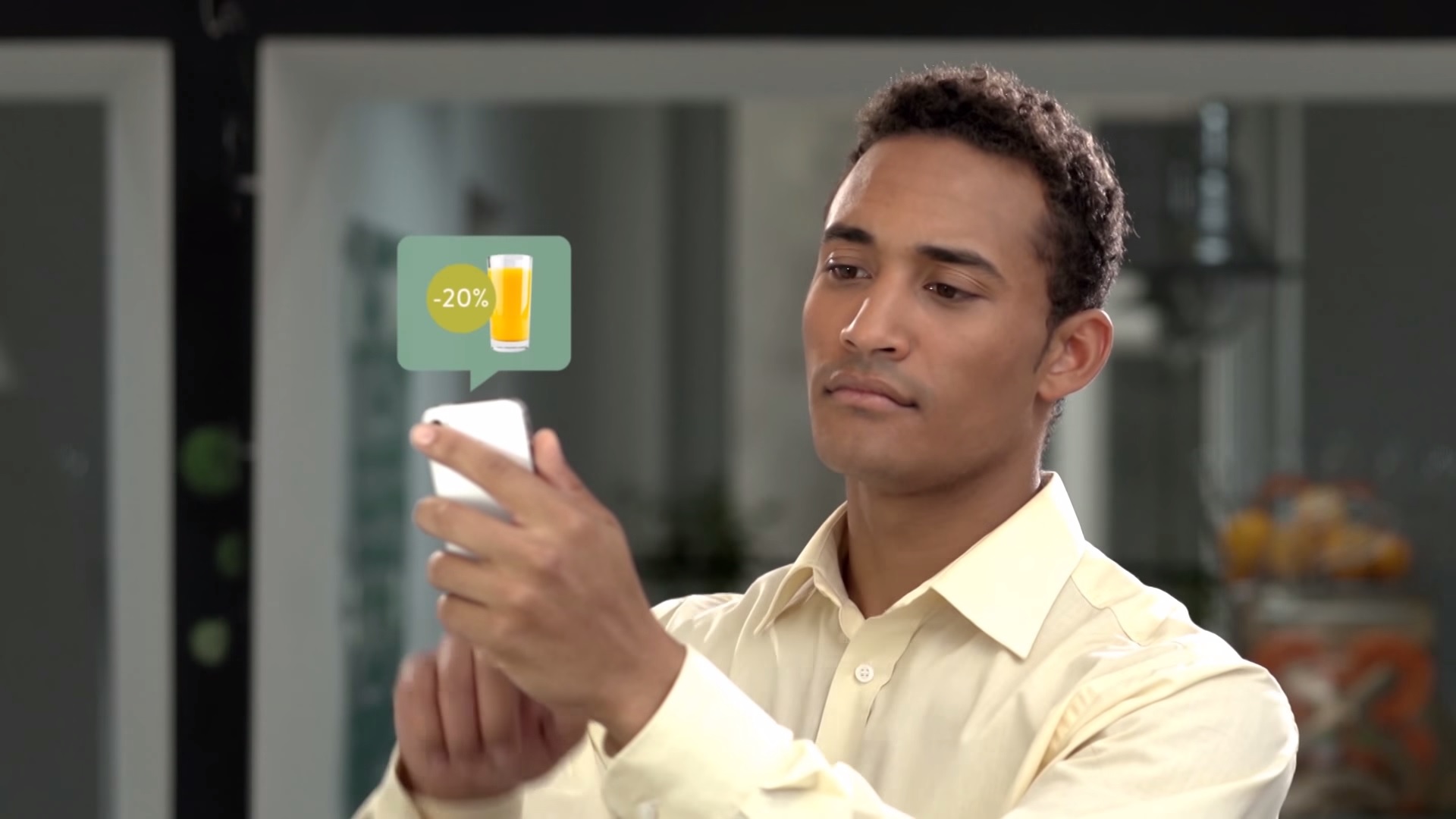
The tool that UX designers will have to master to create great iBeacon solutions is, of course, context. Micro-location gives you the ability to push truly relevant content to users as never before, but it takes a lot of care and sensitivity to find the thin line between valuable and creepy. Rover, a 500 Startups company building a software platform for beacons, helped Toronto’s craft beer juggernaut, Bar Hop, develop their own app. The core feature is pretty basic: users receive special offers after they enter the venue. The little add-on that makes it so much better than other coupon/beacon apps is that you can mark each offer as “favorite” or “not relevant.” It’s only one click, but the software remembers your choices and tailors future suggestions to only offer you drinks and snacks you’re likely to enjoy. The Bar Hop app widens the context to include not only location, but also a user’s taste and leverages that to improve its own offering.
Tips for Designing Beacon-Powered Apps
There are a few things worth accounting for when designing your beacon-powered app in order to enable the best possible user experience. First, remember that beacons broadcast a radio wave that’s susceptible to many external factors—meaning the beacon reported as the closest one in a given second might temporarily disappear from view of the device a second later, only to reappear shortly after that. This can easily lead to poor experience for the user. You might consider letting the beacons ranging (method used by the app to determine the distance to a particular beacon) go on for a few seconds or developing algorithms to average the results and tighten the margin of error.
The tool that UX designers will have to master to create great iBeacon solutions is context
Second, with great power comes great responsibility. Scanning for beacons enables your app to know a user’s location, and knowing the user’s context can be considered sensitive information. In iOS 8, there’s a whole new authorization model around Location Services (which includes iBeacon) to give users more control over how apps access location data. iOS will present a popup asking the user for appropriate permissions and you can control the message shown in this popup.
It is also a common practice to show a more thorough explanation as part of the app-onboarding flow and only then present the system popup. All in all, make sure users know exactly how your app uses their location data. Most of us are happy to share such information with apps we’re using, as long as its crystal clear what’s in it for us.
Last but not least, beacons aren’t all powerful. We’re often seeing people overstate the background monitoring capabilities of iBeacon. Don’t get us wrong: it is incredible technology that enables many awesome ideas to come to life. Usually though, most value that apps deliver to their users comes from the foreground usage. The app needs to be active to perform ranging: calculate distance to beacons in real time. If it’s shut down or running in the background, it can only keep monitoring for beacon regions. In layman terms: checking if there are any beacons in range or not.
Background processing poses a lot of technical challenges and invokes numerous tradeoffs on devices with limited resources and battery life. iBeacon, being based on Bluetooth Smart fares very well here when compared to other background activities likes GPS monitoring or playing music, but still offers better responsiveness and richer feature set when used in the foreground. By no means do we want to discourage you from using background beacon monitoring in your app—it’s there for a reason!—but we suggest you thoroughly consider which mode enables your app to best solve the problem you’ve set out to tackle when designing your user experience.
Own the Space
Most apps using iBeacon are tied to specific locations. It seems obvious, but it’s an important thing to remember when designing your app. The person who’s writing the code and configuring beacons should also know as much as possible about the venue where they’ll be used. It’s not always possible, but if you can’t bring your developers for on-site testing, at least send them a detailed description and pictures. There are many factors you can easily forget that might have a huge impact on the overall experience.
Can you place the beacons anywhere, or are there significant limitations? For instance, museums (understandably) tend to be strict about beacon placement. How crowded will the museum get at peak times and are there any obstacles that a beacon’s signal will have to pass through? How close to one another are separate events supposed to be triggered? Answers to all these questions are crucial for smooth interaction with iBeacon-enabled apps.
If you want to create an experience that’s good enough, setting up your beacons is simple. Just put them in places where you want to push notifications and content to the users. But for an app to stand out it needs to be more than just good enough. You need to carefully set up beacons in the right spots, honing their range and finding the best balance between signal responsiveness and battery life. There are some great posts from the Brooklyn Museum and Talking Llama that can help you with this.
There’s no universal set of rules on how to position beacons when deploying them in your space. Every location and use case is different, but there are a bunch of best practices and tips to keep in mind that might help achieve best results:
- First: radio waves broadcast by beacons are sensitive to absorption and a multitude of other factors, so try to position them for an unobstructed line of sight between the beacon and the user’s device—this means no hiding beacons behind paintings or sticking them in nooks and crannies or under tables.
- Second: to minimize interference, adjust your beacons’ broadcasting power to the minimum required by your use case. If you only need to detect people sitting at a table, you probably won’t need a 50m broadcasting range, plus your beacons’ battery will last longer! Note that in some cases though, stronger signals can result in better stability, even if you don’t need the bigger range.
The most important tip, however, is to experiment! Try different surfaces to combat wave reflection. Adjust the height to improve line-of-sight or even—as shown in the thetalkingllama.com post above—alter the angle at which you mount your beacon. These subtle tweaks can make a difference. Just like designing software can be a creative, lengthy, process, requiring out-of-the-box thinking, so can the search for the perfect beacons-powered user experience.
Conclusion
This post only scratches the surface of how location-based services will impact interaction design. Beacons are still a fresh technology and Internet of Things is in early stages of mainstream adoption. New best practices and principles of UX design for the physical spaces and contextual computing will emerge and become more visible as projects and apps go live. We’re eager to see ideas and rules we wouldn’t have thought about otherwise. So if you have any in the works or simply on your mind, share them with us! We’re waiting for your comments and will be happy to answer them.
- Analytics and Tracking, Android, Apple, Apple iOS, Design, Development, Information Design and Architecture, Interaction Design, Interface and Navigation Design, iPad, iPhone, Location-Based Services, Mobile Applications, Mobile Technology, New and Emerging Technologies, Product design, Research Methods and Techniques, Research Tools and Software, Tablet, Technology, Ubiquitous Computing
Wojciech Borowicz
This user does not have bio yet.
Piotr Krawiec
This user does not have bio yet.


