Save
As team lead in user experience for SAP’s Mobile Design Center, I recently spent time familiarizing myself with Apple’s latest release of iOS 7 in order to gain better insight into how this new mobile operating system will affect users.
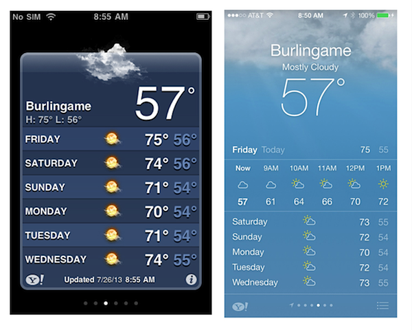
iOS 7 is being touted as the first major update to the look and feel of Apple products since the passing of Steve Jobs, who was known for his love of “skeuemorphic” design, in which user interface elements are designed to mimic real life.
Think of the cheap pine bookcase background in the iBooks library, the stitching on the edge of the calendar app, the notes app that looks like an old-fashioned legal pad, or the green felt background of the Game Center app. All of these design elements speak to the user in a language distinctly Apple, telling them that this is not only a genuine Apple experience but a reflection of the imagination, care, and meticulous attention to detail in design that the company is so famous for.
iOS creator and former lead design thinker Scott Forestall was also a long-time champion of skeuomorphic design. However, Apple design chief Jony Ive, who stepped forward last year to take the role of lead design thinker for product hardware as well as software environment, has long been a critic of skeuomorphic design.
With iOS 7, his vision for a simplified “flat” design that eschews all things skeuomorphic has been realized. Apple’s new operating system is more than a just facelift, revision, or update—it’s a direction-setting blueprint that gives us insight into the future of mobility.
It’s Not Just an Operating System—It’s an Experience
The changes to the graphic interface are immediately apparent: a thin-serifed global font, Helvetica Neue, combines with thin line icons and bright, primary colors to create a look that clearly distinguishes iOS 7 from its predecessors. The colorful, flat icons use the retina display to high advantage by creating a sparkling, eye-catching home screen. The changes aren’t just cosmetic: the new gesture-controlled functions represent an advance in a gesture-based behavior that didn’t exist a few short years ago and allow easier access to controls, like Notifications Center or Control Center, and faster content searching with a single swipe down on any screen.
iOS 7 … a light and playful experience, perfectly in tune with the content it is designed to support
In a keynote speech at Apple’s last Worldwide Developer’s Conference, Ives said: “True simplicity is derived from so much more than just the absences of clutter or ornamentation, it’s about bringing order to complexity.”
When you look at all the new iOS 7 screens in together in a side-by-side view, you get a clear sense of what he means. The simplified design removes mental associations that might complicate one’s ability to process the experience. At the same time the OS introduces dimension into the experience. Everything has been flattened into a two-dimensional layer but there are added translucent layers of functionality on top of each other, making it easy to move from one layer to the next.
The result is a light and playful experience, perfectly in tune with the content it is designed to support. The operating system minimizes the number of background brain cells required to process what you are seeing in order to allow you to more richly experience what you are feeling, substantiating Apple’s claims that it’s in the “experience-creating business.”
And why should we expect anything less? This is the company that created the iProduct family of iTunes, iPods, iMovies, Garage Band, etc. and pioneered the concept of creating a compelling complete multi-media entertainment system for your computer.
In the same way, iOS 7 isn’t supposed to be seen as another product offering but rather a way to perceive something already familiar from a different angle. It’s a unique language that is easily understood and repeatable across multiple devices with varying screen resolutions and screen sizes and, above all, representative of Apple’s unique brand values.
Elevating the Experience While Remaining True to the Brand
Compare iOS 7 to Microsoft’s 2012 release of the Metro user interface. There are arguable similarities found in the color palettes, font, and icon styling of the two different user interfaces. And yet there’s a huge difference in how these two releases were executed on a brand level. Microsoft spent countless millions on advertising to create anticipation for Metro, which it tried to brand as a revolutionary game-changer.
It reminded me of a friend who tries to look younger then his years by wearing a baseball cap backwards on his head. Unless you can name three current pop songs that are topping the charts, have Tweeted at least 20 times that day and really know what “WWAG do,” your hat had better face forwards. No matter how revolutionary and cool Metro tried to be, it was hamstrung by the fact that it lived side by side with a Windows browsing experience. And ultimately, “hip and cool” just aren’t descriptors that reflect Window’s long-time brand identity.
Apple, on the other hand, isn’t trying to be the ultimate game changer here. Instead, they want to be the cilantro in the omelet: the ingredient that adds freshness and flavor when least expected. They don’t want to dominate the experience: they want to surprise and delight you. One surprise I discovered was the new feature of a moving background image, which moves ever so slightly when you tilt your iPhone up and down. The effect makes it look like your pictures are nearly 3D, but if you want to really be impressed, set your iPhone homescreen picture as a panorama and spin around.
Get Ready tor More Exciting Experiences Coming Down the Pipe
That’s what iOS 7 is telling me: that there are new and interesting experiences coming my way from the guys who made the iPhone and iPad. At the very least, I expect to see new advances in translucent user interfaces that communicate dimension in a nontraditional manner.
The new operating system also encourages users to stop unconsciously focusing on how they’re making something happen and instead to enjoy what they’re making happen. And this makes me excited about the other great leaps we’ll see as the mobile landscape continues to evolve.
Riccardo Spina
Riccardo Spina is a creative team lead at SAP's Mobility Design Center in the San Francisco Bay Area. He has extensive experience building new products and brands in mobile, digital, and traditional media. He is focused on dissolving the dividing lines of print and digital as well as interactive and environmental to create great interactive experiences that transcend the limitations of any one medium.


