When we design interfaces, we often rely on metaphors as a starting point and source of inspiration. If we are to choose a metaphor for reading, we quickly think about the most obvious of all: the book.
While the web isn’t exactly new, it’s certainly not old compared to print. Therefore it makes sense to borrow design decisions that have proven valuable for centuries and apply them to a digital counterpart. This very act of adaptation is often referred to as designing with metaphors.
In his popular post “What screens want”, designer Frank Chimero describes designing with metaphors this way: “In the case of software on a screen, the metaphors visually explain the functions of an interface, and provide a bridge from a familiar place to a less known area by suggesting a tool’s function and its relationship to others.”
If you put a trash bin on a screen, the person might not know what technical implications it has. But they already have a pretty clear picture on how it might work without having used it before. It’s understandable that designers feel inclined to use metaphors, but they don’t come without flaws.
Let’s have a look at the book. Compared to a magazine or any other printed material, a book is usually linear, has a one-column layout, barely any advertising, and a clearly understandable flow of information. But it goes beyond that.
As Hans Peter Willberg, author from the German book Lesetypografie so beautifully put it: “The book is a thing for the senses.”
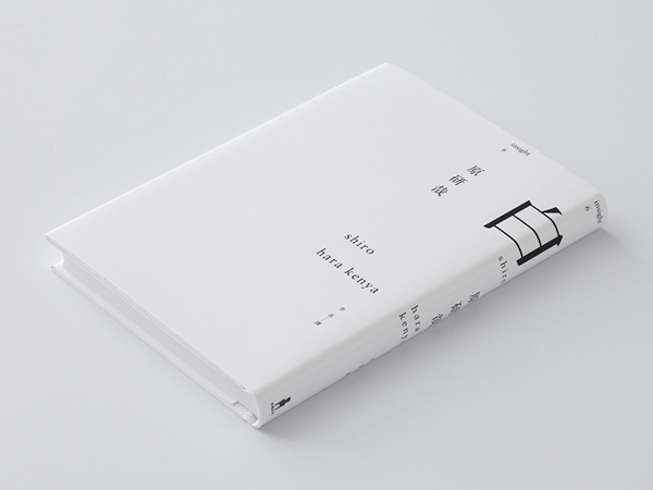
White by Kenya Hara
We can’t mimic the smell, feeling, and atmosphere of a book. Despite that, companies like Apple and Amazon did such a great job in creating devices and apps that mimic most design characteristics of books so perfectly, that it changed the conceptual meaning of the word—and it’s at this point that new problems usually sneak in our user interfaces.
Shortcomings of the book experience have serious implications on the way we think about interfaces
One of the key problems of metaphor-based design is that you can’t replicate the original object without raising new design issues. You have to choose reasonably which characteristics you need and which ones to leave out. While the book does have many benefits, it is certainly not flawless from a UX perspective.
An open book always gives you two columns
You need to remember which page you were on before. A short interruption and you might easily forget on which page you were reading.
It can get bumpy
The reader’s eyes have to make a considerable effort to change focus from the left side to the right, which can be tiring, especially for beginning readers.
It’s sliced in pieces
In a book, content is sliced in arbitrary parts. When you’re writing a book, you don’t think about pages, you think about content. A professional typographer can solve this issue to some extent, but pages are, in fact, a reading impediment from a UX point of view.
Enforced interaction
You need to turn pages. This leads to interruptions and a possible loss of context each time the reader turns the page. When we are reading a scientific book with formulas or source code, and the code is spread across several pages, it’s much harder to understand it. You end up leafing back and forth, in order to make sense of the things you read—a really frustrating experience.
Search and retrieval
In the beginning, using sticky notes might be a good way to keep your notes together and bookmark individual pages, but at some point it won’t work out anymore because of the book’s static nature, which brings us to the next point.
It’s static
Have you ever ordered a book and then found that the type is set too small? Since there is no way to change it, you’re usually stuck with it. (Maybe a good occasion to finally get those reading glasses you were thinking about buying.)
Conclusion
As you can see, the book isn’t as perfect a metaphor as we might think. The shortcomings of the book experience can have serious implications on the way we think about interfaces. It’s not so much about if we want to go skeumorphic, dimensional, or flat, it’s about combining the advantages of the metaphor without incorporating it’s limitations.
Apple did a great job in the new iBooks App on iOS7. While certainly influenced by their anti-skeumporph approach to design, the new version now allows you to change the reading mode from page flips to scrolling. So instead of implementing page flip effects that unnecessarily expose the user to the limitations of the book, they harness the advantages and possibilities of technology to create something that combines the best of both worlds.
When was the last time you used a metaphor in design? Please share the strengths and shortcomings you encountered in the comments section below.
Mirrored image of Marylin Monroe reading Ulysses adapted from an original photo by Eve Arnold