From the moment you walk into a theme park, everything is meticulously designed to deliver you an immersive experience unlike any other. Universal Studios, where I once worked as a VIP tour guide, is no exception. When you get ready to fight bad guys in the streets of New York with Spider-Man, the queue you stand in is lined with monochromatic rooms as a throwback to the style of early comics. The story of the ride begins in line—the ride itself is only the cinematic conclusion.
Working as a tour guide here was a fun experience, and I realize that I still help deliver immersive experiences to people as a marketer and design enthusiast in the Bay Area. Looking back to my days at Universal, however, I sometimes wish that I had the vocabulary then to articulate my understanding of good design, because it turns out the experience taught me a lot about UX. The first step to creating an amazing digital experience is often finding inspiration in the real world, so here are four lessons I learned in the (rather unreal) real world of Universal Studios.
Pay Gates Often Lead to Terrible User Experience
You’ve just been dropped 50 feet at 60 miles an hour on the last leg of your favorite rollercoaster. During that drop you saw a bright flash. “Cool, they took our picture!” You race through the gift shop (at the end of every ride) with your family and wait for your picture to show up on a monitor.

The picture is hysterical, everyone in your group is laughing. You’re having a great time. But then you find out that the picture is really expensive. You already paid a huge ticket price, and bought a t-shirt and some overpriced food. This exciting experience quickly morphs into a disappointing one as you deliberate over whether or not you should buy the picture. You go to snap a picture of the screen with your phone, but before you can, a park employee stops you.
Many websites do something similar. Just take a look at any resume-building product. They say you can make a resume for free by using their template. You decide to make the resume then input all of your professional and educational achievements. Then, after putting in all of that work, you’re surprised to discover that if you want to save or print your resume, you have to put in your credit card and pay a monthly fee to access it. Trapping your customers may help conversion rates initially, but it’s terrible user experience that won’t work over the long haul.
Similarly, a media site might let you read two paragraphs of a story before making you sign up for a subscription to the site. You might take that next step, if you feel the need to read the rest of the article, but pay gates diminish customer happiness with the feeling that someone has pulled one over on us.
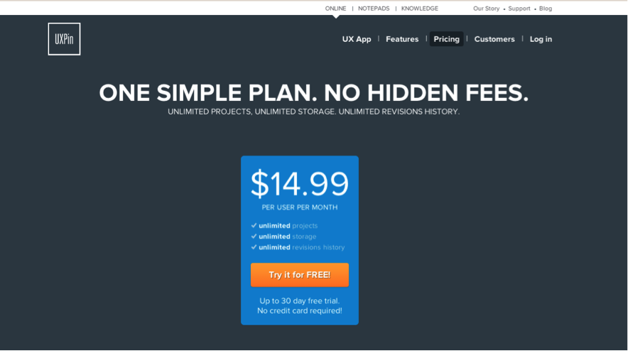
We can deliver better user experiences by being upfront with our intentions. Countless products, including UXPin, offer upfront free trials. You can try before you buy, with an understanding of how much the product costs. Offering transparency to your customers isn’t just a best practice, it’s the right thing to do.
The Best Experience Doesn’t Come from Copying Others
If you’ve been to a theme park you may notice that most of them have a wheel and spoke layout. This helps flow people through the park and once they have finished everything they are right back at the beginning so it’s easy to exit (and make a final purchase at the gift shop).
As a tour guide, I encountered millions of guests—most of them beginning their day by entering the park and turning right. With everyone going the same direction some rides at had significantly longer lines in the morning while rides on the other side of the park saw bottlenecks in the evenings. Families that turned left would usually have a significantly better time in the park, with fewer wait times.
When designing products people giving feedback will often misuse the term “best practices” for what they really mean: “it’s what everyone else does.” I norder to deliver the best experience to your customers you may want to venture into new territory. It’s the people who make the leaps in product design to do something different that start new trends. Mobile interactions like the swipe were new and unproven, but revolutionized user experience.
People often misuse “best practices” for what they really mean: “It’s what everyone else does”
Some of our most common practices deliver bad user experiences. Just think about this the next you read a listicle that makes you click every time you want to see the next item in their collection of “10 Child Stars Who Ruined Their Careers With Drugs.” Be bold and don’t do something just because everyone else does it.
If Your Users are Lost, It’s You not Them
According to Jakob Nielsen’s 5 User Theory it only takes 5 users to find 98% of your usability problems. When running user tests it can be difficult to not want to help guide your subjects to the obvious solution. But your users are looking at your design in a way you never can: for the first time.
While working at Universal it was surprising to me how many people would try to enter rides through their exits—especially during the park’s annual Halloween Horror Nights, when the makeshift lines weren’t as thoroughly designated as the main attractions. To many employees and regular guests, the entrances and exits made perfect sense. This didn’t stop new guests from getting lost, even with a map. As I watched our guests try to enter the wrong way, time and time again, it was obvious something was wrong. While there were many reasons, the placement of non-lit signs for a nighttime event played a major role. A greater presence of event staff with glow sticks to herd everyone in the right direction made a big difference.
Today, when putting together experiences on the web I think about my tour guests and their confusion. When a tester or new user isn’t able easily navigate, my first thought is that we need to make the experience better, not that the users are wrong.
Iteration is Key to Success
During my time at Universal Studios, I had the privilege of being part of one of the largest theme park openings of all time: the Wizarding World of Harry Potter. With hundreds of thousands of guests visiting the park on opening day we were well beyond capacity. Even today, many of us who worked there refer to June 18, 2010 as one of the worst, most exciting and most memorable days of our lives.
The opening of The Wizarding World of Harry Potter was complete chaos. We had to think quick on our feet and throw away pre-planned processes throughout the day, immediately switching tactics and continuing to refine them daily until the excitement died down. For example, our queues far exceeded the number of people we could safely house in the building while maintaining order in our Guest Services lobby. All senior level employees had to come together to design and implement a new queue structure that went beyond the doors of our office. We continued to proactively make adjustments with each wave of guests to deliver the most ordered and polished experience possible. By the end of our first summer, we had it down to a science.

This experience taught me to be flexible. You must be open to refining your processes, procedures and work. No amount of upfront work could have prepared us for the chaos that ensued. When we deploy our projects into production, we can’t prepare for the issues our end users will identify. We must be open to iterating and use data to keep improving our products and services.
By learning to adapt to our new popularity, my team at Universal was able to offer an amazing guest experience. When it comes to web products, my mindset is exactly the same. We owe it to our customers to deliver top quality user experiences and we can find lessons in how to do it in every aspect of our lives.
Image of Diagon Alley courtesy Universal Studios.