Balance is something all people strive to achieve in life as it gives us a sense of stability and strength. Our lives are full of dynamic forces influencing our daily routines and finding balance means creating priorities and allocating time to all areas accordingly in order to hold on to our personal sanity.
Visual balance is somewhat similar. The dynamic interplay of shapes, colors, and type elements influences the way we view and absorb compositions. Naturally, when we think of balance, we try to allocate weight to elements and see which side of the scale tips further, as our experience in the physical world teaches us that weight is associated with gravity, with objects being pulled downward.
Visual weight is somewhat different as it applies itself in other directions as well. While gravity rules still apply in some cases (we can’t ignore what we already know), each visual object carries its own weight, pushing some elements forward while causing others to recede. The elements that appear to come forward carry more visual weight and attract the user’s eye more than other page elements. Make all elements equally important and viewers are left with an overwhelming sea of information jumping out at them (think of Times Square in New York City) and the uncertainty of having to decide where to look first and which path to follow.
Designing balanced compositions means allocating weight to page elements (based on importance) and creating a successful visual path that in return controls which elements are seen in what order.
Symmetrical and Asymmetrical Compositions
There are two basic ways to achieve balance: symmetrical and asymmetrical compositions.
Symmetrical
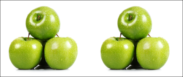
Draw a vertical imaginary line in the center of an image dividing it to left and right. If both sides are exactly the same, you have a balanced symmetrical image. The three apples on the left weigh the same as the three apples on the right. (This is true in both the physical and visual worlds.)
Asymmetrical
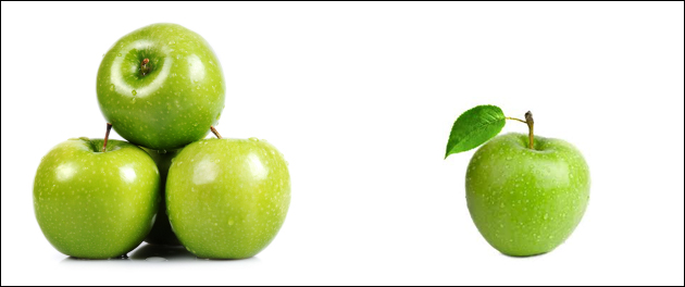
Use the same imaginary line and note the left is different than the right, resulting in an asymmetrical composition. Naturally, this scenario appears unbalanced as the three apples on the left weigh more than the right side (think gravity).
This also holds true for the visual world. The three apples on the left create a larger shape and therefore attract more attention and are said to hold a heavier visual weight than the same color apple on the right.
Asymmetrical balance
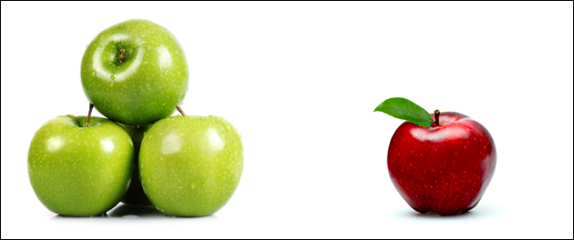
Replacing one component and using a red apple on the right instead of green, shifts the visual weight on the page. Although three apples are physically heavier than one, the visual weight of the red apple is strong enough to counter balance the three green ones on the left and you are looking at an asymmetrical balanced composition.
Now let’s put this in web context and add usability to it. Remember that in addition to what we know of the physical world, an object’s weight may be also be determined by its placement, size, color, and shape, and that its weight effects the overall visual path.
Visual Weight Allocation by Color
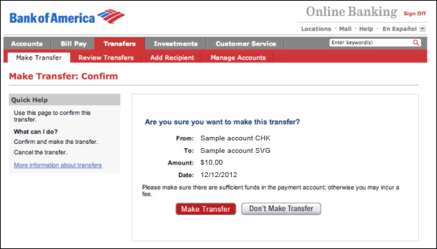
When making a money transfer on the Bank of America website, you are presented with two action items prior to finalizing the transfer. While the left button, Make Transfer, finalizes the transaction, the right button, Don’t Make Transfer, cancels the operation (without prior warning). I repeatedly make the same mistake on their site, selecting Don’t Make Transfer and canceling my operation. I get upset each time.
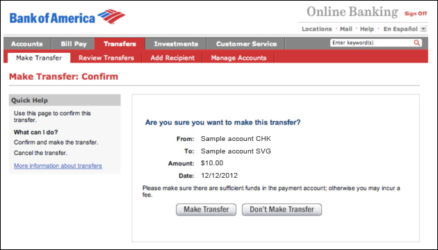
Just like the two piles of apples above, the two buttons are equal in visual weight (same shape and color) and therefore force users to read them carefully in no particular order, which already presents one problem, as online users don’t like to read.
A second problem is that humans are animals of habit. While some expect forward moving action items to be on the right, others expect them to be on the left. The difference in expectations stems from the sites we use and the inconsistent behavior of these sites. I must be one of those users who continuously look at the right side for forward moving action items.
Similar to the apple example above, one way to fix this usability issue is by allocating more weight to one item, pushing it forward in the visual path. A simple color change shifts the weight making the Make Transfer button heavier and, by doing so, attracts more attention to it. This carries user’s eye to it immediately and makes it more important in hierarchy than the gray button. Now, by design, my eye will directly carry me to the left.
When working with color within web compositions it is important to remember that warm and bright colors appear to come forward and attract attention, and therefore are said to carry more visual weight than cool colors.
Visual Weight Allocation by Size
In the physical world, larger objects are heavier than smaller objects. The same holds true for visual design. Tiffany & Co. utilizes size differences in their category pages, creating a dynamic, less systematic feel to their layouts while at the same time promoting certain elements by adding to their visual weight. What’s interesting in the screen shot below is that you get to experience how both size and color effect the visual weight of the page. The two larger watches on the page carry more weight than the smaller images on the page ensuring users see them first. Which do you think carries more visual weight between the two larger watches?
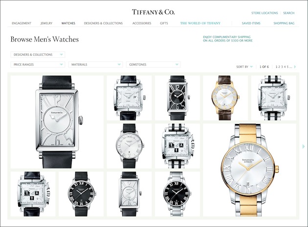
The gold watch carries more weight simply because of its warm color. However, the top-left position of the large black watch gives a strong counterbalance, making for a balanced composition.
Visual Weight Allocation by Location
Both the left and center positions of a composition carry more visual weight (in English speaking countries). The left carries more weight due to our natural reading flow learned from a young age, while the center location of a composition carries more weight due to our learned behavior from using web products.
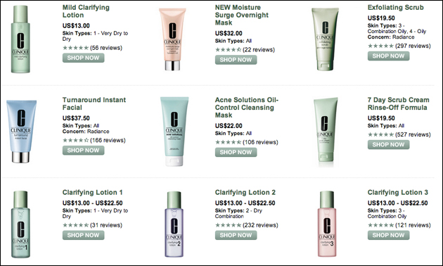
In comparison to the Tiffany & Co. example above, the objects on the Clinique category page are all equal in size and all carry a similar color tone. While some users who may detect their product immediately, others will start their browsing experience from the top left item and work their way through the list of rows.
The strength of a site’s center position comes from goal-driven web users. Looking at how users scan web pages, we see that most users seek content first, ignoring navigational elements. Only when/if users are unable to orient themselves, will they turn to the navigation.
In Conclusion
Balance is an essential player when it comes to the success of visual communication and can be controlled by careful planning and distribution of visual weight allocation. The dynamic interplay of shapes, colors, and type elements we use to communicate our messages influences the way we view and absorb the information we present. Keep Times Square in mind: the competitive banner display and the overwhelming feeling you get standing at the center of it all. Remember to prioritize page elements (assign levels of importance similar to what you would do with your daily tasks to achieve balance in life), push some forward and recede others to the back.
Let’s Practice!
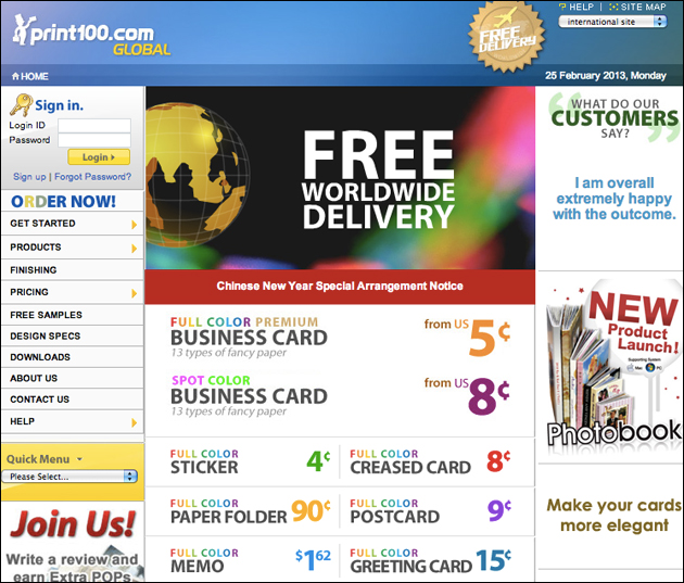
One way to practice is by doing. You can use Print100 (which is in some ways the digital equivalent of visiting Times Square) and try to redesign their home page . Prioritize page elements and think of a possible visual path. Then experiment by changing font sizes, colors, and location of elements, allocating more weight to high priority items (pushing them forward) and less weight to others.
Image of balanced pebbles courtesy Shutterstock.