At the time of this writing, there are nearly 70 million tablet users in the U.S. alone, a figure that has doubled from the year before. This means that nearly 30% of the country’s Internet users are browsing on a tablet device. Tablet traffic to e-commerce sites grew by 348% from 2011 to 2012, overtaking smartphone traffic for the first time. With the tablet market as young as it is, its footprint is only going to expand.
This trend sends a strong message: if you haven’t already, now is the time to prioritize your website’s design considerations for tablet functionality. Ignoring this could negatively impact your website’s overall conversion rate, return visits, sales, and more.
What is Tappiness?
When a website exhibits “tappiness,” it’s easy—or even delightful—to use on a mobile or tablet device. Tappiness encompasses smart use of space, text that is easy to read, logical interaction clues, and large touch targets that allow visitors to navigate with confidence.
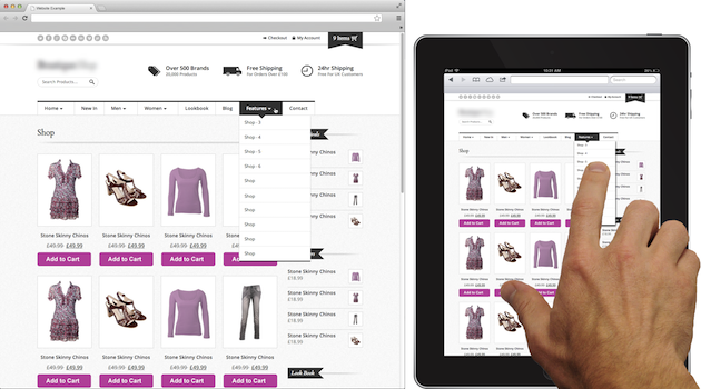
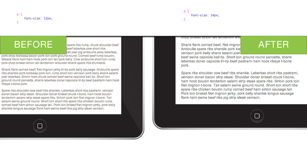
The large font sizes and wide touch targets in this design offer a positive experience, even when reduced in scale on a tablet.
The opposite experience exists when text is too small to read and navigation links are so close together that unintended navigation occurs. This adds time, complexity, and frustration to the navigation experience, which will quickly drive away your visitors.
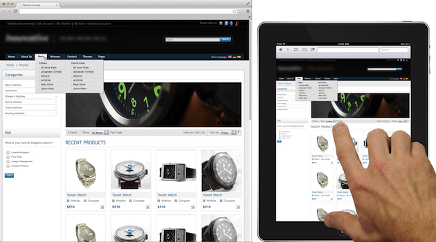
Small font sizes and narrow touch targets in this design prove to be much more difficult to read and use on a tablet.
While it may be ideal to redesign your website with a responsive layout for all devices, time and cost may inhibit you from a complete overhaul. But you do have other options. Here are some tips to help you improve the way tablet users experience your website, with just a few simple changes that you can make today!
Improve Your Site’s Tappiness in Six Easy Steps
Just a few subtle adjustments to your CSS can greatly improve legibility and navigation dexterity on a tablet.
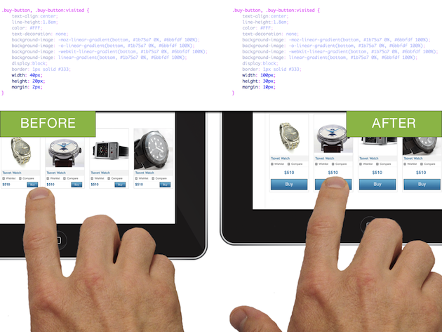
1. Increase the size and margin for buttons and calls-to-action. The average width of the index finger for most adults translates to about 45-57 pixels. Why make your visitor work harder to find and tap the “Buy” button?
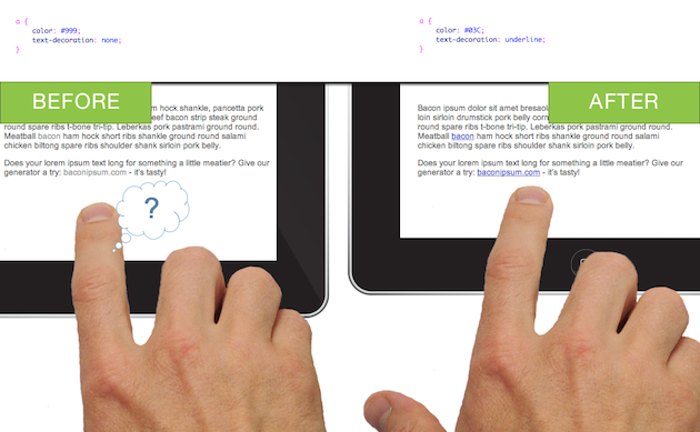
2. Ensure links and calls-to-action look tap-able without hover states. Hover states do not exist on a tablet. Style your text links to use a clear, contrasting color. And don’t be afraid to use underlines for the default link state.
3. Increase font sizes for legibility. Bumping up your font sizes by a couple pixels or partial em’s can make a difference. A little goes a long way.
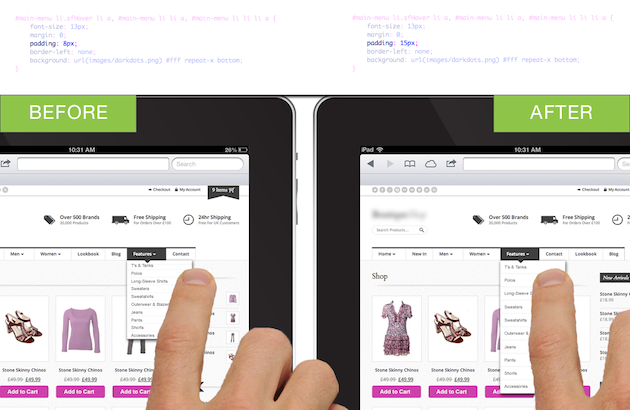
4. Increase padding around navigation menu items. Try increasing padding by 5-10 pixels to start—or more, if your design allows.
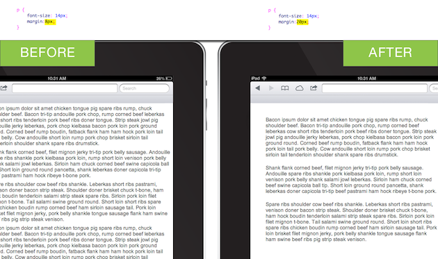
5. Increase margins on pages and content blocks. This improvement supports overall legibility and reduces visual complexity. Increased “white space” can result in the impression that your website’s content is easier to consume, as compared to a website with crowded content.
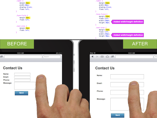
6. Increase form field size and spacing. Make it easier for your visitors to tap and enter information into form fields. Improvements to your forms may make the greatest impact to your conversion rate.
As an added bonus, these simple CSS changes will likely benefit your desktop visitors as well. But, as always, be sure to run QA on your changes for all platforms and browsers before committing to them.
Websites with Tappiness
Below are a few websites that exemplify tappiness. Try these out on your tablet as well as your desktop. Notice these sites don’t employ separate layouts or versions for tablets. Yet the same site looks good and works well on both platforms.
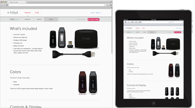
Fitbit uses a healthy amount of white space coupled with large text and generously-sized touch targets.
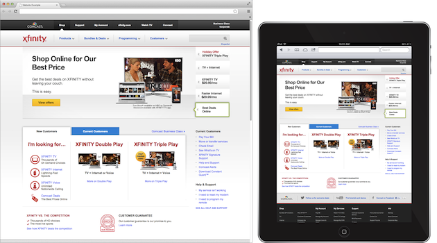
Comcast’s website offers large text and spacing. You’ll also notice clearly indicated links, well-spaced navigation and sub-navigation, and large, easy-to-use form fields.
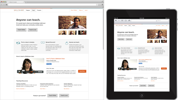
While Skillshare could bump up the size of their body text a bit more, they do offer large, easy-to-use buttons for navigation and calls-to-action. There is also plenty of space surrounding content blocks.
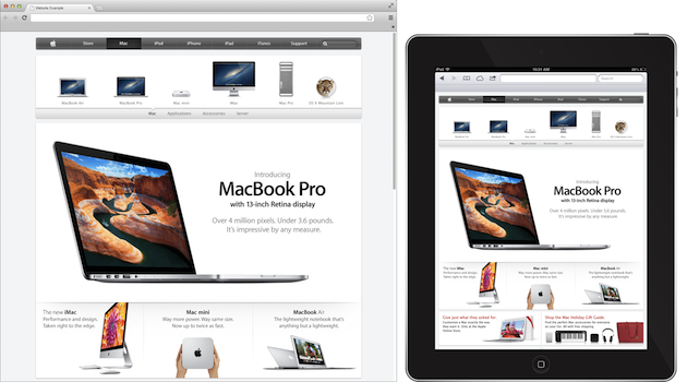
It’s no surprise that Apple’s website has tappiness (after all, they did pioneer the design for hand-held touch screens.
Conclusion
Does your site provide tappiness? Check it out on a tablet device and see for yourself. Your website may be losing visitors, conversions, and money by creating an unpleasant experience for tablet users.
The good news: you don’t need to spend a lot of time or money to make tiny, incremental changes that will vastly improve your user experience on tablet devices. For many of you, that means money in the bank.
Continue the conversation
Share a website that brings you tappiness! Have a question or comment regarding this topic? Please post a response.
Image of woman tapping tablet courtesy Shutterstock.