Save
When you order a short latte with a dollop of whipped cream at a coffeehouse you are customizing based on your tastes. When you tailor an app, program, or anything you are interacting with it to get it just right, you are customizing as well. It can take a while and requires some effort on your part to get it how you want it.
Personalization, on the other hand, is when an app, piece of software, or your favorite music streamer adapts itself based on the knowledge it already has about you, without you having to put much forth much effort at all: it just happens.
The idea behind personalization is to tailor the experience from the moment it begins, whether that’s using an espresso maker, a Jacuzzi, or an app. Indeed, it’s mobile technology that has brought personalization to the fore. When UX customization started on the desktop, there were severe limits with the diversity of customization—frequently put forth by the website itself.
These limitations were stripped away when technologies such as Flash and Ajax burst onto the scene alongside web interfaces that mirrored Graphical User Interface (GUI) APIs of client-based software. The decrease in limitations on customization provided designers with the ability to place limits on the levels of customization themselves. This allowed for the user-initiated modification of interfaces within the shape scheme that adhered to the defined constraints.
The Shift from Customization to Personalization
Customization of experiences became more difficult with mobile devices, largely because of screen size and gesture-heavy interfaces. Concepts in interface design—such as sliding screens, scalers, and scrollers—were challenging in customization efforts. Going beyond colors, in the context of web design, buttons, and fonts there really isn’t much you can do. Compared with desktop web interfaces, there isn’t a lot of flexibility in creating custom designed interfaces for each and every user on that small mobile screen.
The idea behind personalization is to tailor the experience from the moment it begins
Thought patterns need to make a shift as well, and that’s what is driving the trend toward personalization. While this type of tailoring has been a mainstay of desktop web interfaces for some time, pioneered by such ecommerce giants as Amazon, this has only recently become important on mobile devices. For example, Amazon knows a lot about their customers from their purchase history as well as other sources, so they can personalize and offer their customers customized special offers, personalizing the user experience from the very beginning and helping to make the company the king of ecommerce. This kind of personalization not only brings value to customers but also increases loyalty.
Personalization goes a step beyond customization in that it doesn’t just affect the way things look to users, it also is the way things feel to users. It delivers the content users want it, based on their past use, their preferences, or their location. So, say a user exhibits interest in content related to baby health, cars, and cooking. When that user launches a content app or visits a content site, the content will alternate in delivering articles tied to those topics. This is paramount in creating a user experience that is both unified and pleasing.
Mobile Personalization Bottlenecks
Some of the obstacles that developers and app designers may experience in the course of creating personalized mobile experiences are related to standards. Establishing standards is difficult because of the various platforms. While this problem isn’t pronounced with different iOS versions, it’s rampant across the many Android platforms out there. First and foremost, mobile users expect a smooth, mobile user experience, so much so that they often overlook the privacy issues that many using desktops do not.
Tactics for Personalizing Mobile UX
Let’s take a look at some real world examples of how brands utilize their data to personalize the mobile experience.
- Personalized Content: A key step in creating an experience that is personalized is to put your visitors into groups so that the app will present users with content that is highly relevant.
- Personalized Recommendations: A customer in Florida wouldn’t be offered a winter coat, while someone in New York City would. Say a user purchased baby shoes during their last visit. How about a designer bib? A matching hat for wintertime?
- Push Notifications: Cache, a specialty women’s retailer, gives users the option to opt-in to receive push notifications to their mobile, offering them discounts at nearby stores, as well as promotions based on their past shopping activity.
- Location-Based Personalization: Online retailers with a mobile presence utilize their user’s location to personalize the experience. Say a user is at the gym, a mobile app can offer them a special deal on Powerbars at the store around the corner. Perhaps a heart-meter from eBay as well?
The Importance of Monitoring Mobile UX
Monitoring the user experience via visual mobile app analytics solution, like the one Appsee provides, is also highly recommended so that personalization may be further refined. Such a solution will enable you to dive deep into user behavior, so you can understand exactly how users interact with your app and gain insights into how to optimize your app personalization.
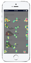
One of the key features of app analytic tools is touch heatmaps, which aggregate all user interactions (swipes, taps, and pinches) into visual reports. For example, app makers can place recommended products based on previous purchasing history and by analyzing where these recommendations are ignored or engaged with.
Another key feature, user recordings, allow you to watch videos of real-time user sessions and understand how they experience your app as if you are seeing the app through their eyes. By using this feature, app makers can see how users engaged with the different content, how much time they spend on the screen, actions on the screen (scrolling down to continue reading, clicking on links within the content) and so on. It will empower app publishers to provide specific users more relevant content.
Another example of how using mobile analytics can heighten personalization is with push notification campaigns. App publishers can see how users are engaged with different push notifications by analyzing the push notification CTRs (click-through rates) and the user flow (if/how users navigate to a certain product screen), and choose the push notification that provides the most value to the user.
Conclusion
Personalizing mobile experience requires movement on many fronts. Look at what others are doing, track your own users’ engagement, and get creative. Plan your mobile app personalization with the user in mind will help your users realize the most ultimate mobile user experience and bring them back to your app.
Image of chameleon courtesty Shutterstock.
- Analytics and Tracking, Android, Apple, Apple iOS, Customer Experience, Design, Design Tools and Software, Information Design and Architecture, Input devices, Interaction Design, Interface and Navigation Design, iPhone, Location-Based Services, Mobile Applications, Mobile Technology, Product design, Research Methods and Techniques, Research Tools and Software, Ubiquitous Computing, Usability, Visual Design


