Save
Pointing and clicking? That seems like an awful lot of work …
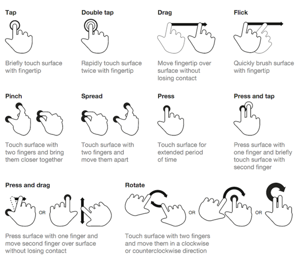
The ease and functionality of mobile devices is shifting the way we think about interactivity. Smartphones, tablets, and laptop hybrids are ushering in a new age of UI that favors a more direct form of interaction, one where mouses are optional. While a few years ago you could chalk up mobile devices’ popularity to being new and different, today we’re forced to admit there’s something else behind their lasting success. Users are finding that the control system of gestures—made viable by animation—are more than merely entertaining, they’re useful.
Welcome to the “Minority Report” future.
Gestures: The Intuitive Mouse
A study by Dan Mauney, Director of Human Factors & Research at HumanCentric, shows us that gestures might be more intuitive than we once thought. According to the notes by Luke Wroblewski, the study asked 40 people in nine different countries to create gestures for 28 tasks like deleting, scrolling, zooming, etc.
Source: Touch Gestures
While this is a topic worthy of its own article, the important thing to note here is that the gestures tended to be similar across culture and experience. For example, when prompted to “delete,” most people—regardless of nationality or proficiency with mobile devices—tried dragging the object off screen. The differences between cultures and familiarity with touch devices was slim (although the Chinese seemed to favor symbolic gestures). The biggest differences arose in scrolling, where some gestured up and others gestured down, depending on which mobile device, if any, they were more familiar with.
What this tells us is that gesture-based controls seem to come naturally to us, or at least can be picked up quickly. If that alone isn’t reason enough to embrace it, let’s take a more practical look.
- Less Clutter: As if the size limitations on mobile devices weren’t bad enough, the common lack of a keyboard means often the UI control panel is squeezed onto the screen, sacrificing valuable content space. But the more an app/site relies on gesture controls, the less buttons on-screen, and thus more content.
- More Fun: While this may not seem like a practical factor in making a business decision, the fact is people will choose a fun app/site over a slightly more useful one.
- More Potential: Every corner of mouse pointing-and-clicking has pretty much been explored by now, and it’s rare to see something new with it these days. However, gesture controls are still very much new and exciting, and can be interpreted in many more ways. With a little ingenuity and imagination, you can create something no one’s ever done before. If you have doubts about this, just look at the diversity of touch-based video games.
To be fair, there are downsides to gestures. As Thomas Joos, managing partner of Little Miss Robot, points out, one of the biggest drawbacks to gesture controls is the learning curve. Because there is so much potential and room for interpretation, gestures can also be confusing, especially when users switch between devices with contrasting controls. In fact, the more you rely on gestures over visible buttons, the greater the possibility for confusion.
The more you rely on gestures over visible buttons, the greater the possibility for confusion
There are several ways around this, but Max Rudberg, co-founder of Filibaba, advises against walkthroughs. In a post titled “If You See a UI Walkthrough, They Blew It,” he explains that too much information at once might lead to more confusion. The safer option, then, is to explain the trickier gestures slowly and over time, preferably with subtle visual cues instead of flat-out explanations.
Animation: Completing the Illusion
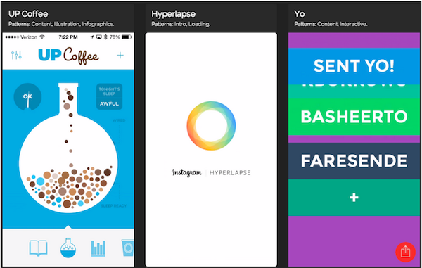
One of the main reasons gesture controls feel so natural and intuitive to us is because they resemble interacting with a real object. To throw out a used tissue, we select it, move it over the trash can, then release it. As discussed in Web UI Patterns 2014, that interaction is just more satisfying than a traditional drag and drop action. But in order to recreate these life-like sensations digitally, well-executed animation is no less than necessary.
When paired with gesture-controls, animations essentially trick the brain into thinking, at least somewhat, that it’s interacting with something tangible. So when animations visually mimic the real-life reactivity to our gestures, we become that much more immersed in the experience. But be careful, because this works both ways: one false step, and the illusion—along with our immersion—is shattered.
Source: Capptivate
Simulating realistic responses digitally is by no means easy, but when done correctly it is rewarding. Rachel Hinman, Mobile UX Researcher at Intel, compiled a list of the 12 basic principles for animation, taken straight from the 1981 book The Illusion of Life: Disney Animation, but adapted to mobile design.
- Squash & Stretch: Be mindful of an object’s mass and rigidity, displayed by how it “squashes” or “stretches” when moved. Will your object move as a solid block, or will it display some flexibility?
- Anticipation: Visually anticipating the next action can help alleviate some user confusion, as well as make the UX more enjoyable.
- Staging: Presenting your content properly will help anchor your user so that they feel more comfortable interacting with your app/site.
- Straight-Ahead and Pose-to-Pose: Use straight-ahead animation to capture dynamic and complex movement, and pose-to-pose to cover more predictable movement.
- Follow-Through and Overlapping Action: Most movement isn’t stagnant throughout; pay attention to the differences between different areas, for example, a man walking moves his arms differently than he does his legs.
- Slow In and Out: Adding more frames to the beginning and end of, say, scrolling through a menu, will give the impression that the app/site follows the laws of inertia like any other real-world object.
- Arcs: Movement along an arc feels more organic, while movement along straight lines seems mechanical.
- Secondary Action: In the real world, actions have multiple consequences; a good example of a secondary action in a mobile app/site would be, if the user opens a new window, animate the old window closing.
- Timing: There is no one-rule for timing, as different speeds convey different tones. Fast might work best for light, fun apps/sites, while slow might be better for more structured and complex ones.
- Exaggeration: Don’t be afraid to take things bigger—just because you’re following reality doesn’t mean you can’t bend the rules when appropriate.
- Solid Drawing: Make use of 3D space, weight, and volume, as a real world object does.
- Appeal: A more theoretical principle, give your app/site some personality and charisma. A personal touch can go a long way in improving UX.
To read more about mobile interface design patterns, and how gestures and animation factor into successful mobile designs, download your free copy of Mobile UI Design Patterns 2014 from UXPin. In this eBook, I’ll guide you through various input interfaces, navigation types, data and content management systems, and integrating social networking into your mobile designs.
Illustration of gestures courtesy Shutterstock.
- Consumer products, Content and Copy, Design, Digital Publishing and eBooks, Flow and Immersion, Gestures, Interaction Design, Interface and Navigation Design, iPad, iPhone, Mobile Applications, Mobile Technology, Motion and Animation, New and Emerging Technologies, Product design, Tablet, Technology, Touch, Usability, Visual Design
Chris Bank
Chris Bank is the growth lead at UXPin. He also led growth at Lettuce (acquired by Intuit), MyFit (acquired by Naviance), and his own startup Epostmarks (USPS strategic partner), and launched Kaggle in the B2B tech vertical. Visit his website, follow him on Twitter and check out UXPin.


