Whenever I see an arrow pointing right in a website or app, I cringe a little.
There’s just no consensus on the use of the right arrow. Despite—or perhaps because of—decades of use (and, arguably, misuse), you can never be sure what a right arrow will do.
Interfaces work best when the symbols for controls are standardized: An X means “close.” A circle with a vertical line through the top is a power switch. The three-lined “hamburger” button has quickly been adopted as a menu reveal control.
The right arrow, though, is so generic that it’s employed in a multitude of functions. Even worse, it’s often stylized to resemble a slightly different symbol, further muddying the waters. In my extensive clicky travels, I’ve catalogued four main types of right arrow:
→ A literal arrow symbol, with a stem and point (Unicode: 2192).
▶ A triangle with one point to the right (Unicode: 25B6).
> A “greater than” sign (Unicode: 003E).
>> A double or triple “greater than” sign.
The triangle usually (but not always!) denotes a “play” control for audio or video. It can also—like the others—advance a slideshow, initiate progress in a software wizard, expand a directory, show a menu, activate a pop-up, or simply link to a new page.
The variety of uses this one little symbol gets up to is truly staggering. Take a little tour with me.
Literal Arrow
Until recently, probably the most prominent literal right arrow in use was in the Instagram app, where immediately after snapping a picture, users are prompted to add a filter and proceed to the next step. It’s still an arrow in the Android app, but probably not for long, because it’s been replaced by clickable “NEXT” text on the iPhone.
Either way, it’s pretty intuitive; the interface even slides the current screen off to the left.
Microsoft has a curious relationship with the literal right arrow. Depending on the app you’re using, it might mean different things—or it might not be there at all.
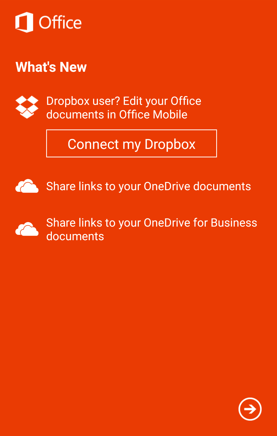
Microsoft Office arrow
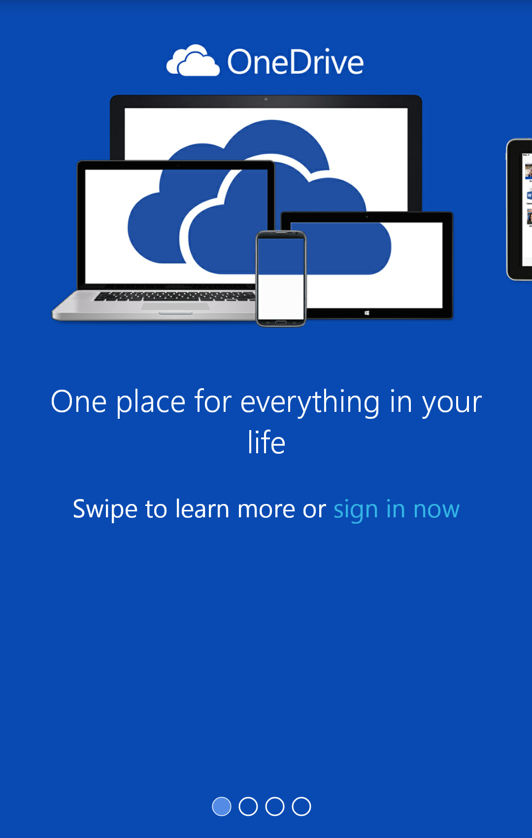
Microsoft OneDrive arrow
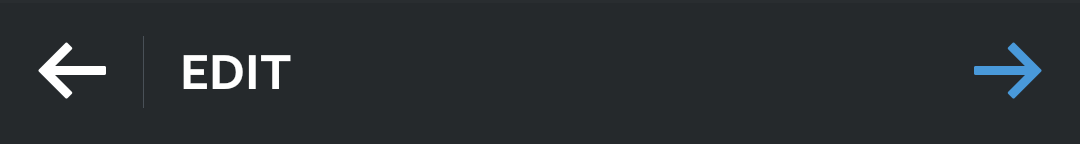
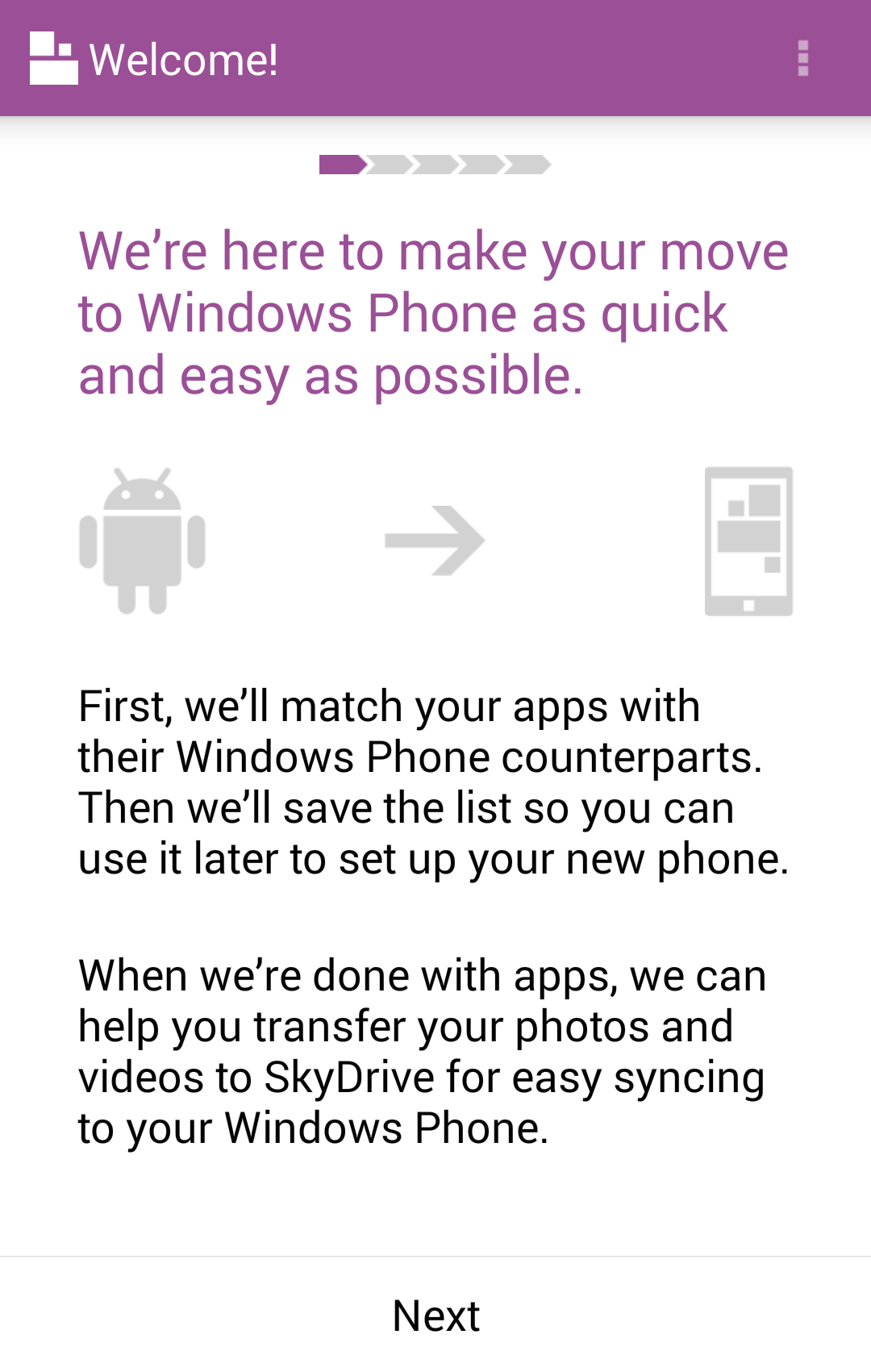
Windows Phone arrow
Microsoft Office Mobile and OneDrive both feature little slideshows. Office provides an encircled arrow button to prompt you to the next screen, while OneDrive uses the pretty standard series of dots to encourage swiping. It’s curiously inconsistent given that the look and feel of both apps are otherwise quite similar.
Now the Switch to Windows Phone app on Android—that one’s a bit embarrassing. There’s a progress bar along the top showing how many steps you’ve completed; an arrow in the middle of the screen representing the transition from using an Android device to a Windows Phone device; and a bland, centered “Next” button at the bottom. Swiping does nothing. Also, the app hasn’t been updated in a year and reviews indicate it gives terrible recommendations for Windows Phone apps to replace the Android apps on your device. Probably best to move on.
Triangle Pointing Right
This particular form of the right arrow is extra perplexing, because it’s usually an equilateral triangle. With all three sides the same length, there are really three directions the “arrow” could be pointing. It’s only the viewer’s predilection to look for the four cardinal directions that make an equilateral triangle in an interface point right (or left, up, or down).
Despite decades of use (and, arguably, misuse), you can never be sure what a right arrow will do
This quality becomes particularly troublesome in the Mac OS X default file navigator, Finder. Folders have right-pointing triangles next to them; click the triangle, and it rotates to point down, and the contents of the folder are shown.
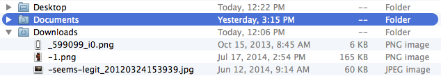
A clearly isosceles triangle would make more sense, because at least then there would be one vertex different from the other two. But equilateral triangles look cleaner with their greater symmetry, and they work well enough due to humanity’s axial bias.
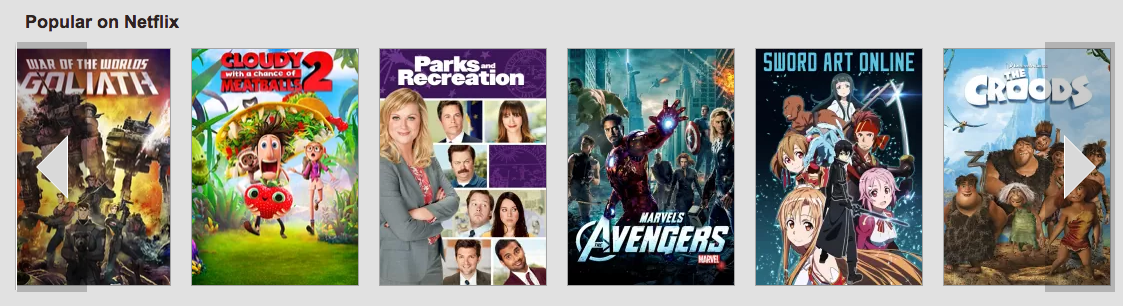
Netflix uses a slightly flattened triangle on its website for scrolling through streaming titles. You don’t even have to click, just hovering over the control sets the line of movie and television artwork parading smoothly across the screen.
Perhaps because of the clean look of the equilateral triangle, it’s used all over the place. Sometimes with just a hint of isoscelization, it’s long been the “Play” button for audio and video, likely originating with reel-to-reel tape machines.
It’s no surprise, then, that it’s not only the main control, but also a logo for YouTube.

Google (which owns YouTube) decided to use Play as both the name and logo for its app and media store.
Oh, but Google Play is guilty of much worse sins than using a triangle logo for multiple services. Much, much worse …
Single Greater Than
When you visit an app’s page on the Google Play website in some browsers, you’re presented with a row of images and videos—screenshots and demonstrations, mostly.
If your mouse, touchpad, or touchscreen allows you to swipe through the images, great. Just don’t try using that handy-looking greater than sign on the right. For some reason, instead of scrolling immediately, a click of that button enlarges the first image. Not even the first item if it’s a video, but the first image.
To be fair, after the enlargement, the greater than sign does scroll through the images. And a row of “Similar” apps near the bottom of the page with the same control responds by sliding the current group off to the left to be replaced by a new group. Which … actually, is that more confusing? Should one button do two different things? Isn’t it a main point of this article that it shouldn’t?
Buttons also shouldn’t block the content they’re displaying. Netflix gets away with it above because any partially obscured artwork scrolls into view quickly. On Cracked’s mobile site, however, controls on slideshows cover up bits of each image. Even though there’s space on each side of each image, and even though the same slideshow on the desktop site has controls in exactly that space.
Cracked mobile 1
Cracked mobile 2
Again, being fair: the overlaid controls only appear when you tap the images, and you can swipe left to advance instead. But, being unfair and somewhat off-topic: see that gray circle in the upper right of the mobile screenshot? All that button (a triangle pointing up) does is scroll back to the top of the page. I’d rather be able to read all the content clearly, thanks.
Double Greater Than
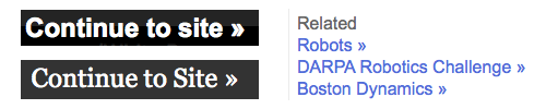
Finally, do you want to fast-forward past stuff you never wanted to see in the first place? That’s the (probably unintentional) message conveyed on sites like ComputerWorld and Forbes, where “Continue to site >>” lets you skip pop-over ads. Google News, meanwhile, uses the double greater than symbol to direct you past headlines to “related” stories.
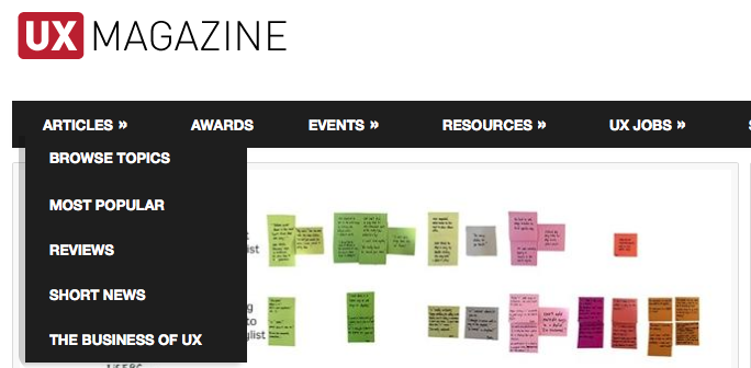
Being simple text characters, the two brackets are tempting. Even UX Mag can’t resist, employing them to indicate a dropdown menu. Mac’s Safari browser used them similarly, to drop down a list of additional tabs, before the most recent version in OS X Yosemite.
It’s good to have some symbol after menu headings, so that readers know the menu expands, even if the direction is a bit nonsensical. A menu that slides to the right would stay consistent with the imagery, but probably be unwieldy to use.
The “skip over” functionality is a better use of the double greater than symbol. Even Zco’s site uses the same symbol to advance five pages ahead on our blog, with a single greater than to advance one page.
Okay, I might be biased on that one.
Illustration of right arrow courtesy Shutterstock.