Save
More than ever in the digital domain, companies rely on design to communicate with their customers. Because the experience of visiting a company website is by nature remote—lacking any direct interaction with any tangible assets offered—the company’s digital presence often defines a user’s impressions of the company as a whole. In this context, how customers experience not only the website but also the way the site handles their personal information becomes key to shaping their overall impression of the brand.
In this article, we will dive into the nature of trusted online experiences, why they are important, design attributes that we know people trust, and how design creates trust and distrust. We’ll illustrate the issues around designing for trust with a sample prototype of a healthcare exchange design and user reactions to it.
What is Trust?
For consumers, trust means:
- A company is moral. Trust involves the belief that a company is law-abiding and fair while also showing that it cares about its customers.
- A product will do what it claims to do. A consumer has expectations that the company’s product will live up to its claims, which are assumed to be accurate and unbiased. Most people trust that when they hit the “send” button, an email will be sent to the selected contact.
- Information will be correct, complete, and unbiased. When people trust the information and choices presented, they are less likely to feel a need to go elsewhere.
- A product or service has quality. People want to feel confident in their choices and we all want to feel confident that our digital devices are quality products that will safely hold important data.
- “A company will protect me.” Security and privacy are increasingly a key concern for consumers as they navigate the digital world. People want to know that a company has their best interests in mind. Will a company safely store my personal credit card information and keep sensitive information private?
- “If I don’t understand, there is a good reason why.” Consumers can be comfortable with not understanding exactly why a company collects information if they are confident that the information is being used to create a better product or service.
- “I will be successful.” For consumers, there must be a sense that if they follow a process through all required steps, their goals and intention will be met
Consumers who distrust will:
- View company claims and intentions with suspicion
- Go to other websites to verify information
- Decide not to make a purchase
- Attempt to conceal or withhold personal information
- Abandon processes
- Tell others about their negative experiences
What do people trust?
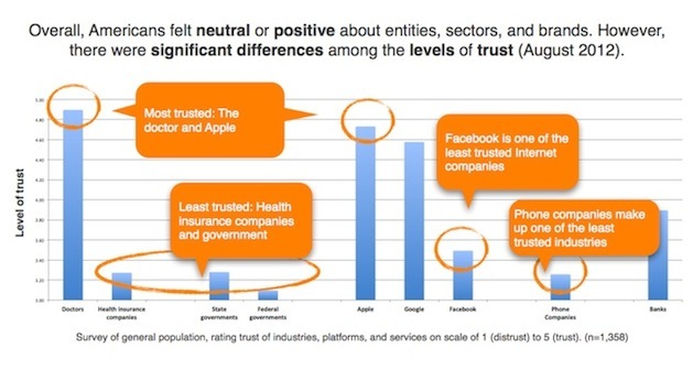
We surveyed 1,358 consumers in August 2012 about trust. Participants were asked to rate, on a scale of one (distrust) to five (trust), how they felt about a range of industries, services, and platforms.
According to the survey, people trust doctors and Apple the most and health insurance companies and state and federal government the least. On the upside for health insurance companies and the government, good design has the potential to create trust and move brands toward a more trusted stauts.
Testing for Trust
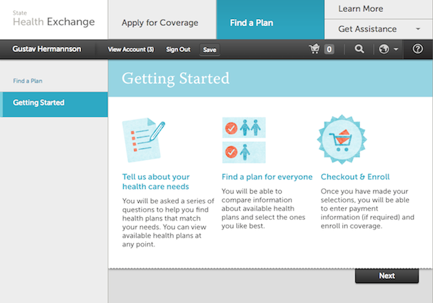
To explore the impact of design on trust, we tested the online health insurance exchange prototype developed by IDEO—in collaboration with private and public entities—under the Enroll UX2014 initiative. This tool allows states to leverage a prototype site and create online exchanges that will provide citizens access to health insurance under the Affordable Care Act (ACA). The goal of the online exchange is to provide a simple, self-service solution that precludes expensive call centers, reducing taxpayer costs.
Given the results of the survey, we knew that people regard the health insurance industry and the federal and state government as lesser-trusted entities. We wanted to evaluate the UX2014 design to determine how it impacted people’s level of trust.
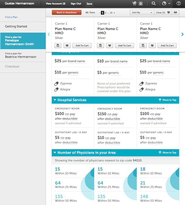
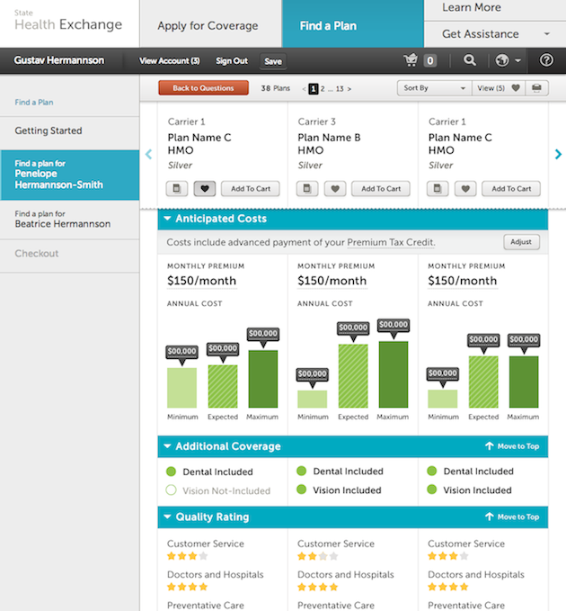
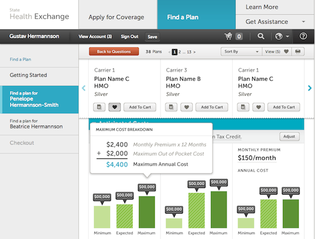
Based on research conducted by Pacific Business Group on Health, the design team at IDEO created a prototype that allows people to compare health insurance options by viewing three at a time. “They see all of the plan data in the same place—they don’t have to navigate to a new page in our model. Three sets of information is the most data most consumers can retain, and so we looked at a model that would allow people to [examine] sets of three and then deal with their filtering separately,” Christian Palino, Senior Project Leader at IDEO, says. Additional information, such as the deductible amounts, is layered in the user interface with rollover windows.
Our study was conducted in Create with Context’s lab as part of the ongoing Digital Trust Initiative, which has included ethnographic interviews, longitudinal surveys, eye tracking studies, usability testing, surveys, and iterative test and design with over 1,500 participants.
Findings:
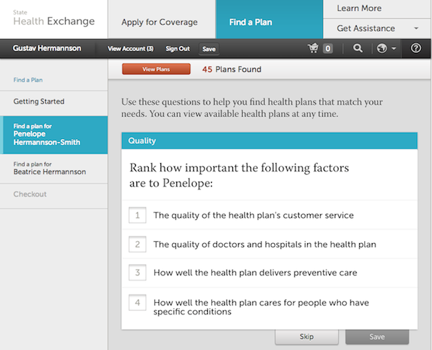
As you can see in the video above, as participants navigated their way through the UX2014 prototype website, we were immediately reminded that context is important. Users’ confidence was eroded when they felt that the services offered weren’t relevant to their needs. For example, when asked to numerically rank her decision criteria when choosing a plan, one participant could not find her single most deciding factor: the monthly cost of the plan. Puzzled by the available options on her screen and she asked, “How much do I have to pay before the plan covers me? I don’t see that here.”
Ranking priorities was less relevant to participants because a) the lists did not address some of their most important concerns, such as expense, and b) they felt that because each criteria could be important in its own right, they were making tradeoffs too early in the process. Instead they expressed a desire to rate each item rather than rank them in relation to one another. The fact that the website did not meet people’s expectations made it frustrating. “To me, to be forced to rank something is difficult. I think it’d be better if there was a dropdown, so that I could choose.”
Good design allows people to see the big picture before diving into details, but it also makes all the key details readily available. When reviewing plan options, one user was frustrated by the fact that he saw 13 pages of plans that he needed to review, but that no overview of all of them was provided. He felt that having to wade through all 13 pages one by one could not only be frustrating, but that he also might end up getting side-tracked by it. “It’s kind of frustrating … then you have to go through 13 pages, going back and forth. Because obviously you’re going to want to look at every plan before you choose one.”
Layering key information in a rollover can create suspicion. People look to rollovers for more detail, but it is not the primary place where they want to find key decision drivers. The information feels hidden, not transparent, eroding confidence that the service has their best interests in mind. “I’m not even seeing the deductible amount,” one participant noted, not seeing that the information she was looking for was in a rollover graphic. “That’s a big thing. [Rolls over it.] Oh, there it is. That’s kinda stupid. … I don’t know why you would hide it. That seems weird.”
Good design doesn’t just look simple; it is simple. It communicates complexity seamlessly. Simplicity for its own sake is not good design. Several participants felt that the UX2014 site was so simple that it did not provide them with enough information to make a decision. One participant said he would do more research “online or on a third party site.” Another said, “It just feels too naked. If I’m going to spend $200 to $300 a month on something, I need to know more than this to be able to make a decision. This little amount of information just isn’t enough.”
Cognitive load is a real issue when people have to make complex decisions based on several variables. This is further complicated when people are unfamiliar with the health insurance landscape. We know that showing every plan with all its details on one screen isn’t a viable option—we need to simplify. However, the UX 2014 model of simplification does not take people’s context into account.
Conclusion
The UX2014 case study revealed the ways in which a design can miss opportunities to earn consumers’ trust. We need to understand and design for the factors that matter to people: their knowledge of health insurance, the surfacing of information at their time of need, and the task flow for the decision-making process, to name a few. The next question is: How can we improve a design to create trusted digital experiences, especially for government and health insurance companies?
The Digital Trust Initiative is an independent effort to study digital design and privacy policy in digital technology. The work of the initiative is funded, in part, by a variety of partners: Yahoo!, Create With Context, AOL,Verizon, and Visa. The views expressed in this article and the conclusions drawn do not reflect the views of these partners. Further, the partners have not independently verified the results of the study, nor do they make any representation as to the accuracy or value of any statements made herein.
Pillars image courtesy Shutterstock
- Apple, Content Strategy, Customer Experience, Data visualization, Design, Direct Observation Research, Ethnography, Eye tracking, Government and Public Services, Healthcare, Human factors, Information Design and Architecture, Prototypes, Psychology and Human Behavior, Research Methods and Techniques, Software as a Service, Usability, User Acceptance Testing, User Reported Feedback
Ilana Westerman has for the past 15 years focused on helping bring people and technology together through seamless digital experiences. At Create with Context, Ilana leads strategic research and idea generation for global Fortune 500 companies.
Ilana also shares her passion for research-driven design as a part-time faculty member at San José State University, where she has taught graduate level courses in the Industrial Systems Engineering/HFES program since 2005.
Previously, Ilana performed strategic user research at Adobe, helping envision and define future products focused on digital youth and creativity.
Prior to that, Ilana joined Yahoo! in its infancy and helped build the User Experience Research team, managing Community, Cross-platform, Mobile, and Living Room experience teams. Her group defined the strategic direction of Yahoo! with projects including Future of the Internet (3, 5, 10 years out), Platform Convergence, Internet Everywhere, What Can Be with Yahoo! Mobile, and Global Yahoo! Platform.


