Save
The release of Windows 8 has disturbed the current ecosystem of designing for device-specific platforms. Fortunately, instead of asking users to learn three different digital experiences (phone, tablet, browser), the latest operating system attempts to bridge that gap by creating a hybrid space that users can explore as a single unit from different devices.
As is typical with a system revamp, there’s been confusion among both consumers and third-party designers. These two groups must commit to learning new rules and tools in order to quickly acclimate.
In theory, this move by Microsoft lowers the user’s burden by creating one standard location for many important tools that traditional websites have placed in different areas and hierarchies. However, in practice, the implementation of a universal tool set in a consistent location has not been entirely successful.
Another major shift is the introduction of a primarily horizontal layout, which disrupts the current mental model for users accustomed to a primarily vertical space on smartphones and e-readers. This affects more than the aesthetics. It also introduces challenges to the way users interact with content across different platforms. Careful consideration should be given to how much room there will be to interact with smaller touch spaces with on-screen keyboards and, conversely, what parameters should be set for larger monitors in order to reduce user burden in the distance it takes for the eye or hand to travel between targets.
This new paradigm requires that designers adhere to the rules and trust Microsoft to handle critical features that affect revenue and branding. Designers can play a large role in creating apps that represent the intent of Microsoft’s UX best practices while also helping to resolve two of the biggest issues that currently exist with the OS: a steeper learning curve and the lack of maturity in features that have not yet been fully explored by designers.
Issue: Learnability
Windows 8 is so dramatically different in scope and capability from Windows 7 that learning how to use it is one of the biggest hurdles users will face. In a sense, Windows 8 combines all the potential functions from all platforms, and in doing so muddles user expectations. The horizontal-based layout impacts the way items or lists are displayed, running counter to the way users have come to read on the web. A horizontal space harkens back to a more print-based framework, where pages are consumed left to right.
Luckily, users don’t stay beginners forever and Windows 8 has provided a set of native tools to help designers create an environment that takes advantage of its features. To help users become proficient, designers must align with the best practices Microsoft has established. And on their end, Microsoft needs to highlight the benefits of their unique UI and continue to build out the standards in a way that makes sense to various types of organizations.
Solution:
Scaffold the learning experience. Make sure that the user understands the capabilities of the app. Since the universal commands and tools are initially hidden in either the Charms or App Bar, designers must make those tools sticky at appropriate times to help guide the user towards specific goals.
Take advantage of knowledge transference. Windows 8 likely won’t mark the first interaction a user has had with apps in general. And since mobile devices are the primary way most people access the web, we can assume that there will be some level of knowledge transference from phone apps and traditional web experience. Design for the intermediate user.
Trust Windows 8 best practices. This latest OS has room for improvement, but a few best practices should always be followed to make it easier for users to learn the system. For instance, since Windows provides the OS-native app bar, don’t display universal actions directly on the screen. Users will look toward the app bar for tools such as filter, sort, cart items, and lists. When apps break this best practice, it reinforces a chrome-like design. In addition, most violations of this feature take place in the top right corner of the screen, which disrupts the user’s experience since it never scrolls away as it would on a traditional website experience.
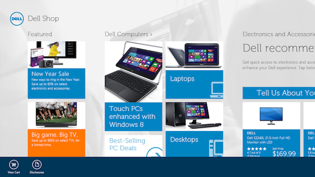
The Dell Shop app makes use of the bottom App Bar for universal actions. Not only does this simplify the page, it helps reinforce that app functions will be displayed in the app bar.
Issue: Lack of Maturity
Windows 8 doesn’t fully exist for any platform. It switches between desktop and app mode. It can be touch or mouse driven. In the traditional sense of use and functionality, it is not yet fully mature because designers aren’t making full use of its unique attributes. What separates Windows 8 from other operating systems is that it is very focused on using content, particularly as a complement to navigation. Everything in this operating system, from its live tiles to zoom functions, seeks to provide the user with information about where they are, and where they are going. As designers continue to explore Windows 8’s methods for creating universal standards for so many core functions, the OS will mature along with individual apps.
Solutions:
Build out snap view. To accommodate multitaskers, Windows 8 created “snap view,” which allows users to browse and use two apps simultaneously, allocating 75% of the screen to one app and 25% to the other. Theoretically, snap view’s functions are as robust as the full-screen version of the app. While snap view currently limits the number of open apps to two, future versions likely won’t, as there is no limit on tabs in traditional browsers. Building out this functionality not only ensures that your app gets screen time and users can always use it, it also establishes Windows 8 as a system that accommodates every user situation.
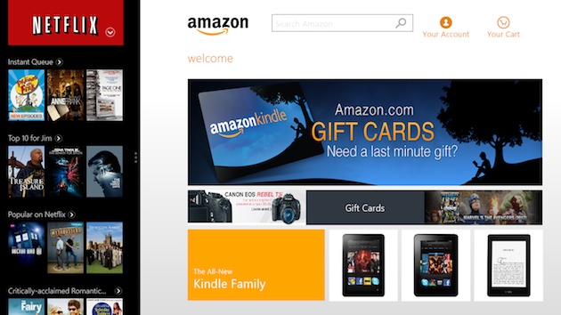
In this illustration, Netflix is in snap view mode on the left. Netflix creates a robust experience by allowing users to access the full functionality of their app while multi-tasking. This app also takes advantage of multi-directional scrolling by displaying a carousel for exploration within a category as well as a vertical scroll to reveal multiple categories, which maximizes the amount of content displayed with minimal screen real estate.
Surface content. Every interaction needs to explicitly provide a clue or summary of the next step. This could be as simple as surfacing the number of results for each category of items, or as involved and difficult as taking the time to provide summaries of each news story so that a user can determine their interest in an article in the snap view. If this type of content does not exist for your purposes, it may need to be created. By providing content early in the user’s browsing, you enable the user to more intelligently assess what he or she is seeing. Exposing relevant data is a key element in defining and differentiating Window 8 as a uniquely content-driven OS.
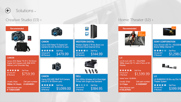
Surfacing the number of results for each category of “Solutions” indicates that there are more results than those displayed and also serves as a high-level summary for the results within that category.
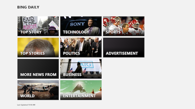
Bing smartly allows users to get a bird’s eye view of all its top level categories. In the future, Bing could help users navigate even more by displaying the number of total articles, or number of new articles since the user’s last visit.
Develop best practices. Although designers should try their best to follow established guidelines, now is also the perfect time to help Microsoft create an even more unique and useful experience. For instance, even accounting for Microsoft’s split view model, there’s still no intuitive way to scroll both vertically and horizontally on the same page. This is an open invitation for designers to play.
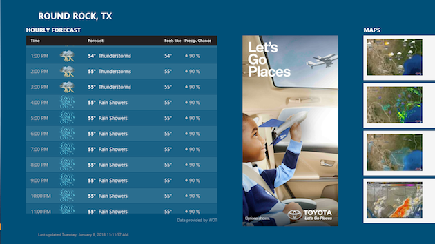
The hourly weather predictions can be scrolled vertically. Users can quickly scan weather changes by the hour without having to move their line of vision too much. Designers should not feel constrained by a unidirectional scroll since various contexts require different information visualization.
Conclusion
It’s exciting to see the beginnings of an OS that truly supports ubiquitous computing. Windows 8 is far from perfect, but it raises important questions about the future of the PC, the need for responsive design, and paradigm shifts in the way users expect to interact with both non web-based and web-based apps. As Windows 8 evolves, designers can worry less about cross-functionality and focus more on what they love to do in the first place: design.
- Content and Copy, Content Strategy, Data visualization, Design, Design Tools and Software, Digital Publishing and eBooks, Flow and Immersion, Interaction Design, Interface and Navigation Design, Microsoft, Microsoft Windows, Mobile Applications, Mobile Technology, New and Emerging Technologies, Operating Systems, Product design, Tablet, Technology, Touch
Tiffany Chow
Tiffany Chow is an experience designer based in Austin, Texas.


