A good practice when building anything is to begin with the end in mind, and information architecture provides a context for doing just that when building a website. Information architecture generally applies to websites, but can also apply to web applications, mobile applications, and social media software.
Due to the dynamic nature of lean/agile methodology projects, UX designers on agile teams often abandon traditional information architecture practices and go straight to prototyping. This is unfortunate because a good IA will guide the site as it evolves.
IA typically considers important concepts such as the find-ability, taxonomy, and, perhaps most importantly, navigation of a site. A well-constructed navigation is easy to learn, supports the user’s tasks, and ensures the minimum number of clicks for a user to arrive at the next destination.
Information Breakdown
Site maps and flowcharts are used by information architects to visualize the hierarchical relationships and flow of pages in a website. The traditional use of these tools assumes that the website is well defined and will not change significantly throughout the project. When working in a lean or agile environment, however, the opposite is assumed—that the project is not well defined and will change over time.
At the beginning of a project, the initial site map and flowcharts provide high-level direction, but as features are added the site map lacks the detail to indicate where the feature should be added, or how it affects the overall system. At first this doesn’t seem to matter much, but over time the conceptual integrity of the site begins to deteriorate.
Consider a simple example. An agile team building a university website may develop the Faculty/Staff pages early in the project. If the Human Resources pages are developed later in the project, and the UX designer doesn’t revisit the overall system flow, a link to the job postings page may only be on the Faculty/Staff page because adding the link on the Human Resources page can easily be overlooked.
Enter the DoGo Map
The DoGo map was developed to lend IA support to lean and agile teams. It’s a lightweight tool that provides perspective on the overall system combined with the functionality of each page. It blends the overall view of a site map with the detail of a flowchart in order to visualize how a system fits together.
Nodes
To build a DoGo map, first envision a user scenario and create a node for each screen in the site that will be used to fulfill the scenario. At this point, don’t worry about making everything exactly right, just focus on getting the flow out of your head and onto paper. Nodes can be combined or separated as you being to understand the system in greater detail. Each node in the DoGo map specifies both the actions supported on the page (i.e. “Do”) and where the user can go from that page (i.e. “Go”). This provides a lightweight method for planning and testing a site before detailed designs and prototypes are created.
DoGo mapping provides perspective on the overall system combined with the functionality of each page
An index card is used to document each node of a DoGo map, where the nodes represent a page or view within a system. The index card contains five important pieces of information:
- Name: descriptive label for the node (screen)
- Reference Number: quick reference for a node
- Fields: important form fields
- Do: actions for the screen
- Go: neighbors, or where you can go from this node
The name of the node is most often a noun that summarizes the collection of data or the actions presented on the screen.
The reference number is used as a handle to easily connect one node to another. Typically, the nodes are numbered sequentially, but order doesn’t actually matter because as the map changes, new cards will be introduced and the order becomes irrelevant. What is important is consistency and ensuring that the numbers aren’t duplicated, as this helps prevent confusion later on.
As you design the system, consider what a user will want to do on a given screen. Write these actions in the “Do” section of the card, preferably as a concise verb-noun statement (e.g. “Enter location info” or “View message detail”). As you work through the actions, you may want to note the essential form fields. List these near the top of the card, just below the name. Also consider where a user will want to go from this screen, and write these neighbors and their reference numbers under the “Go” section.
Consider a simple login page as an example. The name of the card is “Authentication” and it has a reference number of 8. The important fields on this screen are the username and password.
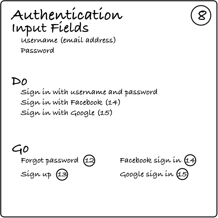
Using the username and password, the user can sign in with an account that has been registered on the site earlier, or with Facebook or Google. How you specify this is really up to you—from a design perspective it could introduce a conversation with the development team. You could assume that the user is already signed into Facebook or Google and when she logs in to your site with that account, authentication happens automatically and she moves on. Or, you could also assume that the user is not logged in and when she selects the Facebook option she has to Go somewhere else to authenticate.
To test the map with a user scenario, focus on authentication and where the user goes after authentication. Clearly there is a lot of room for specification and error handling here. Leave a lot of that detail to the wireframes and testing of prototypes rather than specification at this architectural level. Architecture is for guidance; specification is needed at the time of implementation.
The Common Node
As you work through the organization and navigation components of a site, a few general categories will emerge as places to go or things to do. A card labeled “Common” is used to capture all of the form fields, actions, and neighbors that a user would likely want on most (or all) of the screens in a site. For example, a search function would have the field parameter of “search term” and the action of “search” and the neighbor of “search results”. There is no need to note this common set of functionality on every card, so this would be captured on the “Common” card.
Consider the homepage on weather.com as an example. The primary navigation at the top includes Forecasts, Maps, Videos, Photos, News, TV, Sign In, and Alerts. These eight links are on every content page throughout the site, so rather than list all of these screens on every card; they are listed on the “Common” card that is numbered with a zero (0).
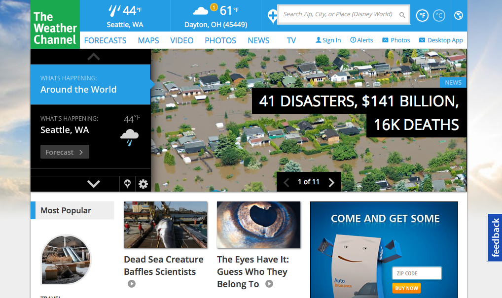
weather.com home page
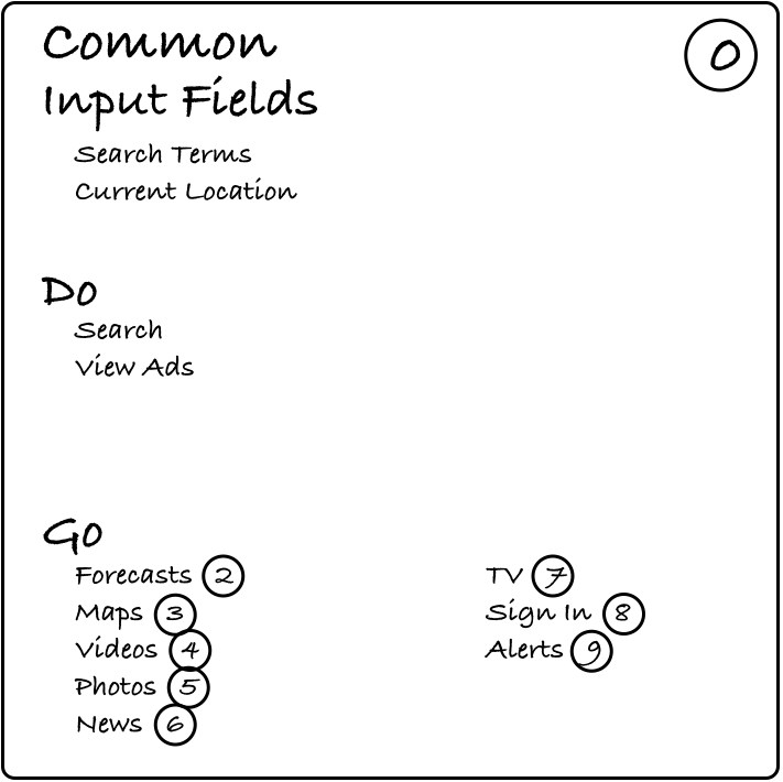
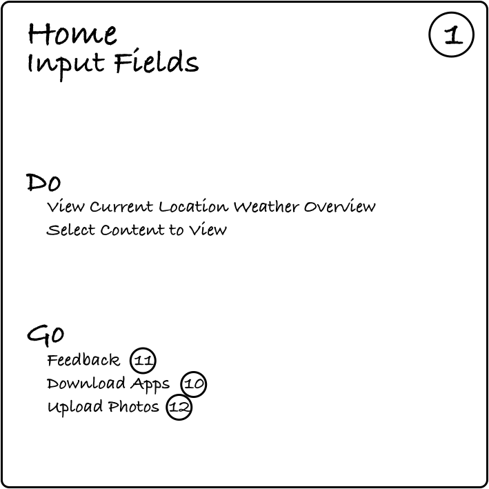
With the bulk of the links covered on the common card, the card for the home page lists only the elements specific to the home page:
The Map
As the individual screens of the site are described on node cards, a map of the site can be drawn. To do this, attach the cards to a whiteboard and draw lines to connect all of the cards referenced in their respective “Go” sections. It is at this point that the organization of the site becomes more apparent. Collections of related screens can be readily identified using different colored lines. Also, screens that a user may want to easily jump to can be identified, and “Go” items can be added to the appropriate cards.
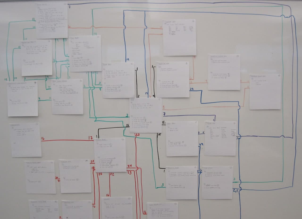
By considering cards with a large number of arrows you may discover items that would useful on the Common card.
Once the map has stabilized, select a few high priority user scenarios and run them through the map. This allows you to count the number of clicks used in order to complete a task. You might also find gaps in the map where needed functionality was overlooked, or flows containing superfluous steps where cards should be eliminated.
As these gaps and superfluous steps are found, fill in places on individual cards, throw out cards, and introduce new ones accordingly. Continue to iterate through the map until you, and the users who test the map, are satisfied with the overall flow. Once you have a good flow you can begin to develop wireframes and other prototypes to specify/test the details of the site.
While you probably won’t keep the map on a whiteboard for the life of the project, the map can be easily recreated on a whiteboard at any point in time to determine the proper place for new features. New features and links to those features can be introduced with confidence in the conceptual integrity of the site.
Conclusion
Conventional tools to support information architecture are often difficult to maintain, and the initial work required to understand the architecture is quickly outdated. The DoGo map is a lightweight, scalable IA tool that provides a high-level understanding of the information architecture of a site, and can be easily incorporated into UX testing and the everyday workflow of a development team, especially in lean and agile environments.