Mobile is increasingly becoming the preferred method for online browsing, and if you are going to survive in this increasingly mobile world, you need to give users a great mobile experience.
Although you may recognize the importance of marketing to your mobile audience, it may be difficult to know exactly where to start. This can be particularly difficult because there are so many things to consider: device type, operating system, site navigation, and more.
Inevitably, all sites will at some point have to address the growing number of mobile users. That being said, it may not be necessary to immediately implement the changes required to optimize mobile experience. Before we outline things to consider, here are three to ask yourself BEFORE optimizing.
- Does your mobile traffic represent more than 20% of your total traffic?
- Do you have regular content on your site that users are reading?
- Does your site sell products online?
If you answered “yes” to any of these questions, you need to start optimizing your site for mobile today. Here are four more questions you should ask that will help provide your users the best mobile experience possible.
1. Are Your Form Fields Scaring Away Customers?
Have you ever tried filling out a long form on your mobile phone? Chances are you didn’t complete the form, and neither will your customers. Despite this, many marketers and companies insist on adding the same form fields from desktop experiences to mobile without any further consideration for the end experience. This also can be a grave mistake for e-commerce sites that require unnecessary form fields prior to the checkout page. Keeping form fields on your mobile site simple and minimal appeals to your users and is a quick fix that is sure to increase conversion rates.
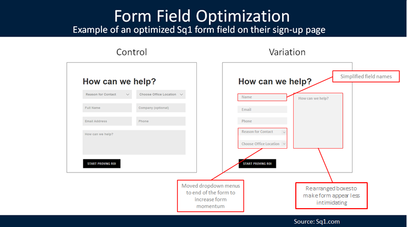
An example of how form field optimization can be accomlished making a few changes
2. Is Your Site Optimized for Slow Connections?
One of the most overlooked elements on a mobile site is the speed of the device the user is browsing. Although you may be testing your mobile site on Wi-Fi, the vast majority of users browse mobile sites their carrier’s network. Amazon’s site optimizers report that every 100ms of loading time decreases revenue by 1%. It may also be helpful to try multiple Internet connections on your site to get an idea of what users may be experiencing. If your site only loads quickly on a 4G connection, you may want to consider redesigning the page to reduce load times. The Gomez Peak Time Internet Usage Study (PDF) conducted by Equation Research on 1,500 consumers only reinforces the negative effects slow speeds have on pages; below are the results.
- At peak traffic times more than 75% of online consumers left for a competitor’s site rather than suffer delays
- 88% of online consumers are less likely to return to a site after a bad experience
- Almost half expressed a less positive perception of the company overall after a single bad experience
- More than a third told others about their disappointing experience
Your site’s mobile experience is extremely important to the overall experience of your users
3. Are You Accounting for the Thousands of Mobile Devices?
There are so many mobile devices these days that it makes it really difficult for you to optimize for all of your users. Although Apple (prior to the 5C and the iPhone 6 Plus) made it a little easier when it comes to optimizing for different phones, the thousands of Android and Windows Phone devices may cause you great anxiety when testing your mobile site. Not to mention with multiple devices also come other variables, like processor speed, screen size, and different mobile browsers. Focusing on the most popular devices (iPhone, Samsung Galaxy) in this situation is the easiest way to make sure most of your bases are covered, but more importantly, be thorough in testing devices that your customers are using.
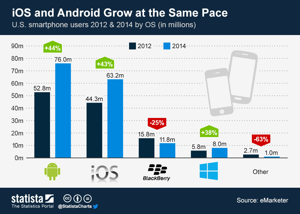
The anticipated growth for each platform, according to eMarketer
4. Are You Using Visitor Location Information?
Since we are talking mobile, you need to remember that your user is mobile. When drawing up a mobile website test, one of your top priorities is to consider the location of the user. For example, let’s say that you are a retailer really interested in getting users into the store after browsing your site. Including important store information, like available products, the user’s distance from the store, and directions to the store are all ways you could increase the likelihood of a user coming in to shop. The goal of making this information readily available is to relieve any anxieties (e.g., price, distance, availability) the user may have about coming into the store.
TL;DR — Too Long Didn’t Read
Your site’s mobile experience is extremely important to the overall experience of your users and is expected to only become more important in the coming years. Here is a brief recap of the four questions you must ask when optimizing your site.
First of all, make sure you keep your user’s experience in mind when browsing form fields; reducing unnecessary form fields is a quick way to improve your mobile experience. Second, make sure you get a clear idea of load times on your pages on multiple types of connections. Just because your site loads quickly on your Wi-Fi connection doesn’t mean it will on your customer’s 3G connection. Third, optimize your site’s design to devices your customers are using (this can be done with Google Analytics), make sure they have a good experience with your site and, when in doubt, focus on popular devices. Finally, you need to make sure you are taking advantage of the location data that only the mobile experience can provide. Addressing these considerations will get you started down the right path of mobile site optimization.
Image of person using mobile device courtesy Shutterstock.