Simplicity is at the core of what we do as user experience professionals. Its importance can be found in almost every design principle and guideline out there, evidenced in the work of everyone from IBM to Dieter Rams. Author Ken Segall even wrote a book about Steve Jobs’ passion for simplicity, titled Insanely Simple.
But before we get started on how we can better refine simplicity in our own work, let’s review what the typical UX process looks like. First, in order to achieve an easy to understand and rewarding user experience, it’s important to understand and identify the problem. For every problem, there are usually two considerations: the various expectations of the user (obvious) and the needs of the business (sometimes not as obvious, but just as important).
Once the problem has been identified, we can begin to work towards an end result, which should ultimately deliver a solid solution. Making this solution as simple as possible is the preferred form of refinement.
Of course, this is all pretty familiar stuff in the field of design and engineering. What can make things difficult are the additional complications that crop up along the way. These can come in the form of formal requirements, meeting notes, or even casual hallway discussion. To limit complexity, I’ve always tried to adhere to a set of rules that help me avoid over-complicating the problem while inspiring simplicity.
Context is King
Keeping things in context keeps us familiar with our surroundings and frees us from worrying about getting lost. Imagine what it would be like driving around with no street signs; no way of knowing where you were or where you were going. People like to know where they are at all times, especially when interacting with technology. Remember, technology is still a learning experience for most people, especially as it continues to evolve.
Being familiar with something allows for a sense of ease that encourages a smooth overall experience. Recently, I was put on hold over the telephone and told there were 17 people in front of me. But what did that mean? How long would it take for each person ahead of me to be taken care of? An easier method would have been to put the wait in context by giving me an approximate time, making it easier for me to determine if I wanted to continue waiting or try again later.
This same principle applies to web design when taking a user through a process. Keep them aware of and familiar with their surroundings so they know what to expect.
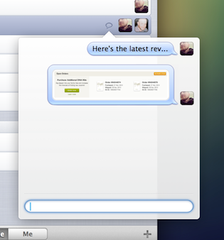
The recently released task management software, Kickoff, does a great job of this. I can easily discuss a project with other team members, keeping my notes and screenshots in context with the project I’m working on. Other examples are the contextual menus of Apple OS, Adobe CS, and the innovative Microsoft Office ribbon.
On the flipside, we need to be careful not to assume too much of what the user is expecting to accomplish. Doing so will only confuse the user. So be sure you’ve spent efficient time on identifying the problem.
Respect Existing Patterns
Most of the activities we do online have become second nature, often modeled after real life habits (for exampe, to get rid of something in both realms, you place it in a trashcan).
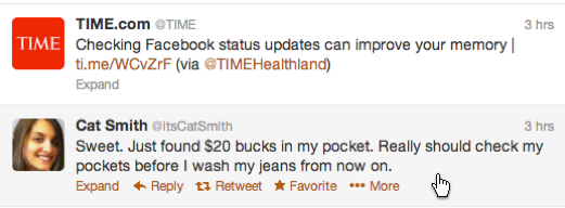
Some common examples of desktop-specific patterns include infinite scroll, breadcrumbs, and progressive disclosure. And in the mobile space, swiping, scrolling, pinching, and holding. While it’s always good to try and experiment with new patterns, such as drag and drop to upload, when you do this be sure to guide the user as much as possible without getting in the way. If a process is more complicated, include helps or hints using progressive disclosure to help them along. In this example, Twitter does an excellent job showing deeper level actions once a user hovers over the message.
Becoming familiar with interaction patterns will also do wonders for your design. Apple’s Human Interface Guidelines are an excellent resource for understanding many common interaction patterns.
Stay Focused and Fragmented
While it’s important that you stay focused on the primary task, be sure to also provide options along the way in case a user veers off course. A primary task can usually be broken down into smaller chunks, while still supporting the overall goal.

For example, creating a new account can be broken into three tasks: 1) Providing the necessary data to create the account, such as an email address and password. 2) Uploading a user photo and additional personal information such as full name, address, phone number, etc. 3) Setting other options and notifications. Identify these early and provide a fragmented approach to complete a task. This way the user can work at his or her own pace and not worry about having to do everything immediately.
Other common implementations of this are the rise of gamification and the profile progress indicator found on LinkedIn. This is a great way to get the user engaged immediately, while still keeping them interested in wanting to give you more information.
Reduce Clutter
This one can be tricky, especially when you work within an organization that already has UI standards in place. Clutter can come in the usual form of copy, disclaimers, and instructions, but also in the way certain buttons, icons, and overall colors are implemented.
Ask yourself if that gradient is really necessary, or if the icon is really needed to convey further definition for a specific action. A rule of thumb here is to only show what you need, when you need to.
Think about using images to convey purpose, as images are easily consumed. Also, our attention spans are getting shorter every day, especially in the current era of digital immediacy. Use as few words as possible and avoid lengthy descriptions. A call to action should be no more than a simple sentence.
In addition, avoid any possible distractions that may derail the user from their original goal or purpose. Starting a project off simply is a great way to allow room for future enhancements. Don’t trap yourself with early unnecessary features.
Keeping It Simple
There are many more methods for refining simplicity found both online and in print. Keeping it simple is not only a great way to ensure that you and those using your product don’t go crazy, it also inspires confidence in the user and shows that you trust them to make the obvious decisions.
In the words of John Maeda, “Simplicity is about subtracting the obvious, and adding the meaningful.”
Image of golden egg courtesy Shutterstock.