There’s no such thing as a “standard” client or project in a typical agency setting, because every business has its own specific goals—not to mention the goals of its users. Because of this, we’re constantly seeking ways to improve our processes and better meet the needs of our clients, regardless of their unique characteristics.
Recently, we discovered the page description diagram (PDD), a method for documenting components without specifying layout. At first, it seemed limited, even simplistic, relative to our needs. But with some consideration, we began to understand the value. We started looking at whether or not PDDs could help us improve our process.
As it turns out, these things have been around for quite a while. Dan Brown devised them way back in 1999 as a way to communicate information architecture to a client in a way that addressed some of his primary issues with wireframes. Those issues were that, looking at wireframes, clients would form expectations prematurely and that designers would be limited in their innovation by a prescribed layout. Brown’s approach was to remove layout entirely, providing priority instead. Each component of a page would be described in terms of the needs it met and how it met those needs, arranged into three priority columns with wireframe-like examples when necessary. The end result looked something like this or this:
So why haven’t you heard of them? Well, we don’t exactly know. All we do know is that they lost popularity at some point. Kristin at Paste Interactive wrote a great blog post about PDDs in which she asked Dan himself, along with several other professionals, whether they still use page description diagrams. In short: they don’t, but the reasons behind the abandonment don’t seem to have anything to do with the method itself. Somehow, PDDs just dropped out of the public eye.
But to the point, are PDDs useful? We think so, and we’re bringing them back.
Reunion Tour
There are a lot of good reasons to bring something like the PDD back. The reason we keep circling is that while client deliverables can be extremely valuable, you should always let experts deal in their expertise. The client is an expert in their own field and you, as a UX professional, are an expert in information architecture, workflow, and interaction. So why would you ask the client for input on IA, workflow, and interaction when you can ask them about what they actually know? That’s what a page description diagram does, and that’s why we’re using them now.
We put goals and priorities in front of the client for their input, but we keep layout, flow, and design behind the curtain. For a convincing argument that goes into greater detail on the topic, head over to Bold Perspective’s blog post entitled “Professionals Don’t Show Clients Wireframes.”
Don’t Throw the Wireframes out with the Bathwater
It’s important to note that page description diagrams aren’t necessarily a good excuse to do away with wireframes altogether. Many would take the opportunity to claim that actual layout is something to be left to visual designers, but there is still value in having a UX professional help define the spatial structure of a page. There is also an additional level of interpretation needed for a designer to translate a PDD effectively without losing sight of the underlying concept. Since wireframes can mitigate these issues, we can use PDDs and still keep control of the facets that align with our expertise.
We retain UX input into layout and structure by keeping wireframes in the process, but they are for internal use only. We don’t replace the value of wireframing with PDDs, we simply replace the client-facing deliverable with them. This lets us specify layout as needed to craft the flow of information again. We also address the difficulty of communicating UX intent by involving visual designers in the wireframe creation process. Each project starts with a co-design session in which UX and visual design teams collaboratively sketch the beginnings of the wireframe. UX designers retain ownership for flow and usability, but visual designers contribute aesthetics and visual innovation at an early stage.
The New Process
The end result is a process that protects our design workflow from armchair advice while involving the client in a way that makes sense: show clients a page description diagram, and then develop wireframes to communicate and collaborate internally with design. We don’t have to explain to a client what a wireframe is and we don’t have to deal with endless attempts to revise colors and other irrelevant details in the wireframes. Perhaps best of all, we still get to put something in front of the client to make sure we’re on the right track. Since the features on a PDD are incorporated directly, our clients still experience buy-in and a sense of ownership when we reveal the homepage design. Overall, there are a lot of wins here.
The primary sacrifice in removing wireframes from the client deliverables is that any major layout revisions have to be made to the production-quality layout. This takes longer than bumping around wireframe components, but is mitigated by the lack of wireframe revisions and the option to choose more efficient methods of communicating layout internally, such as sketches.
What We’ve Learned
Not surprisingly, we encountered several issues when we introduced PDDs into our process. Overall, however, we believe that our process has been enhanced by the method.
Maintain Clear Priorities
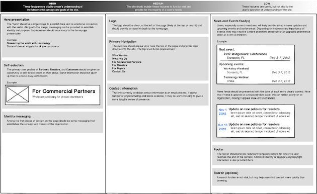
One of the first things we learned is that we needed to standardize definitions for what made an element high, medium, or low priority. These priorities are key to both defining the layout of the elements and encoding the users’ needs, so they need to be both consistent and clear. We came up with the following definitions:
- High Priority: These features are vital to a user’s understanding of the fundamental concept and goals of the site.
- Medium Priority: The site should include these features to function well and provide for the majority of a user’s needs.
- Low Priority: These features are useful, but not vital to the user’s operation or understanding of the site.
Without these definitions, the “high priority” column may be filled with “always there” page elements such as logos, navigation, and footers. But this doesn’t speak to the actual importance of these elements. The priorities of a site should be organized by how important they are to accomplishing the user’s goals, not by the mere expectation that they should be on the site.
To explain this, we sometimes use a car analogy. An example of a high priority item is the engine—without it, the car simply fails to function. A medium priority item would be seats—you could ride in the car without them, but the experience suffers. Low priority items would be cup holders or a sunroof, which complete the car, but are effectively optional. By this metric, the logos, navigation, and footers, though ever-present, should be medium priority items: important to the experience, but technically non-vital to the primary goal of establishing identity and directing the user to a product or service. High-priority items are more likely to include identity messaging and calls-to-action, and low-priority items might be news, social media, and newsletter signup.
Create One Diagram Per Page
It is important to focus on one PDD for each page. Home pages will likely require the most effort, so we have found it helpful to complete this diagram first. Some of the features that are initially brainstormed for the homepage may overflow into or be repeated on sub-pages.
In our experience, PDDs are also helpful for second-level pages since they are often used to provide an overview of the content in their section, but lower-level pages are usually more repetitive and content-heavy, making a PDD less valuable.
Leverage PDDs for Mobile-First Design
PDDs work very nicely with mobile-first and responsive design techniques, as well. When designing for mobile, you can use your PDD to easily prioritize content; sometimes that can be as simple as flowing most elements down the page in order of priority. Later, when you design checkpoints for other devices, you can refer to your PDD again for guidance on the size, positioning, and visual weight of page elements.
Keep Them Digital
Paper and sticky notes are great ways to start your PDD, but building a digital version in Microsoft Word or your favorite wireframing tool makes it much easier to share. If you don’t have time to type it up by hand, you can at least take a picture of your paper version and send it to everyone.
We recommend creating a template in your tool of choice, but if you use Balsamiq Mockups, we have created a template that you can download here.
Create Them Collaboratively
Perhaps the most important thing we have learned is that PDDs cannot be built in a silo by one information architect. Gathering input from stakeholders and the rest of your team will yield a shared sense of ownership and a more robust set of features than going it alone.
Conclusion
If you’re having trouble with clients engaging too little about what matters (goals and priorities) and too much with what doesn’t (“Can you add some whitespace between those buttons?”), consider using page description diagrams. With them, you’ll find it easier to prioritize features of your website design and increase buy-in for project team members while also reducing the need to show clients wireframes. It has worked very well for us so far.
Image of colorful pyramid courtesy Shutterstock.