I recently had an opportunity to research prototyping tools for my company, Smule. We make a slew of mobile music apps that let users create their own content, whether that’s singing via karaoke, rap battling, or playing a piano. When the company was still small, product designers used to prototype with engineers, sitting side-by-side and exploring new possibilities. Now, the company has taken on more ambitious features, leaving designers and engineers less time for prototyping.
This is why I’m on a mission to find a perfect prototyping tool that meets the need of all the product designers at my company. The most important criteria are: mobile friendly, easily sharable, no learning curve, and highly interactive. The tools that I’ll introduce in a series of two articles are ones I found discussed most often in UX groups online along with those that many experts and designer peers thought would best suit our needs.
Types of Prototyping Tools
After extensive research, I divided prototyping tools into three categories: page-based, layer-based, and coding-based. Tools in each category share distinctive features as well as pros and cons. This article will focus on two page-based prototyping tools as they offer the easiest adoption out of three categories, in future articles, I’ll explore layer-based and coding-based options.
Page-Based Prototyping Tools
Page-based tools include Flinto, Invision, Keynote and Fluid UI. Using these tools, you can create multiple pages or import your static mocks, and then easily create hotspots to link to the next page with nifty transitions. These tools are best used for showcasing the entire flow for a big feature or an entire app. Since all of them support drag-and-drop with intuitive navigation, there is virtually no learning curve. However, these tools do not offer an ability to fine-tune fancy animations or control a single component within the page.
Flinto
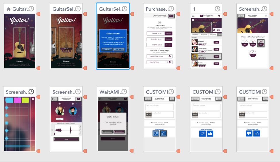
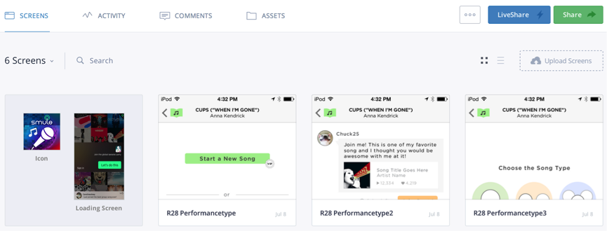
After some consideration, we decided to use Flinto instead of other tools in this category. Flinto works best for us for several reasons. First, most of our apps are at a stable stage. With every release we build an exciting feature for an existing app rather than building a completely new one. We have UI elements, style guide, and screenshots ready to go.
Whenever we make changes to a mock in @Dropbox, it will be automatically updated in @flinto as well
We also find the Dropbox syncing feature in Flinto exceptionally useful, as we are able to save our mocks in Dropbox. This means whenever we make changes to a mock in Dropbox, it will be automatically updated in Flinto as well. Flinto is extremely easy to use, and you can build a prototype in mere minutes.
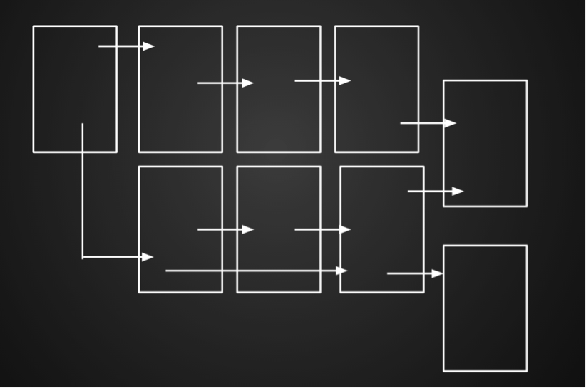
Just like the other tools in this category, Flinto does not offer smooth animation on a page. For instance, the animation of a progress bar needs to be divided into many images and renders choppy rather than as a smooth animation.
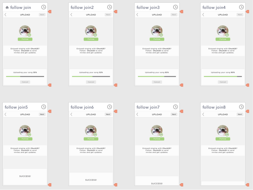
This simple progress bar with success message animation required eight mocks and still appeared really choppy
Invision
Invision is a close second to Flinto, and shares many of features we like in Flinto. It is easily sharable, highly collaborative, is optimized for mobile, offers syncing, and has version controlling from PSD files. Just like Flinto, you can drag-and-drop multiple images and create hotspots to make an interactive prototype in minutes.
The only reason we didn’t go with Invision is that it’s not as easy to manipulate pages. In Invision, you only see a single page in a browser then select the file name you want to link in a dropdown menu. This provides little visibility of the entire mocks we imported, which were often over 50 images. Also, linking pages based on filenames isn’t as intuitive as visually identifying files.
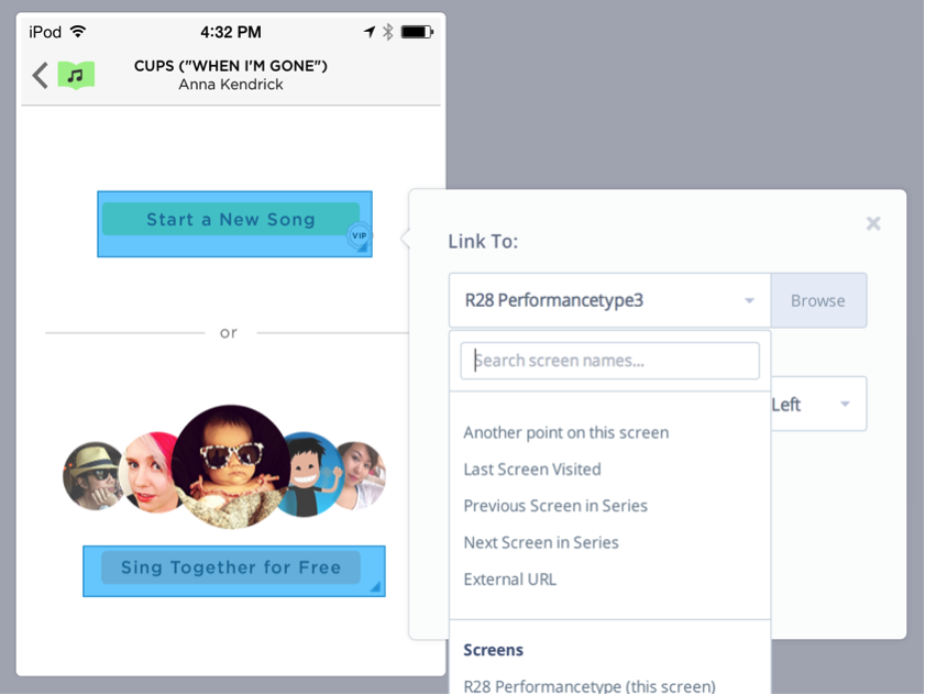
Unlike Flinto, you can only see one page at a time and select linking page from a dropdown menu
Keynote
If you’ve only used Keynote for presentation purposes, you haven’t discovered its powerful features for prototyping. Keynote offers animated transitions between slides, gestural control, editing capacity of alignment, auto distribution, and smart guides. The animations offered in Keynote are fairly well-mapped to standard animations you’d get in iOS development. The great thing about keynote is your likely familiarity with the program. It’s the most intuitive and self-explanatory tool in of this category, since there is (likely) zero learning curve.
However, sharing Keynote prototypes is not as easy as one would think. Unlike Flinto or Invision, you need to export the prototype as PDF and upload it to you server, then send the link to the user testers or your clients. This means that not only do you need to take an additional step in the sharing process but you also don’t control how it will be displayed on recipients’ devices. If your user tester has an Android device, the PDF can be displayed in many different zoom levels or lose its interactivity entirely. The best method of deployment to keep the experience as high-fidelity as possible is to download keynote for iPhone or iPad on the recipients’ devices. This deployment process is not as efficient as other two tools above.
Fluid UI
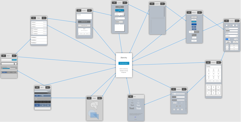
Fluid UI is an excellent tool if you’re starting the prototype from scratch. It comes with over 2,000 ready-made wireframe UI widgets for phone and tablet for both iOS and Android. You can also export the entire view and use it as a flow document.
You can also upload your high fidelity mocks and create hotspots just like Invision and Flinto. However, I must say that Fluid UI is best suited for prototypes made from scratch. Since uploading multiple images is not supported, you need to upload each mock one-by-one. Also, lack of ability to link your Dropbox folder means you need to switch mocks every time you make changes to your design.
In the next article, I will review layer-based and code-based tools’ pros and cons. Thanks for reading and stay tuned!
Be sure to check out Bona’s reviews of popular layer- and code-based prototyping tools.