Save
Part two of this article can be found here.
As an exploration into the creation of a true tablet computing device, I wrote the piece you are about to read, which, while originally a single 3500-word monster, has been split into two fairly coherent parts in order to spare you a headache. The first part is an examination of current devices, why they are not “true” tablets, and why they have not caught on. It was written the day before Apple‘s “Creation” event. The second part, which includes some hopes for a revolutionary tablet OS, and how they are (not) reflected in the iPad, was written after. I thought it would be interesting to compare my predictions with the reality. The tablet didn’t turn out as I hoped, but the lessons learned are no less valuable.
The main trouble in visualizing an interface for a tablet device is lowered expectations. This stems from the lack of true tablet devices available to the consumer. Of course there are convertible laptops and a few tablets here and there, but they all share the same crippling flaw: they run an OS that was not designed for tablet use. The limited resources of a physically small, low-power computer have restricted them to either running Windows XP, CE, or some sort of heavily accoutered mobile OS. There are small exceptions here and there in trade devices like medical tablets or field and military devices, but by and large these are still running on one of the OSes mentioned, and are likely even running minimally modified desktop software. Thus my assertion that there are no “true” tablet devices available at this moment (which is to say, January 26th), and although I do not know what Apple may be announcing tomorrow, I think that it has a fair chance of being the first. As I write this, I know I could still be wrong, and that gives me no small amount of anxiety.
The lowered expectations I mention, then, are those that result from a decade of being exposed to nothing but half-thought-out compromises in devices of this class. One can be forgiven a certain lack of imagination if the players in the industry have worked hard at scouring it from one. On the other hand, people are happy to up-size something like the iPhone or an e-book reader, foreseeing only gains in screen real estate and not stopping to think of the ergonomic consequences of moving an OS designed for a 3.5″ screen to one with four times the space. Therefore it is that most people expect too little in one way or another—and will not have the dust shaken from their skulls without a plain demonstration of what is possible. This period of low expectations is an excellent time to strike with an innovative device, as the iPhone proved, for there is a greater delta between consumer expectations expect and what you provide.
Before entering into fantasy and making a wish list for tablets of the future, let’s examine more closely the proto-tablets from today. Why haven’t they caught on? Well, what exactly is the benefit of a tablet device to the average consumer? There isn’t one apart from simple portability, because full-size OSes are designed around the mouse and keyboard, and are more easily navigable with those tools. Sure, it’s nice to be able to touch the buttons on an ATM, but is it actually more convenient to open your folders and move things around with your fingers? Certainly not in Windows XP, though Vista included some touch out of the box and Windows 7 more so. And let’s not forget that the resistive touchscreens that first made tablets and convertibles touch-enabled are limited in precision when using your fingers, and limited in versatility when using a stylus. After all, what is a stylus but a means of simulating a cursor? Capacitive screens are less cursor-aping, but also less precise, which requires accommodations I will detail later.
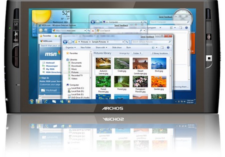
I have tried several UMPCs, slates, and tablets, and all suffered from the same fundamental usability issues. And while these issues may be negligible to, say, an IT worker who needs a compact full XP device to troubleshoot servers, the average user will find the devices clunky, slow, and difficult to read. Just so I’m clear: it’s not that these devices don’t function, but that they kind of limp along and no one minds because they’ve never seen a tablet run.
On the other end of the spectrum, though there are fewer of these, you have tablet or slate devices that use a handheld OS that has been modified to work on a device larger than a handheld. I suppose there are more than I think, given that many embedded devices and kiosks run on Windows CE or some such. And I have to admit that CE was designed to be a portable OS. But let’s be honest: when you think of an internet tablet for today’s consumers, Windows CE is the last thing on your mind. It’s two or three generations old, and far too dilapidated to be restored to any popular use.
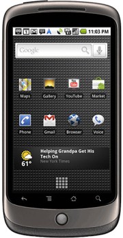
Android is now the hot OS to “grow” into larger devices. 
It’s unfortunate that we haven’t had any popular tablets before now, but the growing popularity of smartphones has at least set a floor for what’s expected. The big players, of course, can either aim for what’s expected (Lenovo has an interesting convertible in the U1, but it’s firmly rooted in existing tech and the UI is weird) or shoot for the moon.
And shooting for the moon is necessarily a lot of work. Innovation may be required. That pretty much rules out 90% of the industry. Apple’s still in there, though they will almost certainly lean on the iPhone for UI cues, and Microsoft is still there as well, or at least the subdivision of Microsoft responsible for the Courier. I complained to a Windows Mobile guy the other day that we have seen neither hide nor hair of Courier since the big leak, and he got quite evasive, so I’m going to guess it hasn’t been canned. At any rate, what needs to happen to make a tablet work for the average person on the street?
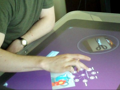
The Surface is a great jumping-off point for tablets. Anybody who’s played with one can tell you how intuitive, how fun, and how seamless the touch-based interface is. The project, which has grown from a handful of guys in the early 2000s to a full-blown division of Microsoft, also largely underpins Windows 7’s multitouch capability. But you may notice that Windows 7, while more touch-friendly than its precursors, is still very much a desktop OS. The way I understand it, work on the Surface mainly let Microsoft create an OS that would be open to being touched without relying on it. You know: creating standard behavior for things like dragging a scroll bar in both directions at once, or implementing momentum and friction for windows being tossed around. Good, but a tablet OS is made from the ground up to be touched.
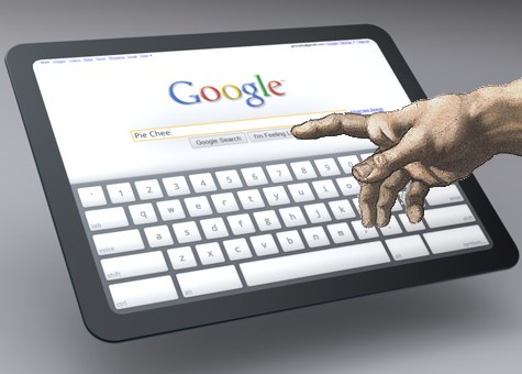
Apple, too: the iPhone and iPod touch are what most people will think of if you were to say “internet tablet” or “slate.” But they’re still mobile experiences, and Apple’s whole design philosophy precludes many of the UI elements from being reused in a larger context. I read a post on Gizmodo about how thumb reach will influence placement of buttons, docks, and so on with the Apple Tablet. I thought it ridiculous; if Apple wanted to make a bigger iPhone, they would have done so a long time ago. [later: oops]
A 10.6-inch screen, as the tablet is rumored to have, presents a completely different ergonomic landscape than a palm-sized device. Furthermore, even on the iPhone, nobody uses their thumbs for any precision work or gestures—not only are they big and clumsy compared to every other digit, but they obscure much of the screen and often lead to accidental presses with the palm while you’re reaching for the top. Any problem the iPhone has with thumb-based navigation, an Apple Tablet would have far worse. And Apple, rather than beat their head against it and design an absurd UI revolving around using your thumbs to navigate a large screen, will simply move on.
It is for that reason that I think that the tablet will be far more focused on one-handed, multi-finger gestures. They’ve pioneered their popular use with their excellent trackpads—it’s valuable IP and Apple would do well to leverage it. Besides, they want consumers to think (that is, if I speculate further) they’re using a fully-powered, compact Mac, not a souped up iPhone. The latter case would be bad product positioning, degrading the value of both devices.
That forms the first part of this expedition into creating a tablet OS. The second part will be published on Friday, containing some specific limitations of touch-based UIs and some suggestions on accommodating them, as well as a breakdown of the iPad’s strengths and shortcomings in this regard.
Devin Coldewey
Devin Coldewey is a Seattle-based freelance writer and photographer. He primarily writes for CrunchGear and TechCrunch. Devin's personal website is coldewey.cc.


