Leveraging the subconscious rules we follow surrounding availability, affect, and representativeness can reduce friction in experience design.
We’ve only got so much mental bandwidth, and it seems like we’re always pushing that bandwidth to its limit: multitasking, moving at a breakneck pace, trying to do too much with too little—all of which limits our ability to weigh every possible outcome of our decisions.
Despite the crunch, we tend to get around just fine, making—mostly—decent choices.
You can thank heuristics, the subconscious rules we use to help us make decisions when we’re short on time or brain power. These mental shortcuts often involve focusing on one piece of a puzzle to the exclusion of all others, particularly when the problem’s complex.
At InVision, we keep in mind that the people we design products for face exactly these issues. They’re madly busy, multitasking machines—just like us. That’s why we focus on creating the most frictionless flow through the product possible, using our research findings, gut instincts, and best guesses to guide us.
By building your conscious understanding of heuristics, you can become more aware of your own thought patterns and biases and make better guesses about other people’s decision making.
Here are three of the most powerful heuristics to use in your design work.
1. Availability
The availability heuristic means that the easier it is to think of an example of something—an event, entity, whatever—the more probable it is.
We think: “I remember this, so it must be important.” It’s a classic subjectivity-is-not-reality moment. We typically remember things we’ve heard about recently, or frequently. So the relative importance of these facts is of little to no significance.
For example, 2011 was called the “Summer of the Shark” due to increased media coverage of shark attacks, not an actual increase in shark attacks. And the last time you thought of buying a lottery ticket? Probably happened soon after you heard about someone else winning.
What availability teaches us about user experience
Remind a user of a problem they face, and they’ll consider it a problem worth solving. Try these three things to keep their problem top of mind.
Focus landing page design and copy on the problems your product solves, not what it does. “Get dinner delivered faster” is better than “Fast food delivery online.”
Give users positive feedback when they solve a problem, and remind them what it was. “Congrats—you’re one step closer to inbox 0!” is better than “Congrats!”
Cut irrelevant info from your design. Every irrelevant message dilutes the relevant ones.
2. Affect
The affect heuristic means that words with positive and/or negative connotations have corresponding influence over your decision-making. The fleeting but powerful bursts of emotion that words like “home,” “cancer,” and “escape” evoke can cause us to act, or hold back.
If you feel good about an activity—let’s say, skydiving—you’re more likely to believe the risks are low and the benefits high. And the reverse is also true. If you’re scared of heights, you’ll think that skydiving isn’t fun enough to warrant the risk. Put simply, emotions do powerful things to your decisions.
What affect teaches us about user experience
A user’s emotional response to your visuals and content determine whether or not they’ll use your product. Keep emotion at the forefront of your design with powerful, evocative language, photography, and colors. It’s equally important in both appearance and usability.
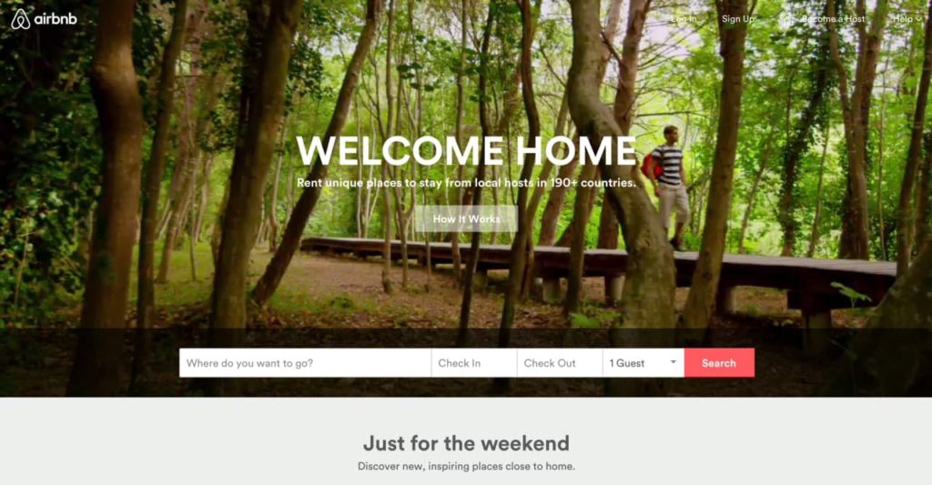
Notice how Airbnb uses the richly charged idea of “home” throughout its design. Traveling can be a pain. Renting out a stranger’s home can feel unsettling. But being welcomed home? It doesn’t get any more comforting.
Aarron Walter sums it up perfectly in Designing for Emotion: “Emotional design turns casual users into fanatics, ready to tell others about their positive experience.”
3. Representativeness
The representativeness heuristic means that you determine the likelihood of something happening based on what you think about something similar to it. It’s the stereotype heuristic. For example, if you just moved and need to update your address at a new DMV office, you’ll expect it to be as wretchedly soul-sucking as your old one.
What representativeness teaches us about user experience
Trying out a new product can create anxiety. Even a free product requires an investment of time, attention, and—usually—inbox space. But you can use the representativeness heuristic to prevent anxiety by establishing yourself as an authority.
To establish authority, liken your product to something the target audience already enjoys. As thousands of logo “lockups” show, this can be as simple as placing them together visually. “Birds of a feather flock together,” after all.
The Fine Print
Designing for people means designing for all of their quirks and eccentricities. Thought patterns are, after all, just patterns—things people deviate from. So you’ll still want to run usability tests to make sure your design holds up in the real world.
But keeping these heuristics in mind while you design can really help you create more human-centered products.
Image of wooden houses courtesy Shutterstock.
Artificial Intelligence, Design Leadership, Future of Work, Human-AI Collaboration, Product Design, User Experience, UX × AI Series, UX Design
AI can create wireframes, synthesize research, and draft copy fast. What it can’t do: understand your users, carry context, or be accountable when something goes wrong. That’s still you.
The Agile Trap Designers Fall into: Feeding the Beast
Agile teams are fast, but designers get stuck in an infinite loop of visual work: redesigning the same components over and over instead of solving real UX problems.
Design systems break that cycle, defining the building blocks once, freeing designers to focus on how the product works, not how it looks.
When the basics are in place, teams can start working together sooner, prototype faster, and release incremental features without the interface falling apart.
Gamification 2.0. Beyond Points and Badges: Designing for Players, Not Metrics. Conclusion
Most apps use gamification as a manipulation layer to drive metrics, but people engage with things that are truly worthy of their time, not points or streak guilt.
Apps that people stick with do this by designing for intrinsic motivation, making the experience itself rewarding.
The true measure of success is whether users feel more capable, accomplished, and enriched for having used your app.