Save
Fireproof Games was taken by surprise when Apple named their iPad adventure-puzzler, The Room, Game of the Year at the end of 2012, propelling it to the #1 position in the App Store.
“We didn’t receive any word other than an email of congratulations, and that was only after it had already started being featured,” explains founding partner Rob Dodd. “They’re really unbelievably tight-lipped about these things.” While Apple’s rationale for the pick remains unspoken, it’s a safe bet that the success of The Room has a lot to do with the quality of its user experience.
Video games constitute a distinct branch of human-computer interaction, and playing them is a definite form of UX. While there are important differences between games and conventional software, the two overlap in ways that are easy to find. A great many of the skills UX designers practice everyday transfer directly to the design of video games, and studying game design can offer a fresh perspective on our everyday work. As video games gain increasing dominance as a primary way that human beings interact with machines, they should become a subject of active review and discussion within the UX community.
The Room is one illustrative example of a game guided by an ethic of player-centric design that prioritizes the human experience.
A Custom-Fitted Interaction Model
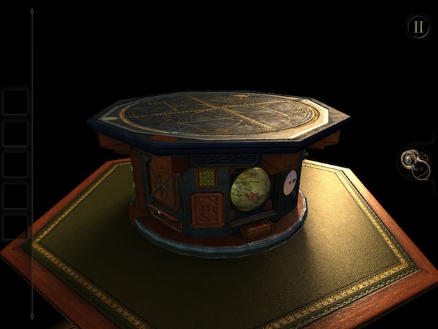
The concept of The Room is somewhat unprecedented, as it is focused solely on opening complex puzzle boxes. While the pseudo-mechanical contraptions are reminiscent of discrete puzzles found scattered throughout adventure games like Myst, the puzzles in The Room are not nested within a broader world. Instead, the puzzle boxes are all there is to see.
Most video games follow a basic interaction model established by countless predecessors. But none of these models are quite right for The Room, which requires extremely close attention to the very minute details of a three-dimensional object, but nothing else. As a result, the game’s designers had to invent their own model for interacting with the game world.
The result is a novel interface where players swipe to rotate a camera around the puzzle box, which automatically stays fixed in the center of the user’s field of view. When they see an interesting feature on the box, users can tap or pinch to zoom in and interact with it, then pinch back out to return to rotation mode.
This model is very amenable to touchscreens, providing a simple and intuitive method for examining and manipulating the puzzles. Gestures map directly to the physical movements you would expect in the real world, making the underlying interface accessible to a broad variety of user demographics and skill levels (my three-year-old is a wizard with it). Players don’t need to deal with the overhead of learning how to move within a broader world.
The constrained user perspective also creates aesthetic advantages. It allows for the dedication of iPad’s relatively lightweight graphical processing resources to creating richer detail and texture in the ornate boxes. It enables realistic lighting effects that give wooden and metal surfaces a tangible luster. Automatically keeping the puzzle box centered also contributes to the experience’s creepy mood. As Dodd explains, “If you’re always forced to look at the object it creates a sense of claustrophobia, because you never know what’s lurking behind you in the darkness.”
Affordances at the Threshold of Understanding
In The Room, players are frequently challenged to find a hidden panel, a secret switch, or a camouflaged dial. But players are not just tapping randomly on perfectly smooth, undifferentiated surfaces in the hope of lucking out and springing a lock. Instead the design uses minimal affordances that, ideally, just barely pass the minimum threshold needed to perceive and understand them. The design challenge is not in how the secrets should be hidden, but in how they should be revealed.
In the first level, for example, subtle seams in an ornate panel denote a hidden door in the wall of a safe. Nearby, tiny scratch marks in the metal show where a cover slides over a keyhole.
This fairly simple puzzle is intended to orient users to the game’s design by demonstrating the kinds of affordances users should look for as the game grows more challenging. In a more advanced level, one of the feet on the puzzle box rotates to reveal a hidden object. The only indication that the foot rotates is the tactile ribbing around the metal. The affordance is plain enough, but useless until the user hits on the insight that it’s not just decorative.
In some cases, the designers fell short on creating affordances that sufficiently connect objects to possible actions. Dodd owns up that “I think we got it wrong on the tilt puzzle in level two, which became a point where a lot of people found themselves stuck.” Shown below, four metal orbs suspended in the top of a box need to be aligned by tilting the iPad itself in the right direction.
The orbs lay off-kilter in a way that’s meant to cue users to the solution. But tilting the iPad breaks the separation between the game world and the physical world in a way that comes without precedent in The Room. Previous experience is what gives an affordance its voice, so the cues to the solution of the tilt puzzle are effectively mute.
Progressive Help
Puzzle games need to strike a precarious balance: players want the satisfaction of solving difficult problems, as long as they’re actually able to solve them. Too much challenge and people become frustrated; too little and they become bored.
Designing around this dilemma presents an especially difficult problem for a game like The Room, which relies on players hitting on eureka moment after eureka moment, because insight is fickle. I might pull my hair out for hours trying to solve a puzzle that you breeze through in a second. Almost everyone who plays The Room is likely to get frustratingly stuck at some point, but they won’t all get stuck at just the same points.
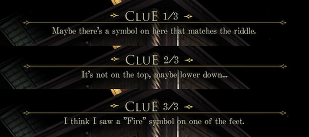
To provide an experience that allows people to surmount stubborn problems without robbing the game of its challenge, The Room incorporates a well-designed hint system into the UI. If a certain amount of time passes without the player solving a puzzle, an icon appears to indicate that a hint has become available. This timing makes the help system wonderfully sensitive to the user’s exact point of need. In conventional software, help systems usually aren’t so attuned to what the user is trying to accomplish, working more like digital reference manuals. At every moment in The Room, however, a hint written specifically for that moment is waiting to be triggered. Once it becomes available, the user is free to decide whether to view the hint or keep on trying to figure it out unassisted.
There are three or four hints available for each problem in the game, fed to the user one at a time. These are structured to progressively become more direct, growing from gentle nudging to explicitly spelling out the solution. This gives players who read the hints the satisfaction of still claiming partial credit for solving the puzzle.
Far from sacrificing the challenge of the game, Dodd explains that the hint system allowed the game to remain difficult. “When people are having a hard time, you can’t always just make it easier. That would lose the point of playing a puzzle game in the first place,” he explains. “Hints provide a safety net so that you can get past the odd mental block, and also so we don’t have to completely change the design. The hints allow the game to be what it should be.”
Iterative Design and Testing
As with conventional UX design, worthwhile video games usually don’t follow a straight path from concept to finished product. Instead they are designed and developed through a process of repeated prototyping, user testing, and revision. Dodd explains: “You rarely get a good game by just writing up some documents and throwing them over the wall. It has to be done iteratively, so that the idea changes as you build on it.”
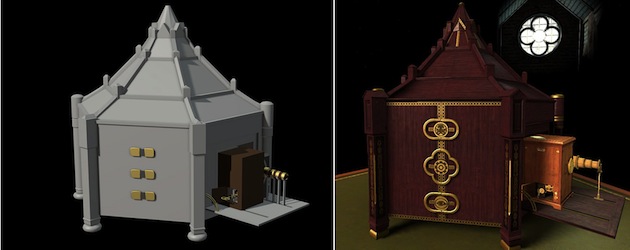
Each level in The Room started out as a “whitebox”, the equivalent of an interactive wireframe that represents just minimum structure and functionality needed to play it, without the aesthetic refinement of a finished product. The design team tested the whiteboxes early and often with anyone willing to give them a try.
For example, the design team experimented with several different interaction models before settling on the one described above. Initially, users toggled between the two modes—interact and move—by tapping a button. This modal structure was intended to prevent users from accidentally triggering an action by inadvertently touching an object when they were trying to swipe to rotate the camera.
However, when testing the whitebox they found that users would frequently forget to swap between modes. In some cases they would find the right interactive object, then tap it without switching modes and conclude that it wasn’t functional. So players not only needed to solve the cognitive challenge of the puzzles themselves, but also solve the cognitive challenge of the UI.
The designers tried removing the button, instead letting users toggle between interact and move modes by pinching to zoom in and out. This proved to be far more intuitive, since objects were too small to read as tactile when the camera was zoomed out. The designers wouldn’t have been able to discover this without the opportunity to test and iterate.
A Leap into the Player’s Mind
Ultimately, UX design and video game design both endeavor to understand a user’s mental model for accomplishing tasks and construct an interactive experience that’s sensitive to that model. As Mark Hamilton, another founder of Fireproof Games, explains, “I very consciously thought about the implications of everything I was designing in terms of what it would make the player think, what the reaction would be, and the player’s understanding of their goal.”
As with UX, human-centric thinking is the secret of all great design.
Save 15% on John Ferrara’s Rosenfeld Media book, Playful Design: Creating Game Experiences in Everyday Interfaces by entering the promo code “UXMAG” at checkout.
John Ferrara
John Ferrara has worked in in user experience design since 1999, designing interfaces for websites, desktop applications, and video games. Since 2006 he's been with Vanguard, and before that did significant work for Unisys and General Electric. He's been a forceful advocate for closer connections between UX and game design at the IA Summit, EuroIA, and Games for Health. He’s the author of the new book Playful Design: Creating Game Experiences in Everyday Interfaces, published by Rosenfeld Media. His nutrition education game Fitter Critters was a top prizewinner in the Apps For Healthy Kids contest, sponsored by Michelle Obama's Let's Move! campaign. Before entering the professional world, he earned bachelor's and master's degrees in communications. Feel free to follow John on Twitter at @PlayfulDesign.


