Apple and Google have been fighting for map dominance for nearly a decade. In 2012, just months after Google Maps first hit one billion users, Apple Maps was set as the default mapping application on IOS.
As a result, it’s estimated that Google lost 300 million IOS users.
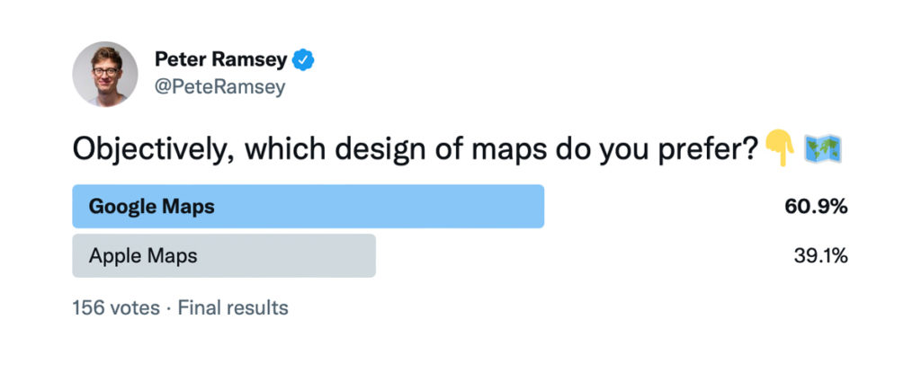
I often ponder why I typically use Google Maps, given how much I love Apple, and how easy it is to access on my iPhone.
And if one small poll on Twitter is representative, you largely agree.
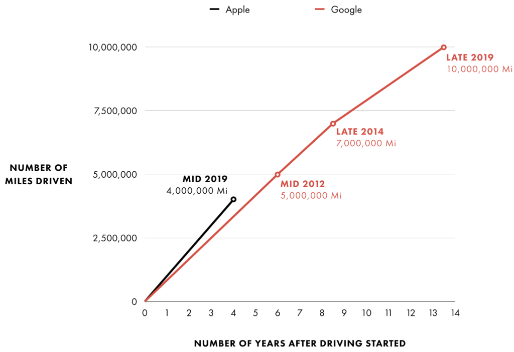
The breadth of data is the primary differentiator—of which Google has a significant advantage.
For example, I use Street View to quickly contextualize where a destination is, and it has huge broad value, like identifying if there’s on-street parking available.
Apple’s version, called ‘Look Around’, is still about a decade behind (in terms of miles driven, which should be positively correlated to the availability of the feature).
But assuming that you live in a densely-populated city—where both Apple and Google have similar amounts of data—how do these services compare?
While the issues raised below may be relatively minor, it demonstrates that there is still room for improvement, within two world-class apps.
Let’s jump in.
Key UX takeaways
1. Contextualising data
Both Apple and Google know that this burger restaurant is currently closed and that it opens at 12.00 tomorrow.
But context is the foundation of great UX—not raw data—and Google contextualizes this better by also showing you when it next opens.
i.e., you may not be looking for somewhere to eat right now, but instead be keen on eating at this specific location at some point in the future.
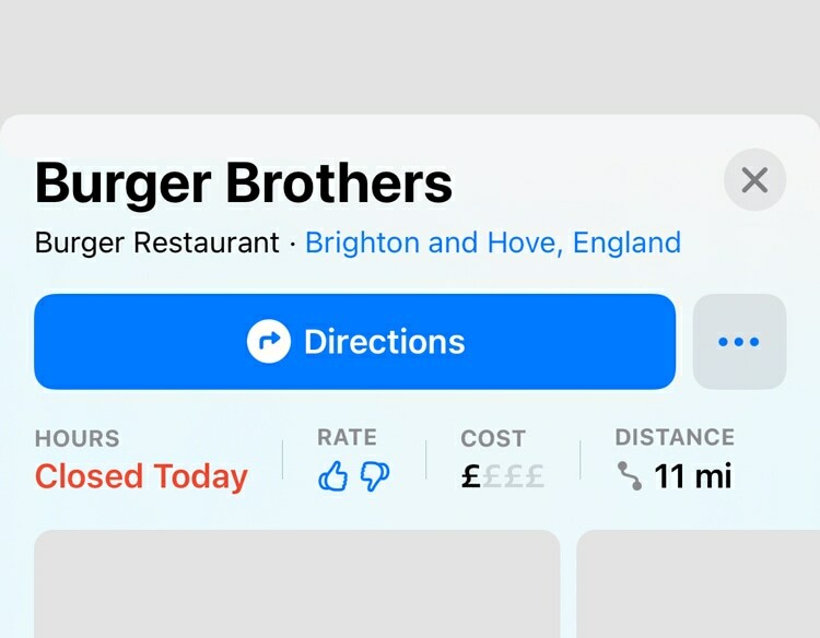
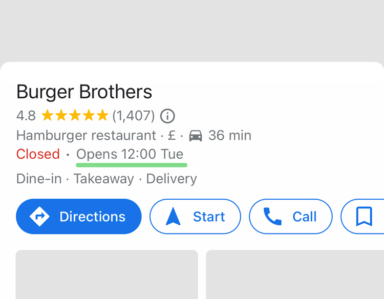
Sure, Apple will show you full opening times, but it’s hidden behind a scroll and a click.
More impressively, if you then navigate to this destination, Google will proactively notify you that it’s closed before you set off.
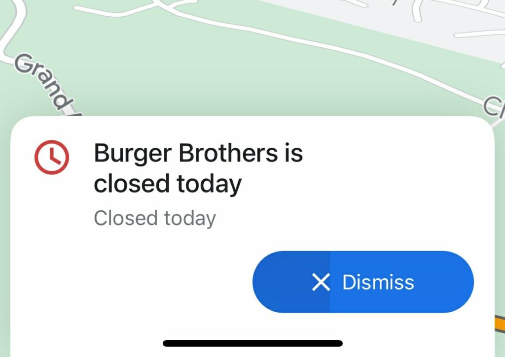
They’ll even let you know if the place is currently open, but is likely to be closed by the time you arrive.
Apple doesn’t do this, despite having the data, and it is obvious how valuable this kind of analysis could be.
The takeaway here—and the insight that Google probably discovered—is that people enjoy the comfort of context.
i.e., most people prefer being told what the consequences of the data are, not purely the data itself.
Note: it’s obviously advantageous to consider this when building dashboards and specific data tools, but it has a broad use for most data points. For instance, Uber showing the driver on a real-time map adds context to their arrival time.
2. More clicks, please
“Taking friction out of processes has been the playbook of Silicon Valley for the last decade or two”
Jason Calacanis
As I tweeted in response, it’s important to remove the right clicks, not just any click.
For instance, when I search for ‘IKEA’, I get two very distinct outcomes:
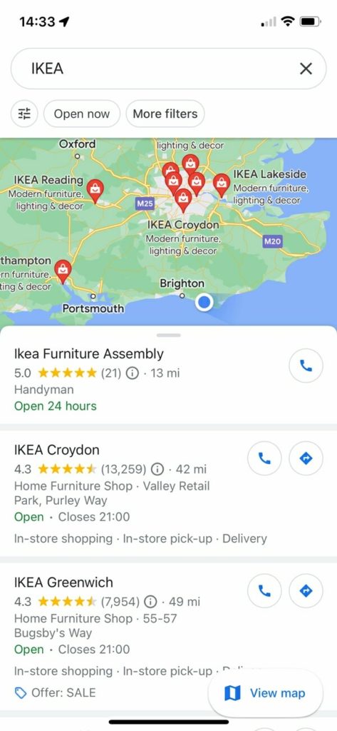
- Google shows me the nearest IKEAs, within roughly 100 miles.
- Apple takes me immediately to the nearest IKEA.
The issue is obvious with the screenshots below: the IKEA that Apple takes me to is a permanently closed small business.
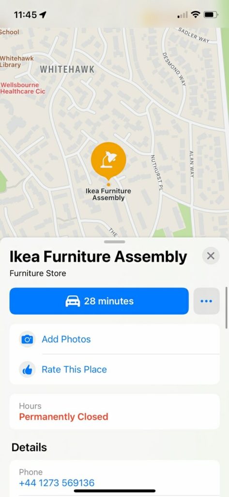
The problem is partly due to Apple sourcing a lot of data from 3rd parties, like TomTom, some of which is old and defunct.
i.e., in the short term, they have a major data problem.
But, the avoidable UX mistake was to optimise for simplicity, without the data to operate at that calibre.
In other words: because Apple’s data quality is occasionally so poor, they need to add friction back in—by showing the user many results, and letting them select the best option.
I often see start-up founders make similar errors.
e.g., assuming that because Airbnb has a 4-click booking process, they should too—ignoring the fact that Airbnb requires very little introduction or context.
3. Human alternative
Consider that there are two distinct (but often combined) use cases for mapping apps:
- 🚘Navigation i.e., how to get somewhere.
- 🚦En-route context i.e., the fastest way of getting somewhere.
The nuance is that the user may care more about their journey, than the destination.
i.e., show me the fastest route, given the traffic today.
And for that second use case, the quality of the routing is important, because you may already know the area well—and so navigation errors will be noticeable.
Google demonstrates a willingness to use pedestrian paths and shortcuts—ideal for city walkers. By default Apple sticks to the main roads.
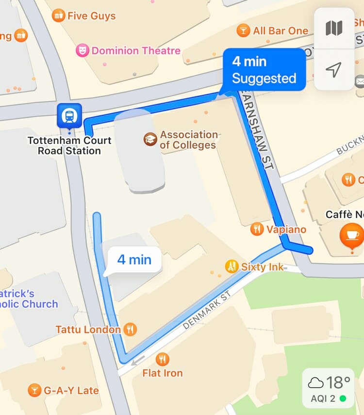
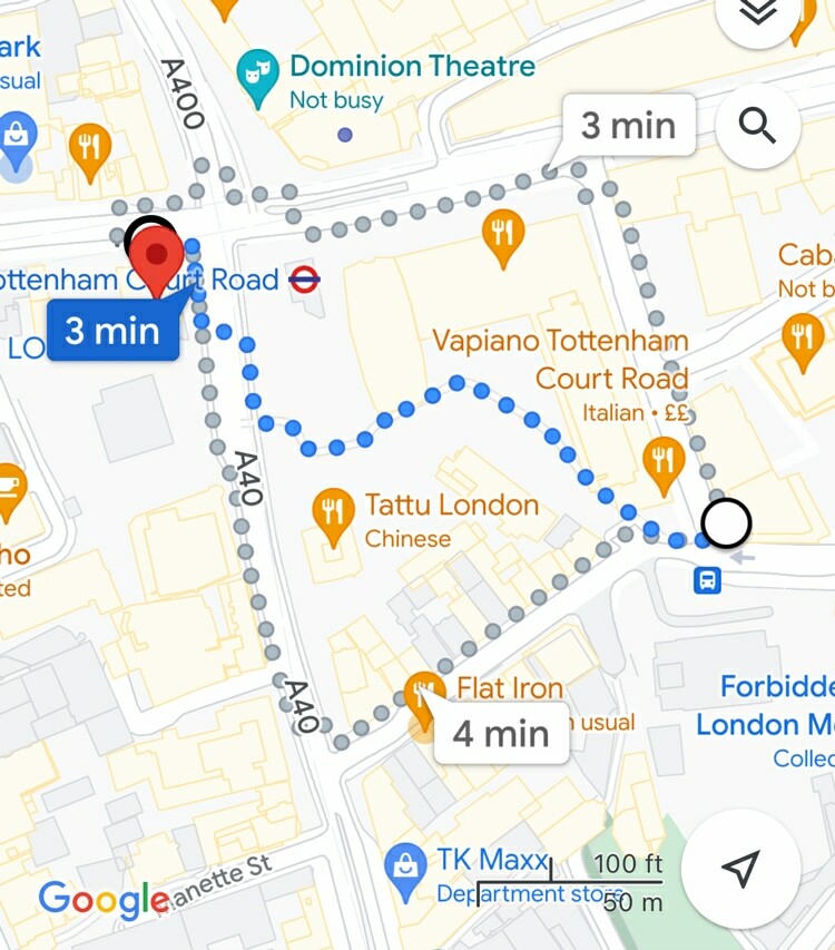
To be clear, the issue here is not an unsuitable route, but rather that the lack of these ‘obvious-to-a-human’ shortcuts can reduce the motivation to use Apple Maps for local journeys.
To illustrate that point, here is the shortcut that Apple would have missed:
It wouldn’t need to miss many of these before local residents concluded that they knew their area better than Apple—or that the value Apple provides to their short trip is a net negative.
4. Audio
Audio becomes such an important part of the experience whilst navigating, particularly during stressful situations when your visual attention is required to drive safely.
I’ll assume that most of you aren’t reading this article whilst merging lanes on a motorway, so it’s important to reframe your empathy for the issue that I’m about to describe.
Remember: stressful situations usually amplify friction.
What I found was this:
Apple’s narration felt considerably better; calming and very human. Google’s often felt sporadic and robotic.
As an example, here’s a recording from identical journeys (same starting location, same destination, same route), with Apple Maps and Google Maps respectively:
After transcribing a bunch of identical journeys, I found that Google not only says more (on average, about 14%), but does so without many natural pauses, or human cadence.
Listen to that recording a few times, and you may (if you’re like me) start to find Google’s narration quite grating and irritating. This is a major dampener on the UX, given that:
- ⏱1. Journeys may be long i.e., you may be listening to this voice for hours.
- 🤬2. It’s valuable during intensity i.e., you need to listen carefully during the most stressful scenarios.
It’s not immediately obvious how this specific UX issue is transferable to other industries, but it is.
Often the things that go unnoticed during relaxed usage (i.e., testing), become problems in moments of high intensity.
From a user testing perspective, Google would likely receive richer feedback by polling users who’d just missed their turning on a motorway, and had some guy in a 1999 Honda Civic swearing at them in their rearview mirror.
5. Parking
Both services (although Google’s is turned off by default) will automatically mark where you last parked your car.
Most of the time you won’t need, or even notice it. But it’s a feature that could provide enormous value in certain situations.
i.e., low frequency, high impact.
But, for some reason, Google can’t handle car parks. Instead, it just says I parked on the nearest public road.
i.e., I’m parked in the same place in the screenshots below, but notice where my pin is.
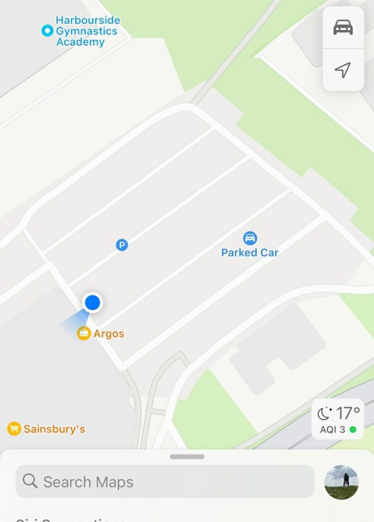
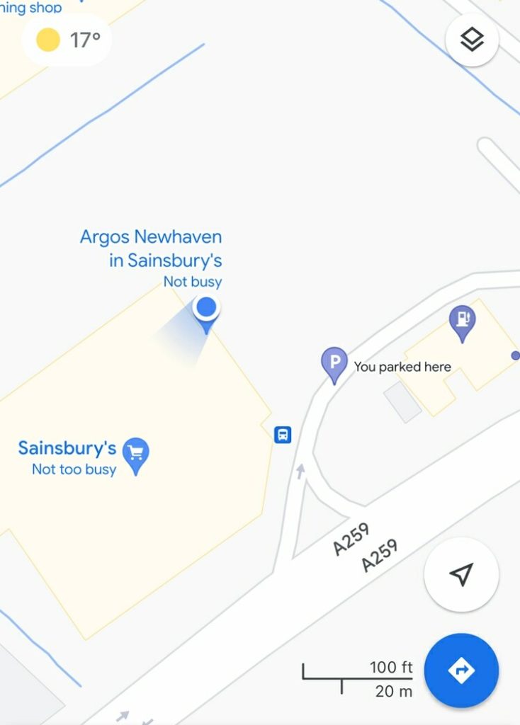
Google must have known where I actually parked—see how my blue ‘current location’ is correct in both.
And there’s something extremely damaging about confidently marking where your car is when that isn’t where your car actually is.
Imagine trying to locate your car at a music festival, following the pin on Google Maps, only to find that it’s taken you to a side road near the fields. Not only have you wasted your time, but you still need to find your car.
That’s the risk of low frequency and high impact moments—when they do occur, things deteriorate quickly.
Product teams often downplay low-frequency events, because the probability of it happening is very slim. But the key is to identify which of those rare events lead to outsized horrific (or very annoying) outcomes.
(i.e., very similar to ‘Black Swan’ events in finance).
6. Digesting lists
If you search for a specific coffee shop, you’ll be shown results from all over the world.
(I’ve added the darker sidebar with flags, to demonstrate my point).
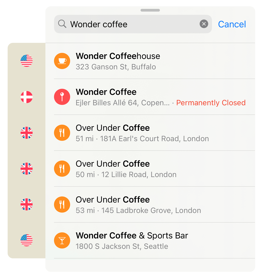
And although showing results in other countries first (I’m in the U.K.), can be frustrating at times, simply sorting by location wouldn’t be without flaws.
There has to be some weighting for popularity. For instance, to stop the Statue of Liberty from getting buried below random businesses and shops with a similar name—but that happens to be closer.
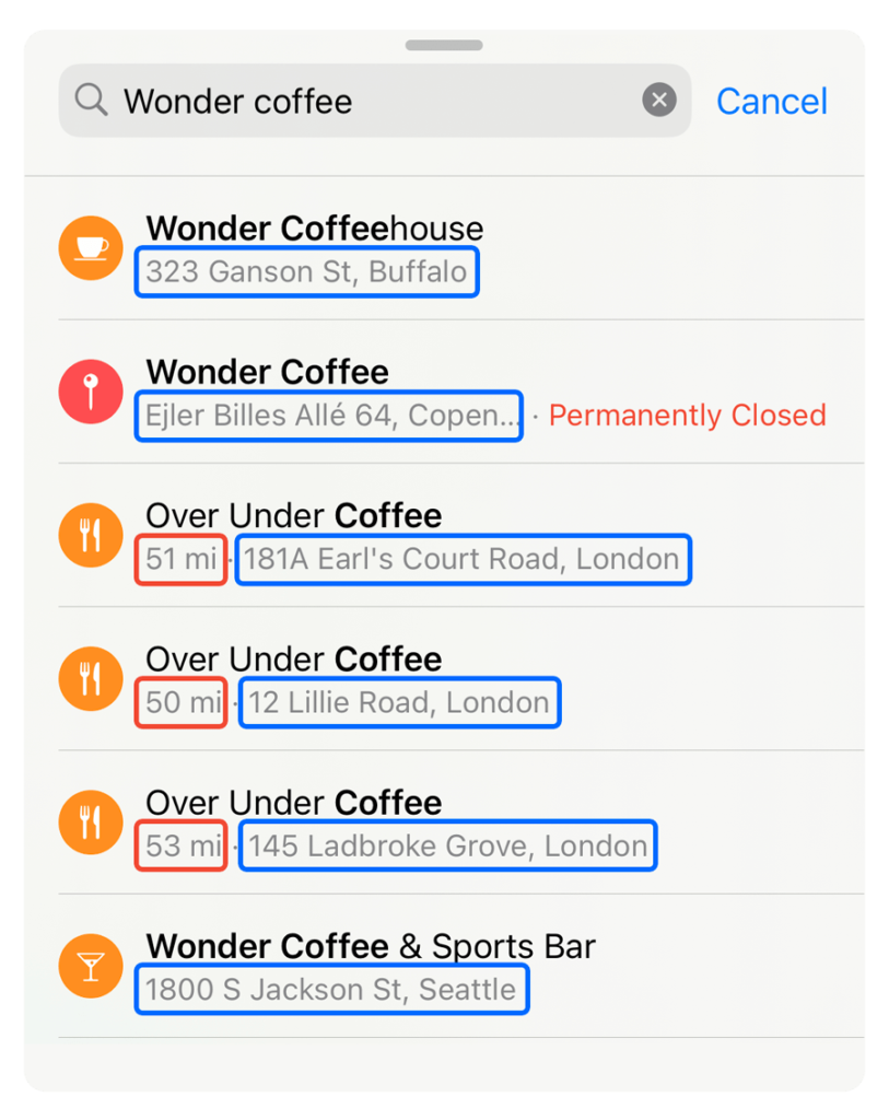
Instead, the more subtle UX sin is that Apple have hidden ‘miles’ for all locations outside of my country.
At a glance, “18 mi” and “1800 S” are very similar.
The lack of distinction increases the 🧠 Cognitive Load to glance down the list and digest the metadata.
There’s no obvious (and flawless) solution here. In fact, it’s an awkward use of components that feels messy.
But, as an example, adding a subtle background to the ‘miles’ helps anchor the eye—drawing your attention to regularity (and irregularity).
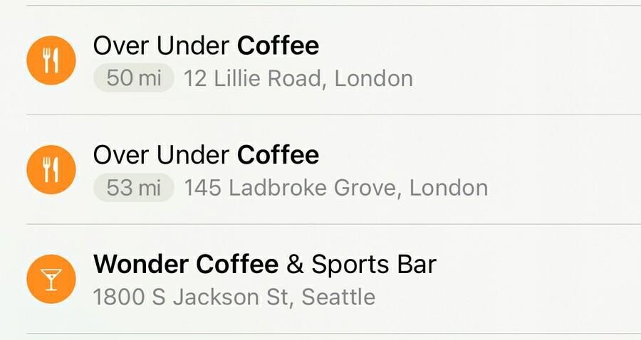
If you challenged yourself to look at the address of the second item in the list above, over and over, you’ll probably notice that once you understand the pattern, it’s far more efficient.
That doesn’t automatically make it the right design choice, but it demonstrates the issue with the status quo.
Original UX analysis published by our friends at Built for Mars — where you can find 50+ case studies like this for free. Check them out!