Save
In the age of wearable technology, Fitbit has taken center stage and in many ways stolen the show in the health and fitness category.
I finally shuffled to the top of the hill at 40 this year. I have suffered from chronic back and neck pain as well as acid-reflux disease for over a decade now. Something had to give, and Ben & Jerry certainly weren’t helping a brother out. I’ve lost nearly 30lbs in the past 6mos since I stopped—or at least significantly slowed—my consumption of refined sugars and started actually exercising. Imagine that.
One of the welcome additions in my new lease on life has been the ability to measure my fitness goals using the Fitbit Flex. One of the setbacks is that I’ve developed something of a love/hate relationship with the device. I’d like to share my experience with Fitbit Flex because:- I care about users and product design.
- You’re considering a purchase of a Fitbit and you want to know if the experience is all its [ahem] tapped up to be.
- Perhaps you too are throwing a fit because of your Fitbit, and I merely want to commensurate with you.
First, the Good
Silent Alarm
One of the features I stumbled upon through app exploration was the silent alarm feature. Part of my fitness regimen involves waking up at the ungodly hour of 4:30am. My wife is a super-light sleeper so whether she liked it or not she was being disturbed by the Yanni-esque wake up tone through my Sleep Cycle app. Even after changing it to vibrate, because my phone was underneath my huge pillow, her sleep was still being disturbed. Fitbit’s silent alarm allows me to set a wake time through the app, and even lets me specify that it should only go off on weekdays. Ah, all better. Now my wrist gets a little vibration action every morning and my wife stays undisturbed.Gamifying Fitness
Who doesn’t love the idea of making fitness fun? Milton Teagle (né Richard) Simmons and his puffy hair have been trying since the ‘80s! One of the things Fitbit does really well is rewarding you with badges as certain milestones are achieved. These are all viewable within the app.Image credit: Louis Gray
Other gamifying aspects are social in nature. You can add friends who also sport the wrist-rubber-big-brother to a variety of challenges and taunt and/or cheer them on. These social aspects become competitive and actually drive you to want to achieve better results since the stakes are higher… and much more public!Goal Setting
This is one of the super-valuable pros to the app. You can customize total daily steps goal and get multiple motivational notifications throughout the day—that is if you never turn your Bluetooth off (a fit about Bluetooth later). In addition to steps, you can also set calorie, weight, and sleep goals (a fit about sleep mode later).App Design
Big kudos to the design team on the app: it’s simple, intuitive, and visually appealing. The data charts are also very well designed. My only complaint is that some of the important features (like silent alarm and goals) are buried in the account preferences funnel.Water Resistant
Yes, it is, but I still take mine off before showering. Nice to know though when I bathe the little one I don’t have to panic every time it gets wet, although I’m probably racking up unmerited steps in the process (a fit about accuracy later).Fit 1: Sleep Mode
I’ll be honest here, up until my research for this article, I thought the multiple taps for “Sleep Mode” was for putting the entire device to sleep so that the Fitbit stopped tracking in order to save batteries. I still have a major UX problem with this gesture, which I’ll get into in a sec.
Once I realized that the Fitbit still tracked movement in sleep mode, I was somewhat relieved, and actually utilized this feature (correctly) for the first time the other night to track my sleep. All along I thought I had to go into the app every time to activate it. So, instead of continuing to let the hate flow through me, I’m now more eating granola barefoot in the mountains on this one.
Pro
Like “The Clapper” ad, I do see the value in being able to activate sleep mode with just a touch gesture in bed instead of having to go into the app.Con
This gesture is way too easily initiated without user intent. Here’s how it happens:- Air drums (this also has inaccuracy implications I address later)
- My wife and I both, just by having our hands at “10 and 2” on the steering wheel and driving over bumpy roads
- Pushing a grocery cart on a sidewalk (to take groceries to the car not to get to my sleeping bag under the freeway bridge!)
- Riding mower (this also has inaccuracy implications I address later)
- Kids! How many of you have little ones that love to tap your Fitbit to see how awesome (or sucky) you were that day? I’ll bet the farm they can’t just tap it twice — has to be at least eight times fast … am I right??
Couple of possible solutions to this design problem
- Continue using the existing and somewhat familiar multiple taps behavior, just double the tap rate intention to 10+ instead of 5ish
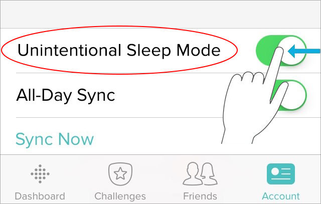
- Add an “Unintentional Sleep Mode” feature in the app account settings to mitigate annoyance
Fit 2: Inaccuracies
Wave your hands in the air … now wave ‘em like you just don’t care! Nice, you just added 10 “steps” to your daily goal!
This is probably my biggest issue with the Fitbit. You should understandably expect a pedometer to have a high accuracy rate — especially when you’re putting so much faith in it to measure your health and fitness goals. The problem with a wearable pedometer device that uses an accelerometer to measure “steps” is that it also records pretty much any quick hand movements.
Here are some of my own examples I’ve been observing and testing into:
Air Drums
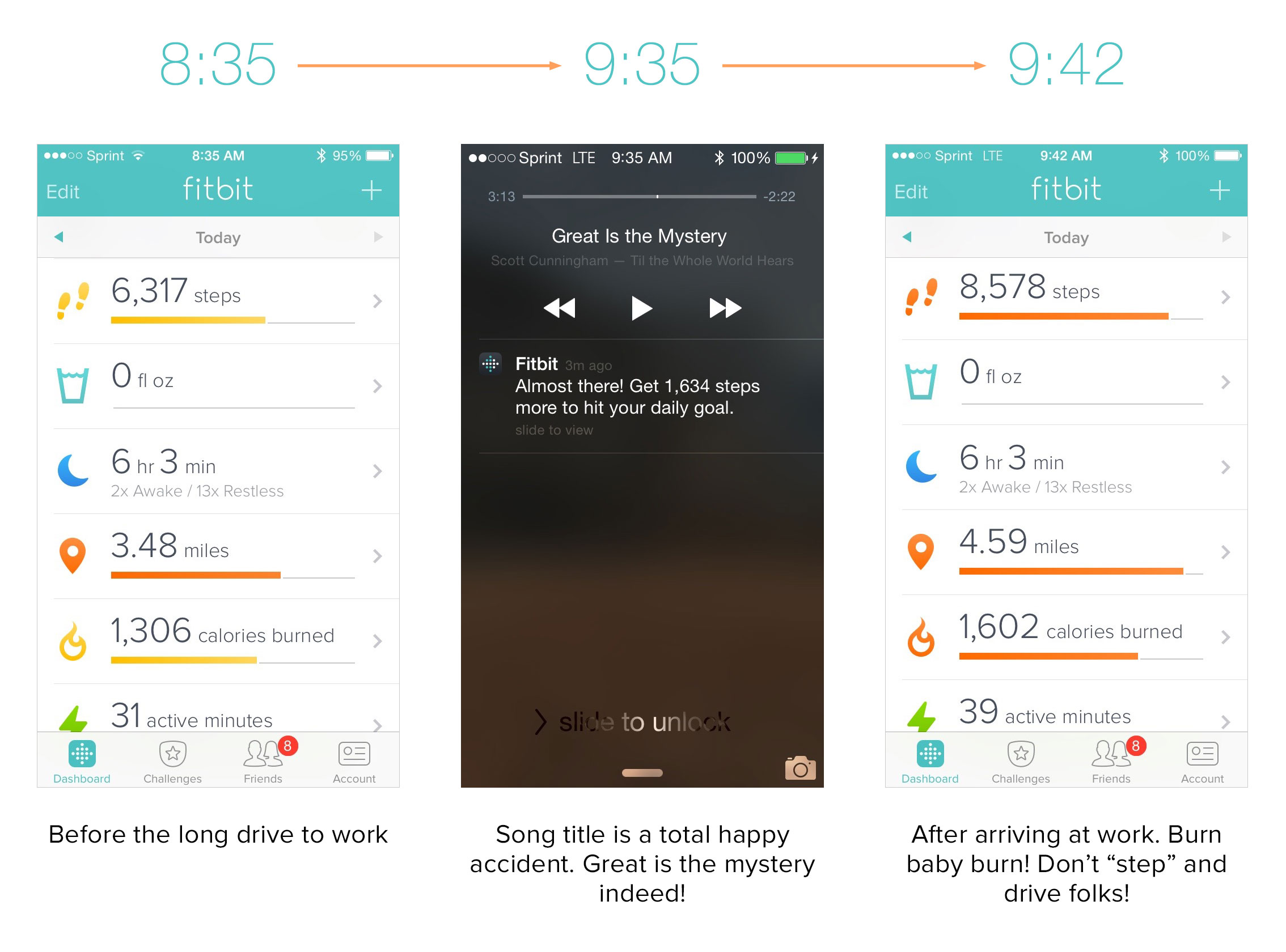
On the seldom occasion that I’m not listening to podcasts on my way to/from work, I listen to music. And when I do, I play air drums. I can’t help it—the rhythm is gonna get me … every time.
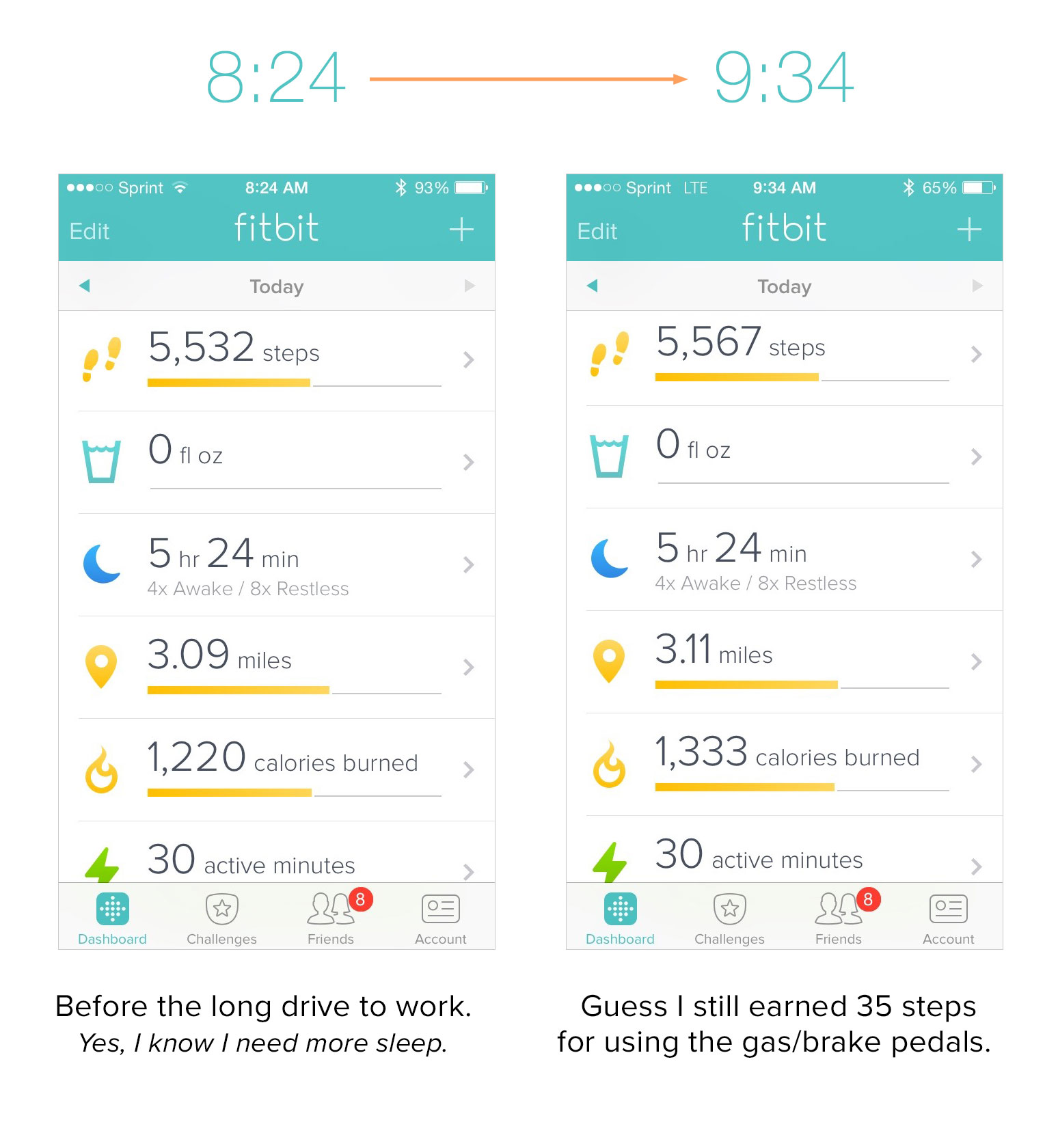
My work commute is significant. I drive from about 15 miles east of Colorado Springs to South Denver. This equates to about 55 miles each way. Travel time averages out at around 1h 15m each way. My weekday mornings start out with 30 minutes on the treadmill, which gives me a nice start toward my goal each day. However, just by air-drumming on my leg on the way I garnered 2,261 “steps” and almost achieved my 10k goal by the time I arrived to work! Yay me!
Flipping Bacon
This drives my wife nuts. Not that I’m awesome at bacon, but that on the days I make it, I was always way ahead of her in our daily goals by mid-day. This was a big issue until I switched the setting of my dominant hand, then well, I don’t know…I don’t yet have the supporting data. Darn, I’ll have to test that again! Bacon!
Lawn Mowing
I live on the prairie (5 acres of it) in beautiful Colorado. So, naturally (especially when we get lots of rain) I have to keep on that prairie grass.

Me sitting (not Prancercizing) on my riding mower
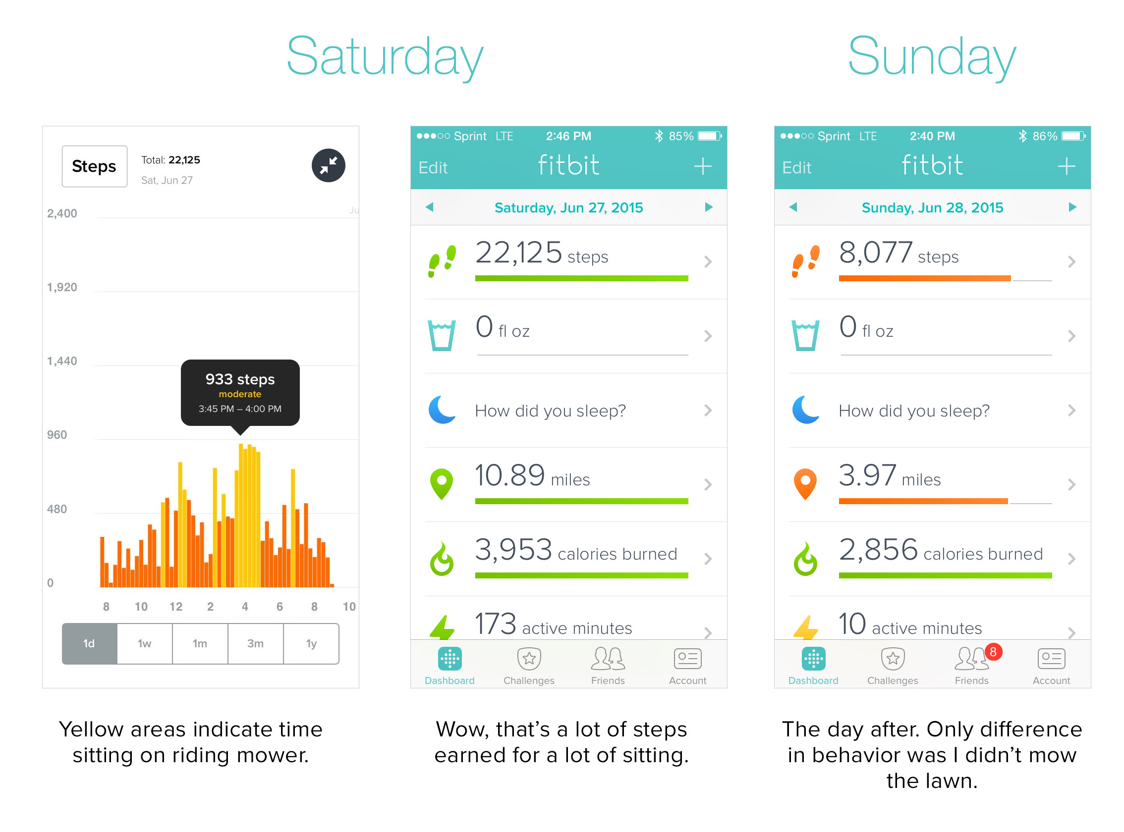
Thankfully, I have a riding mower (John Deere if you please) that helps me with that. Unfortunately, my Fitbit more than doubles my average step count when I mow the lawn.
It was Saturday, June 27th. I spent 3–4 hours on my mower on this particular day. Apart from this, I only took my normal relaxed weekend strides around the house. Somehow I racked up a whopping 22,125 steps by end of day! Look at my following day Sunday, June 28th. I look like a lazy butt comparatively. Only difference in my behavior? Sitting on a riding mower for a few hours.
I am aware of the “Wrist Setting” and that you can change it to “Non-Dominant” wrist to try and avoid some of the potential hand-waving inaccuracies, which I did do.
There are still a couple problems with this:
- I’m ambidextrous
- There are many daily activities that many folks will unconsciously initiate with their non-dominant hand
Possible solution to this design problem
Ideally, the accelerometer would have more intelligence measuring impact of weighted footsteps using user’s weight data collected in on-boarding process vs. just counting every arm movement from air-traffic control to that goofy Saturday Night Fever pointing dance.Fit 3: Battery Notification
I do love that Fitbit uses Bluetooth technology to keep it wireless. It just bothers me that unless you keep your phone’s Bluetooth setting activated persistently, you will never receive any low-battery notifications, because it’s obviously not able to send you that message (even though it requires an Internet connection anyway to send data across to your phone).
Fitbit boasts that they have: “The first all-day activity trackers to offer Bluetooth Low Energy connectivity so you see your stats in real-time”
You still use more phone battery power than you would want to and end up charging your phone more often. So basically, in order to save batteries on your phone, you cannot tell if your batteries are dead on your FitBit.
Fit 4: Wrist-Banned
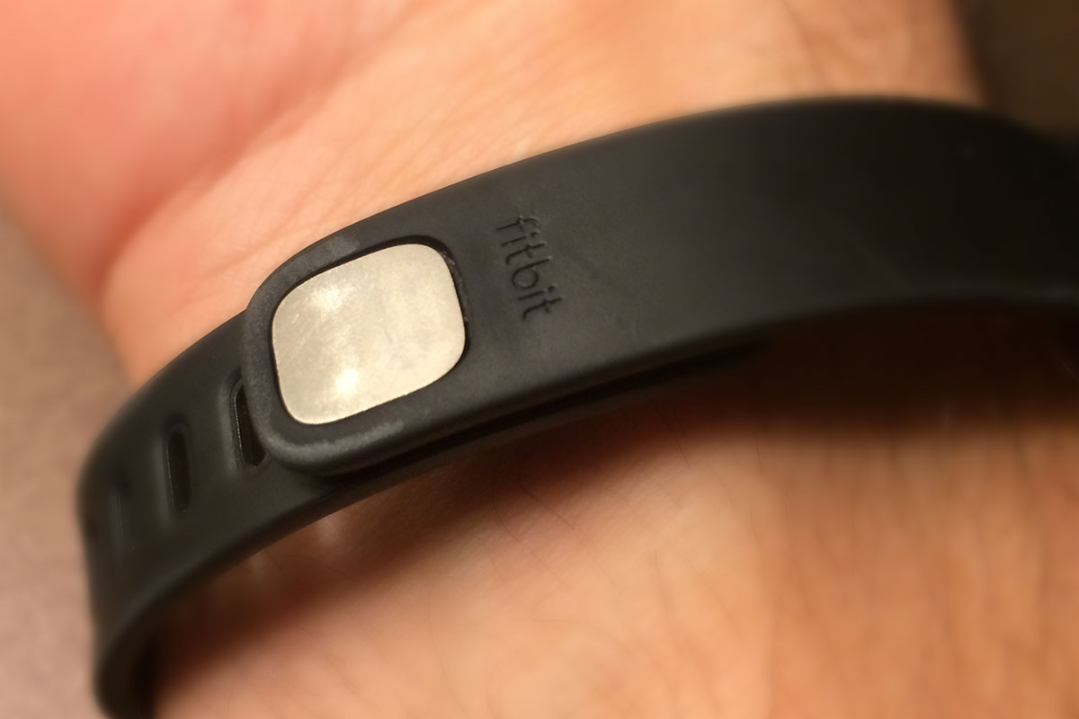
My final fit has to do with the wristband. This one is by far the least disparaging, yet still worth mentioning.Heavy metal
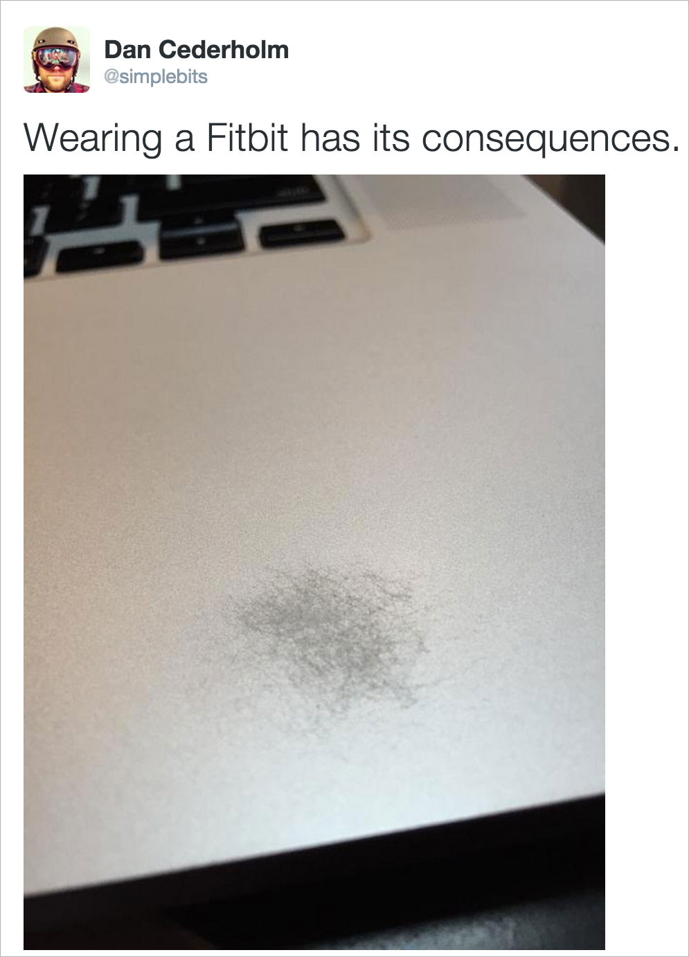
So for whatever reason (I’m sure there’s a valid design one), the Fitbit wristband has a metal plate at the bottom even though the fastener teeth attached to it happen to be plastic.Image credit: Dan Cederholm
Only reason I can think they decided to make the plate metal was because it looks cooler and catches the light better. Sexy factor (a.k.a. form over function?) Dan Cederholm’s Fitbit wristband seems to be earning passive income as a demolitionist. Look what it did to his MacBook! Has this happened to you? Not sure if Dan’s an edge-case on this one, but I bet he probably earned 20k “steps” in the process!Oh snap
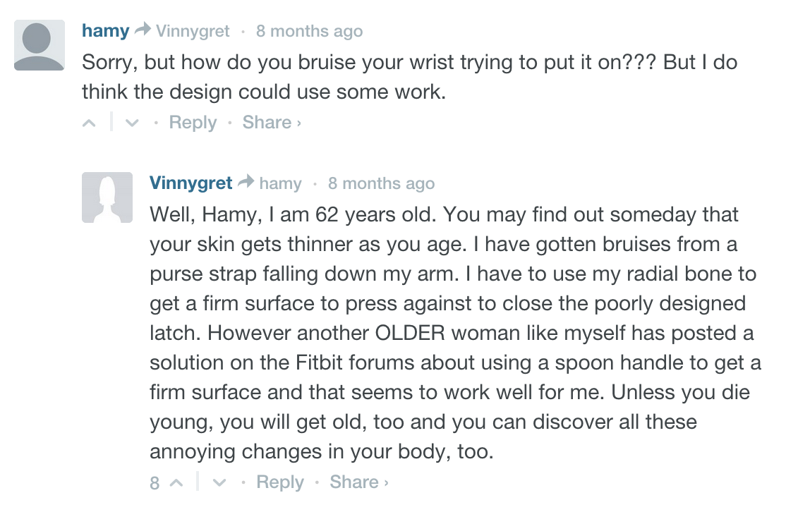
The other problem with the wristband fastener is it’s not very easy to put on. You have to really use those newly formed fitness muscles, and a little dab of elbow grease to snap that sucker on!
It’s quite possible that the design rationale may be if it’s really difficult to put on, it will be really difficult to accidentally take off. Maybe so, but mine has come off numerous times on accident during house cleaning and other occasional occurrences of catching it on various surfaces.
Some folks are getting slightly injured in the process
“To button up the band you snap these pegs into the Flex’s notch-shaped holes. In my experience it’s a tricky process that requires a lot of force. Call me a wimp, but I even injured myself attaching the band; I mashed my thumb too hard against my wrist. Fitbit says that it’s aware of this issue and that it should only affect preproduction units such as mine. One benefit of the Flex’s tight wrist lock is that it’s unlikely to become unhooked.” — CNET: Fitbit Flex reviewNot convinced the “preproduction units” flaw has been fixed.
“Getting the Flex closed the first time can be challenging, but it does quickly become second nature. It’s not as comfortable or effortless as the Jawbone Up, but it is functional.” — TechRadar Fitbit Flex ReviewI agree that putting the wristband does get easier after the first few times, but it never becomes easy and painless. Couple of readers/commenters on the above review would agree.
Conclusion
To sum it up, I’m not (fit)bitter, so please don’t misunderstand me. The reason I started with the good in this article was because there really are a LOT of good things about Fitbit Flex. I still wear mine religiously. In fact, I’m wearing it right now as I type this.
I’ve seen great advantages in my own life in wearing one to help me achieve optimal fitness and keep myself accountable to that end. I just want anyone considering a purchase to be aware of the things I would’ve never noticed until I owned one and started observing my experience with it.
Just like any great product, there are always opportunities to make it even better. Take the original iPod vs. current iteration for example.
Fitbit has been at this for a good while and have only gotten better with time, so I’m confident if they want to stay relevant and yes even stay ahead of Apple in wearable sales, they will need to (as we all must) continue to innovate … or relegate. I’m confident they will see fit to innovate.
How about you? Have you experienced some of these UX issues with your Fitbit? Have you found workarounds to these? Love to hear about your fits or bliss in the comments below!
- Analytics and Tracking, Consumer products, Data visualization, Design, Gaming, Gestures, Healthcare, Input devices, Interaction Design, Interface and Navigation Design, Mobile Applications, Mobile Technology, New and Emerging Technologies, Product design, Product Releases and Redesigns, Reviews, Social Networking, Ubiquitous Computing
Jason Ogle
Jason Ogle has been designing digital experiences and fighting for the user since 1996. He’s a Senior UX Designer at NCM in Denver, CO and the host of the User Defenders podcast focused around inspiring interviews with successful UX Designers. He's also a husband, father of 7, and craft coffee roaster. He has a personal relationship with the Creator of the Universe. Connect with him on Twitter @jasonogle


