Creating products or services that customers call simple is often the Holy Grail for designers. As Duncan Stephen once quipped, “our goal as designers is to make things as easy as possible for the user”.
It’s no surprise then that Apple and Google have been hailed as revolutionary, with many of us celebrating their simple aesthetic across user experience-related publications. And yet, while we can collectively recognize certain interfaces as simple, we still see many examples of products or services that are not necessarily oozing with such simplicity.
What’s the deal?
The Problem with “Simple”
There’s a famous quote by beloved author Antoine de Saint-Exupéry that says “Perfection is achieved when there is nothing left to take away.”
While this may resonate with some, there’s still an on-going and healthy debate across the wider software development community as to what perfection looks like on an interface. Often, with designers, this comes up in discussions around simplicity—whether less really is more. In many cases, the conversation heats up when we argue about whether the amount of features positively or negatively impacts simplicity.
On the one hand, there’s a camp of practitioners, like Nick Bradbury, who believe “it’s a mistake to think that simplicity means having a small feature set.” On the other, there are a slew of designers who claim simple systems indeed have less. Luminary John Maeda even started his book The Laws of Simplicity with a statement explaining the easiest way to achieve simplicity is to reduce. His first law states, “The simplest way to achieve simplicity is through thoughtful reduction.”
This train of thought—less leads to simple—has popped up across design publications for years now. For example, in 2010, designer Trent Martens wrote a reflective piece centered on the concept of less is more. In the end, he recommended we ask, “What can we take out of the experience to make it easier for our users to make decisions?”
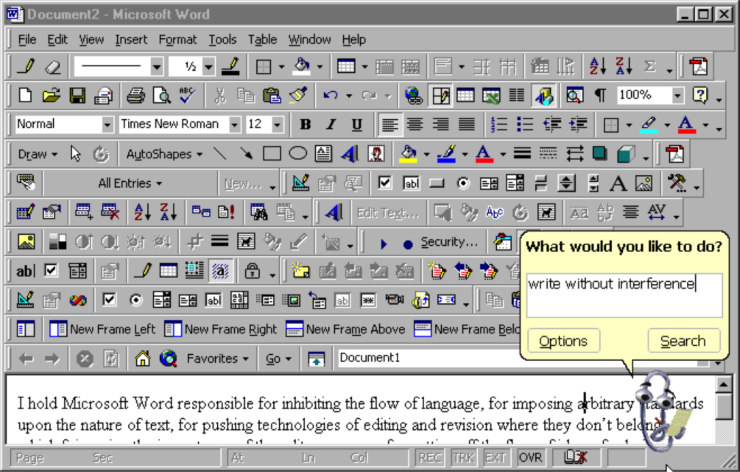
A cluttered Microsoft Word via @ftrain
Simple is contextual. Simple is culturally dependent. Simple is subjective.
But with a nod to the troubling definition of “perfection” in the Antoine de Saint-Expurey quote above, it seems endlessly debatable to know the point at which there’s nothing left to take away.
Less is More?
Perhaps the question around simplicity in design has nothing to do with quantity, but rather in the way we’re thinking about simplicity.
Joel Spolsky, founder of Fog Creek Software, once laid out this conundrum quite well:
If you’re using the term “simplicity” to refer to a product in which the user model corresponds closely to the program model, so the product is easy to use, fine, more power to ya. If you’re using the term “simplicity” to refer to a product with a spare, clean visual appearance, so the term is nothing more than an aesthetic description much in the same way you might describe Ralph Lauren clothes as “Southampton WASP,” fine, more power to ya. Minimalist aesthetics are quite hip these days. But if you think simplicity means “not very many features” or “does one thing and does it well,” then I applaud your integrity but you can’t go that far with a product that deliberately leaves features out. Even the iPod has gratuitous Solitaire game.
Spolsky does a fantastic job of pinning down the nuances and complexities to thinking of the word “simplicity.” By looking at the different ways to how we employ the adjective simple, he illustrates how we can, at times, diminish the conversation around simplicity to a more-versus-less game. He then makes an excellent driving home point: the iPod Solitaire game, and the fact that even a widely referred to “simple” product still contains what many designers may view as a non-essential element.
We cannot continue to equate simple with less. Even the dictionary definition clearly lays out that simple has nothing to do with amounts. Simple is defined as clear, understandable, and easy—not: minimal.
Staying “Simple”
When it comes to designing, there is no magic wand that will help us conjure simple. There are foundational principles and tried-and-true heuristics, but they can only take our designs so far. Simple is contextual. Simple is culturally dependent. Simple, in every facet of the word, is subjective.
The best way to decrease complexity in our designs is to regularly observe how people interact with our products and services; so as to constantly challenge our inherent assumptions about what we believe might be simple. As Don Norman put it:
Logic is not the way to answer these issues: human behavior is the key. Avoid the engineer’s and economist’s fallacy: don’t reason your way to a solution—observe real people. We have to take human behavior the way it is, not the way we would wish it to be.
It’s our users who will help us iteratively design towards simple, not us. Let’s get their feedback, early and continuously. Let’s champion simplicity by championing their observations in our teams.
Image of The Little Prince via Writer’s Edit.