In the early 1900s, electricity was scary.
The lack of understanding surrounding this new technology contributed to a great deal of public fear.
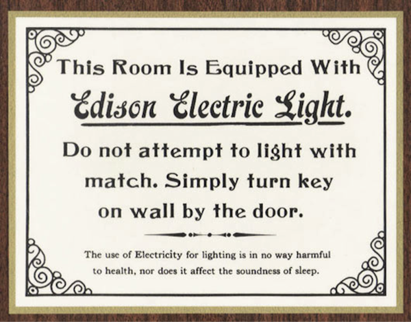
The sign pictured below, from a turn of the century hotel, offers us a glimpse of what it must have been like for guests to make sense of the confusing installations of metal, glass, and wire they found lurking in their rooms.
When it comes to emerging technologies, the stakes for design are high. One misstep and a promising new product can become yesterday’s news. To be effective, designers must set their sights well beyond easy-to-use. We need to convey more than how. We need to convey what as well. We need to be interpreters, to contextualize new products and concisely convey their identity, purpose, and value.
One approach, commonly called design metaphor applies a known concept to a new context to help people make sense of new products. As in literature, repurposing known concepts is a shortcut for accessing shared cultural memory—tapping into the past to make sense of the present.
Skeuomorphs and Affordances
Since the introduction of iOS 7, the blogosphere has been alive with debate on Apple’s departure from skeuomorphism—the yellow lined legal pad of Notes, the leather bound folio of Calendar. We are now deeply mired in a flat vs. skeuomorphic debate that reduces skeuomorphism to coddling kitsch and equates flat design with high-modernism. Both sides have missed the point.
Skeuomorphs in design aren’t useless decoration, but contextual clues. Like design metaphor they are the visual equivalent of figurative language—enabling designers to quickly tap into shared cultural understandings and convey complex meanings in a straightforward way. They work as a new kind of affordance, one that communicates not function but identity.
We shouldn’t abandon cultural affordances like skeuomorphs because some find them tacky or overused
Affordances, a concept originated by James Gibson, are an object’s inherent possibilities for action. Donald Norman evolved this definition to encompass the act of communicating possibilities for action through design. These perceived affordances are lingua franca for product designers. Every day we shape things to emphasize their utility, to show how this device operates or to illustrate how to use that application. Until now, this approach has been primarily focused on utility and operation.

A designed affordance: The classic example of a rotating door handle [flickr: sk8geek]
The design of a rotating door handle, for example, suggests how to use it, but does not give us context for what it is or why we should use it. Smartphone or lawnmower, before we figure out how something works, we usually ask what kind of a thing it is and why we should use it in the first place.
Reconsidering Skeuomorphs as Cultural Affordances
Skeuomorphs are stories of utility frozen in time. A new kind of affordance—a cultural affordance—that provides the context we need to understand the possibilities for action. They don’t work because they coddle or educate the user—digital wood grain shelves and page-flips didn’t teach people how to read ebooks—they work because they leverage a user’s past experience and apply that understanding to something new.
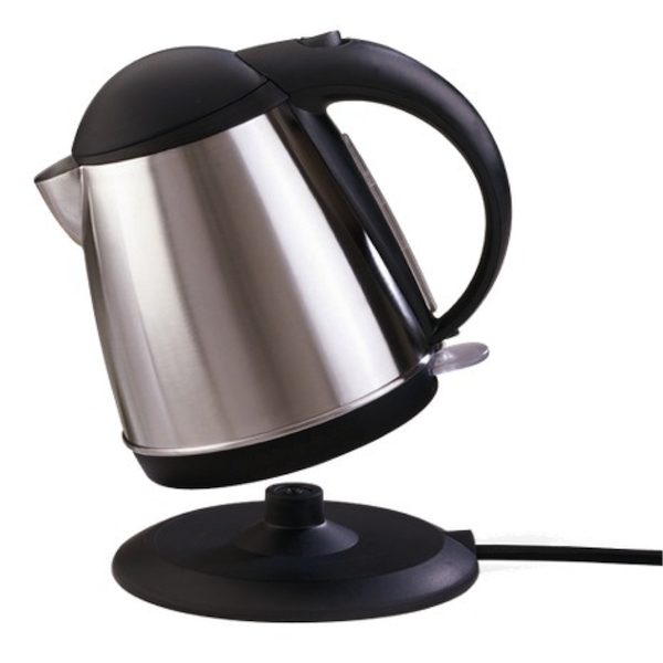
Take this electric kettle for example. Though thousands of variations exist, we still understand the basic shape as a vessel for heating water. Designers have used a variety of cultural affordances to communicate this purpose. The tapering shape—originally larger on the bottom to maximize contact with the heat source—is no longer a requirement, but remains a key feature. The exaggerated, arching handle amplifies the kettle-ness of the object. Even the electric plug plays a role. Expanded to the scale of a stovetop heating element, it indicates where to put the kettle for use, though this modern version transmits electricity, not heat.
The kettle retains the basic shape of its ancestors and through that shape conveys its purpose. Its form is no longer tied to its literal function, but rather to functional analogs of the past. In the digital realm, where there are fewer precedents for utility, figurative design has long played a critical role in helping people make sense of new products.
The tabbed folders and icons in the Xerox Alto interface
Xerox Alto, the first commercially available graphical user interface (GUI), laid the groundwork for design metaphors like representational icons, tabs, and “spatial” organization. But there are many more ways to guide users through an interface beyond the ubiquitous tabbed folder metaphor introduced by the Alto. Other metaphor-like conventions like visual synecdoche, where a part can stand for the whole—a letter icon for the inbox—or even playful visual puns, where multiple meanings can be attributed to one object, can also help people make sense of unfamiliar digital territory.
From tabs and folders to the digital “click” on today’s cameras, many cultural affordances have become standard patterns that are used by UI designers without a second thought. But as the hotel sign at the beginning of this article attests, emerging technologies without the necessary cultural affordances leave us wondering. What is it for? How will it be used? It can also leave us even a little afraid of the possibilities.
The Untapped Power of Cultural Affordances
In the last 10 years, over a billion people have started using iPhones. At least a few of those users made the mental leap between the yellow legal pad motif—the one that makes digital designerati stomachs churn—and the idea of a place to quickly jot things down. With the potential to communicate not just functionality, but identity and purpose on that scale, we shouldn’t abandon cultural affordances like skeuomorphs simply because some find them tacky or overused.
Faced with ever-increasing digitization of formerly physical products, we should not retreat to the functional, literal design of the past for shortsighted aesthetic reasons. We need to expand the conversation about what design can do through cultural affordances—not simply to address ease of use, but to communicate context, identity, purpose, and value. If we don’t, we may find our users just as wary and confused as the hotel patrons who first encountered the Edison’s innovative new electric lights.
John Payne will be speaking at the Institute of Design’s Design Research Conference, October 8-9 in Chicago.
Image of legal pad and pencil courtesy Shutterstock