It doesn’t take a rocket scientist (or a UX Magazine reporter) to notice that much about the Tesla Model-S’s user experience is vastly different from the normal automobile. And the differences go beyond the fact that the car’s motor is electric.
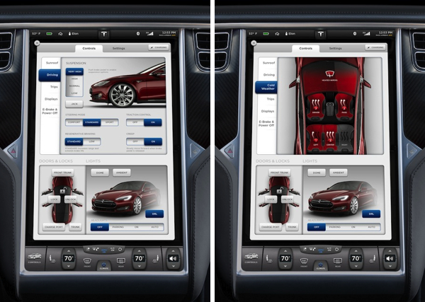
When MotorTrend named it the 2013 Car of Year, it aptly said, “…all judges were impressed with the Tesla’s unique user interface, courtesy of the giant touch screen in the center of the car that controls everything from the air-conditioning to the navy stem to the sound system to the car’s steering, suspension, and brake regeneration settings.”
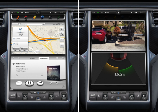
The user-friendliness starts before even entering the car when the door handle that is flush with the body of the car slides out to greet you, but it certainly doesn’t end there. Upon climbing in and powering-up the fully reconfigurable 12” cluster and 17” center display screens, you can’t help but notice the intentional deviation from scores of hard, fixed controls.
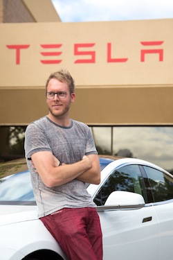
“Dashboards of the past are littered with physical buttons that can never change, forever ingrained into them. The Model S, by contrast, has a fully upgradeable dash that’s software driven. We started with a blank slate—17” of glass, which is the centerpiece of the interior. That inspired an all-digital touchscreen automotive UI platform built from the ground up—one that could be updated over the air to provide new functionality as the years go on,” says Telsa’s User Interface Manager, Brennan Boblett. I recently had the opportunity to sit down with Boblett, providing a window into the customer-centric enthusiasm and passion that’s at the core of Telsa’s UX philosophy.
How does Tesla define UX?
If you think of the typical definition of user experience, it’s “the feeling that one gets from using a system.” Whether that system is a kiosk in a store or a piece of software on a device or computer, that’s the traditional mindset for user experience. That definitely still applies here, but our definition goes beyond that in a more holistic way. It’s the car and the software working harmoniously together to create a unique experience that can be felt even before you sit down in the car. HMI should be empowering, not typical. We take the small, little things you do all of the time and make them a bit more of a pleasure. It’s those little nuances and attention to details that we rally behind, which add value to the user experience and strengthens the core of usability.
There has never been a full OS in the car with fluid and responsive hardware until now
For instance, we have a feature called HomeLink, where we added a small detail that a traditional garage door opener couldn’t do. When entering your home’s geofence, you are presented with a menu that enables you to open the garage. Although just one small detail, little things like that become a pleasure to use over time. It’s all about understanding the context of each user scenario and presenting them the most useful options. That’s one core aspect of the puzzle and when combined strategically along with a solid visual UI construct and the right balance of information design, anything is possible.
[google_ad:WITHINARTICLE_1_234X60_ALL]
If you were to use five adjectives to describe Tesla’s cockpit UX strategy going forward, what would they be?
The first word would be, “innovative.” Tesla has deliberately broken new ground with this design and we aspire to continually push the boundaries of in-car UI and UX.
“Intelligent” is another adjective that’s important because it’s not enough to just do something new for the sake of being new: it needs to be well-conceived—born out of an idea that is user-centric from the beginning and one that adapts to the user’s tastes and behaviors over time. Tesla embodies that. Our firmware platform is just as impressive and technologically advanced as the car’s exterior design language.
“Inspiring.” Good design should evoke a positive emotion. When you open the sunroof in our car from the touchscreen, it’s hard not to smile and relish in its simplicity and intuitiveness as you swipe your finger across the glass to drag the sunroof to the desired location, with precision down to the exact percentage.
“Sophisticated.” This is a premium car and, therefore, it also should have a premium user experience. That starts, first and foremost, with the vehicle being smart on your behalf and offering solutions that are likely what you need at that given moment.
“Empowering.” Nothing is compromised in a Model S, not even the UI. The software adapts to each driver’s preferences and configuration. You get to choose what “apps” you want displayed on either screen that may be beneficial for your drive, while having common controls (like climate) quickly accessible at all times.
[google_ad:WITHINARTICLE_1_468X60]
What about the Model S UX experience do you think contributed to it receiving the accolades it has?
Tesla truly turned the thinking upside down on how a car should be designed, from the way it’s driven all the way down to the software. But from the cockpit standpoint, I think the reason we are different is that Tesla truly believed in the idea that the user experience should really be the centerpiece of the interior.
There has never been a full OS in the car with fluid and responsive hardware until now, which is a monumental shift. You shouldn’t have to use clunky hardware that already feels outdated from the day you buy it. If you think of all the time and effort that you can put into designing a user interface with the best UX team, none of that is relevant or even appreciated if it’s limited by the hardware itself. For example: If the color reproduction is poor or the resolution appears too low, maybe the touch response rate isn’t what you expect, or you have to punch the screen to register a button on the haptic touchscreen, then you know the project has already failed.
The emergence of the mobile consumer electronics market has changed significantly over the past few years. How do you see Tesla fitting in with that growth?
If you think about the term “automotive grade,” what does that mean? Basically it means something needs to work for eight years after you’ve bought the car: the UI is no different. If you think about the first thing that becomes outdated in a car, it’s usually the infotainment system. We are very much driven by the mobile industry and the hardware behind consumer electronic devices. However, we have to account for longer product lifecycles when compared to mobile phones and tablets. Since we can do updates over the air, we can continue to upgrade your software even after you owned the car for years.
Sometimes you will feel like you’re getting a new car because new features will show up that you didn’t have before. We do this via a dedicated data connection that can also be used as a hotspot for your other devices, and of course hook up to the WiFi at your house, workplace, etc. This allows your excitement for the car to exceed long after the honeymoon, since the car is continually improving with time.