What makes your favorite mobile app so addictive? You know, the one you check over and over again throughout the day?
The likely answer is visceral design. It’s the difference between a high aesthetic design with little emotional connection, and one that feels infused with soul.
Visceral design is the key to creating experiences people can’t get enough of. Game designers and mobile app developers have done a great job of leveraging visceral design, web designers can and should leverage it too.
So what exactly is visceral design? Foster, from Mysterious Trousers, articulates it best when he explains visceral design as the satisfying feeling we get when potential energy is converted to kinetic energy. That point where we release energy from a design in a way that creates surprise, delight, or simply a response that satisfies our desire to engage, manipulate, and shape our experience.
From the Gut
The satisfaction comes from the gut level connection it makes, causing the design to just “feel” right. Visceral design isn’t the result of a single mechanic or design choice; it’s a series of design and UX decisions that create an overarching feeling of contentment. Visceral design can be achieved through microinteractions, design that inspires, or story-driven narrative experiences, to name a few possibilities.
In the gaming world visceral design is called “juicy feedback,” and they’ve been using it almost since the beginning. Juicy feedback is that overwhelming experience you receive whenever you pass a milestone, like clearing a level in Peggle. Mobile app developers have learned from game makers to build this satisfying, visceral feedback into their apps. Path uses the pop-out navigation that makes you want to keep hitting it just for the interaction. Juicy feedback elicits a visceral, highly satisfying response.
There are huge benefits for designers when we move from design with a high aesthetic to one that affects users on a gut level. When things feel right, users derive emotional satisfaction from their interactions. Like the rush of g forces in a car, this creates rewarding sensations. These feelings resonate and promote gut level responses that drive habitual behavior.
Users come back over and over, creating more value for the design and engineering teams that can deliver it. When visceral design is used well, users become engaged fans—emotionally connected and vested in the brand. The more personal and visceral the connection, the more benefits are accrued. These benefits create massive value for a business while delivering exceptional experiences to the user.
Study Behavior
The catch, of course, is that creating these experiences is difficult. To begin with, users can rarely articulate what makes something elicit their visceral response. Even with their favorite apps, most people can’t describe the combination of features that adds up to the rewarding experience. So the key to creating successful visceral feedback must start with an understanding of human behavior: which types of interactions elicit which responses.
This understanding is then refined through research and testing, which can hint at or confirm which interactions and design elements add value and create that coveted visceral reaction.
- Watching users engage with the elements for the first time can give insight into whether we’re creating positive surprise and delight, or damaging friction and confusion.
- A/B testing can provide quantitative data analyzing how interactions aimed at eliciting visceral response boost site performance.
- Qualitative research through surveys and ethnographic studies can gauge overall satisfaction from users before and after visceral feedback elements have been introduced.
- Eye tracking and click maps can provide data on whether the elements we’ve designed are creating repeat use and gaining additional attention.
- By setting a baseline against current design patterns, we can see if the new feedback elements create a more visceral feeling through usage patterns and user feedback.
It’s clear that visceral design is effective, but how, exactly, do you go about building it into your next design? Here are five ways to build visceral design into your site.
Focus on Feedback Loops
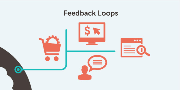
The key to creating visceral design is to focus on the feedback loops inherent in your user experience. The pull-to-refresh mechanics that every app has come to know and love since being introduced by Loren Brichter are perfect examples of mechanics that elicit visceral response. But while we can name many apps that embrace this type of interaction, we struggle to name a website that is as thoughtful and inspired with it’s feedback mechanisms.
Which feedback mechanisms should you start with? Start by looking at the core user flows on your site: registration, ordering, conversion points, exploration, etc. Each of these points and modes of use provide ample opportunities for the inclusion of visceral feedback interactions. Look to deliver in the details of those engagements.
Deliver Micro-Experiences
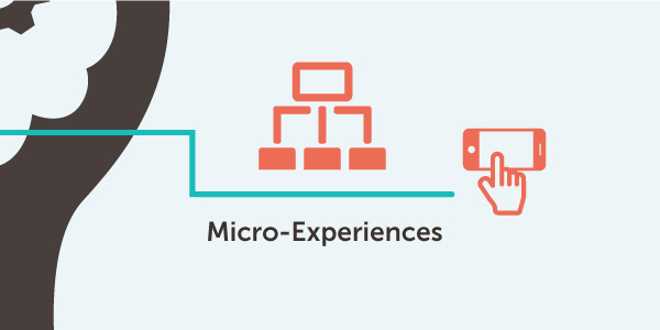
When a user wants to accomplish a task, focus on the micro-experience around that task. Go deeper than just the page or flow level experience. Get down to the details of what actually happens with a single click. Actions that have additional effects, and pleasant, surprising responses create indelible memories and word-of-mouth sharing. Photojojo’s “Do Not Pull” button is a classic example of this.
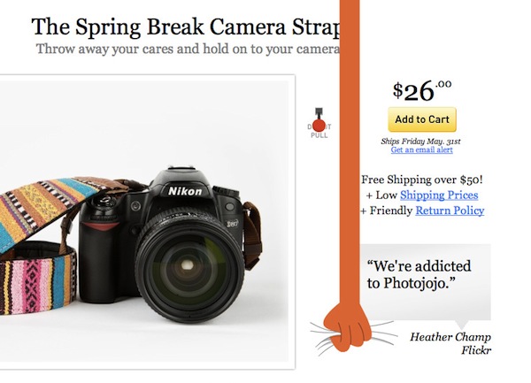 More muted forms work as well, but satisfying responses to even the smallest actions are key to delivering visceral design.
Think Beyond Two Dimensions
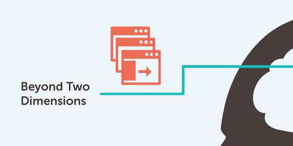
Websites aren’t really pages of paper. It’s easy to forget that with the language and mental model we’ve used to define them for the last 20 years, but it’s critical that we, as designers, let go of that false paradigm. Each website has a z axis or third dimension. There’s no reason you can’t take advantage of this axis to create multiple layers within your website. Interactions like drawers provide ways to provide more context and detail while keeping the main flow and narrative clean. They’re less disjunctive than a page refresh and help keep users on task and within the story, without jolting them to a new page without any context.
It’s also satisfying to see pages change in response to feedback. Other layer-based mechanics like those on Square or Origami (our version of it) provide an additional level of content, waiting behind the main facade of the design.
It’s Not Just About Great Design
While aesthetics are important, remember, we’re focusing on the feedback here. It can’t just look good. Looks without attachment don’t move us closer to that visceral response. It has to feel good.
You can accomplish this by testing and optimizing things like delay, response, and state. Standing apart with a little delay and a little bounce, Path’s navigation makes a prime example of this. Don’t discount sound either; it’s making its way into web apps. Even though Facebook’s disastrous notification sound may have spoiled the idea for some, there will be a designer who brings TweetBot-level audio into their UX and blows us all away.
Go Beyond Responsive
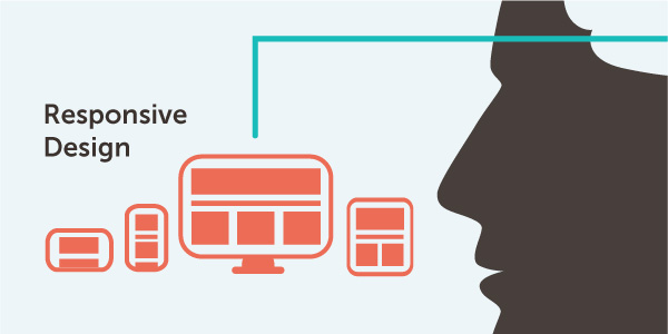
Responsive design is an important evolution in creating usable designs on any screen size. But too many equate responsive with reduction; stripping away features and content to optimize speed and utility.
When you strip an experience to the minimum, you lose the opportunity to deliver details that create visceral attachment. Responsive needs to evolve so we equate it with optimal instead of minimal. Call it Responsive+. This means reworking interactions to fit the device.
Sliders are more appropriate in a mobile view, while more fine-tuned controls work better on the desktop. Links may become buttons on a mobile phone to make them easier targets to hit with fingers. By thinking more about the best experience you can deliver, you’ll imbue the design with the visceral feel that is found in your favorite mobile apps.
Conclusion
Visceral design may be hard to get right on the web, but we can learn a lot by looking at the work done by our design counterparts in the gaming and mobile industries. By delivering rich, juicy feedback to our users we can create that satisfying sensation of a visceral, gut-level reaction. Thought interactions and response mechanisms will create surprise and delight, which leave indelible, positive marks on our visitors.
By creating more interesting and engaging experiences, we also make happier users. All of which spells great benefits for our businesses.