Photos have a huge impact on the usability of digital products and services.
In every research project I work on I see how photos influence the way people use things, make decisions, and buy products. I find it strange that we seem to disregard them from a user experience perspective during the design process, despite the huge impact they clearly have on the end user.
Photos are the unsung heroes of user experience design, and I’ve embarked on a mission to improve the usability of web photos.
In order to improve the situation we need to first understand what makes a photo usable and effective. I’ve struggled to find any information online regarding this so I’ve created my own photo usability checklist, which you can download for free.
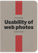
The checklist forms part of my new eBook Usability of Web Photos which is one of the new Pocket Guide series from the guys at Five Simple Steps.
The book explains just what usable photos are and why they’re important. I also share some photo usability stories from my own research, uncover why so many web photos are so ineffective, and present some user-centered design techniques to improve photo usability.
The Thinking Behind the Checklist
My checklist is based on the art of using language to persuade others: rhetoric. Persuasiveness is one of many qualities you might want in an effective photo, but rhetoric goes further by identifying what qualities any method of communication must have in order to be effective.
Aristotle defined three types of rhetoric, which we can use to help determine the effectiveness of a photo. He called them ethos, pathos, and logos.
Ethos relates to the credibility and perceived authority of the communicator, pathos is about persuading by appealing to the emotions, and logos is about presenting a logical argument to persuade people through reason.
For a photo to be effective and usable it must be credible (ethos). It should also elicit a desirable emotional response (pathos) and help answer practical questions (logos).
The Checklist
The checklist is made up of three parts, which structure the evaluation around the principles of rhetoric as well as the pillars of usability: effectiveness, efficiency, and satisfaction.
Part one evaluates whether the photo is legible or credible. These are fundamentally important elements because if a photo cannot be seen properly or lacks credibility it will be immediately disregarded.
Part two helps you to determine the messages that the photo is communicating. This section makes you think about what the product owner may want a photo to communicate and, critically, how users will actually interpret the photos.
Part three brings everything together so you can determine how useful and effective the photo is. It questions how well a photo is helping a user with their task and whether the photo is having the impact on user behavior that it was designed to have.
You can use the checklist as a prompt when user testing or as a pure “expert review” tool if you can’t get any input from representative users.
If you wish, you can score the different parts to quantify how usable and effective your photos are or just use it as a qualitative tool. The approach you take is likely to be determined by just how many photos you need to evaluate. For large evaluations you should pick a representative sample of photos that are used within key parts of the user journey such as product pages and article pages.
You may find that only some of the checklist is relevant to you given the context of your work. Just give it a try and let me know how you think I can improve it.
Let’s Evaluate Some Photos
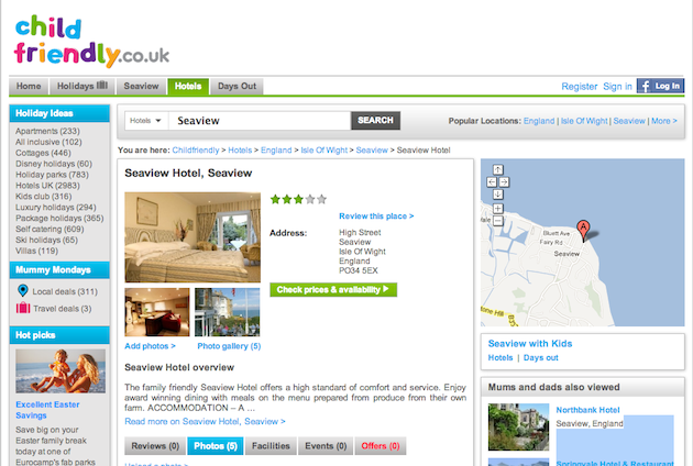
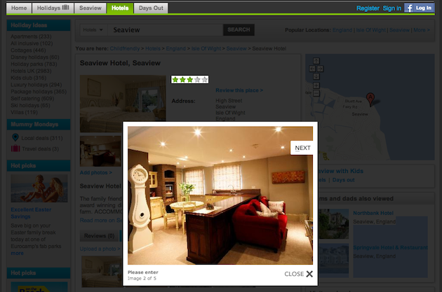
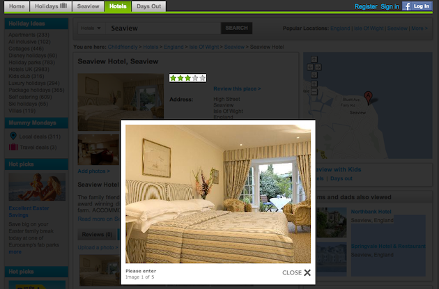
It’s freezing here in the UK at the moment and work is busy. I’m thinking about booking a holiday. I’ve found a site called Childfriendly and have used it to find out what is available in the Isle of Wight.
I have a young family, so where we stay while on holiday is particularly important in terms of safety and space. I also want to get excited about staying somewhere and imagine myself there during the tricky days at work in the months before I go!
I’ll demo the checklist by evaluating just how usable and effective the accommodation photos are on this page.
1. Legibility and credibility
Can you clearly see the contents of the photos?
Not really. The photos are small and I can’t click on the ones at the top to enlarge them. The photos at the bottom launch a lightbox but could stand to be at least 30% larger when displayed this way. The photos are in focus, are well exposed, and the composition is ok. The photo quality is decent but some look a little pixelated.
Do the photos look credible?
Yes, they are appropriate and believable. They don’t look manipulated and are relevant to the topic of the page.
2. What messages do the photos communicate?
What does the business or product owner want the photos to communicate?
They want to make the accommodations look as good as possible. The room is tidy and looks to have high-quality furnishings. The bright lighting makes the room look more luxurious. The exterior shots of the hotel show how close the property is to the sea.
What messages should the photos communicate to meet user needs?
I want to see the facilities that relate to how child-friendly the accommodations are. I want to be able to imagine staying there and to understand what I will get for my money. I need to be sure that this is going to suit my family and be a great place to stay during my precious time off.
What messages do the photos actually communicate to users?
The bedroom looks small because or the relative size of the bed in the photo. I have no idea if we could fit a cot in that room and that’s a problem for me. The living room looks a bit too flashy and impractical given that I have a one-year-old who likes to destroy things. I have no idea why they display two identical photos of the place settings. It looks more fine-dining than family friendly.
3. Usefulness and effectiveness
Do the photos result in the desired emotional response?
No. I really can’t see this hotel being an option for us, and it’s interesting that I’ve ruled it out completely just by looking at the photos. I haven’t and wouldn’t bother reading any of the text or checking the price.
Do the photos help the user with their task?
No. Because I’m viewing the photos within the context of a website that specializes in child-friendly hotels. The job of the photos is to make the accommodations look both safe and desirable.
Will the photos influence the behavior of the user?
Not in the desired fashion. The desired outcome from browsing these photos is to investigate the property further and they have not made me want to do that. I think it’s become fairly clear where I won’t be staying this year on my holiday.
The Power of the Checklist
The checklist is useful because it forces you to think about the job that the photos should be doing from a business and a user perspective and how well they are performing. It’s quick to complete and, as this example shows, you can use it to evaluate a group of photos in one hit.
As with any sort of expert review or evaluation it’s always easier to comment on a context that you understand or that has some sort of meaning to you. This evaluation was easy because I knew what was important to me, but if I was evaluating something I din’t understand, such as photos of electronic components, then it would be much harder.
As ever, if you find yourself needing to evaluate some photos try and involve real users in the process and use the checklist to structure your test plan. You can employ the checklist in the same way you would a set of usability heuristics, but you won’t be able to answer the question that covers what messages the photos are communicating to users without their help.
You can also use this checklist as part of your content strategy toolkit. It gives you a simple framework to use to evaluate photos when conducting content audits. You can also use it to determine your photo requirements when commissioning new photos to be taken.
In Summary
Thinking about photos in terms of their usability may seem a bit odd, but I hope that this example shows just how relevant and important it is. I believe this is the first framework of it’s kind, developed to be used for evaluating the usability and effectiveness of photos from a user experience perspective.
It’s brand new, so please join me on my mission to improve the usability of web photos: give it a try and let me know how I can improve it.
Cheers, @chudders
Image of vintage lightbox courtesty Shutterstock.