In my previous article, we looked at search as a dialogue in which the user expresses their information need as a query, and the system expresses its response as a set of results. We focused in particular on the detailed design of the individual search results, and their nature as independent interpretations of a user’s information request.
In this piece we continue to look at the role of search results, but switch our attention to the bigger picture: how they function as a collective or aggregate response to an information request. At this stage, it’s the higher-level page anatomy and architecture that matters most, bringing with it a very different set of principles and best practices. We begin, therefore, by examining the most universal form of aggregation: the search results page.
Basic Principles
At its most basic, the role of the search engine results page (SERP) is to present items matching a given query. However, behind this simple brief resides a layer of depth and complexity. As we saw in the previous article, the form of individual search results can vary considerably, from 3-line snippets to complex, multi-faceted summaries. The structure and organization of the SERPs also needs to reflect their context of use, drawing on the dimensions we explored earlier.
Even Google, with its minimalist home page design, manages to pack more than a dozen separate features into its default search results page. These can be grouped according their primary function, such as input, informational, control, or personalization (Wilson, 2011):
1. Input features
- Search box including auto-suggest and instant results (on character input)
2. Informational features
- Number of results found
- Support for query reformulation (Did You Mean? and auto-correct)
- Individual results consisting of hyperlinked titles with snippets and URLs, page preview (available on hover), and related metadata (e.g. previous visits, citations, related articles, social data, like page sharing by colleagues)
- Related searches
- Sponsored links (advertisements)
3. Control features
- Faceted navigation menu for content type, date, etc.
- Search tools menu (sites with images, visited pages, etc.)
- Pagination
- Options for advanced search and help
4. Personalization features (when logged in)
- Profile, settings, notifications, etc.
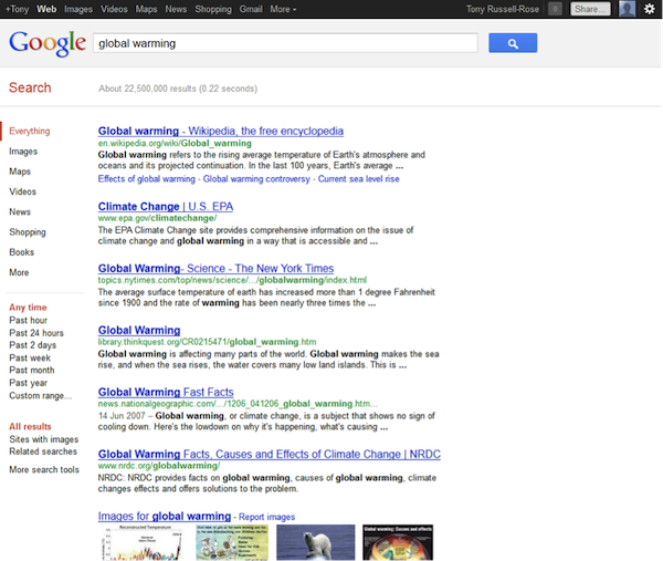
Minimalist design belies feature-rich complexity in Google’s SERPs
Despite this apparent complexity, there are some principles that all SERPS should observe. As we discussed earlier, query reformulation is a critical step in many information journeys. Displaying the current query and allowing it to be edited in place—i.e. within the search box—maintains vital context. In fact, this principle is so fundamental that we often take it for granted, and it becomes conspicuous only by its absence: faced with the results shown in below, can you work out what the query was or how best to reformulate it?
The results page plays a crucial role in the search experience
In this instance the user is forced to rely on recall rather than recognition, contrary to the principles outlined previously. (It was actually a query for the quoted phrase “zero search results,” which, ironically for a site with such valuable resources on user experience design, produces zero results).
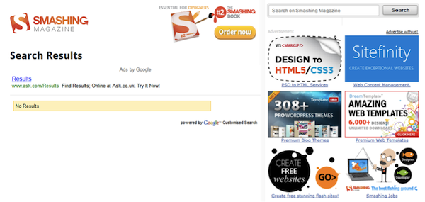
Smashing Magazine’s SERP lacked the context necessary for effective query reformulation
A second, related principle is to maintain the context of the current search by displaying the number of matching results. This deceptively simple measure plays a vital role in the information seeking dialogue, as it communicates the size of the current information space and helps the user make more informed query reformulations. For example, can you determine the number of matching iTunes app results shown below? At first glance (left hand image), it appears to be absent, but scrolling the bottom (right hand image) reveals the value just when we need in most: in the context of a link to show more. Note, however, that the query itself remains absent: perhaps a reflection of the shorter, more focused information needs and reduced query reformulation patterns that characterize mobile search.
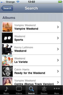
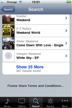
The iTunes app shows the number of matching results in context
Many of the features described above are instantiated as explicit interface elements. However, there are some features that are implicit to the result set, whose effects only become apparent when we consider the page as a whole. For example, the order in which results are displayed is known to have a profound influence on the search experience, particularly when they are sorted “best first,” by topical relevance.
On the web, relevance is calculated using a variety of signals, such as “on-page” attributes (content and metadata), popularity (inbound links, etc.), behavioral cues (clickstream data) and so on. In fact, the effect of this ordering is so powerful that in practice many users go no further than the first page of results, and in many cases scan only the first few items (Hearst, 2009). This means that it is important to present an appropriate level of “diversity” within the first few results. In the example above, we see a diversity represented by a range of different media types and genres (reference works, news items, images, etc.) within the first page of results.
The issue is even more acute for vague or ambiguous queries such as “apple” or “java.” Terms like these can have multiple interpretations, and a pure “best first” approach may return an initial page of results biased toward just one of those meanings. A first impression such as this can be misleading, and may undermine the potential for discovery by suggesting to the user that what they are looking for simply isn’t there. It seems that “best first” in this case should ideally provide a little of the best of every interpretation.
Web search engine DuckDuckGo makes a virtue of this: a search for “apple,” for example, returns results for all the major senses in the first few results. Moreover, it also displays an explicit clarification panel, showing the alternative meanings and offering users the opportunity to clarify their intent. This is a pivotal point in the search experience, when users are invited to explore the subtleties of their information need, and engage in a dialogue that allows them to build their own mental map of the information landscape.
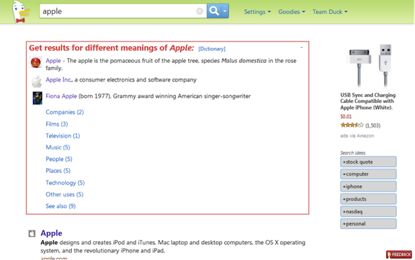
Clarifying our information need at DuckDuckGo
Indeed, the same principle applies within other search contexts. In online retail, for example, it is vital to convey an abundance of product and facilitate serendipitous discovery. Amazon uses this to good effect, presenting several alternative interpretations on the first page for an ambiguous query such as “washer:”
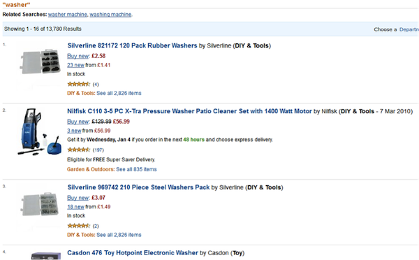
Diversity of search results at Amazon
Page Layouts
In the above examples the results are displayed as a list, which is a logical structure for intuitively communicating the sort order. But lists don’t have to be vertical. In fact, in some environments, it makes more sense to allow users to browse products visually, laying out the results in a two-dimensional grid. This type of “gallery” layout is commonly seen in online retail, with each result displayed in a more concise, pictorial form facilitating rapid visual scanning. This type of view supports the search modes of exploring and locating (Russell-Rose & Makri, 2012).

Gallery view at eBay
In a heterogeneous collection, such as a department store, the ideal layout will depend on the particular result set: those items for which appearance is important (e.g. cars, clothing, etc.) are naturally suited to a visually-oriented layout, whereas others (e.g. computers, electrical goods, etc.) may be better suited to a detail-oriented layout. For this reason, it is common to see a control allowing users to switch between views (see top left of the figure above).
Although list and gallery view are popular configurations, they are by no means the only options. Complex products such as electrical components may be more meaningfully viewed using a display that exposes the full detail of their specification, allowing rapid scanning and comparison of their individual attributes. This type of view supports key search modes such as analyzing and comparing (Russell-Rose & Makri, 2012).

Parametric view at RS Components
In some search contexts, the results may have a geospatial element to them. In these cases, the most natural layout is to present them as a two-dimensional map. This is particularly appropriate for mobile search results, where the spatio-temporal context plays a fundamental role in the relevance of results returned:
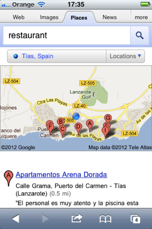
Search results are shown in map view on Google mobile
But maps don’t have to be exclusively geographical. In fact, there are other layouts we can use if the landscape we wish to convey is more conceptual in nature. Web search engine Yippy, for example, analyizes the content of search results and presents the output as a set of topical clusters.
Carrot2 takes the concept further still, offering a choice of visualizations. This allows users to gain an impression of the overall themes within the results and explore similar results together within a single folder. Like the diversity approaches we discussed earlier, this is another solution for dealing with vague or ambiguous queries, inviting users to explore and comprehend the subtleties of their particular information need.
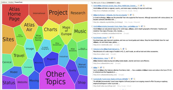
Search results are clustered by topic at Carrot2
In the above example, the clusters are generated dynamically from a particular results set. But it’s also possible to generate conceptual maps using static or “curated” metadata. A wine catalog, for example, might have metadata for color, varietal, vintage, region, and so on. These can all be presented as separate dimensions or “facets” by which users can explore and refine a particular result set. This approach, known as “faceted search,” has become the foundation of online retail and many other commercial search and discovery applications.
Blended Results
As we saw earlier, one of the challenges of displaying content from a heterogeneous collection is that different types of results require different layouts—some may require a detail oriented view, others visually oriented, and so on. One solution is to invite users to clarify their intent (e.g. by selecting a product category) so that their results converge on a reasonably homogeneous set. Then, as in the eBay example, they can simply select whichever view is most appropriate for their results.
But it isn’t always appropriate or desirable to persuade users to narrow their results down to a particular category so early in the dialogue. Sometimes, supporting a multiplicity of formats on the search results page can be a virtue in itself. This is particularly appropriate for information or content oriented sites, where the goal is not so much to guide users down a specific “funnel” (e.g. to the shopping basket or checkout pages) but to encourage them to engage in further exploration and discovery. The Guardian newspaper, for example, used to show results laid out in vertical list but grouped according to category (editor’s picks, tags, most recent articles, etc):
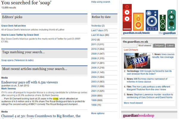
Search results are grouped vertically by type at The Guardian
A similar approach is applied by web search engines in response to vague or ambiguous queries. Just like the topical diversity we considered earlier, a diversity of formats or media can also facilitate exploration and discovery. A query for “jets” on Google, for example, returns sports scores, news items, web pages and more. However, unlike the previous example, these are displayed in an undifferentiated vertical list:
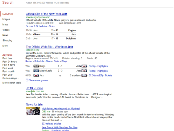
Blended search results and media types at Google
By contrast, business information provider Reuters groups search results according to medium (news, blogs, video, or pictures) and displays them in separate panels. News items take precedence as the default content shown in the main panel, but this can be replaced by another content type by selecting the appropriate tab.
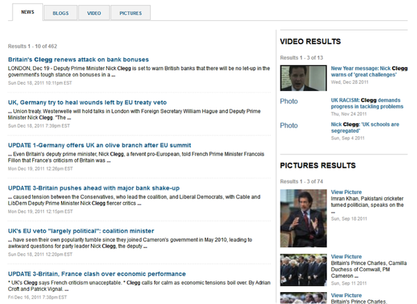
Search results are grouped by medium at Reuters
Apple’s iTunes store takes the structured approach a step further, displaying a variety of content types on the SERP as actionable objects in individual panels with custom controls:
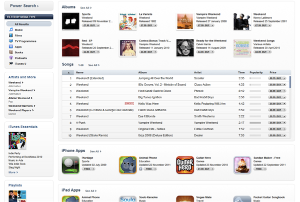
Varied content types displayed in individual panels with custom controls at the iTunes store
The layout of the SERP can also provide opportunities for promoting particular content items or products. At Food Network for example, the primary content consists of recipes, but the SERP also promotes related content (in the form of videos) and products (from the Food Network store), using a sidebar on the right hand side. Like many other online retailers, this site also employs the concept of “featured results”, i.e. items that would have appeared in the regular search results, but for commercial reasons (e.g. sponsorship) are prioritized in some way. This is usually achieved using layout (e.g. by displaying them above the regular search results), or highlighting them visually (e.g. by applying a different design treatment), etc.
Featured results are typically generated automatically from the result set returned for a given query. But they don’t have to be derived algorithmically: sometimes it makes more sense to exercise some editorial control. At The Guardian,as shown above, we see “Editor’s picks” at the top of the SERP. These are commonly known as “best bets”, i.e. items that are known to be good matches for popular queries. As with many natural language phenomena, keyword queries obey a power law (Zipf, 1949). This means there are a small number of very common terms but a large number of very rare terms, producing a “long tail” distribution. Pre-selecting good matches for each of the small number of items in the “short head” can deliver a substantial return on investment.
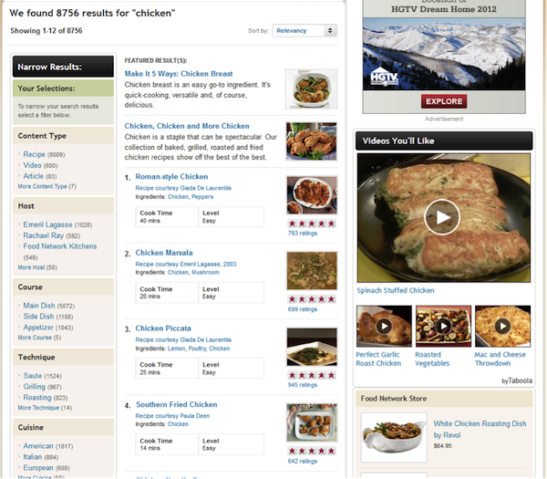
Promotion of related content and products at Food Network
Zero Results
There are many techniques we can apply to facilitate the process of query formulation, such as guidance in the form of as-you-type suggestions and support in the form of “Did you mean?” and auto-corrections. We’ve also seen how partial match strategies can deal with esoteric query term combinations that would otherwise produce zero results. And we’ve seen how scoped search can benefit from a fall back strategy that searches across all categories when searching within one produces zero results.
These techniques all to help to minimize the likelihood of “failed” searches by avoiding the problem at source. But inevitably, some queries just don’t return any meaningful results. Sometimes this may be due to an error of some sort; in other cases the user may be looking for something that simply can’t be found (this is particularly acute for “search within”). Either way, if we can’t prevent a zero-results outcome, we must deal with it effectively.
As we saw earlier, one of the most basic principles of SERP design is to maintain the context of the search by clearly displaying the number of results found. Despite this, there are still many sites and applications that fail to do this, and then compound the problem by failing to provide an explicit message when zero results are returned (Nudelman, 2010).
But the issue isn’t just about communication: in addition to ensuring that the user understands the outcome, we should also help them to rectify it. In this respect, the zero results page is an opportunity to provide support in the form of advice and tools for query reformulation. The zero results page at Smashing Magazine, for example, provides neither of these (shown above). Slightly more helpful is the Apple store, which provides basic advice but misses the opportunity to provide concrete support:
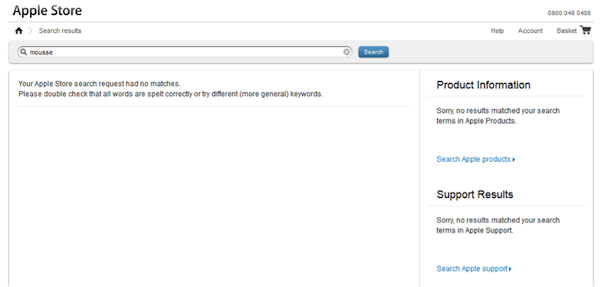
Limited support for query reformulation on the Apple store zero results page
Classified ad site Carzone, by contrast, not only provides clear messaging and useful advice, but also the means to directly address the issue by removing the non-matching search criteria:
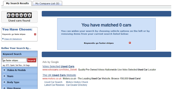
Extended support for query reformulation on the Carzone zero results page
In the absence of any of the above strategies, it is still possible to facilitate productive interaction with a zero results page. The absence of results creates an opportunity to promote exploration and discovery through a range of other navigation options such as top searches, featured products, popular items, and so on. There seems little virtue in presenting a blank screen for a zero SERP when all the other pages work so hard to make every pixel count.
Summary and Best Practices
The results page plays a crucial role in the search experience, conveying to users a response to their information needs, and engaging them in a dialogue that guides them along their information journey. By drawing on a broad repertoire of layouts, views, and configurations, it can support a variety of search modes and contexts. And even when there are no results to return, or queries to reformulate, it can still facilitate productive exploration and discovery. In the next section, we’ll look at the means by which users can interact with the search results, through the lens of the SERP control features.
Search results pages
- Consider search results not as competing alternatives, but as an aggregate response to an information need
- Maintain context by displaying the current query (and allow it to be edited in place), the state of any other navigational context such as current facet selections, and the number of matching results
- Present an appropriate level of diversity, particularly for for vague or ambiguous queries
- Apply a layout that matches the result set (e.g. gallery view for items whose appearance is important, list or detail view for complex or highly attributed items, and map view for geospatial data)
- Allow the user to switch between layouts
Blended results
- Use sidebars or complementary panels to promote related items
- Distinguish featured results using layout and/or visual highlighting
- Use best bets to provide effective matches for popular queries
Zero results pages
- Provide an explicit message when zero results are returned
- Provide support in the form of advice and tools for query reformulation
- Display other navigation options such as top searches, featured products, popular items, etc.
Image of gold nugget courtesy Shutterstock.