Save
Search is a conversation: a dialogue between user and system that can be every bit as rich as human conversation. Like human dialogue, it is bidirectional: on one side is the user with their information need, which they articulate as some form of query.
On the other is the system and its response, which it expresses a set of search results. Together, these two elements lie at the heart of the search experience, defining and shaping much of the information seeking dialogue. In this piece, we examine the most universal of elements within that response: the search result.
Basic Principles
Search results play a vital role in the search experience, communicating the richness and diversity of the overall result set, while at the same time conveying the detail of each individual item. This dual purpose creates the primary tension in the design: results that are too detailed risk wasting valuable screen space while those that are too succinct risk omitting vital information.
Suppose you’re looking for a new job, and you browse to the 40 or so open positions listed on UsabilityNews. The results are displayed in concise groups of ten, occupying minimal screen space. But can you tell which ones might be worth pursuing?
Weak information scent in the job listings at UsabilityNews
The roles all sound quite similar (and job titles can be misleading anyway) and closing dates seem largely irrelevant, unless we already have a particular position in mind. The end result is a weak information scent that forces us to continually jump back and forth between the individual results and the list to see the information we need. Some degree of movement like this may be inevitable with any design, but when it becomes chronic, it is referred to as “pogosticking.”
What we need instead is information that allows us to make a more informed judgment regarding the suitability of each position: details like location, remuneration, role description, and so on. A similar search on recruitment agency Reed offers all of these, along with associated tools and controls. By presenting supplementary information such as this, the user can more effectively browse the individual results and verify their suitability without leaving the page.
More informative job listings at Reed
Of course, the corollary is that each item occupies more screen space, and fewer results can be shown above the fold (i.e. in the area that is visible without scrolling). This increases the likelihood that potentially valuable results might be overlooked, particularly if relevance appears to be weaker further down the list.
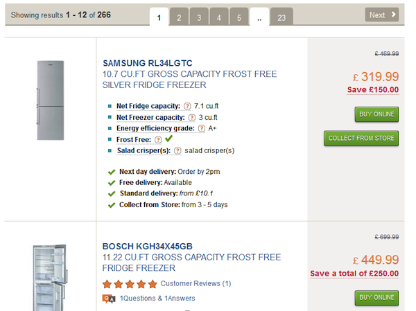
An acute example can be found at electrical retailer Comet, where each individual result extends to over 300 pixels in height. Consequently, in many cases it is not possible to view more than two or three results at any one time. In practice, we need a balance that addresses the user’s characteristics, their information seeking behavior, and the broader search context.
Highly detailed product listings at Comet
The Anatomy of a Search Result
While the above principles may guide us toward the optimal level of detail for the search results, we still need to structure and display them appropriately. In this respect, the three major web search engines are remarkably consistent. By default, each one displays the page title, the URL (in abbreviated form), and an informative summary of the content (known as a “snippet”). Moreover, they all apply a similar color scheme to differentiate the information types. Can you tell which is which?


Commonality of design for the major web search engines
These results are from Google, Bing, and Yahoo! respectively. (Of course, Yahoo!’s results are actually powered by Bing, but that shouldn’t constrain their freedom to apply their own design treatment).
The order of the components is subtly different: Google displays the URL immediately below the title, perhaps reflecting its value to users in making trust and credibility judgments. But one feature they all share is the use of query-oriented summaries: snippets that show the query terms in context. In addition, these summaries highlight the matching terms (using boldface), which has the effect of drawing attention to key fragments in the text and communicating how closely the query terms appear to one another. This is known to be a strong indicator of relevance.
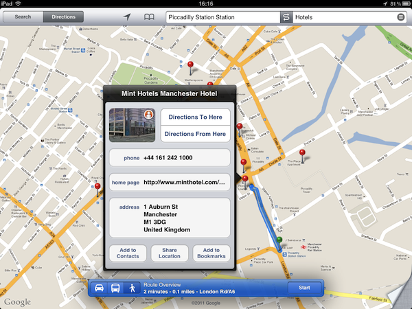
Of course, one reason these results look similar is that they are all summaries of unstructured documents found on the web. But in a different context, different rules apply. In e-commerce, for example, photos of each product are a vital part of the search results. For news search, publication dates may be essential. And for mobile, almost everything changes: it’s important to keep the snippets short, but more importantly we need results that reflect our spatial location. Here, maps become the natural medium for search results, placing each result in its geospatial context.
Search results as map locations in the mobile context
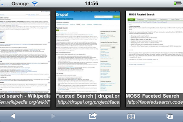
But search results don’t have to be text at all. If our goal is to re-find a previously known item, it may be quicker for us to view them as a set of thumbnails, flicking through them in sequence. When we know exactly what our target looks like, we can rely on recognition rather than recall to find it.
Search results displayed as thumbnails on Google mobile web
Likewise, if we know what type of page we are looking for, we can take other types of shortcuts. By offering deep links to key pages within popular sites, the major web search engines invite us to skip home pages and navigate direct to content that would otherwise be buried deep within a site’s structure.
Deep links in search results at Yahoo!
Search Result Previews
As we saw earlier, pogosticking occurs when there is insufficient detail for users to make informed judgements about the relevance of individual search results. We can reduce it by adding more information, but at the cost of using more screen space and potentially pushing valuable results out of view. It seems there is no escaping the tension between these opposing forces.
There is, however, an alternative approach. Previews allow us to see the detail of an individual item within the context of the search results page. Bing, for example, uses previews to provide further detail in the form of extended snippets, popular links, contact information, and so on. Google provides a snapshot of the page with key passages highlighted and displayed in callouts. By being accessible on hover, they provide on-demand access to further detail without interrupting our flow. With previews, we get to see the trees without leaving the woods.
Search result previews at Bing
Previews have also been applied to a variety of other contexts, like viewing user profiles on social networking sites such as Facebook and LinkedIn. And other organizations (such as Snap Technologies) have extended this approach to the web as a whole, offering on-demand, interactive previews for any hyperlinked content. In providing a convenient, lightweight method for verifying individual items, previews offer direct support for one of the key modes of human information seeking behavior.
Answers and Shortcuts
As we saw above, search is a conversation in which we articulate information needs through queries and interpret the responses as matching results. This type of on-going, iterative dialogue lies at the heart of our information journey. But sometimes our needs can be addressed in a much more direct manner.
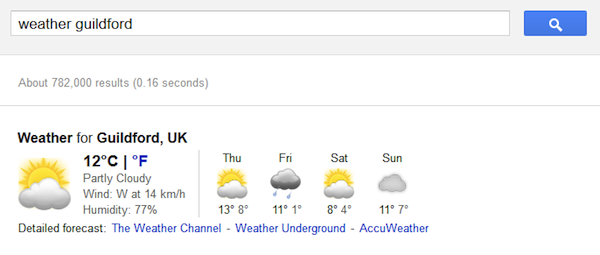
Google, for example, allows us to ask direct questions in a variety of forms. When it recognizes the presence of certain “trigger words,” it responds with weather forecasts, stock quotes, maps, and sports scores. We can even track parcels, convert currencies, and ask it to perform all manner of numeric calculations and conversions. In this context, the boundary between search and question answering becomes blurred, with the search box presenting a command-line style of interface to those who can exploit its power and flexibility.
Direct answers for focused information needs at Google
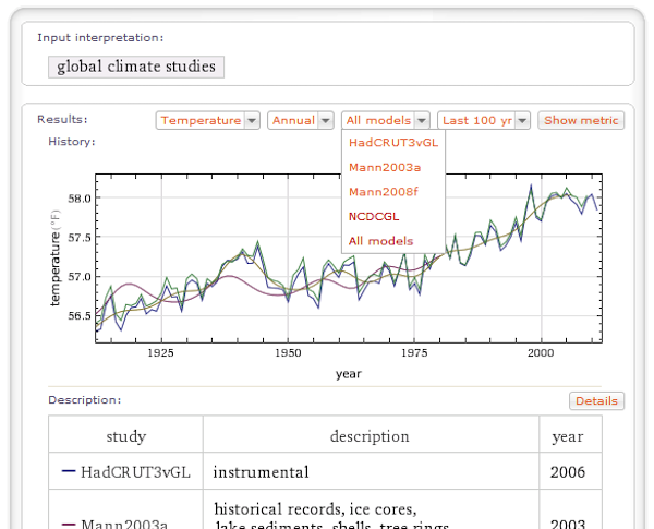
Wolfram Alpha extends the concept further still. With graphs, charts, tables, and visualizations all within its repertoire, it chooses the right format for our specific information needs. This type of interaction extends of concept of search beyond findability and into a new territory of computational knowledge and inference.
Beyond traditional search results at Wolfram Alpha
And search results aren’t restricted to being passive vessels for communicating information. Quite the contrary: they can become active elements, inviting interaction and direct manipulation. At Google, for example, we can recommend a particular result and share it with colleagues by using the ‘+1’ button.
Recommending a search result at Google
Likewise, at major online retailers such as Sainsbury’s or Tesco, it is possible to add items to the shopping basket directly from the search results page. And at the BBC, we can play video and audio clips with a single click.
Content can be played directly from the results page at BBC
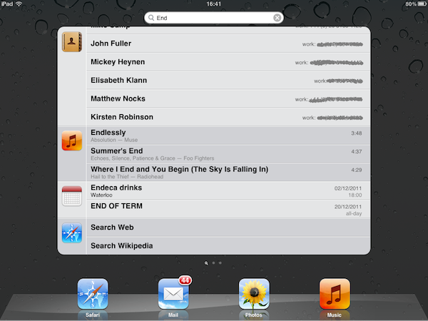
Similarly, on iPad and iPhone we can use Spotlight to search across all our data. But the results are more than just placeholders for files: they are actionable objects, offering a direct invitation to play content, make phone calls, or launch applications. In this respect, actionable results provide a bridge to the broader task context of search, helping us progress from finding information to completing goals.
Spotlight search provides actionable objects as results
Conclusion
When designing search results, try to strike a balance between richness and diversity: if they are too detailed screen space may be wasted; too succinct and vital information may be omitted. Pogosticking and other symptoms of weak information scent may be an indication of the latter. Always consider your users’ characteristics, their information seeking tasks, and the broader context (e.g. using short, location-oriented summaries for mobile).
In addition, use query-oriented summaries that show the keywords in context, highlighting the matching terms and clearly indicating the current query terms. Adopt a consistent approach that clearly indicates the composition of each search result, and wherever possible use previews to provide on demand access to further detail.
Image of Russian hunting spaniel courtesy Shutterstock
I am currently director of UXLabs, a UX research and design consultancy specialising in complex search and information access applications. Before founding UXLabs I was Manager of User Experience at Endeca and editor of the Endeca UI Design Pattern Library, an online resource dedicated to best practice in the design of search and discovery experiences. Prior to this I was technical lead at Reuters, specialising in advanced user interfaces for information access and search. And before Reuters I was R&D group manager at Canon Research Centre Europe, where I led a team developing next generation information access products and services. Earlier professional experience includes a Royal Academy of Engineering fellowship at HP Labs working on speech UIs for mobile devices, and a Short-term Research Fellowship at BT Labs working on intelligent agents for information retrieval.
My academic qualifications include a PhD in human-computer interaction, an MSc in cognitive psychology and a first degree in engineering, majoring in human factors. I also hold the position of Honorary Visiting Fellow at the Centre for Interactive Systems Research, City University, London.
I am currently vice-chair of the BCS Information Retrieval group and chair of the IEHF Human-Computer Interaction group.


