Save
Do you shop for clothes, accessories, electronics, home goods, or gifts at home, snug and comfortable in front of the television, tapping tirelessly on your tablet? If you do, then you, like me, are part of a growing trend of men and women relying on smart devices to make purchases. A Nielsen study found that as of 2013, 38% of online purchases were made on tablets and 24% on smartphones and 95% of those were made from home.
People are getting increasingly comfortable with making big amount purchases from their smart devices. If users trust a brand, they are comfortable making swift purchase decisions, even from their smart devices.
As recently as 2011, tablets were merely research tools while desktops were used for online purchases. This has changed vastly: in 2013 with nearly 50% of all purchase-related actions coming from a smart device.
But what does the user’s experience of search, select, decide and checkout look like? Are increased sales from smart devices commensurate with an enhanced purchase experience?
Does Increased Online Mobile Sales Inspire Improving User Experience?
It is surprising that online retailers are content with having a mobile or optimized site and are not seriously doubling down on optimizing the user experience. Landing pages with glossy hero area and promo space may encourage users to peruse products and make the effort to proceed to checkout, but even the pluckiest user can be easily waylaid by a stubborn site that just won’t get the job done.
So What Was The Purpose Of The Study?
Researchers at UserZoom conducted an unmoderated remote competitive usability test of the tablet websites of four American fashion brands’ in April 2013. We wanted to dig deeper into the user experience elements of mobile e-commerce and selected the sites for Bebe, Guess, Kenneth Cole, and White House Black Market (WHBM) to test with 200 female tablet users.
About the four selected brands:
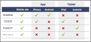
At the time of the study, the four brands either had mobile pps or mobile optimized sites for Android or for iPad. None of the brands had sites that were optimized for both iPad and Android devices.
What were the research questions?
1. Can users search for and find a product? On the fashion sites, we had users look for a black dress that they liked, add it to the cart and checkout. We requested users proceed to the point where their credit card information was requested and then to stop. In the process, users were asked to note all the purchasing options that the site offered (PayPal, Discover Card, Visa, MasterCard etc.).
2. Can users find specific product information? Users were provided with a product name for a necklace unique to each site and were asked to find out what the necklace was made of.
3. Can users find website policy information? For this task, we wanted users to find return policy information for online purchases.
How was the study designed?
200 frequent female mobile shoppers and between the ages of 25 and 45 years from across the country were screened by a panel provider to participate in this study. The study had a “between subjects” design, meaning users performed the three tasks on only one randomly assigned site from the four choices (Bebe, Guess, Kenneth Cole, WHBM).
For each research question, efficiency (time to complete tasks) and effectiveness (success rates) ratios were gathered. After each task, users were asked to rate the tasks on ease of completion and satisfaction. At the end, users were also asked the NPS (Net Promoter Score) question.
What Were The Results?
Each of these sites had very fashionable hero pages and users were impressed by how lively and trendy they looked. However, not everyone was successful completing the three tasks. Here are the top four findings:
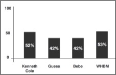
1. 50% users were unable to find the purchase related information, while purchasing the dress. When asked a question about the payment methods offered by the website, half of the users said they did not find it.
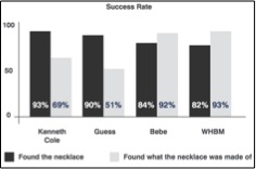
2. Unclear product description: In the “finding what the necklace is made of” task, ~90% users found the correct product page, but only a fraction of them were able to note the necklace material accurately.
3. Tortuous return policy information: While users were able to find the correct return policy page, the policy for online purchases was lost in the protracted and jargon filled policy description.
4. The NPS ratings correlated with tablet optimization: Sites like WHBM that were optimized for the iPad, rated the highest on the NPS while cites like Bebe and Kenneth Cole, which were not, scored poorly.
Results in Detail:
Task 1: “Buy a black dress and proceed to checkout. Note what the payment options were.”
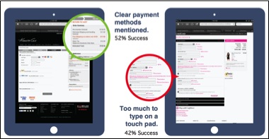
1. Users complained that they had to tap in too much personal information and this deterred them from continuing the process. While all had a “checkout as a guest” option, users still found it overwhelming.
2. The personal information form on Bebe’s site looked especially daunting. Users were wary of typing in all this information even before getting to the next stage, which there were three of.
3. Kenneth Cole and WHBM sites had the cleanest checkout process.
4. On these two sites, users were able to easily find and note what the payment methods were.
Task 2: “Look for this necklace and find out what it is made of.”
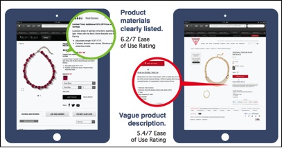
1. Users unable to find product information: The dark bars on the graph show the percentage of users that found the product page successfully. The light bars show the percentage of those users who were able to note what the product was made of.
2. Users guessed what the product material was based on the product image when they did not find this information in the product description.
3. Product material (metal, plastic, nickel plated, wax coated etc.,), and the length and size of accessories were important to the user. They indicated that the product pages did not provide this information in much detail. While there were descriptions, they were lengthy but not informative.
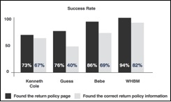
Task 3: “Find information about return policy in order to return a product purchased online.”
1. Users unable to find return policy information: The dark bars on the graph show the percentage of users who found the return policy page successfully. The light bars show the percentage of those users who were able to find the correct product return policy.
2. Indecipherable return policy information: While the return policy pages were certainly comprehensive, they were not easily decodable. Each policy had multiple conditions with multiple “ifs” that made it really difficult adjudge what the online return criterion was.
3. Tiny font on a small device.
What was the Verdict on the Performance?
Along with the the success, efficiency, and satisfaction information, users were also asked to inform us whether they used search and category filters while browsing and to describe their overall experience with the site.
Lessons learned:
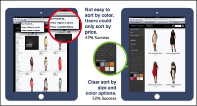
1. Users like the option to sort by color, size, and price.
2. Users appreciate short descriptions that include the length, color, size, and what material the product is made of.
3. Users prefer a clearly formatted return policy information.
Can The Lessons From The Study Be Generalized?
One important takeaway from this study was that users expect a seamless experience that transitions smoothly from desktop websites to mobile devices into one comprehensive brand experience.
It’s not a matter of isolated device centered usability testing. We know that the same problems of findability, readability, and mismatched user expectations vs. outcome plague mobile and desktop websites alike.
Some of the areas of concern that users have voiced through our study can be generalized to what a users’ experience should be on any website. However, for users to be able to communicate their experience, they have to be approached and engaged in this type of usability testing first. To read more about how each of these sites performed in our user tests, you can download our e-book that has more detailed information.
Image of retail shopper courtesy Shutterstock
- Android, Apple, Apple iOS, Contextual User Studies, Customer Experience, Design, E-commerce, Interaction Design, iPad, Mobile Applications, Mobile Technology, Research Methods and Techniques, Short News, Tablet, Technology, Usability, User Acceptance Testing, User Adoption, User Reported Feedback, Web
Sneha Kanneganti
This user does not have bio yet.


