Save
The traditional method for creating content is by using the commands nested in menus and toolbars to gradually move towards a desired end-state. However, so-called result-oriented interfaces aim to facilitate the creative process through the aid of templates.
Evaluating both interface types reveals that a result-oriented interface does have its place and benefits but, ironically, not within the creativity application it was originally developed for.
The Workshop Interface Paradigm
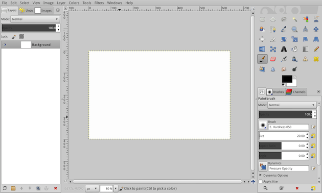
The traditional interface paradigm, which I refer to as the workshop interface paradigm, resembles the respective real world process for creating content. Users literally start with a blank canvas, which they can transform to their liking using the tools available in the menu bar and the toolbars.
The menu bar is a comprehensive map that contains all the functionality that the application provides; similar to a workshop, in which one would store all their tools. The dropdown menus are akin to labeled drawers in which the tools are tidily organized according to the functionality they represent. However, since one rarely needs all the tools for a particular project, only the most frequently used ones are placed on the toolbar, or the workbench, for easy access. With these tools, users gradually move towards a desired end-state, constantly reviewing and confirming their steps along the way.
Of course, mimicking the real world is not an end in itself. This is why various virtual means exist to support and facilitate the creative process. Users can easily undo and redo their steps. They can typically navigate within, preview, and compare their projects in many sophisticated, virtual ways. And they can save, export, and duplicate the current state of their project.
This model is well-established for creating content. Result-oriented interfaces try to further increase productivity with a template-centric interface design.
The Result-Oriented Interface Paradigm
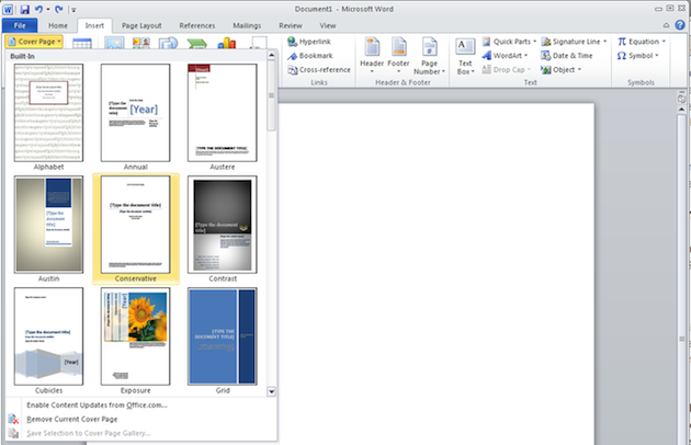
The main distinction of a result-oriented interface is that it aims to spare users from going through individual steps to achieve certain results. Instead, users can choose a predefined result directly from a gallery. Microsofts Ribbon serves as an example of this.
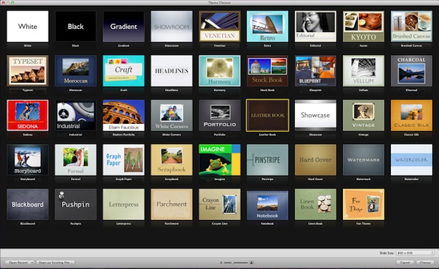
The iWork applications behave similarly. Although it is possible to start with a blank canvas, users are encouraged to choose a template as soon as they launch the application.
The templates in result-oriented interfaces are the main selling point. This affects the interface design in two ways:
First, the templates are very elaborate, allowing users to merely replace the placeholder elements, such as the text or images to finish the project. Second, many options and tools to create a very customized project from scratch or extensively edit the templates are either hidden away or removed altogether.
Working with titles in iMovie is a good example. While adding a title template is straightforward, the ability to create a title from scratch or customize the provided ones is either very limited or non-existent.
This restriction is logically coherent. After all, requiring or just encouraging users to edit the templates with too many options reintroduces the supposed problems of workshop interfaces, which the developers tried to avoid by promoting templates in the first place.
In result-oriented interfaces, the templates, and not the tools, become the center of the interface and of the user’s creative work. The question that arises now is, of course, which paradigm is better suited for creating content.
Fostering the Creative Process
In order to evaluate both paradigms, one would have to first analyze creative processes and then compare the two paradigms in terms of how well they support various aspects of a process. Typically, a creative process comprises five stages: inspiration, conceptualization, experimentation, review, and refinement.
Inspiration
Workshop interfaces typically greet users with a blank canvas, requiring them to envision their results in advance. However, as Jakob Nielsen argues, not everyone is a Michelangelo who might readily see a statue hidden in an uncarved marble block. Professional looking templates can help users by providing them with guidance and inspiration.
The problem with these templates, however, is that they are unlikely to provide genuine creative inspiration. As they come bundled with a million copies, by necessity they have to be in line with very common, widely accepted ideas. Although technically well crafted, they are not genuinely creative.
Inspiration, as important as it is, does not have to come from templates anyway. It can come from a good book or a walk in the park. Getting inspiration is a very personal experience and while it is always good if an application can do more, it does not need to give inspiration as well. However, it should certainly allow users to get an idea onto the canvas.
Conceptualization
Getting the rough concept of an idea onto the canvas can be problematic with a result-oriented interface. As seen above, it is easy to choose and work within templates, but creating one’s own custom project from scratch is more difficult, if not impossible. The problem is that it tends to only confirm old ideas, not encourage new ones.
Experimentation
Even experienced professional artists rarely envision exact results in advance. They often like to try out different things. In order to allow users to experiment, an application has to offer the advanced functionality that allows for experimentation. As functionality is added, menus in workshop interfaces can become very complex, and users may not find many of the tools. However, finding tools is more a question of how tidied up the workshop is.
Deploying a proper information architecture and tidily organizing and labeling the tools will make it much easier for users to find their way around. Adding new tools, such as newer, finer brushes to the other brushes in the drawer would not make the workshop more complex: it would make it more interesting and powerful.
Another technique for uncluttering virtual interfaces while preserving their features is to progressively disclose only the tools that are likely to be required in a particular context.
By contrast, in a result-oriented interface, by design most controls would be hidden or removed in favor of very specific templates. These templates represent only a very small fraction of the available functionality, especially since offering too many options to alter these templates would defeat the purpose of a template-based interface.
Review
As important as experimenting with functionality is, it’s only as useful with the ability to review and compare the results of one’s experiments. In order to be able to review their work, users need:
- Easy ways to navigate a project history
- Quick and sophisticated ways to preview a project as a print or web document (or other kinds of exported media)
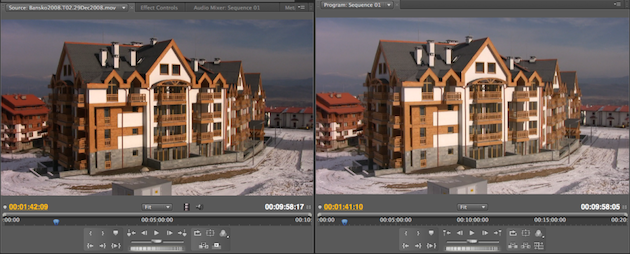
- The ability to compare steps: for example, side-by-side comparison modes
Sophisticated tools to review one’s work, whether in a custom project or template, is something that both interfaces can provide equally well.
Refinement
The last step in a creative process is usually to polish the rough edges. This can be a slow process in workshop interfaces. Much like a sculptor, users have to manually labor their way, stroke for stroke, toward the desired result. Templates, on the other hand, have all the details already worked out. While the latter method may be faster, there are very good reasons why skipping those steps is not recommended.
A template is a combination of steps, or design decisions, that the template designer took for the users. Even if the users, professionals or not, tend to agree with these design decisions, they may not fully understand the reasoning behind them. What’s more, they may not even notice every design decision. As a result, it will be difficult for them to identify with, explain, and justify their results.
While speeding up interaction is a commendable goal, there are ways to achieve this without replacing the users’ creativity with templates. Application developers can:
- Offer easy and precise ways to navigate within a project; a feature that gets more important the larger a project gets
- Place commands that are typically executed in succession close to each other, not across the interface
- Make it easy to save and execute command sequences as macros
- Allow users to customize the interface to work more comfortably
Still, there are occasions where templates do have benefits, even in creativity applications.
The Benefits of Templates
Workshop interfaces and templates do not have to be mutually exclusive. However, workshop interfaces put templates at the end rather than the start of a creative process, allowing users to save the current state of their project at any time as a template.
But even very impersonal templates can be helpful within creativity applications. However, they only make sense when things do not have to be creative.
For example, when writing a resume or form, users could manually create the layout according to formal requirements, but it makes more sense for them to simply download a template, fill out the information, and get on with their work.
So, templates can make sense in creativity applications, when adhering to standards is mandatory, but they are better as an additional service, not the center of the user’s work.
Final Thoughts
Result-oriented interfaces aim to facilitate content creation with the help of templates. This facilitation comes at the cost of the users’ creativity, conditioning them to work within someone else’s creative framework.
Workshop interfaces, on the other hand, enable users to create their own custom framework by combining traditional crafting metaphors with powerful virtual techniques.
When it comes to creativity applications, designers should strive to develop and refine workshop applications as they will ultimately foster, not hamper, the user’s creativity.
Image of carpenter’s workshop courtesy Shutterstock.
Anastasios Karafillis
I am a freelance user interface designer based in Greece. Having studied Social Sciences and Philosophy, I believe that a proper philosophy of language is crucial to any well-designed social or digital information system. My main areas of expertise are: Interaction Design, Information Architecture, Empathy, Usability, Nomenclature.


