Parallax scrolling has become increasingly popular in web page design. Pages that employ it often create an impression of action through clever techniques that utilize page depth, animation, and movement.
Owing its beginnings to the multiplane camera technique developed by early animators in the 1940’s, parallax scrolling was first popularized in the 1980’s as a way to add depth in 2D video games. These day’s though, you mostly hear about parallax scrolling as a way to improve user experience in web design.
It works by having the foreground and background move at different speeds while the user is scrolling. This creates a hypnotic animated effect that can impress, engage, and direct the viewer’s attention toward whatever you desire. This can be extremely effective when attempting to draw attention to on-page calls to action, and parallax scrolling gives web designers an unprecedented amount of control over the flow of user experience. By having images enter, intertwine, and exit as the visitor scrolls, you’re able to create a visual narrative, giving your website a certain storytelling quality that can lull your visitors into a trance.
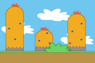
Example of parallax scrolling courtesy OhSqueezy
Advantages
So what does this mean for you? It means that, above all else, applying parallax scrolling can help engage your visitors. Creating a visually pleasing aesthetic with a fancy interface can be the difference in holding on to the fragile attention spans of the masses. This is because the unconventional format serves as an invitation to interact. People will automatically feel more engaged when they’re scrolling (which is an instinctive action) because doing so drastically alters the depth and content of their view. By simply scrolling, they’ve seemingly changed the fabric of the site itself. This creates a feeling of power and significance. It’s a psychological trick that pulls a visitor deeper into your website, by fueling their desire to explore.
Designing your website with parallax scrolling can help to improve all of the following areas:
- Visitor engagement
- Holding visitor interest
- Directing the course of visitor attention
- Making your site easily navigable
- Storing all of your content on one page
- Creating a compelling narrative around your brand
All of these factors combine to create an engrossing user experience. An experience that I’ve opted to describe as hypnotic, and it is hypnotic in a sense. When scrolling through a well-designed web page that employs parallax scrolling, a visitor does give up a measure of control to the web designer. Much like a roller coaster, they are along for the ride until they’ve reached the destination. A destination that’s predetermined by you, the designer.
Disadvantages and Solutions
There are some concerns with parallax scrolling that need to be addressed. In particular:
- Page load times
- Mobile viewing
- Horizontal movement
- Search Engine Optimization
Page Load Times
Because sites that have parallax scrolling often pack a lot of their content onto one page, things like animation and layered imagery can result in longer intervals between clicking and loading. This wouldn’t be a problem, except that visitors are notoriously impatient while browsing. If a page is taking too long, it’s often a signal that whatever is content it contains isn’t worth the actual time it takes to view.
As with every web design choice, there are pros and cons to implementing parallax scrolling
To circumvent this problem, it’s smart to keep your pages somewhat minimalist. The more animation, layers, and content you add to your page the slower it will be to load. So in order to cut down on the load time, you’ll need to avoid an overly busy interface. Doing so will free up those precious seconds while your visitors decide if they want to stick around for the pay off or not.
Mobile Viewing
Parallax scrolling does not play well with mobile technology. If you’re investing in a parallax enabled page, you need to have a separate mobile optimized site in place, or at least a mobile application in lieu of an unresponsive and ineffective mobile site.
Horizontal Movement
This is just a personal preference really, but many users find it odd when they scroll downward and the page moves horizontally. It can be an unexpected and unwanted phenomenon. That being said, you won’t please everyone all the time, and many users don’t mind horizontal scrolling in the slightest. So use your best judgment as to whether or not this is right for your site.
Search Engine Optimization
Many have claimed that parallax scrolling pages force you to take a hit on your SEO page rankings and subsequently your organic traffic. This is certainly true to a degree. Having one page rather than several means that you’re looking to rank for all your keywords on a single page. This will be a lot harder than ranking for one or two on multiple pages. Not only that, but you won’t be able to update your site’s content as often with fewer pages to work with.
Still, it’s not all hopeless. Parallax scrolling sites are magnets for back links. They increase page views and page view intervals. Also the unique design can escalate overall traffic, and as we’ve mentioned the main advantage is improved engagement. With more engagement, comes more social media sharing, which has a direct effect on page ranking.
Effective Examples of Parallax Scrolling
As with every web design choice, there are pros and cons to implementing parallax scrolling, so it’s a good idea to check out what a successfully integrated design might look like. Take a look at the following 5 examples to see what’s possible with parallax scrolling.
- A map of the history of Mario Kart
- The Smokey Bones Restaurant site
- A site advertising a music festival called Beer Camp
- Web design firm, Unfold’s site
- A site selling bicycle designs and prints
Parallax scrolling is not all that difficult to implement—either by tweaking code to achieve this effect or using jQuery plugins—and it makes for a uniquely hypnotic user experience.
Image of optical illusion courtesy of Shutterstock.