Have you ever walked into a friend’s house and realized that he has completely rearranged his furniture? Or gone to your favorite grocery store, only to find the aisles have been reorganized, and your produce, pasta sauce and preferred snacks are no longer in the same spot?
It’s a jarring experience, one that can feel temporarily shocking and strange. This isn’t how I remember things! you might say to yourself. This isn’t right!
Human beings are creatures of habit, and once we have a model for how a certain space should look in our head, finding that model flipped on its head can disorient us. Our brain is hardwired to seek out familiar patterns, so when the recognizable becomes unrecognizable, we experience a sort of shock.
We operate the same way using fixed mental models. Princeton’s Mental Models and Reasoning Lab describes mental models as “psychological representations of real, hypothetical, or imaginary situations.” When we look at this in the context of design, sudden, unexpected changes to design and outlook are presented as a clash of realities. A website redesign produces the same unsettling effect in customers that a grocery store reorganization does in hungry shoppers.
With that being said, website designers who are tempted to spruce up their sites or shift things around in the name of trend and aesthetics should proceed with caution. They must think how they themselves would feel if they stumbled into their local Stop ‘N Shop and were suddenly unable to find a simple carton of milk.
Familiarity breeds…Content!
No one logs onto a website knowing that they are applying mental models. It happens subconsciously, the same way you connect a name to a familiar face, or an action, like “Stop,” to a red, octagonal-shaped sign. We organize our world by shapes and colors and various cues, and designers facing a creative urge need to balance their desire for uniqueness with their realization that customers simply prefer the familiar.
When we shop online, of course, we don’t really think we have a model for where the “Add to Cart” button, or the “Support” and “Contact Us” links should be located. But we do –– it’s a model based on all of our previous experiences online, an amalgamation of the standards and general trends applied to websites today.
Killer aesthetics are wonderful–surprising and disorienting your customers is not
When we interact with a website, we are doing much more than looking at prices, text and colors. We are scanning for the familiar, first seeking out clues like square-shaped boxes that give us baseline information before we apply higher-level cognitive processes like the reading the text written on those boxes.
As a web psychologist for ClickTale, I have access to a wealth of data to help me analyze how visitors interact with different platforms. In my job, I don’t analyze how individuals interact with the world – I analyze how users interact on the World Wide Web.
To test the preconceptions users may have about web design, we ran a study of a major global e-commerce company whose Call-To-Action (CTA) buttons varied in size and shape across their site. By analyzing hundreds of user interactions with the site, we saw that users presented clear indications of confusion, such as scrolling up and down and searching where to click. Each button varied in design, which meant that it took users longer to rearrange to their mental models and understand how to react. That’s frustrating and, in the long run, detrimental to a company’s bottom line.
We recommended that the e-commerce site change their website so that all CTAs were consistent in both appearance and position. Once the change was implemented, our customer saw a dramatic jump of 6.3% in their conversion rates over previous six months.

Who Moved My (Virtual) Cheese?
Human interaction with the world flows like an inverted triangle, in a form of mental processing called Top-Down processing. First we deal with the big, general stuff, like shapes, trends and categories. Only after we process those ideas can we tackle the smaller and more specific details.
For example, in a top-down process, users will feel familiar and comfortable with a new website after only a brief exposure, because they have general expectations about where to find certain pieces of information even before typing in the URL.
On the other hand, if we are encountering a new structure that cannot be interpreted using our existing model, the senses must provide information to the brain. An example might be the first time we are exposed to a touchscreen on a smartphone or tablet. This bottom-up process requires much more effort on our part, attention and time we are not necessarily willing to give.
But new experiences, like visiting a social network or dating website for the very first time, require a different type of process: the Bottom-Up process. Here, we take in the specific first and then the general, allowing our brains to become familiar with new structures and usability models. This sort of thought process is significantly more exhausting than Top-Down processing, so if we have an existing mental model in our minds, we will always defer to it rather than expend energy to build a new one.
This is where website designers need to tread careful in terms of innovation. All of us know what websites look like; we interact with hundreds of pages each week and we have mental models for almost every basic type of site – e-commerce, media, entertainment, social networking – set in our brains already.
So when a visitor comes to a truly unique-looking site, his first reaction is not going to be a sense of wonder and awe at the beauty of its design. It will be simple frustration that things are not where they should be, according to his mental model. Who moved my cheese? he will think, or more likely, Who moved my “About Us” tab?
When you mess with mental models, as we saw with the Call-to-Action button example above, you run a major risk of slowing down and annoying your customers, and potentially losing them all together.
The Power of Prototypes
Not only do we have mental models for generic website layout, our brains also produce mental models for each individual category or type of industry.
Let’s say we come across a new website. If it follows the familiar scheme for its category (such as online shopping, media, or banking), we are able to identify the website type after brief exposure because we connect it to an existing online mental model and we already have a general idea of how to use it.
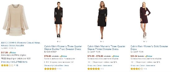
For example, we are used to the Amazon prototype where the products are arranged horizontally. When one of our retail clients launched a page with products arranged vertically, session replays revealed a surprising pattern of behavior – the users kept scrolling horizontally even though it didn’t match the layout.
If you want people to feel good about interacting with your products or brand, make sure the surface elements match what they’ve come to expect from similar types of pages.
Curb Your (Creative) Enthusiasm
Humans are amazing energy-conservers when it comes to brainpower. Once we establish a mental model, it immediately gets stored as a default template for all similar schemes, saving us valuable brainpower and energy that would be required for the recognition process.
So whether you are a website designer, a major e-commerce site or just the owner of a small business looking to expand your Web presence, keep these points in mind when it comes to creating and updating your homepage:
- KISS: Keep it Simple, Stupid. Killer aesthetics are wonderful. Surprising and disorienting your customers is not. If you want to go funky and fresh on your website design, feel free, but make sure that no matter how wild your creative urge, you keep the standards – like Call-to-Action buttons and the placement of crucial tabs – simple.
- Practice model behavior. If you’re unsure what your customers’ existing mental models for websites might look like, then do a little research. A good rule of thumb is to start with the big boys. Are you an e-commerce website? Check out Amazon’s layout. Are you a publishing or mediahouse? Scroll your way over to The New York Times website or CNN. The bigger the site’s user base, the more standardized their site will look like, and hence, the more likely that its basic features will be ingrained in most customers’ mental models.
- Creativity may be key, but don’t forget the lock. Artistic license is an excellent tool to yield in order to stand out from the pack and make your site memorable. But be careful to strike a balance: Make sure your website has a flawless, clean skeleton that covers the basics of customer experience, and that the creative aspects are limited to excess dressing and design.
- When in doubt, put yourself into your customers’ virtual shoes. When working on an exciting new website design, it’s easy to get caught up in the glitz and forget what it feels like to be an average consumer who logs on to make a simple purchase. Always imagine yourself as a consumer, not a designer, and if making the leap to virtual experience is too tough, break it down into the individual steps a customer will need to take to complete the action.
Remember, logging on and shopping on the web isn’t so different than driving to the corner store for a few basic groceries. And no one, no matter how sophisticated a shopper, likes it when they have to stroll the entire store just to find a simple pint of milk.
Photo of smart mouse in maze courtesy of Shutterstock.