When it comes to e-commerce sites and shopping cart flows, usability testing is more than good practice. It’s a precious tool that helps uncover missed opportunities and dollars left on the table.
I’d like to present a handful of case studies and A/B tests that indicate a streamlined, “no BS” e-commerce flow with elegant user experience—where the site is honest and clear with visitors about how checkout works and what happens next—usually takes the cake for best conversion rate. The caveat is, keep on testing. As the last case study will suggest, there are always surprises.
Lesson 1: Do what you say you’re going to do
In business and in life, integrity is key and we often prefer people who do what they say they’re going to do. Why should buttons be any different?
Curious Country Creations, with the help of their digital agency, benefited from a nearly 88% lift in clickthroughs to the next page in the purchase process when they swapped their original button text on the page below from “Submit” to “Go to Payment Options.”
What do they sell? Dried plants and flowers for home decor.
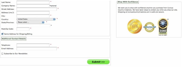
“Submit” button
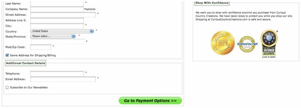
“Go to Payment Options” button
The takeaway here is, if you’re wondering what’ll convert best on that button, ask yourself: does this button do exactly what its text suggests? The visitors in this test knew exactly what they were in for when they clicked the “Go to Payment Options” button, and I’ll bet when they hit the payment options page, they were anything but surprised, which recalls another powerful checkout usability maxim: keep the surprise factor low! It’s a shopping cart, not a birthday party.
Lesson 2: Eliminate distractions, tempting as they may be
It’s a tough choice. You know it’s useful for your customer to see an order summary before checkout—perhaps it’s even the more transparent and “honest” approach to checkout UX—but it dominates a large swath of real estate.
Is it better to provide an order summary during checkout, or minimize distractions during the purchase process?
In this case study, Windstream, a provider of high-speed Internet service, saw a 5% increase in purchases when they removed an inline order summary sidebar on their final checkout page.
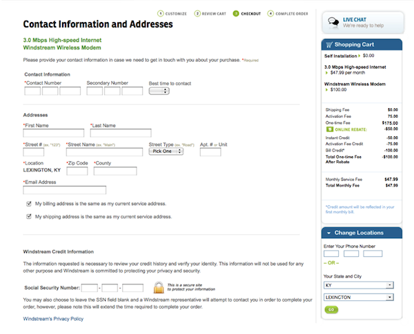
Inline order summary
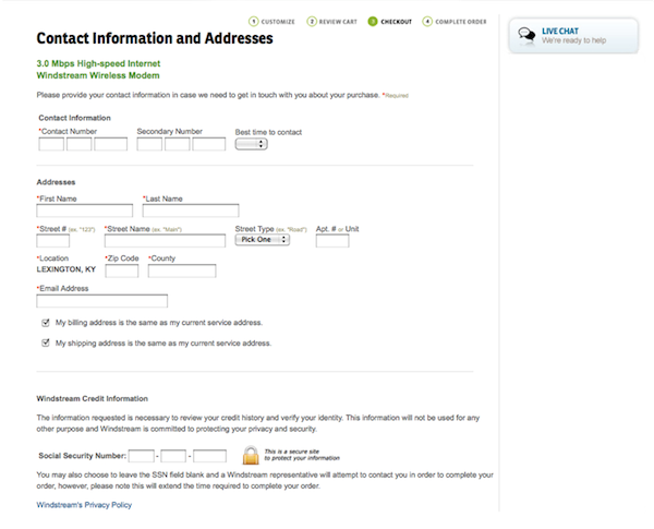
No order summary
This single study doesn’t tell the whole story when it comes to order summaries (we all know Amazon swears by theirs) but it’s important to consider what your site visitors might consider distracting. For Windstream, it turned out the summary was just that: a distraction.
Lesson 3: Give them the whole enchilada
There are good reasons to break the order process into bite-size pieces: it’s less overwhelming, more organized, and cleaner in the design phase. But a number of studies like this one have shown that, perhaps counter-intuitively, a single-page checkout can perform better than a multi-step purchase process.
Charmandising, a French e-commerce site that sells pop music memorabilia, discovered that a single-page checkout process increased purchases by a whopping 67%.
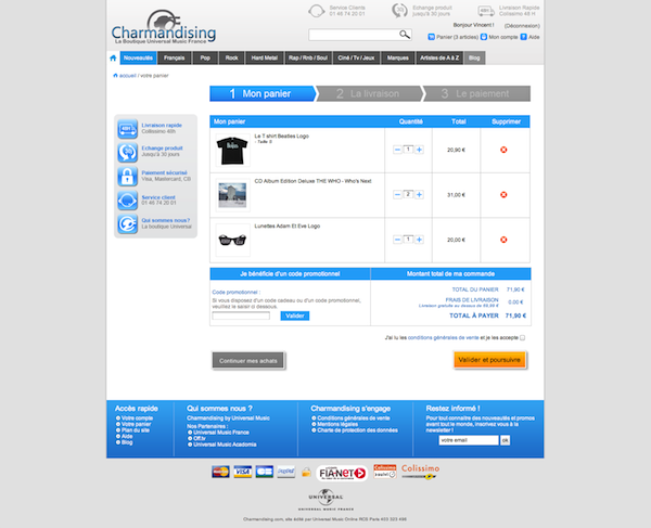
Single-page checkout
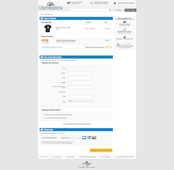
Multi-step checkout
Lesson 4: Surprises lurk, so keep on testing
Yes, much of the common (empirical) lore suggests that your e-commerce site will convert better if you keep a streamlined, clean checkout flow with minimal distractions and no friction. But Dell ran quite an interesting test to the contrary.
The Dell team decided to test whether sales might be helped by a small lightbox creating some friction for users who decide to leave the shopping cart screen. As it turned out, the triggered overlay increased Dell’s sales by 4.4% while decreasing the number of items being removed from the cart.
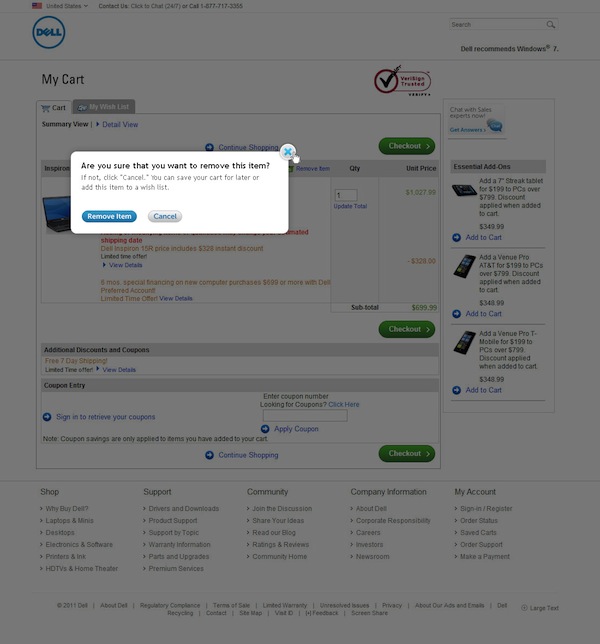
Triggered “are you sure” overlay
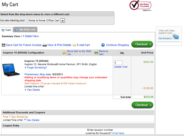
No overlay
One nuance to consider in this test is that most of Dell’s products are “high consideration” products. People tend to research the computer they’re going to buy with some gravity and time investment as compared to, say, a t-shirt or a toaster. So the “are you sure” triggered overlay for this type of customer may help create real second-guessing and embattle the decision a bit, whereas a buyer of products of “lower consideration” may not behave the same way.
Conclusion
In these case studies, three companies won customers by: setting and fulfilling clear expectations of how their e-commerce website will behave; favoring a clean house free of distractions over increased detail about the purchase; and doing on a single web page what many shopping cart flows insist on doing over several.
It’s important to remember that, between retail category, visitor demographics and savvy, and changing trends over time, there’s a lot of idiosyncrasy to any single case study. And of course, as Dell’s bold triggered overlay test illustrates, there are exceptions and surprises, and we have to keep on testing to uncover them.
Image of shopping carts courtesy Shutterstock.