Designing a rich Internet application (RIA) can test even an experienced design team. The hardest challenge is to blend Web and desktop paradigms to create a responsive and intuitive experience. Some paradigms that exist in the desktop environment are ill-suited for the Web, while many of the Web paradigms people are familiar with (paging, explicit refresh) are no longer necessary with RIA technologies like Flex and Ajax. As this space matures, we are learning more and more about which boundaries can be pushed, and which patterns transcend time and technology. While working on the book Designing Web Interfaces, Bill Scott and I explored hundreds of Web applications searching for these patterns. Armed with a crazy amount of examples, we distilled the patterns into six principles:
- Make It Direct
- Keep It Lightweight
- Stay in the Page
- Provide Invitations
- Use Transitions
- React Immediately
But we didn’t tackle the larger topic of how to create a rich application. What is the process? How did products like Mint, Balsamiq, and Wufoo get so good?
This article will outline the process we use to create rich applications, focusing primarily on screen design. All of the content is geared specifically toward productivity applications like Software as a Service (SaaS) products and Rich Enterprise Applications (REAs).
Designing for Richness
Adding an accordion or coverflow to an application doesn’t make it rich. It could even degrade users’ experiences. Starting a design/redesign at the control or screen level can be an expensive and frustrating exercise. Really good RIAs embody richness on all four of these levels:
- Application Structure
- Screen Design
- UI Controls
- Interaction Design
Application Structure
Structuring the application properly will ensure a solid base for the rest of the design process. There are three types of application structure:
- Information: The right structure to use when people need to browse, compare, comprehend information. For example, maps, news readers, dashboards, media players, online stores, etc.
- Process: The right structure to use when people need to provide information in a structured manner. For example, product configuration, setup, or installation; registration forms; tax preparation; checkout; booking travel.
- Creation: The right structure to use when people need to create new content or modify existing content. For example, blogging, illustrating, coding, photo editing, diagramming.
To pick the right one, we need to know the primary user’s goal.
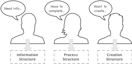
Application structure is based on the user’s goal.
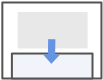
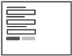
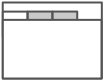
Unless we’re designing a product the likes of which the market has never imagined, identifying the users goal can be a quick and painless process. We typically work closely with the business/product owner to write a short story for each of the primary personas. At this stage it is essential to focus on the goal, not the tasks. We sketch up a storyboard and validate it with an informal user group.
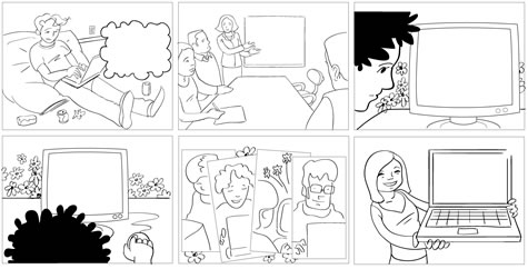
Early storyboard to validate user goals.
Once we understand the user goals, we can pick the right application structure. Some applications will have multiple structures; maybe the user needs to configure a product initially (process structure), but afterwards the goal is to analyze information (information structure). This is completely normal and can be designed for.
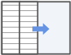
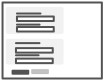
Next we build on the personas and storyboards to diagram the screen map and process flow diagrams.
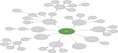
Screen map using the information application structure and hub-and-spoke principle.
Once these are established, we can start designing the screens.
Screen Design
We approach screen design with the “one screen per goal” philosophy. For instance, if the user’s goal is to find a couple of houses and contact a realtor to set up showings, we design one screen to support this instead of creating one screen for every task in the flow. This takes some finesse and discipline, but it will eliminate unnecessary navigation from the most common workflows.
These 15 screen layouts illustrate the current best practices in RIA design. Be sure to check out the accompanying presentation on Slideshare (also embedded at the end of this article) with examples from 80 recent RIAs.
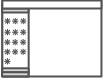
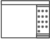
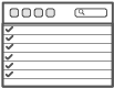
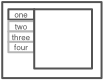
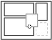
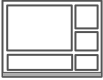
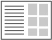
Master/Detail
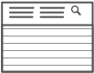
The Master/Detail screen layout can be vertical, horizontal, or even nested. It is ideal for creating an efficient user experience by allowing the user to stay in the same screen while navigating between items. A horizontal layout is a good choice when the user needs to see more information in the master list than just a few identifiers, or when the master view is comprised of a set of items that each have additional details.
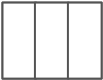
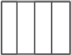
Column Browse
The Column Browse screen layout can be vertical or horizontal and a number of levels deep. Ideal for creating an custom user experience by allowing the user to start from various entry points for navigating hierarchal or related data.
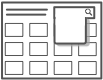
Palette/Canvas
Palette/Canvas is the perfect layout for the documentation or creation of linear or non-liner processes, flow diagrams, screen layouts, and designs/diagrams with physical size or layout constraints. The palette can be floating, dockable, or permanently situated. Consider offering a “fullscreen” toggle to give users maximum real estate for creating content.
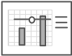
Dashboard
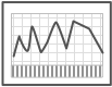
A Dashboard layout will provide key information at a glance, real time data, easy to read graphics, and clear entry points for exploration. Stephen Few‘s book, Information Dashboard Design: The Effective Visual Communication of Data can be used for reference in designing and testing Dashboard designs.
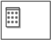
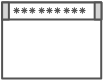
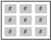
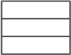
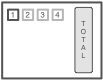
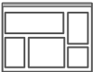
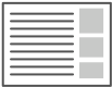
Spreadsheet
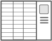
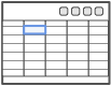
The Spreadsheet layout can offer easy edits, additions, previews and totaling. This type of screen should provide the following functionality: standard table features like sort, hide/show columns, rearrange columns, group by (if applicable), global level undo/redo, add/insert/delete row, keyboard navigation, import and export, and possibly preview and summary functionality.
Interactive Model

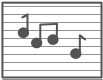
The Interactive Model layout is characterized by many interactive elements associated with a core object (e.g., a graph, calendar, map, sheet music, or text). It closely aligns with the user’s mental model and offers direct manipulation.
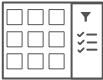
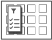
Search/Results
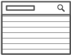
The Search screen pattern can range from very simple to quite advanced. This pattern is ideal for creating an efficient user experience by allowing the user to navigate directly to an item or set of items meeting specific criteria.
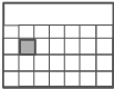
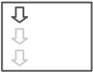
Refine Dataset
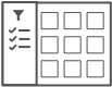
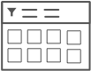
The Refine Dataset layout can be vertical or horizontal, and is ideal for creating an efficient user experience by allowing the user to refine a set of known data, or further refine search results.
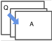
Parallel Panels
Parallel Panels can be stacked (showing one at a time) or unstacked (showing all at once). This pattern is ideal for organizing chunks of information that are similar or have interdependent tendencies. Efficiency is gained by keeping the user in one screen. Ideal candidates for the stacked variation of this pattern are simple workflows with a visible goal that is fed by multiple inputs or multiple non-sequential steps.
Wizard
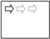
The Wizard layout is ideal for guiding a user through a complex or infrequent workflow. It can be vertical or horizontal depending on the nature of the data.
Question/Answer
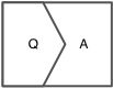
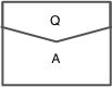
The Q/A screen layout is ideal for helping a user quickly find a solution. Q/A differs from Search/Results in that it can assist users in identifying possible options or a single recommendation in an arena they are lacking expert knowledge (e.g., health insurance, mortgages, or budgeting).
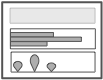
Forms
Any Form layouts should be approached with a solid understanding of usability and design best practices. Web Form Design: Filling in the Blanks by Luke Wroblewski is a terrific resource for designing forms.
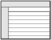
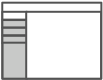
Portal
Portal layouts can provide a high degree of customization for users. They’re ideal for news sites, but not a replacement for a well-designed Dashboard in a business application.
Tabbed
Tabs can be vertical or horizontal. The Tabbed layout should be explored after all other layouts have been considered. Before choosing the Tabbed layout, double check that this approach won’t make users tab between sections to complete a single workflow. Remember to apply the “one screen per goal” philosophy. A Tabbed layout can work well when there is workflow requiring data to be analyzed from multiple perspectives, as with a list, chart, and heat map.
Browse
Browse can provide the best layout for users who goal is to quickly scan and navigate information. It can be two or three columns and typically the primary content is in the left most column, with additional related options served up in the right column(s).
Examples
Check out these designs in action; this presentation includes screenshots from 80+ current RIAs organized by screen layout.
View more presentations from Theresa Neil.
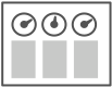
UI Controls
Equally important as the layout is the selection of the right UI controls for the screen. Although we try to avoid designing for the chosen framework, we do invest a good chunk of time learning about it so we know what is technically feasible.
While some frameworks have a great set of controls out of the box (JQuery, Flex, ExtJs, Telerik Rad Controls), others offer only a subset of common controls and/or are designed with no regard for usability. Talk with the development team about what is feasible with the chosen framework, timeline, and budget. We use these 30 Essential Controls as our starting point for these discussions.
Once we get the screens 60-70% complete, we transition to prototyping, and those early discussions with the development team prove invaluable. 70% is the amount of design Todd Warfel recommends having design be 70% complete before beginning prototyping in his book, Prototyping: A Practitioner’s Guide. He suggests getting just enough designed to get buy-in from the user group and the stakeholders. Here are the types of questions we get when we pitch these designs:
- What happens when I click here?
- Will this move when I…?
- Oh, cool, can I…?
Instead of designing more wireframes to answer these questions, we build an interactive prototype. The best practices and examples in Designing Web Interfaces guide the interaction design down a proven path. And the resulting prototype can be played with, tested, refined, and then delivered as part of the development specs. This has proved to be quite a bit quicker, cheaper, and more effective for getting a good RIA developed than our old approach which resulted in a massive stack of wireframes and interaction specs.
Learn More
If you have found this article valuable, be sure to check out:
- Designing for Interesting Moments, a SlideShare presentation by Bill Scott.
- Designing Rich Applications, a SlideShareBy presentation by me, Theresa Neil.
- DesignGalleRIA, a design gallery and showcase of the best rich Internet applications.
- Web Form Design: Filling in the Blanks, by Luke Wroblewski. Rosenfeld Media, May 2008.
- Prototyping: A Practitioner’s Guide, by Todd Warfel. Rosenfeld Media, May 2008.
- Designing for Flex,An Adobe Developer Connection article by Rob Adams.
- The Designer’s Guide to Web Applications, Part 1: Structures and Flows , a User Interface Engineering paper by Hagan Rivers.
- Designing Web Interfaces: Principle and Patterns for Rich Interactions,by Bill Scott and Theresa Neil. O’Reilly Media, January 2009.
- About Face 3: The Essentials of Interaction Design, by Alan Cooper, Robert Reimann, and David Cronin. Wiley, May 2007.
- Designing Interfaces: Patterns for Effective Interaction Design, by Jenifer Tidwell. O’Reilly Media, November 2005.