Effective data visualization supports cognition in many ways. It reduces cognitive load on the user, aids in problem solving, and facilitates discovery of insights. Poor visualizations, on the other hand, confuse and lead to wrong conclusions.
Since cognitive science has given us tremendous understanding of the mechanisms and processes by which we perceive things, comprehend them, and use them for decision-making, it’s reasonable to assume that such findings are very relevant to dashboard design issues. How users interpret data, what demands our designs place on their attention, what knowledge they need for making effective decisions―all these factors need to be considered while designing an information dashboard. Here are four guidelines derived from studies on human cognition that can be applied while designing information dashboards:
1. Put an Emphasis on Readability
To perform any kind of analysis using a dashboard, the user must be able to extract and process visual stimuli reliably and quickly. The interface should be such that it guides visual processing and doesn’t deter it.
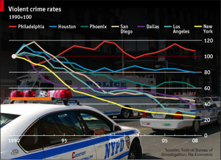
Image source: Smashing Magazine
In the visualization above, the busy background image makes the chart cluttered and reduces its readability. To enhance readability, there should be proper contrast between the chart background and the data plots.
Using a dashboard, the user must be able to extract and process visual stimuli reliably and quickly
Also, prioritization of information helps make the dashboard more readable. As Amanda Cox, Head of The New York Times Graphic Department once noted, “Data isn’t like your kids. You don’t have to pretend to love them equally.” Know where to focus your user’s attention.
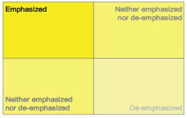
Image Source: Stephen Few, With Dashboards Formatting & Layout Definitely Matter
The layout of the dashboard can be roughly divided into four quadrants based on the importance it accords to its respective content. The top-left quadrant is the section that gains the maximum attention from the user so the most important metrics should occupy this section. The other metrics should then be distributed based on their order of importance.
2. Minimize Cognitive Load
Theoretical insights into cognitive architecture emphasize the memory constraints of humans. These lessons have been learned by the HCI community who argue that interaction sequences should be designed to minimize short term memory load. Since recognition memory is superior to absolute recall, the dashboard should provide all the information that the user needs for a specific analysis in front of his or her eyes. (The details of how a dashboard can reduce the dependence on short term memory are covered in my article “The Psychology Behind Information Dashboards”.)
3. Use Graphical Representation
We are wired for visualization. Whether it’s graphs putting raw data into a perspective or the use of icons, which helps to overcome issues of limited real estate, we do value a picture over a thousand words.
To make dashboards easier to comprehend, couple icons with one-two word text labels (pop-up or otherwise) that explain the meaning to users who find the representations difficult to decipher.
4. Follow Gestalt Laws
Gestalt psychology offers a set of laws that explain how we perceive or intuit patterns and conclusions from the things we see. Applying these laws to charting and data visualization can help users easily identify patterns in their data. Some of these laws are:
Law of Prägnanz: This law states that the human brain tends to process simple patterns—patterns that are regular, even, and orderly—faster than patterns that are more complex. To understand this, consider the two charts below. If you were asked to find the top performer from these two charts, which chart would you find easier to get the data from?
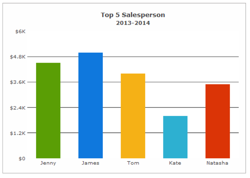
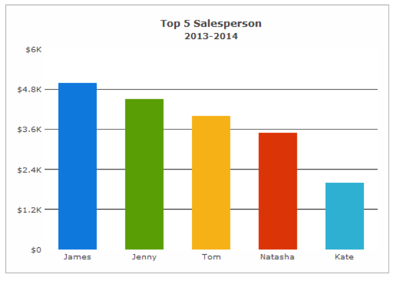
It is easier to see that James is the top performer in the second chart because the data plots are ordered here. If the data is name or category-based, and not time-based, it is a good idea to arrange the data in descending/ascending order.
Law of Focal Point: This law states that in a visual presentation, distinctive objects create a focal point. For example, if you want to focus your user’s attention on a specific data point, you can create a focal point by using a different color. 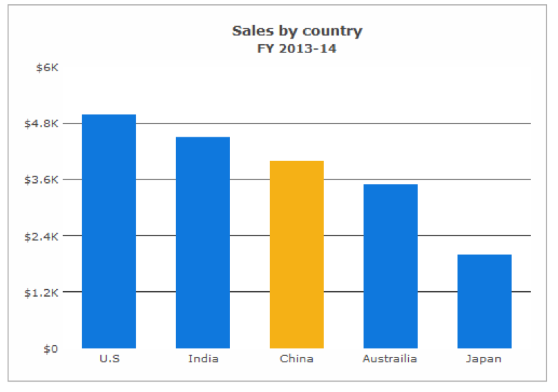
In this chart, China is the focal point due to its difference in color from the other data plots.
Further reading: How to Make Data Visualization Better with Gestalt Laws
Conclusion
Information dashboards aim to augment human cognitive abilities and aid in decision-making. The challenges of designing an effective dashboard are many, but the potential benefits make this a challenge worth pursuing. The key is not in finding what’s most exciting or what’s most outside-the-box but in applying simple concepts which we know but still tend to overlook.
Image of colorful brain courtesy Shutterstock.