With data-driven decisions gradually becoming the norm in every industry, the information dashboard has an important role.
With its interactive and intuitive interface and its ability to visualize data in a single screen, it’s becoming a critical tool in the hands of the business user. Moreover, the information dashboard is also making its way into apps used by laypeople for managing day-to-day activities like budget tracking and fitness management.
So what makes information dashboards so appealing to the human mind? What is it that the human mind seeks that is so nicely provided by information dashboards?
Desire to Control
We love to be in control. Imagine a situation where you are unaware of what’s happening around you. Very soon your panic button is switched on and you want to know what’s going on and what you can control.
From an evolutionary standpoint, if we are in control of our environment we have a better chance of survival. Our subconscious mind prepares us for all kinds of danger (fight or flight) based on our perceived level of control.
An information dashboard gives you that control. Whether it’s a personal finance dashboard that makes you conscious of you spending trends or an enterprise marketing dashboard that helps you keep track of your marketing budgets, both heighten your awareness of a situation, giving you the sense of control you crave.
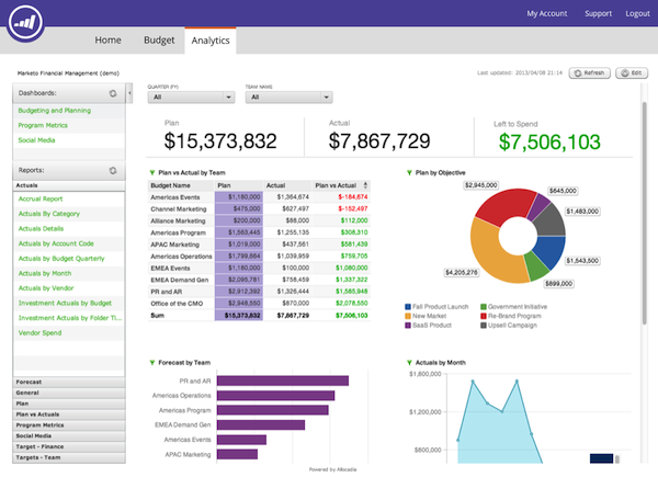
This Marketo dashboard helps marketing teams collaborate on budgets and keep spending on target.
Most information dashboards use a three-pronged strategy to establish a sense of control:
- Giving you a clear understanding of things to help establish a feeling of certainty
- Giving you the resources to predict and plan for the future
- Helping you complete critical tasks in time to avoid last-minute panic
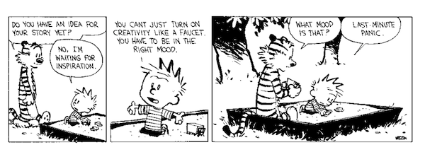
Calvin and Hobbes by Bill Watterson
Short Short Term Memory
In his article “Short-Term Memory and Web Usability,” Jakob Nielsen points out that the human mind can’t store much information in short term memory and that this is especially true when they are bombarded with multiple abstract or unusual pieces of data in rapid succession. He cites research that suggests our short-term memory holds only about seven chunks of information, and that these fade from our brain in about 20 seconds.
Dashboards work by overcoming this limitation of short-term memory. By displaying all relevant information on a single screen within a user’s eye span, they reduce the dependence on the short term memory. You don’t have to remember anything because it’s all there in front of your eyes.
What is it that the human mind seeks that is so nicely provided by information dashboards?
However, in many scenarios, there is so much data that it won’t fit on a single screen. Dashboards work around the limits of short-term memory in three ways:
1. Using chart and graphs to reduce the dependence on short-term memory
To understand this, let’s consider two ways of visualizing the same data: a table and a graph.
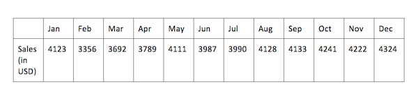
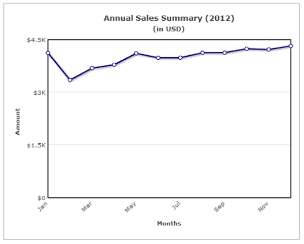
It is easier to remember the ups and downs in sales from the line chart than it is to remember the exact figures from the table.
2. Providing an overview/summary screen with drill-down options
The overview screen provides a snapshot view of critical data on a single page, reducing the load on short-term memory. Users can then drill down if they need details about a specific dataset.
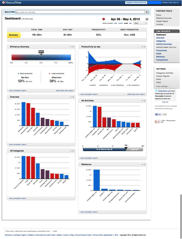
The RescueTime Summary screen provides a bird’s eye view of critical metrics, which can be drilled down for further details.
3. Splitting data across tabs and placing all related data under one tab
This helps reduce the cognitive load on the user by breaking information down into digestible chunks. Also, as related data is placed under one tab, it is easier for the user to analyze it.
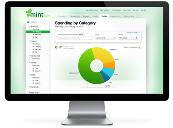
Mint splits data across various tabs: Overview, Transactions, Budgets, Goals, Trends, Investments, and Ways to Save.
Ease of Use
Keep it simple, stupid! This principle works as much in business as it does in real life.
Let’s consider an inventory management system. Using pen and paper, it would take several hours to maintain up-to-date records of incoming and outgoing orders (not to mention the running around involved doing so), with today’s digital dashboards this time can be drastically cut.
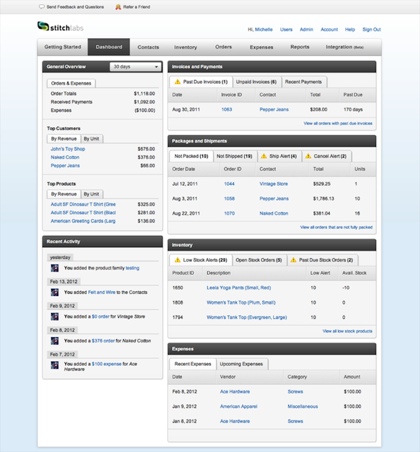
Stitch Labs is one such inventory management dashboard that lets merchants monitor their inventory across multiple sales channels.
Also, with responsive designs becoming the norm in the digital industry, these dashboards will gradually become device agnostic, giving users access to the information from their desktops and laptops as well as a plethora of mobile devices. 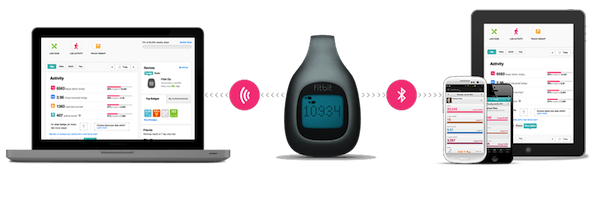
The FitBit dashboard can be viewed across multiple devices.
Conclusion
Any product that has an information dashboard as one of its key offerings should keep the psychological needs of its end users in mind. Users like being in control, they have a limited short-term memory, and they love things that are simple. These three factors should form the foundation of all dashboard designs. Understand your user’s requirements and add in your design best practices and you have the ingredients for creating the perfect information dashboard.