Some of you might work for companies that have not figured it out. They might still be pondering, “Why should we care about user experience?” Maybe they don’t care at all. Maybe they’ve lucked into a strange vortex where customers are accepting of unpleasant interactions and misguided designs.
If you’re that lucky, stop reading this article and go buy a lottery ticket. If, on the other hand, you work at any company with a product, website, or application within which a customer might fail or succeed, you should pause to understand how the strategic failings of some (e.g. Research In Motion, Yahoo, or Sony) caused them to be leapfrogged by the vision of others (e.g. Apple, Google).
But delineating the underpinnings of user experience clearly for everyone is not an easy task. There are algorithms, axioms, and antonyms abound. My frequent reference-point is pop culture; something to which folks can relate. I’ve already touched on UX lessons from Tom Cruise and Johnny Depp, but a thirsty person crawling through the desert of knowledge needs more than two swigs, so today’s user experience lessons are five taken from the cannon of Tom Hanks.
Lesson #1: Re-Skinning Can Allow Financially-Advantageous Reuse
“I think we’ll have a wonderful time, just us girls.”
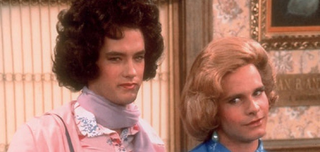
In the 1980s sitcom Bosom Buddies, Hanks played Kip Wilson. The premise of this whimsical show was that Kip and his roommate, Henry Desmond (played by Peter Scolari), were only able to afford housing in an all-women’s apartment complex, so they changed their exteriors—cross-dressing while at home—to save on cost.
In UX, this type of saving is called re-skinning—a feature available in the more advanced modeling tools. Imagine you spend months perfecting a user experience by creating an advanced model, porting that to reference hardware, testing it with persona-like users, and iterating your masterpiece. And then management says, “I want that same thing, but for Brand XYZ.” The cheapest and quickest thing to do is re-skinning: you swap colors or pictures within the model without removing all of the logic previously created and tested. At CES 2012, Paul Leroux (QNX) characterized re-skinning as “… essential to projecting a unique brand identity … cost-effectively for multiple model lines.”
And, just like Bosom Buddies, your male design can instantly look like a female design without a change to the core of product.
Lesson #2: Fictional Personas Can Bring Sanity to the Project
“Hey, you want to hear something funny? My dentist’s name is James Spalding.”
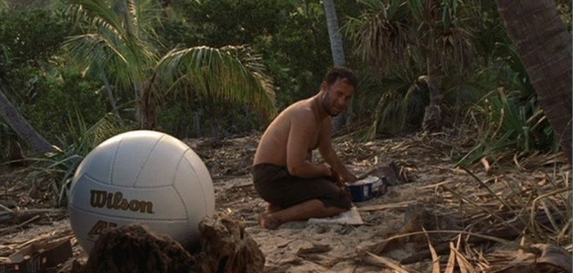
In the movie Cast Away, Hanks plays a FedEx executive whose plane crashes in the middle of nowhere. He ends up stranded on an island with only a few household items salvaged from the wreck. Among them is a Wilson volleyball that—while battling depression and isolation—he transforms into an imaginary companion named Mr. Wilson (no known relation to Kip Wilson). This quasi-companionship helps Hanks solidify his resolve to escape the island.
In user experience realms, fictional characters whose goals help to formulate strategies are called “personas.” As stated by Alan Cooper in The Inmates Are Running the Asylum, “We make up pretend users and design for them … and they are the necessary foundation of good interaction design.”
And as summarized perfectly by Dr. Charles B. Kreitzberg, personas:
- Enable designers to make inferences about the needs and desires of audience segments.
- Serve to communicate user characteristics in a compact and easily understood way.
- Help keep stakeholders from changing the definition of audience segments to advance narrow interests.
- Put a face on the person for whom you are designing the UI.
Hanks put a face on the volleyball and, subsequently, put sanity back into his quest to leave the island—demonstrating that a fictional character can add value.
Lesson #3: Task Completion Doesn’t Automatically Equate to Success

[HAL] “Okay, boys, what in the hell happened?
[PAUL]: “An execution. A successful one.
[HAL]: “How in the name of Christ can you call that a success?
[PAUL]: “Eduard Delacroix is dead.”
Paul Edgecomb is the head guard on Death Row in 1935 when several unusual and mostly miraculous events occur in the movie The Green Mile, based on a novel by Stephen King. Without giving away too much of the movie’s plot, a critical scene in the middle is the execution of an inmate that goes awry due to some deception by an evil guard. The victim’s electricution causes him to die in a prolonged, fiery blaze producing a stench that will supposedly take five years to disappear. When confronted by the warden, Hanks’ character tries to downplay the debacle by calling it an objective success despite the tragic ending.
This is not uncommon in UX. A product will be stamped as a “user-friendly” success, based upon one of many objective measures employed by human factors engineers. Most commonly these include effectiveness or task completion, which measure the ability of participants to figure out the interface sufficiently enough to finish a particular assignment. As pointed out by Frøkjær et al (CHI 2000), “When these studies make claims concerning overall usability, they rely on risky assumptions about correlations between usability aspects. Unless domain specific studies suggest otherwise, effectiveness, efficiency, and satisfaction should be considered independent aspects of usability and all be included in usability testing.”
As an example, in a 2010 study of airline websites where participants were asked to complete various tasks such as finding the items not permitted through security, American Airlines was ranked second best for task completion but near the bottom for the subjective rating of “ease of use.” In fact, one can see visually from that study that individual measures cannot deem success.

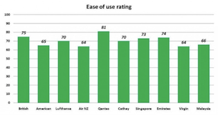
Graphs from the Airline Study Demonstrating Task Completion Isn’t Equal to Ease of Use
Lesson #4: Complicated Interfaces Have Their Purposes, Too
“Only the worthy can unlock the stone.”
We’ve all heard the acronym that doubles as a UX mantra: KISS—Keep It Simple, Stupid. However, we as an expert community must realize there are cultures and sub-cultures that prefer or seek complex user interfaces as a quasi-right of passage.

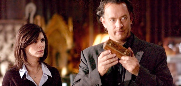
In the very successful novel by Dan Brown and the associated movie, The Da Vinci Code, the protagonist, Robert Langdon (played by … natch … Tom Hanks) must unravel an intentionally complex set of interfaces that only a highly skilled cryptologist or informed member of a secret society can unlock. The culmination leads to a cryptex, a complex combination lock. The user interface is intentionally intricate and arduous.
But this is fiction, right? Are there truly groups that desire multifarious interfaces? It’s no secret that commonalities in preferences can be found deeply-rooted in culture and that information is processed differently in Asia than it is in Europe, but having tested navigational systems around the globe, I have seen firsthand that some cultures feel rewarded by overcoming a complex user interface. In the Far East and even in Western subcultures (such as engineers), having conquered a challenge demonstrates a level of sophistication that may be worn as a badge of honor.
So should we UX engineers always design for the zealots? Certainly not. But just like all design projects, we should not presume the desires of the user without understanding his or her motivations. In some instances—like the Road Rally app or a Murder Mystery game—simplistic is undesirable. Yes, sometimes the user only desires the riddle to be complex and still wants a simple user interface, but not always.
Lesson #5: Exceeding User Goals Makes You Memorable
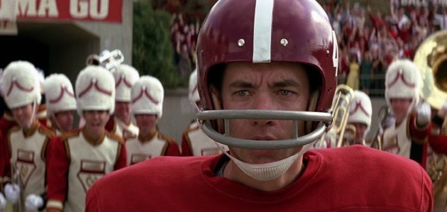
“Run, Forrest! Run!!”
How many of you watched Forrest Gump and have forgotten the scene where Hanks, playing the titular character, not only runs through Alabama’s end zone, but continues running right out of the stadium? Probably not a single one of you. A touchdown is a touchdown—they are worth six points regardless of where the running back stops outside the end zone—but this over-delivery made Gump’s touchdown memorable.
Sure, this simple lesson might be applicable to all business strategies—exceeding the expectations and goals of the user will make your product memorable—but it is absolutely applicable to the design of a UI. In Designing For Emotion, Aaron Walter, the lead user-experience designer for Mail Chimp, talks about making your product memorable. “Hold on to that memory … that feeling is what we’re trying to craft through emotional design. We’ll create that feeling of excitement and we’ll bond with our audience …”
Similarly, in his book, Descartes’ Error, Antonio Damasio explains that feelings and associated projections play a role in choices according to the past experiences with which they are associated. A “somatic marker” (where ‘soma’ means ‘body’ in Greek) improves the predictive efficiency of the decision-making process by reducing the number of options and, therein, protecting the evaluator from future harm. “You can think of them as a system of automatic qualifications of predictions, which acts, like it or not, to evaluate extremely diverse scenarios of the future[s] that lie ahead of you,” Damasio explains. Those which have gone favorably beyond your goals shall be remembered as predictors of future pleasant experiences and subsequently bolster the likelihood of returning.
So, just like Gump, your product could stop right at the goal line, but maybe by going the extra yards it’ll be that much more memorable.
Summary
Making sure your product’s user experience is satisfying, user-centered, and performing beyond the customer goals is the path towards ultimate success. Designing for your customer persona and testing for customer satisfaction as well as task completion is the way to confirm you’ve headed down the appropriate design path. Any other actions can be summarized by another quote from Forrest Gump: “Stupid is as stupid does.”
Tom Hanks honoring George Harrison image courtesy of Shutterstock