The myriad technical issues responsible for the botched rollout of Healthcare.gov have been the subject of steady media attention since the site launched on October 1.
The Affordable Care Act will affect millions of Americans, yet according to the first enrollment numbers released last month, only 106,000 people signed up for coverage in the first month of the exchange’s existence.
This is a far cry from the Obama administration’s expected 500,000 enrollees. While part of the bottleneck can be attributed to flaws in the website’s technology and performance, equally important is whether visitors to the site can effectively use it to easily understand their coverage options so they know which plans best suit their needs. Below we will look at some of the usability issues that may have contributed to such low enrollment numbers in Healthcare.gov’s first month.
One can see the attempts that the website is making. Its design, however, does not reflect an understanding of what its users really need.
Two Key Roles
The website has two key roles to perform:
1. Help people make the best decision for themselves
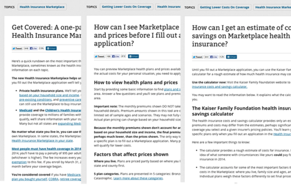
A lack of clear information creates anxiety and distrust. The current website offers information on plans through several different pages. This includes several links from the home page like the 1-page guide to the health insurance marketplace, a cost and savings calculator, and a page where visitors can view possible plans based on their location.
While the information is useful and thorough, each of these informational pages is very text and link heavy, requiring visitors to parse through a maze of different links and articles to try and form a complete picture. This information architecture relies on an assumption that people will know what they need to read and will be able to find the right information on their own, rather than guiding visitors through the process and providing them with the confidence that they are getting all the information needed to make an informed decision.
2. To help people follow the required steps
With a clear understanding of the Affordable Care Act, people need to be able to apply and obtain the right insurance. The website has clear call to action buttons like “Apply Online” and “Apply by Phone.” Choosing to apply online launches a wizard that walks an individual through the application process. There are inconsistencies in this wizard process, however, where the layout changes.
Such inconsistencies should be very easy for the site’s administrators to resolve. The larger opportunity that has been missed is to make this process contextual. For example, one must go through an eight-step process to see a list of plans and sample prices in Virginia. However, one cannot launch to the application process from that step.
[google_ad:WITHINARTICLE_1_234X60_ALL]
The Big Fix
Refining these core functionalities of Healthcare.gov would go a long way toward improving the user experience and putting people back in control of the process and, by extension, their healthcare. A number of changes are required—some large, some small—but here are three key recommendations that will go a long way toward making the site more successful in its ultimate goal of enrolling new users.
1. Develop Empathy with the User
Understanding the wants and needs of the people who are going to use a website is critical for any software solution. In case of Healthcare.gov, the drastic impact it will have on hundreds of thousands of people’s lives is so easy to see. The design team should conduct interviews with people who have registered on the site already to understand their perspectives, their goals, their issues with the site, and what they think about Healthcare.gov overall.
2. Simplify the Website
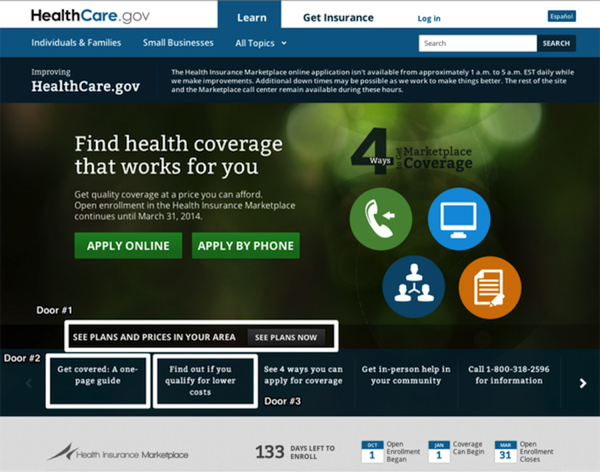
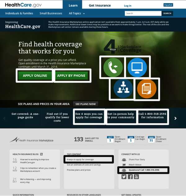
This website puts a TON of information on the homepage, but it does not guide users through that information in a logical way and subjects them to a lot of redundancy. For example, the main section on the Healthcare.gov home page shows four icons representing ways that one can get insurance.
The process puts an increased cognitive load on would-be enrollees and the entire experience suffers
There are buttons to the left that represent two of those four choices. In the menu beneath those options, there are links that read: “See 4 ways you can apply for coverage,” “Get in-person help in your community,” and “Call 1-800-318-2596 for information.” Right under this is the link “4 ways to apply for coverage” under the “Top Content” section. Next to the Top Content section is the “Connect with us” section, which again lists the same phone number. That’s 11 different placements for the same four items, and they are all situated close to each other with very different visual treatments.
All these could be condensed into a single simple message.
The visual design can also be significantly simplified. One can clearly see the number of color variations as well as font-type and font-size variations. Each of these variations adds unnecessary visual complexity and increases the cognitive load necessary to comprehend what could be a much simpler process. Simplifying these would help people focus on the right information.
3. Guide People, Don’t Make them Hunt
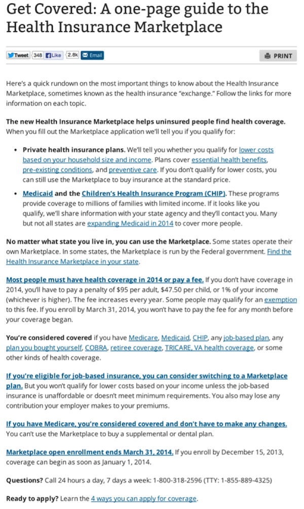
The website currently walks the user through the process of filling in the necessary information to create an account. However, when one looks at the process from a user’s perspective, there are a lot of decisions that must be made before taking those steps. For example, the person applying might have an insurance policy that they have been purchasing individually and are not sure if they even need to even apply for coverage under the ACA. The website provides little guidance for answering questions like this before a user decides to begin applying. The 1-page guide provided on the homepage helps, but the guide contains 20 links to other articles. The design requires users to select and read through the right set of articles, get a proper understanding, and then make a decision.
The absence of such guidance leaves people unsure and anxious about what they should be doing. This results either in a delay in taking the required steps as they take time to figure things out, or a costlier alternative, like placing a phone call to look for answers. The process puts an increased cognitive load on would-be enrollees and the entire experience suffers as a result.
Building an effective guidance system requires looking at the information from the user’s perspective and figuring out their most pressing questions at each step along the way. There is sufficient information available on the website to answer a bevy of questions but without a logical presentation of the information it becomes exponentially more difficult for users to find the answers they’re seeking.
Summary
Healthcare.gov offers a lot of information and solutions for people seeking health care under the Affordable Care Act. However, the design choices reflect big gaps in understanding the needs of the people that it is meant to serve. As a result, a lot of information has been sprinkled across the website and linked from many different places.
There are many simple UX tools that could be utilized to help streamline the process, including interviewing people, observing them using the website, and integrating users into the design process using techniques like card sorting.
As experience designers and researches already know, the time invested in such activities ensures that the solution will be better understood by people and that they will be able to use it, gain the benefits offered by the site, and leave with a greater confidence in the healthcare system and the government. An improved design would also reduce operating costs by limiting the support costs (from inbound phone calls), making the process even more efficient.
Image of angry user courtesy Shutterstock