Save
For a lot of parents in the U.S., the school choice process has just about wrapped up for the 2015/2016 school year. Depending on which state and district parents live in and what goals they have for their child’s education, this can be an extremely taxing ordeal.
Most parents strive to control the forces that will affect kids’ their lives—in this case, which public school they will attend—but the process comes with very specific instructions and piles of confusing school report cards.
It’s precisely the kind of experience that gives the public sector a bad rap.
Political, budgetary, security, and compliance issues can quickly hamper noble intentions, making it hard to implement new ideas. This is unfortunate because the public sector is an area where truly great experiences can reach a broad user base and contribute to the betterment of society—things that undoubtedly appeal to experience designers.
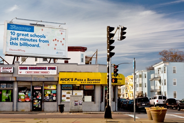
For evidence of how effective a well-designed public sector experience can be, look to a project Joel Mahoney and Objective Subject undertook in 2013 to transform the experience of placing children in Boston’s public schools.
Winner of the Design for Experience award for Public Sector Experience, the project was born out of a fellowship Mahoney began in 2011 with Code for America: a radical overhaul of an antiquated program wieghed down by a dense, 28-page parent handbook. In the pilot year of the platform Mahoney created withhis CfA team, over half the parents in Boston used it to identify the right school for their child.
While the School Department had been reluctant to give scrappy designers and coders control over the direction of an important, user-facing infrastructure, after version one of DiscoverBPS launched, it was difficult to argue with strong usage metrics and glowing user feedback.
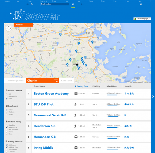
Two years later, the school district enacted a policy to transition from a zone-based model to a home-based placement model, allowing parents to find the best schools for their children within close proximity to where they live. DiscoverBPS was redesigned with an accessible, map-driven interface that centered school options on the user’s location, making it easy to see schools that were within walking distance.
“Our research showed that parents had two primary concerns: school quality and school location,” Mahoney says. “To address those concerns, we included detailed information on commute distances and times (by foot and by bus), as well as MCAS scores, teacher-to-student ratios, school hours, after-school programs, and other performance metrics.”
Viewing parents as users, DiscoverBPS showed the School Department a new way to reach constituents
By focusing on parents as users, DiscoverBPS transformed a dense parent handbook into an intuitive and assistive search engine and showed the School Department a different way of relating to its constituents. As the former superintendent of Boston Public Schools, Carol R. Johnson remarked, Discover BPS “changed the way we relate to parents.”
“Instead of dividing the school district into zones and pre-calculating the list of eligible schools per zone, modern, geospatial tools made it possible to generate a list of results per address—an option that had previously seemed unattainable,” Mahoney says.
As a centerpiece of Boston Public Schools’ user engagement strategy, DiscoverBPS has generated interest from other school departments and has seen at least one similar program launched by the Pittsburgh School Department (DiscoverPPS).
“DiscoverBPS offered a better way of interfacing with the school selection process, and was a breath of fresh air for the School Department,” Mahoney says. “It was the kind of intuitive, modern design (and responsive interface) that users are accustomed to on the web. It’s perhaps not an overstatement to say that DiscoverBPS brought the School Department’s online portfolio into the 21st century.”
As a finalist in the Public Sector Experience category of the DfE awards, The Customer Experence Company helped the New South Wales government redesign their service and delivery systems, giving them Service NSW, a comprehensive website, a 24/7 phone information line, and one-stop shops with extended hours. A massive undertaking, the project saw the successful merging of government operations and the tenets of customer experience design.
Image of young student courtesy Shutterstock.
- Analytics and Tracking, Customer Experience, Design, Government and Public Services, Interface and Navigation Design, Location-Based Services, Privacy and Data Security, Product design, Product Releases and Redesigns, Project Management, Requirements and Specifications, Research Methods and Techniques, Software as a Service, Technology for the Common Good, Working With Stakeholders
Josh Tyson
Josh Tyson is the co-author of the first bestselling book about conversational AI, Age of Invisible Machines. He is also the Director of Creative Content at OneReach.ai and co-host of both the Invisible Machines and N9K podcasts. His writing has appeared in numerous publications over the years, including Chicago Reader, Fast Company, FLAUNT, The New York Times, Observer, SLAP, Stop Smiling, Thrasher, and Westword.


