Flag

We stand with Ukraine and our team members from Ukraine. Here are ways you can help

Get exclusive access to thought-provoking articles, bonus podcast content, and cutting-edge whitepapers. Become a member of the UX Magazine community today!

Home ›› Business Value and ROI ›› 6 Key Questions to Guide International UX Research ›› The Top 5 Website UX Trends of 2012

The Top 5 Website UX Trends of 2012

by Catalyst Group
3 min read
Share this post on
Tweet
Share
Post
Share
Email
Print

Save

A look at some of the best user experience developments on the web this year.

User interface techniques continued to evolve in 2012, often blurring the lines between design, usability, and technology in positive ways to create an overall experience that has been both useful and pleasurable.

Infinite scrolling, for example, is a technological achievement that also helps the user by enabling a more seamless experience. Similarly, advances in Web typography have an aesthetic dimension but also represent a movement toward greater clarity of communication.

1. Single-Page Sites

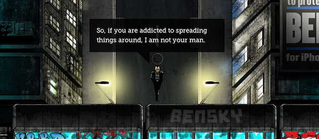
Single-page websites are everywhere. Big background images, rich illustrations, and animation techniques are being used to tell stories, entertain, and get a message across loud and clear. Free of the limitations of traditional website architecture, creative and beautiful one-pagers are flourishing. Two of our favorite single-page sites are Jess and Russ and Ben the Bodyguard. (Several other nice examples can be found here.) As with any trend, people want to emulate it, even if it’s not the appropriate solution. This can easily lead to homogenization of style and, in some cases, poor execution. When done correctly, however, the single page website works very well.

2. Infinite Scrolling

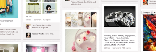
Infinite scrolling is familiar to everyone, even if they don’t realize it. It works best for unstructured information; live feed style, sorted by time. Sites with lots of images—like Google images or Pinterest—make excellent use of this technique, but thoughtful implementation is important to prevent user frustration. Lookbook is another good example. By pairing infinite scroll with a floating right column and a “back to top” button, the site allows users to consume endlessly and still get to other parts of the site easily. Infinite scroll is not a “one size fits all” solution—there are plenty of complex factors to consider, and pagination may still be the best technique for search results, large lists, and e-commerce.

3. Persistent Top Navigation or “Sticky Nav”

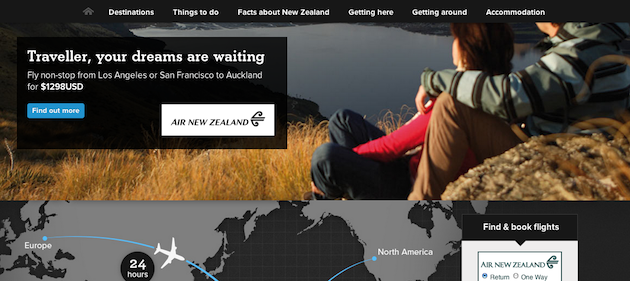
Persistent menus are ideal for complex sites, long scrolling pages, or applications with toolbar functionality. Persistent menus can be distracting, so it’s best to keep them slim and unobtrusive. A great example is New Zealand’s tourism website, which features a navigation that collapses down to just the main sections, leaving plenty of real estate for the rest of the page. The Gmail Web interface also does it right by giving users a persistent toolbar with the most used actions.

4. The Death of Web 2.0 Aesthetics

We’ve noticed a return to basics in visual design trends. A flat, clean, minimalist aesthetic with a focus on typography and information hierarchy has replaced the big, bright, juicy days of Web 2.0. A lot of websites and apps are even ditching graphical background images for pure CSS styles in order ensure a compelling experience across devices and resolutions. Our favorite recent visual designs include Basecamp, Dropbox, and the Smashing Magazine redesign.

5. Typography Returns

Thanks to maturing font technologies and improved font rendering on most browsers and devices, designers have more typefaces to choose from and more control of their type. There is an increased awareness of the importance of content, and with it, using typography to effectively communicate a message. With mobile, responsive design, and more retina displays, typography will continue to be an important focus on the Web in the next few years. One of our favorite examples is The New Yorker, which uses a standard Web font (Times New Roman) for body copy, beautifully paired with display fonts for headings and navigation (Irvin, Neutra).

In 2013, we’ll be looking for more examples of sites that improve user experience by judiciously balancing beauty, utility, and technology.

post authorCatalyst Group

Catalyst Group
Catalyst Group is a leading provider of user experience research, strategy, and design services. Visit us at https://.catalystnyc.com

Tweet
Share
Post
Share
Email
Print

Related Articles

Why do designers grumble at the mere mention of PowerPoint? Discover smart strategies that turn frustration into creative solutions.

Article by Jim Gulsen
Why Designers Hate PowerPoint (and How to Fix It)
  • The article examines why PowerPoint often frustrates designers, from its limited design capabilities to inefficient workflows, and explores opportunities to bridge those gaps.
  • It highlights strategies like building systematic design elements, creating templates, and augmenting slides with other design tools.
  • The piece underscores the importance of collaboration, simplicity, and proactive planning to elevate design and streamline workflows.
  • It highlights practical methods to help designers balance quality and speed for presentations that are both functional and visually engaging.
Share:Why Designers Hate PowerPoint (and How to Fix It)
4 min read

Struggling with PowerPoint’s design limitations? This step-by-step guide shows you how to build systematic design solutions, from mastering slide layouts to using sticker sheets for patterns. Learn to create polished, professional presentations with smart workarounds and helpful tips.

Article by Jim Gulsen
A Step-by-Step Guide to Creating a “Design System” in PowerPoint
  • The article gives a step-by-step guide to building systematic patterns in PowerPoint. It talks about the program’s limitations and gives essential tips like mastering slide layouts and customizing text settings.
  • It suggests using PowerPoint’s automated features carefully and advocating for manual workarounds to elevate quality.
  • The piece introduces creating sticker sheets for reusable design components and highlights strategies for successful workflows.
Share:A Step-by-Step Guide to Creating a “Design System” in PowerPoint
5 min read

Publishing in HCI and design research can feel overwhelming, especially for newcomers. This guide breaks down the process — from choosing the right venue to writing, submitting, and handling revisions. Whether you’re aiming for conferences or journals, learn key strategies to navigate academic publishing with confidence.

Article by Malak Sadek
A Guide to Publishing Human-Computer Interaction (HCI) and Design Research Papers
  • The article provides a guide to publishing in Human-Computer Interaction (HCI) and design research, sharing insights from the author’s PhD experience.
  • It explains the significance of publishing in academia and industry, offering an overview of peer-reviewed journals and conferences.
  • It breaks down the two main types of papers — review and empirical — detailing their structures and acceptance criteria.
  • The piece emphasizes strategic research planning, collaboration, and selecting the right venue for submission.
  • The piece also outlines practical steps for writing, revising, and handling rejections, encouraging persistence and learning from reviewer feedback to improve publication success.
Share:A Guide to Publishing Human-Computer Interaction (HCI) and Design Research Papers
8 min read

Join the UX Magazine community!

Stay informed with exclusive content on the intersection of UX, AI agents, and agentic automation—essential reading for future-focused professionals.

Hello!

You're officially a member of the UX Magazine Community.
We're excited to have you with us!

Thank you!

To begin viewing member content, please verify your email.

Tell us about you. Enroll in the course.

    This website uses cookies to ensure you get the best experience on our website. Check our privacy policy and