When users encounter familiar conventions, they already know how to use them, they feel safe and secure, they can use the product (or the service) efficiently and effectively, and in most cases they also feel satisfied. Breaking the conventions, on the other hand, can easily lead to significant usability issues.
That’s why UXers and human-computer interacton experts usually encourage the use of “UX Patterns” as much as possible to avoid creativity while designing micro-interactions, so as not to surprise users and confuse them. Any professional that has ever conducted usability testing can indicate that deviations from conventions will probably result in a negative effect on system status acquisition, reaction time, and on satisfaction. We also know that breaking conventions binds the user to learn a new pattern that sometimes competes with existing skills they’ve already mastered, and that learning in that case is expected to be slower.
But how extensive is breaking conventions, per micro interaction? What is the performance “price” we pay when we utilize disruptive patterns? Since I wanted to study this issue from a quantitative perspective, I developed a small experiment.
Experiment Goal
The goal of the experiment was to study and demonstrate the decrease in human performance when working with a non-standard pattern, with respect to reaction time and mistakes. For that purpose, I wanted to measure the difference in reaction times between a well-established UX pattern and a slightly different pattern that was still reasonable and logical. I then wanted to compare the number of mistakes – at least the ones noticed and corrected by the user (and to some extent the unnoticed ones, as well).
The conventional pattern I chose for the experiment was a standard telephone keypad (or “dialpad”), and the disruptive pattern was non-standard (yet still logical) layout of the same keypad.
| 1 | 2 | 3 | 1 | 4 | 7 | |
| 4 | 5 | 6 | 2 | 5 | 8 | |
| 7 | 8 | 9 | 3 | 6 | 9 | |
| * | 0 | # | * | 0 | # | |
| Call | ← | Call | ← | |||
| Standard Keypad | Disruptive Keypad | |||||
Using a standard telephone keypad is a well established psycho-motor skill, and we can assume that it is already autonomic for most of the adults. Once the standard keypad is presented, most people will use it naturally with minimal effort.
Breaking UX conventions can easily lead to significant usability issues
The disruptive keypad, on the other hand, is expected to consume more cognitive processing resources, since users are not accustomed to using it, and since using it competes with the existing pattern of the standard layout. Using the disruptive keypad is expected to take longer, and more mistakes are expected to occur.
The Experiment
I composed a small webapp based on a jQuery keypad (client side) and on a MySQL (server side), on which the experiment’s participants (subjects) were asked to dial a ten digit phone number they can easily recall. They were asked to dial the same number twice – the first time using a standard dialpad, and the second time using a disruptive one.
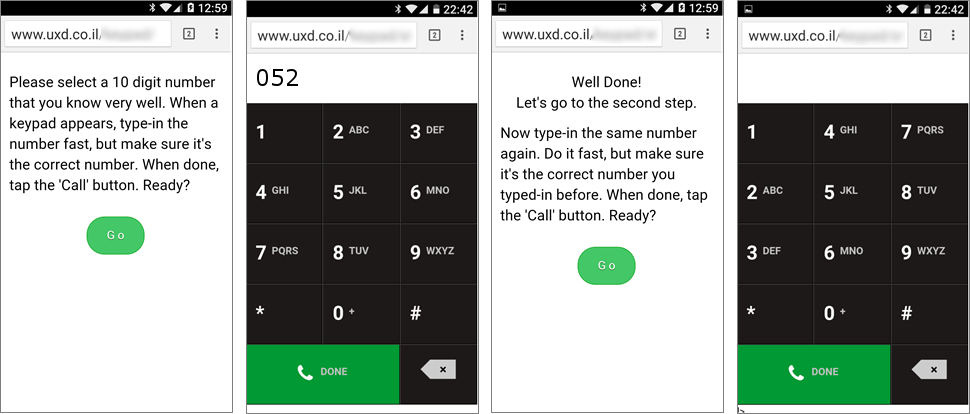
Prior to each of the dialpads shown above, there was a 3-2-1 countdown screen that served two purposes: (1) to make sure the user is ready to dial the number as soon as the dialpad is displayed and (2) to make sure the jQuery is totally loaded and functioning as soon as it is exposed.
The performance time for dialing the ten-digit number (from dialpad reveal to tapping on the call button) was measured, and the number of taps on the backspace button was counted.
Results and Discussion
The experiment was limited to Android users with Google Chrome browser, due to unexpected performance of the jQuery plugin on other platforms. During November 2015, around 150 subjects participated the experiment by invitation via WhatsApp, in person and during my talk at DevFest Romania. I had to eliminate some of the results due to easy-to-type numbers (like 12345…), due to input that was , and due to unreasonable performance time (that probably occurred as a result of technical issues). The following table displays the statistics of 130 valid pairs of inputs.
| Performance time (seconds) | Number of taps on [Backspace] | |||
| Standard | Disruptive | Standard | Disruptive | |
| Average | 8.11 | 10.94 | 0.31 | 0.76 |
| Median | 6.50 | 10.00 | ||
| St. Dev. | 4.28 | 5.34 | 0.97 | 2.28 |
From the table above, we can see that the average time it took to dial the ten-digit number was 35% longer for the disruptive dialpad when compared to using the standard one. The median time to dial for the disruptive dialpad was 10 seconds, which mean that 50% of the subjects took more than 10 seconds to dial the number. A closer look at the performance of the standard dialpad shows that only 20% of the subjects took more than 10 seconds to dial in that case.
Another important finding was that 28 (22%) of the number pairs didn’t match. Assuming that subjects did succeed in dialing the correct number with the standard dialpad, we’ll have to conclude that the disruptive dialpad was so confusing that they didn’t dial the right number while using it.
Now, since the subjects of the experiment used their own devices, we could not avoid delays in the performance that occurred due to technical issues. For that reason, I Iet myself clean the data of the seven subjects that took more than 16 seconds to dial the number with the standard dialpad (16 seconds is about Average+2*St.Dev). The following table displays the statistics of the 123 valid pairs of inputs that remained.
| Performance time (seconds) | Number of taps on [Backspace] | |||
| Standard | Disruptive | Standard | Disruptive | |
| Average | 7.47 | 10.94 | 0.24 | 0.79 |
| Median | 6.00 | 10.00 | ||
| St. Dev. | 3.30 | 5.46 | 0.86 | 2.34 |
From the table above, we can see that the average time to dial the ten digits number was 46% longer while using the disruptive dialpad, when compared to using the standard one. The median time to dial for the disruptive dialpad was 10 seconds, which means that 50% of the subjects took more than 10 seconds to dial the number. A closer look on the performance with the standard dialpad shows that only 15% of the subjects took more than 10 seconds to dial in that case.
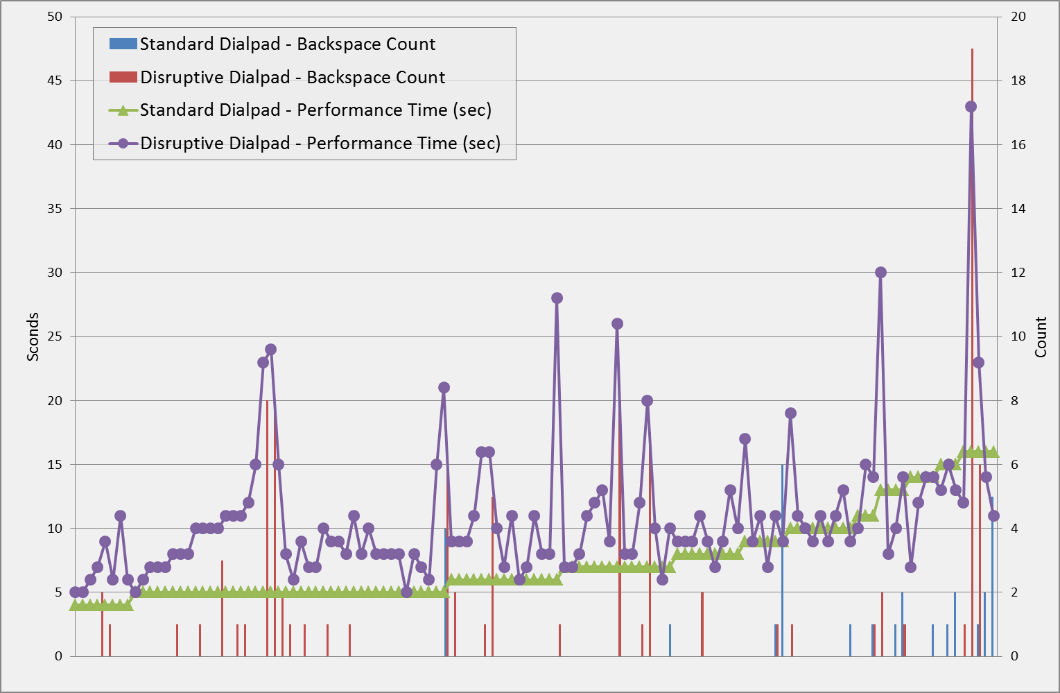
The following graph displays the experiment results sorted by the performance time with the standard dialpad. It’s obvious from the graph that longer performance times with the disruptive dialpad is correlated with the number of taps on the backspace button, and indeed, statistics results here with a correlation coefficient value of 0.77. There were 16 cases in which the performance time with the disruptive dialpad was better than the performance with the standard dialpad, but as can be seen on the graph, they all occurred with subjects that were above the average with the standard dialpad – most of them high above the average. This can imply that these subjects either suffered from some kind of a technical problem or a distraction on the first part of the experiment, or that a few subjects are less sensitive to the keypad layout and they could even improve from the first part to the second one (learning curve).
Conclusions
From the above results, we can conclude that a non-standard keypad – that is not very different from the standard one in layout and in logic – can lead to an increase of 30%-50% in performance time, and can significantly increase the likelihood of mistakes – both noticed and corrected and unnoticed.
When users are accustomed to using a pattern, even a minor change in that pattern can be very expensive in performance terms. In fact, the minor change is confusing in two ways: (1) since the difference is minor, it can go unnoticed, hence , and (2) since the user is already well-trained with the standard pattern, their knowledge masks the new pattern and inhibit learning.
Image of seamless triangle pattern courtesy of Shutterstock.