Flag

We stand with Ukraine and our team members from Ukraine. Here are ways you can help

Get exclusive access to thought-provoking articles, bonus podcast content, and cutting-edge whitepapers. Become a member of the UX Magazine community today!

Home ›› Review: UX Archive

Review: UX Archive

by Andrew Zusman
3 min read
Share this post on
Tweet
Share
Post
Share
Email
Print

Save

UX Archive is a great resource for comparing user flows, but the direction of the site’s growth is unclear.

Buttons, scrollbars, drop-down menus, borders, windows, rollers, cursors, and all sorts of other widgets are the playthings of UI designers. Buttons are for pushing, rollers are for rolling, and knobs are for turning.

User experience deals with how these individual actions feel, but more importantly, a user’s overall experience on web or mobile. This includes making sure users can understand text, navigate with ease, and make smooth transitions—creating seamless user flows so that the product elicits an appropriate emotional response.

Essentially an archive of successful user flows, UX Archive shows a cycle of specific events through individual high-definition screen shots of each process. While currently focused on top-quality apps for iPhone, the site gives viewers a broader understanding of the UI for each individual step and how it contributes to the overall experience.

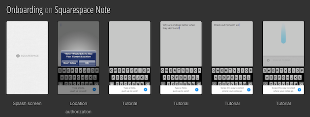
The chain of events shown on the site helps to clarify the architecture of the apps as well as exhibiting the general feel, with events split in to five different sections: exploring, onboarding, searching, sharing and sign up. The “exploring” feature highlights browsing, and the “onboarding” feature shows the process from splash screen to launch. The “searching,” “sharing,” and “signing up” features are what one might expect.

The fact that the events are not combined—no single group of photos showing all five events together—actually makes the site more useful. The short, staccato bursts are very helpful in highlighting specific methods for showing the same processes. UX Archive should be commended for being easy to use and providing a great user experience itself—websites built for UX professionals draw in users who expect a great user experience, and UX Archive delivers.

UX Archive also builds an element of curiosity by highlighting a question at the top of the home page: “How do the best apps handle _____?” The question engages the user and drives the content forward—with the blanks filled in by one of four events noted above. The images showing the process chains for each application are visually appealing and the site is easy to use and well maintained.

At present there are only a handful of applications listed (and, as I mentioned, they are limited to those for iPhones). Clearly the archive will continue to grow, but the direction of that growth is unclear. If everyday users are allowed up upload their own apps, the beauty of the site could be compromised. If the site managers allow only certain apps to be uploaded, the site will maintain its high level of quality but might not have the quantity of content to keep a high profile among UX professionals. Only time will tell how this issue will be resolved, but judging by the look and feel of the site at present, it seems likely that the issue will be handled in a user-friendly way that keeps UX Archive unique and interesting.

Graphic designers have been especially eager to show off all sorts of fun and interesting user interface and navigational tools, with sites like UI Parade, Behance, and Dribble all presenting really great user interface controls, but UX Archive has taken the extra initiative by highlighting great user experience on the macro level. Hopefully this vision will spark even more interest in great user experience design.

post authorAndrew Zusman

Andrew Zusman
Andrew Zusman is a user experience designer at Inkod-Hypera and the creator of the 52 Designers project. Andrew is also the writer of a popular user experience design blog. He lives in Tel-Aviv, Israel with his girlfriend Natasha and their dog Indy.

Tweet
Share
Post
Share
Email
Print

Related Articles

Struggling with PowerPoint’s design limitations? This step-by-step guide shows you how to build systematic design solutions, from mastering slide layouts to using sticker sheets for patterns. Learn to create polished, professional presentations with smart workarounds and helpful tips.

Article by Jim Gulsen
A Step-by-Step Guide to Creating a “Design System” in PowerPoint
  • The article gives a step-by-step guide to building systematic patterns in PowerPoint. It talks about the program’s limitations and gives essential tips like mastering slide layouts and customizing text settings.
  • It suggests using PowerPoint’s automated features carefully and advocating for manual workarounds to elevate quality.
  • The piece introduces creating sticker sheets for reusable design components and highlights strategies for successful workflows.
Share:A Step-by-Step Guide to Creating a “Design System” in PowerPoint
5 min read

Publishing in HCI and design research can feel overwhelming, especially for newcomers. This guide breaks down the process — from choosing the right venue to writing, submitting, and handling revisions. Whether you’re aiming for conferences or journals, learn key strategies to navigate academic publishing with confidence.

Article by Malak Sadek
A Guide to Publishing Human-Computer Interaction (HCI) and Design Research Papers
  • The article provides a guide to publishing in Human-Computer Interaction (HCI) and design research, sharing insights from the author’s PhD experience.
  • It explains the significance of publishing in academia and industry, offering an overview of peer-reviewed journals and conferences.
  • It breaks down the two main types of papers — review and empirical — detailing their structures and acceptance criteria.
  • The piece emphasizes strategic research planning, collaboration, and selecting the right venue for submission.
  • The piece also outlines practical steps for writing, revising, and handling rejections, encouraging persistence and learning from reviewer feedback to improve publication success.
Share:A Guide to Publishing Human-Computer Interaction (HCI) and Design Research Papers
8 min read

Accessibility isn’t just about compliance — it’s about inclusion. A deaf developer shares what UX designers need to know to create better experiences.

Article by Tamara Sredojevic
Designing for Deaf Users
  • The article talks about a deaf developer who shares insights on digital barriers, assistive tech, and inclusive design.
  • It presents a candid conversation on UX challenges, assistive technology, and advocating for better accessibility.
  • The piece dives into the challenges and solutions for creating truly accessible experiences.
Share:Designing for Deaf Users
11 min read

Join the UX Magazine community!

Stay informed with exclusive content on the intersection of UX, AI agents, and agentic automation—essential reading for future-focused professionals.

Hello!

You're officially a member of the UX Magazine Community.
We're excited to have you with us!

Thank you!

To begin viewing member content, please verify your email.

Tell us about you. Enroll in the course.

    This website uses cookies to ensure you get the best experience on our website. Check our privacy policy and