Save
On a dark and stormy night, six colorful people gather in a country manor home, each holding a deadly weapon. Before the evening’s end, there will be a murder and it will be up to you to solve it!
Clue, or Cluedo outside of the United States, is a board game based on the classic whodunit murder-mystery. Clue provides the same enjoyment readers get out of reading murder mysteries by playing on a powerful but often underutilized desire in Web, tablet, and mobile design: curiosity. Curiosity can help user experience designers drive user action by creating an information gap and then directing users on how to fill it in.
User experience designers strive to make their designs clear, understandable, and simple because the concept of usability hinges on users being able to instantly recognize what to do and how to behave. Adding an element of curiosity encourages designers to develop the unknown rather than to make clear what is already known.
A gap in information can create a desire to fill in what’s missing. User experience designers can capitalize on this desire by designing a specific user flow that will lead users to the information that fills in the gap. Cultivating this information gap and flow can be a powerful weapon in the user experience design arsenal.
Clue has an incredibly simple interface: three cards representing the murderer, the weapon, and the location of the murder are selected and hidden at the beginning of the game. The players move from room to room and ask questions to try and determine which cards other players have in order to make an educated guess about the secret cards.
There is a gap in the user’s information: Who is the murderer? What weapon did they use? In which room did they commit the crime? A specific user flow allows the users to find the answers: move from room to room, ask other players about their cards, and fill in the information gap through a process of elimination. Just as Clue has a narrative built around an information gap, Clouds Over Cuba and Only Because We Can are digital experiences that capitalize on a similarly mysterious narrative.
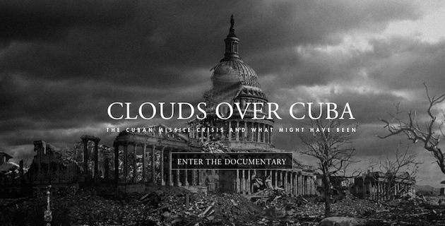
Clouds Over Cuba is a web- and mobile-based documentary that explores the Cuban Missile Crisis and what might have occurred had it boiled over in to war. The site creates an information gap between what users know about the historical events, what they might not know about these events, and a possible alternative outcome. This information gap, much like trying to determine the murderer in Clue, pushes users to continue through the documentary. Even rolling over the “Start Documentary” button on the main screen illuminates this information gap, sparking a high level of curiosity with the image of a demolished U.S. Capitol building.
Similarly, the website Only Because We Can sparks curiosity with a narrative. The site is an interactive video that has an intriguing storyline. The story captures the user’s interest, and before they realize it, they’ve watched and interacted with several minutes of a clothing commercial. Viewers want to know how the story will end—much like Clue players, they want the secret cards to be revealed.
Curiosity can drive an experience in the direction that the designer chooses. Considering what information might be important to the user and then using that information in carrot-and-stick fashion can lead users through specific flows. Harnessing the unknown, rather than explicitly stating information, can generate curiosity and spark interest in a website, application, or product.
What other ways does curiosity aid user experience design? What other websites or applications use an information gap and narrative structure similar to the gameplay in Clue to drive user flows? Please share your thoughts and ideas.
Andrew Zusman
Andrew Zusman is a user experience designer at Inkod-Hypera and the creator of the 52 Designers project. Andrew is also the writer of a popular user experience design blog. He lives in Tel-Aviv, Israel with his girlfriend Natasha and their dog Indy.


