These days, magazines are often seen as relics of the past.
Subscriptions are down, and many editors are busy thinking of ways to revitalize the medium through myriad approaches.
So you can imagine my excitement when High Times called Ashe Avenue for a full revamp of their web presence.
As the design and development lead on this project, I saw that we were faced with many unique and interesting challenges.
Stems and Seeds
The High Times website was a bit of a mess when they came to us. They were very successful at attracting their traditional audience, but they weren’t reaching the newer and younger demographic. It wasn’t hard to see why. The old site was difficult to use and cluttered, which left users feeling like they stumbled upon a sketchy link farm.
We also noticed that around half of the site’s overall visitors were coming from mobile devices—but there was no tailored mobile experience so many users were not spending as much time as they could be interacting with the site. These problems had to be addressed to position High Times properly for digital growth.
[google_ad:WITHINARTICLE_1_234X60_ALL]
Grabbin’ the Grinder
Our approach was to totally rethink High Times’ online presence. This meant a complete overhaul of the architecture and simplifying and refining wherever possible. One of the big aspects that we wanted to carry over was the “feel” of the magazine, which we didn’t think was being accurately portrayed on the existing site.
Having the magazine in your hands felt cool, edgy, and interesting—but the site felt like it was stuck in the ‘90s and trying to sell you insurance. I wanted to make sure that the website felt every bit as cool as the magazine while maintaining a straightforward and easy-to-use interface that transitioned well from device to device.
We also had to take business requirements into account. Advertising was obviously a revenue generator, but it also served another purpose: providing a more legitimate means of promotion to small seed and accessory vendors. The ability for a sponsor to promote their product on one of the most well-known marijuana enthusiast magazines was a crucial selling point and had to be taken into account with every decision we made.
… it was crucial that the end product reinforced High Times’ reputation as a legitimate authority
With marijuana gaining legitimacy in mainstream culture through medical marijuana marketplaces and legalization, it was crucial that the end product reinforced High Times’ reputation as a legitimate authority in the market. The new site had to achieve two seemingly opposable goals: communicate the gritty, edgy feel of the magazine, while reinforcing their validity and reputation.
Packing the Bowl
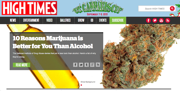
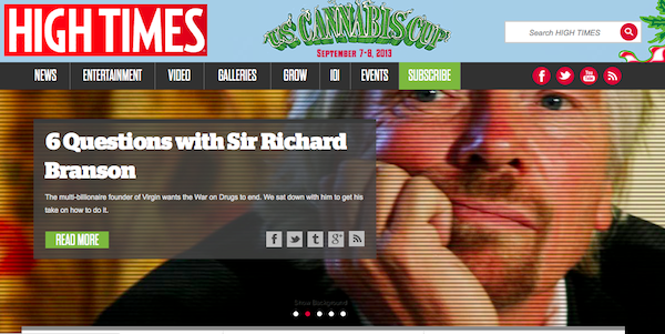
To preserve the feel of the magazine, we decided to base our redesign on a full-screen carousel. This enabled us to translate the idea of the magazine centerfold to the web and focus users’ attention onto a single, powerful image. After all, what would High Times be without those big, beautiful photos of crystallized buds?
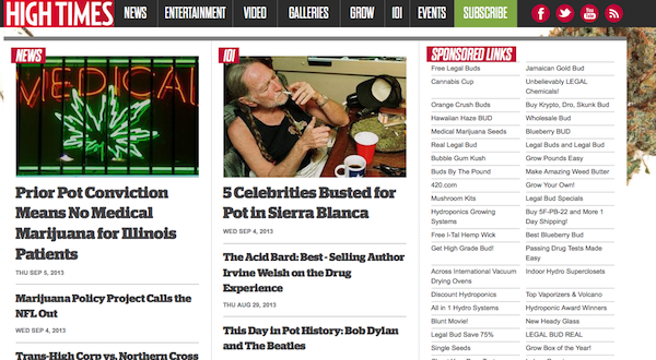
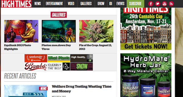
We simplified the navigation by reducing the hierarchical structure to no more than three levels of depth, and by providing enough targeted paths to content we made many articles a single click away.
To accomplish this, placement on the page was key. Whether it was a featured photo gallery or related content at the end of an article, it was important that the user could access as much relevant content as quickly as possible. We also ended up removing large portions of the legacy site that were not receiving much traffic because they were cluttering up the visual space and hindering visitors from finding the content they actually wanted to read.
We created a layout that was fully responsive, providing an optimized experience for every user, whether browsing on a phone, a tablet, laptop, or desktop computer. We decided on a responsive approach because it required no action on the part of the user to optimize their experience. Competing techniques such as native applications have their own benefits, but would have required an installation, which would delay access and prevent some users from interacting with the site.
4:20 to Launch
Through several rounds of wireframes, and with the help of our designers, we came up with a solution that met all of our goals. The new aesthetic was much more aligned with the physical magazine and provided an attractive, legible, and cohesive look and feel.
We also modernized their infrastructure using the latest and greatest in distributed cloud hosting to accommodate the increased traffic. Best practices in modern web development were also followed to ensure that the site was capable of future growth through organic discovery.
Upon launch we received a very positive response from users and the unique visitor count nearly doubled in the first month. Mobile visits also increased to comprise almost two-thirds of site traffic. Pages-per-visit also increased, signaling that the new navigation schema was successful.
Have you had any experience redesigning magazine websites? Share your insights in the comments section below.