What is Mobilegeddon? It refers to Google’s latest search algorithm update, which rolled out at the end of Arpil with the promise to penalize websites with a poor user experience—specifically those which are not optimized for mobile devices.
Two Months On, What Have We Learned?
Although the impact has not yet been significant, there have been some key players affected by the release. After monitoring the search landscape over the course of late April into May, our team at Decibel Digital observed that a number of big brands have taken a few knocks as a result of not having fully optimized websites for mobile devices.
Those Affected
The AA (an auto insurance provider in the U.K.) have only optimized their homepage and a handful of other pages on their website. The ‘insure my car’ tab on the mobile-optimised homepage takes users to the car insurance page, which unfortunately isn’t optimised for mobile devices.
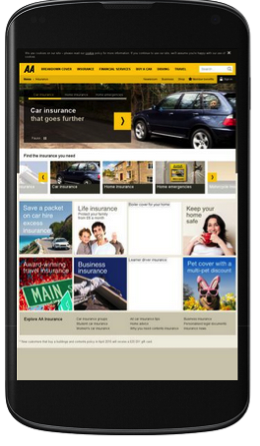
This inconsistency is likely to result in a poor user experience for mobile users, and could have a knock on effect on conversions. Having identified a UX issue on this page, we can see that Mobilegeddon has impacted upon its search visibility, along with other pages which aren’t mobile optimised on the AA site.
Before the Mobilegeddon update on the 21st April, this particular page of the AA’s website appeared on the first page of Google search engine results pages (SERPs) for “cheap car insurance.” We can now see that the AA has been demoted to the second page. A similar impact with drops in visibility has also been seen for other search variations such as “car insurance quotes.” Although we do not have access to specific analytics data, the evidence suggests that the AA are going to find it increasingly difficult to gain traffic to this page if they are not visible for “car insurance” related queries.
Search visibility affects UX and vice versa
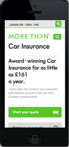
With that in mind, It is no surprise to see Google favoring More Than, another well known insurance brand, currently positioned at the top of search for the “cheap car insurance” term. This could be attributed to their fully responsive website which takes users to the relevant landing page shown below.
A number of other brands, such as Barclays, are experiencing the same issue with falls in search visibility. This is likely due to the fact that only parts of their website are optimized for mobile.
Where Websites Fail to Deliver a Great User Experience
As highlighted above, The AA are not delivering mobile-optimized sitewide experience. This can be seen affecting their search rankings as well, which is likely dinging traffic and site conversions too. Our study of mobile searches over the past month reveals another UX gaffe courtesy of the fashion outlet Next.
Next have a mobile site m.next.co.uk alongside their desktop site www.next.co.uk. Surprisingly, Next are not currently allowing Google to index their mobile website, stifling its availability to users, who have little choice but to visit the desktop site.
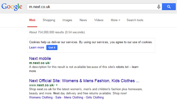
Without Next allowing the Google search bots to crawl their mobile website, there is no optimised user experience provided to existing or potential customers.
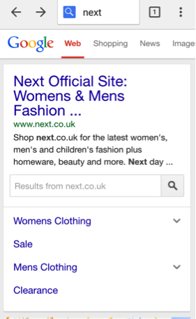
To have any success in landing on Next’s mobile site, users can type “next mobile” into the results page to be presented with the option of visiting the desktop or mobile site. The problem with this is that Next are relying on users to search “next mobile”—very unlikely to happen.
What Can We Learn from Mobilegeddon?
While the full impact of Mobilegeddon has yet to be ascertained, these early indicators show that big brands are also bearing the brunt of Google’s changes. As the examples from The AA and Next demonstrate, simple search or UX mistakes, can result in being demoted in the SERPs by Google.
Search visibility affects UX and vice versa. If both factors are not working together harmoniously, businesses no longer have anywhere to hide and will generally struggle to achieve their potential online.
Image of asteroid impact courtesy Shutterstock.