Beauty is one of the oldest and most powerful concepts in human history—inspiring artists and lighting up cultural movements, philosophical debates, and, in modern times, curious scientific interest. Beauty is a desirable feature of the products we buy, with the power to shape consumer choices and preferences.
While the nature of beauty is still a mystery, the nature of design is unquestionably linked to the beautification of crafts throughout human history.
Designers purposely create beautiful solutions so people can enjoy solving problems, working, or pursuing goals. In recent years, concepts like visual design, aesthetics, information architecture, and usability have helped designers create more ways for people to enjoy using technology. However, when it comes to interaction design, functional beauty outweighs aesthetics—here’s why:
Understanding Functional Beauty
Socrates believed that “all things are good and beautiful in relation to those purposes for which they are well adapted [and] bad and ugly in relation to those for which they are ill adapted.” This view summarizes the “strong” definition of functional beauty. Another way to look at it is that if an object is well made for its purpose, but does not look good, its “fitness for function” may be underestimated and it will not be deemed “good enough.”
For software engineers, this piece of philosophical truth didn’t make much sense for a long time, because design hasn’t always been part of the engineering process. Remember the bulky mobile phones that first came out on the market, or some of the very first operating systems? Ugly products were the first to hit the market because, although they were pushing the boundaries of technology, software engineers left important human factors outside those boundaries for a long time.
A few years later, Apple strategically refocused design thinking on user experience and innovation—a move that we now know helped make it what is widely considered one of the most valuable and admired companies in the world.
“You’ve got to start with the customer experience and work back toward the technology,” Steve Jobs said.
It’s a great piece of advice: To create functional beauty, start with customer experience. It’s a more natural—although not easier—design strategy. Just like beauty, user experience is complex and subjective, but while artists and philosophers scramble to decipher beauty as a whole, UX professionals can actually create it.
Creating Functional Beauty
Designers need to understand that functional beauty is a key element of user experience design. It can be produced intentionally and it’s not related to drawing skills or artistic background. Functional beauty is part of a long, well-documented process, where design thinking, not design making, leads the way from ideas to tangible products. The diagram below shows how functional beauty emerges from the following major components of a well-designed product:
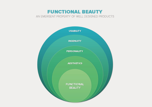
Usability
It’s a mind-blowing truth, but sometimes software products are successful despite their blatant ugliness. Some are so ugly, that their attempted design seems like a deliberate expression of someone trying to make software engineers look bad. Online banking applications and financial and data analysis products usually fall in this category, as does Craigslist. Despite their unappealing and rigid UIs, these products do not have serious usability issues. They are still used mostly in industries where the need for user engagement is low and the focus tends toward managing data or performing complex operations.
However, as consumers more frequently select against poorly designed, unappealing products, there’s a new kind of marketplace rising, where successful products start at the high end of usability and become popular when they are truly unique and beautiful. The building blocks of great usability are: performance, seamless interaction, and familiarity.
Peak performance comes when user goals are met consistently through flawless functionality and error-free interaction. If the product breaks down, it will slow down user productivity and cause frustrating disengagements.
Seamless interaction depends on the quality of the feedback and direction designers are able to incorporate into navigation elements, warning messages, notifications, and the like. If users are left wondering what to do or believing something is not working right, they will no longer enjoy using the product.
Familiarity is a safe common ground where user’s needs and usability issues can be addressed using the same language. There are plenty of examples where interaction is designed around familiar, efficient, and straightforward patterns, including the skeuomorphic approach designers love to hate. Employing a skeuomorphic approach is almost like the easy way out—creating beautiful interfaces that essentially just reproduce the visual coordinates of objects created by craftsmen and artists for a specific type of activity (like the look, sound, and “feel” of turning a page in a book).
The bottom line is, pretty useless products are a waste of time and money, for both customers and software companies. Going back to Socrates’ definition beauty as “fitness for function,” functional beauty should start with usability, but be refined considering the following four dimensions.
Ingenuity
More often than not, innovative ideas sell themselves, but it’s challenging to take the UX design lead because innovation does not fit the tiny box of years-old design methodologies. Ingenuity often comes at the end of a solitary journey, when designers start exploring possibilities outside any previous experience with existing products.
Ingenuity in design is a powerful emotive tool because it engages the user at a deeper level: its novelty excites and its out-of-this-world character converts early adopters into raving fans. Curiosity feeds more positive emotions than familiarity and creates new touch points that resonate with specific user needs.
Discovr is a great example of ingenuity in design: all basic user tasks are intuitively facilitated by simple gestural interaction, making buttons completely unnecessary—so simple, yet so creative. Design ingenuity can be enough to produce compelling interactions. Think about that before trying to beautify interaction by over-designing the interface or striving to create photorealistic skeuomorphic interfaces.
Aesthetics
Appealing interfaces break the ice and tremendously increase a product’s perceived value, however, visual attractiveness alone does not guarantee long-term commitment. Visually appealing interfaces can be surprisingly simple when they are built from a holistic perspective where the designer understands user needs in relation to the dominant activity pre-supposed during interaction.
For example, if reading is the dominant human activity, then a vertical composition will be more intuitive and ensure a clean composition. The Boston Globe, is a great example of a website achieving functional beauty through structure and visual hierarchy (it was the recipient for World’s Best Designed News Website Award in 2011).
The design does not stand out by virtue of any visual element that can be considered conventionally beautiful, such as color palette, decorations, textures, or graphic elements. Instead, it’s the clean structure and layout alone—employing responsive techniques and focusing on a dominant human activity—that make the website exceptionally well-designed with a beautiful interface. Visual hierarchy is constructed through a great use of white space and typography. Employing a vertical composition also ensures that the same visual hierarchy is preserved across all devices.
Rhythm
Rhythm is created through contrast, size, and shape, and is controlled using elements like type, buttons, icons, pictures, and white space. Twitter is a good example of functional beauty achieved through rhythm in design. The content flows vertically, just like an imaginary timeline, while the horizontal space is dedicated to individual events or actions. The rhythm fits perfectly with the continuous flow of conversation, while also encouraging users to focus on and explore individual events in the streamline.
Personality
There’s an old saying that “A house does not make a home.” Any app can look great and pass all usability tests, but there can still be a small chance that users won’t connect with it. An effective way to make that connection, is to add personality to whatever you’re designing.
Ravi Sawhney points out that designers can drive change, but more often than not disruptive ideas and products must have a personality that the average user can relate to. Pretty products without a personality cannot have the emotive power to cause large-scale disruptions because people are unable to relate to an underlying story. Connecting a product with the right kind of personality is best achieved by exploring users’ expectations through research and user testing.
Final Words
Beauty may be fleeting and in the eye of the beholder, but functional beauty is not an elusive attribute. It comes to life through hard work and remains for the entire lifecycle of a product. Designers can produce functional beauty by creating compelling, innovative products that are aesthetically enchanting, adapted to a dominant human activity, and usable. So before you get too excited about inspiring pixel perfect designs, think about it: how much of the beautiful work you’re passionately producing ties in with the function of a brilliantly designed product?
Image of celastrina ladon collecting nectar courtesy Shutterstock.