Save
Yesterday’s announcement of nominees in the 71st annual Golden Globe Awards presented a fine opportunity to revisit some UX lessons from Hollywood, courtesy of our contributing editor, Steve Tengler.
Over the course of a popular series of articles, Tengler explored the work of Laura Dern, Seth Rogen, Jim Carey, Tom Cruise, and Johnny Depp (30 total GG nominations between them). Along the way he amassed some some impressive observations, drawing valuable insight for designers and researchers from Mission Impossible, What’s Eating Gilbert Grape, and even Horton Hears a Who.
Here are five of our favorites.
Lesson #1: Style Captures the Attention
“It was great the way her mind worked. No guilt, no doubts, no fear. None of my specialties. Just the shameless pursuit of immediate gratification. What a capitalist.”
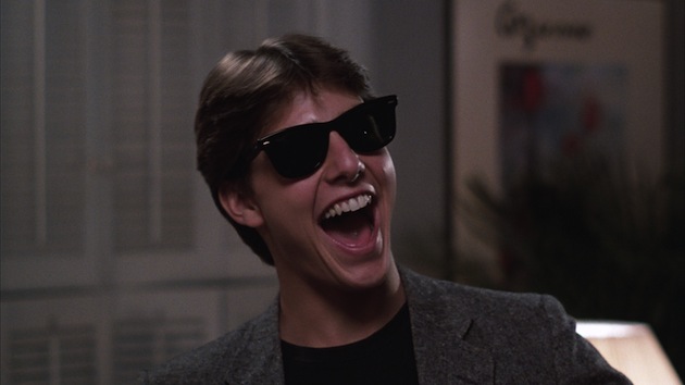
Few of you probably knew of Tom Cruise when he was Billy in Endless Love, and you may have gone back and seen Taps and thought, “Hey, wait, that cadet captain with the red hat. That’s Tom Cruise, isn’t it?!” But looking back on his early films, there is no question in your mind’s eye that Joel Goodsen of Risky Business was played by Tom Cruise. Why is that? Why did that product capture the buying public’s attention so clearly? The answer: style. Tom sported a pair of sunglasses still known as “Risky Business Shades” (Google it if you don’t believe me), and made a very memorable and stylish entry despite wearing only a collared shirt and tighty-whities (that probably were not purchased at K-Mart).
Usability absolutely helps a product, but providing a unique style that captures the eyes of consumers also has its benefits. As noted by Bill Buxton, writing on Apple’s rise in Sketching User Experiences, “The design that led to success was largely in the realm of styling, bordering on the superficial … I don’t mean this in a pejorative sense. The style of these machines gave them character that clearly resonated with people, and help reshape their perception of what a computer might be for.”
In many interviews, Bob Lutz (the former head of product design for General Motors as well as several other automotive companies) has stated that a key lesson GM needed to relearn in order to recover market share was that “Styling is the great differentiator.” And in a Bloomsburg BusinessWeek article entitled “How to Sell More Than a Product”, Carmine Gallo cites Starbucks as providing a “… true strategy for entrepreneurs: Don’t sell products. Sell an ‘experience’”—one which includes creating a style that matches your brand.
Lesson #2: The Details Are Surrounded By Dung
“That is one, big pile of shit.”
In the smash, 1993, action flick Jurassic Park, Laura Dern plays a scientist brought to a remote island for her expert opinion on an amusement park where dinosaurs have been brought back to life in captivity. While touring the facility, her convoy comes across an ailing triceratops, inexplicably lying on its side. Dern’s character does an initial assessment based on tongue polyps and some associated puss, but eventually moves to an eight-foot-high pile of … well … dino-crap and literally digs in. Buried within the droppings she looks for evidence to support her hypothesis: that the triceratops is feasting upon incorrectly engineered fauna that’s likely poisonous to the resurrected creature.
This is the perfect analogy for usability testing. The devil is not in the details, per the cliché. Details are surrounded by the Devil. The engineering minutiae is always buried by a whole bunch of useless stuff, and the secret to great engineering is to go digging for those nuggets of wisdom. A user experience engineer might orchestrate hours of testing of various participants attempting scripted tasks on a prototype product and see only minutes of miscues, confusion, or comments that hint at a better design.
That is, in fact, the whole point of usability testing: uncover the important things that aren’t obvious. As said best by Charles Victor Cherbuliez (who does not appear in the film), “What helps luck is a habit of watching for opportunities, of having a patient, but restless mind, of sacrificing one’s ease or vanity, of uniting a love of detail to foresight, and of passing through hard times bravely and cheerfully.”
So the next time someone tells you “the Devil is in the details”, make sure to counter with “No, the details are in a pile of crap.”
Lesson #3: Overly-Agile Development Can Lead To Accidents
“Life doesn’t care about your vision. You just gotta roll with it.”
In the 2007 comedy Knocked Up, Alison Scott goes to a nightclub to celebrate a promotion and meets a reckless, immature pothead, Ben Stone (Rogen). After drinking and dancing together all night, they end up completely wasted and fumbling through a one night stand sans birth control. In the classic sex scene, Ben struggles with the condom (Plan A) and, when not keeping up with the urgency of the moment, communication errors and a desire to proceed lead to bad judgment (Plan B). Eight weeks later, BOOM—Allison discovers that she is pregnant and the plot thickens.
As crude as the analogy may seem, the agile development process can easily proceed in the same manner: urgency overrules proceeding in a logical, serial manner. For those who are not familiar with agile, there are many online resources but it is essentially like a greyhound race: the user experience engineer is the electronic rabbit providing the vision of where to run, and each software engineer is the sleek dog taking individual steps that eventually lead toward the shortest, prioritized path to success. But here’s where this particular analogy fails: if the user experience engineer doesn’t keep up with the urgency, the greyhounds keep running and determine a path of their own.
The agile evangelist’s argument for proceeding with the race is that each individual step is, by definition, easy to back-out or iterate, but that rarely happens without significant data, which is difficult to provide when the clock is already ticking. So, instead, management or the agile coach becomes the equivalent of Alison’s character screaming, “Just go for it,” and an accident is born.
How does one prevent this from happening and still enjoy the fruits of agile development? I have found two keys to success: 1) providing smaller models, and 2) invoking the backlog.
Giving the design studio and UX team a slight head-start permits them to imagine, sketch, iterate, etc., but the key to staying ahead of the software programmers is to produce smaller modeling prototypes. These are not only essential elements for usability testing, but they may serve as the majority of the specification for the production software generators.
The efficiency of not having to write, check, rewrite, re-check, etc. allows the right-brained folks to stay ahead in the race. But there will inevitably come a time where usability testing of those models shall unearth a design failure which impacts the just-in-time engineering. Invoking the backlog of software bugs or minor improvements allows the software team to be productive while the user experience professionals rework the design.
No matter what, though, don’t just allow the software engineers to “go for it,” which will likely give birth to unintended consequences.
Lesson #4: Know the Business Side of Your Business
“Show business. Show business. Without the business, there is no show.”
Andy Kaufman was a comedic genius. Yes, his style was uniquely odd and full appreciation possibly required a few drinks under your belt, but the movie Man on the Moon skillfully depicts his distinctive rise to fame. In one early scene, Carrey, playing Kaufman, finishes his set having believed there was a communal sense of his entertainment value, but the bar owner explains that beauty is in the eye of the beholder … and it wasn’t pretty.
This lesson can be applied to any discipline—from administration to zoology—but seems particularly applicable to UX engineering: unless your organization truly understands your unique value, you’re likely to get booed offstage. For many UXers, the belief is: “Surely they see my great work and know I’m doing something most folks couldn’t do.” Nope. You’re arranging pictures and words. At least that’s how the electrical engineers of the world see you. They could do what you do. Other engineers save $1-per-part on a million parts and can attach a tangible value to their triumphs. What you do isn’t that special … or so they think.
So here’s the punchline: make sure they understand in dollars and cents the worth of your work. If your latest design moved novice task completion from 70% to 95%, that’s worth an incremental $8 million by extrapolating current sales. If repositioning the core product on the corporate website improved the heat index by 5% for the company’s 10 million hits, you’ve just improved profits by $12 million. Even if your statistics seem overly boastful, you must demonstrate your value in this fashion. Otherwise, it fades into oblivion and management never appreciates your true importance.
Show the business of your show business and they’ll appreciate what makes you uniquely valuable.
Lesson #5: Tremendous Flexibility Can Lead to User Satisfaction
“But lucky for us, we have the Great Glass Elevator to speed things along.”
One of the most memorable scenes in Tim Burton’s Charlie and the Chocolate Factory took place in the Wonkavator, a great glass elevator that can “… go sideways, and slantways, and longways, and backways … and squareways, and front ways, and any other ways that you can think of [to] take you to any room in the whole factory just by pressing one [button].” Tremendous flexibility. You press any button and “Zing, you’re there!” Charlie smiled ear to ear.
There are great examples in the real world of this type of flexibility working well and poorly. A great comparison in one user interface modality is speech technology. Google Voice allows the customer complete natural language that, in essence, permits the same redirection as the Wonkavator. Speech Technology Magazine gave Google Voice the highest ranking in 2012 thanks to “… high accuracy rate, company innovation, and customer satisfaction…” in the midst of that flexibility. Users said where they wanted to go and “zing”, they arrived.
In other automotive applications—which, granted, have larger hurdles such as a road noise and a distant microphone—the user must know to return to the top level of the invisible menu and then some natural language is permitted. Understandably, the hidden inflexibility creates dissatisfied users. In fact, for the first time in the 26-year history of the JD Powers study, owners reported more problems related to audio, entertainment, and navigation systems than in any other vehicle area, which “… is driven in part by a rapid increase in the fitment of new technology, such as voice recognition …” If the “go anywhere” technology has great accuracy, flexibility creates almost as much user satisfaction as a lifetime of chocolate … OK, OK, let’s not overdo it.
Image of Hollywood sign courtesy Shutterstock
- Agile and Iterative Process, Business Value and ROI, Design, Development, Google, Information Design and Architecture, Interaction Design, Interface and Navigation Design, Mobile Technology, New and Emerging Technologies, Product design, Research Methods and Techniques, Strategy, Technology, Usability, User Acceptance Testing, User Reported Feedback
UX Magazine Staff
UX Magazine was created to be a central, one-stop resource for everything related to user experience. Our primary goal is to provide a steady stream of current, informative, and credible information about UX and related fields to enhance the professional and creative lives of UX practitioners and those exploring the field. Our content is driven and created by an impressive roster of experienced professionals who work in all areas of UX and cover the field from diverse angles and perspectives.
Steve Tengler
Steve Tengler is a Senior Director with the Honeywell Connected Vehicle group, where he oversees a global team of engineers, data scientists and designers working on vehicle monitoring solutions such as cybersecurity, prognostics, etc. Steve is a proven expert in the field of the connectivity and user experience with over twenty-five years of experience on some of the country's top automotive teams, such as OnStar, Nissan, Ford and Honeywell.


