Save
According to Bill Buxton, the pioneer computer scientist and designer, there’s a difference between “getting the design right and getting the right design.”
To get a design right, we can test it with customers and integrate their feedback by altering the design. But how do we know that what we started with is what customers want at all?
I think of it this way: if we only test bottle openers, we may never realize customers prefer screw-top bottles. That’s what Buxton means by getting the right design.
Google Wave was preceded by decades of established technology that people used and understood, but that had become complicated, disconnected, and inefficient. Wave sought a solution that used technology for online communication for collaboration.
To appreciate the problem, consider what people commonly use now to communicate with others online: Chat is used for real-time text. E-mail is used to send messages asynchronously with file attachments. Forums are used for threaded conversations. Wikis or browser-based online document services such as Google Docs are used for shared document editing. And every time some new feature is needed, customers must find new and different software rather than having a way to add that function to what they already use.
There should be a way to combine this disparate software into one coherent service to accomplish more work more quickly with less complexity. Google Wave was this service, designed to use a Web browser to help people communicate in new ways.
The Design
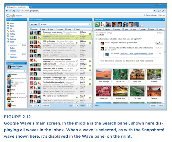
Essentially, a “wave” was a page on the Web where multiple people could add and edit text and multimedia content in real time. By default the Google Wave screen had four panels. In the middle was the Search panel that displayed a list of waves matching search criteria.
When someone started a new wave, it was displayed in the Wave panel on the right. They could type a message in that panel and then select people to share it with from the Contacts panel on the lower left. When someone wanted to contribute to the wave, he or she could reply and leave a new message below the last message, or double-click anywhere in the wave to edit any content, even if someone else created the content.
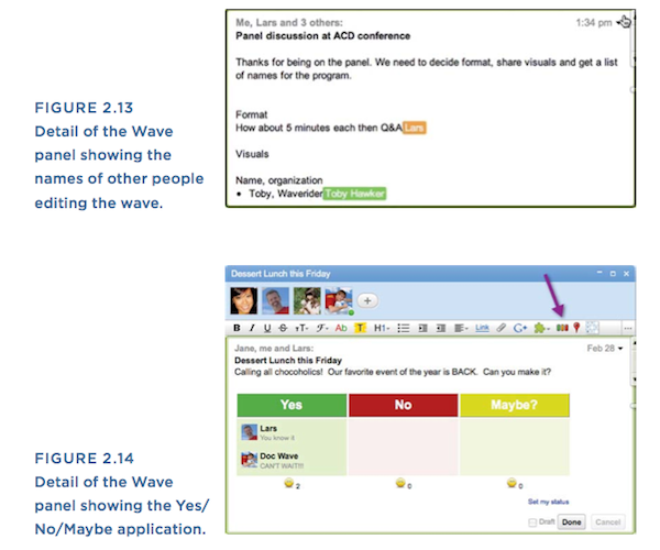
Everyone in a wave could edit content at the same time, and each person could see the other members’ edits as they typed. Wave could autocorrect misspellings and auto-translate in real time. To see which edits happened when, a person could click the Playback button and watch the edits happen one by one. And because this all happened in a Web browser, virtually any kind of content could be added to a wave, such as images, videos, maps, and even applications. For example, a Yes/No/Maybe application could be added to ask friends a question and let them answer with a single click
.
To find a wave, a term could be typed into the box at the top of the Search panel or a link could be selected from the Navigation panel at the upper left.
Wave contained a great deal of interesting technology. An entire wave could be embedded into another website, just like YouTube videos. Images and files could be dragged and dropped into a wave instead of having to attach them. And the spellcheck had some understanding of grammar, so it could differentiate between “to” and “too” or “their” and “they’re.” (For a demonstration, watch the Getting Started with Google Wave video.)
I’m disappointed that Wave didn’t evolve and survive … but the reasons for its failure are clear.
Wave had the potential to change the way people collaborate online. It even had the potential to replace some old but vital technologies such as e-mail. I’m personally disappointed that Wave didn’t evolve and survive because it could have been enormously useful, but the reasons for its failure are clear.
The Customer Experience
Google had built an impressive track record of online innovation from their beginnings as a search engine to their expansion into new areas such as online advertising and e-mail. It would not have been unreasonable to call Google the most innovative Internet company in the world. So when Wave was announced in May 2009, widespread excitement ensued, even though no one was sure exactly what Wave was. Adding to the anticipation was Google’s use of an invitation system to limit the number of people using Wave so that an onslaught of visitors wouldn’t overload their systems.
In September 2009 Google sent out the first round of invitations to 100,000 people. Some people adopted Wave quickly and enthusiastically, finding novel ways to collaborate with others. But for many people, Wave was confusing, and it confused on multiple levels.
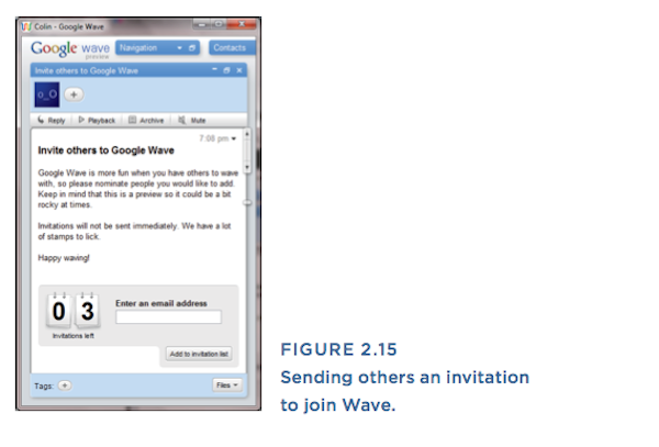
First there was confusion around how to access it. Google’s invite-only testing periods had worked successfully in the past with products like Gmail, but Wave could only be used with others on Wave. If you received an invitation from Google, you could also invite eight friends, but those friends couldn’t invite anyone. If the friends or colleagues you wanted to collaborate with didn’t have an invitation, then Wave was reduced to a fancy electronic notebook.
Next, the layout was new, unfamiliar, and with four panels, a bit complex. To anyone who had used Gmail, the navigation, contacts, and search would look familiar, but otherwise the mash-up of contacts, messages, and documents was a daunting sight for many people.
The interaction was the most confusing. If your mental model of a wave was “waves are like e-mails, but they do more” and you were accustomed to e-mail interfaces like Gmail that offer robust search as the primary way of finding messages, the thought was that you could adapt to finding waves using search. Judging by questions in help forums, the biggest problem with this interaction was that people would lose waves. Someone would scroll down the list of waves and a wave that used to be there was now missing, often because they had recently entered a search term, narrowed the list of waves in the Search panel, and then forgotten they had done that.
By far the most fascinating and challenging aspect of interaction on Wave was the fact that anyone in a wave could edit any part of it, as on wikis. Although this was a powerful feature for collaboration, it also made tracking changes difficult. Again, if your mental model was “waves are like documents, but they do more” and you were accustomed to scanning documents from Microsoft Word with changes noted throughout, you could adapt to scanning waves for changes. But if you thought of waves as being like e-mails or forum conversations, looking for changes throughout a wave was a whole new behavior.
The Wave designers included the helpful Playback feature to step through each change, but jumping from one part of a wave to another part that might have different participants and different content required a lot of cognitive work to repeatedly comprehend the new context, what was changed, and what each change meant in each new context. People do this now, switching among applications and content as they work, but at a much slower pace. Wave’s intense context-switching was integral to the design, but it caused a lot of cognitive fatigue compared to what people were used to.
In conventional text chat with one other person, we sometimes experience the taking-turns problem—one of us types a response before the other person has finished their thought. Maybe a false assumption is made. A flurry of apologies or clarifications follows. Current chat applications try to help you avoid this by signaling to you when the other person is typing. In Wave, the taking-turns problem was amplified. Multiple people could be in a wave at the same time and could not only add messages but also edit content, any content, simultaneously. For the developers this was an awesomely powerful and sophisticated capability. But for most people, the conversational convention of politely waiting until someone else has finished speaking (or typing or editing) got trampled.
Wave was also confusing on a conceptual level. During the lifetime of a wave, the group of people who participated in the wave could grow and shrink. Some people had the expectation that, like a one-to-one chat session, there’s a reasonable assumption of privacy. Wave made these people anxious about who would be able to see the content in the future and who could reply. The flip side of Wave’s powerful, fluid collaboration was the unnerving worry about access privileges.
One early clue that Wave might be too confusing was that everyone had a different definition of Wave. Here are four definitions I came across:
Google Wave is a real-time communication platform.—Ben Parr, Mashable
Google Wave is an integrated set of technologies.—Oliver Wrede, personal blog
A “wave” is equal parts conversation and document.—Lars Rasmussen, google Wave software engineering manager
It’s a hybrid of email, web chat, IM, and project management software.—Ben Parr, Mashable
Yes, Wave was all of those things, and that’s another reason it was so hard to comprehend.
Of course any new product that intends to innovate requires some learning, but if the product concept is too far beyond convention, it’s probably too hard to understand. A classic interface design guideline is that any object that looks familiar should behave in a familiar way. Waves looked like e-mails and documents but didn’t act like either of them.
Reactions
Wave generated extreme reactions from the public. The initial May 2009 announcement caused a few of Google’s followers to admit they didn’t understand it, but mostly it generated awesome anticipation. The media gushed about its potential and said it “drips with ambition” although some predicted a customer backlash. People were rabid for invitations, to the point of buying them on auction sites.
In the months that followed, with many people still eagerly awaiting their invitations, those who had received invitations reported their experiences online. A few were still enthusiastic and committed to using it, but most complained loudly of usability problems. “Someone deleted content from my wave, why can’t I undo that?” “My wave is a mess of replies, why can’t I hide some content?” “Why can’t I get a notification by email when a wave is updated?” Google officially called this time a “preview” period, and like any fledgling, complex, and popular system, it could be slow and unreliable at times.
Within days of receiving invitations, technology writers lashed out. Robert Scoble, the American blogger and technical evangelist, had this reaction:
This service is way overhyped and as people start to use it they will realize it brings the worst of email and IM together: unproductively … [W]hen I look at my google Wave page I see dozens of people all typing to me in real time. I don’t know where to look and keeping up with this real time noise is less like email, which is like tennis (hit one ball at a time) and more like dodging a machine gun of tennis balls. Much more mentally challenging.
It can be a productivity sink. If you thought Twitter or Friend-Feed could chew up cycles, Wave takes it to another level. I had a wonderful chat or three last night, and it was a great tool for that. But there is no way I can possibly see every update on every wave, just like I can’t see every comment on every FriendFeed thread. It can’t replace e-mail for me in this case because with e-mail, it is assumed I read the messages.
Even when it came to Google employees, presumably the people this technology wouldn’t confuse, usage was apparently moderate at best. There are reports that engineering teams regularly used Wave as groupware, while others report it was seldom used: “By early 2010 it was still considered novel, almost lampooning, to create a group Wave. They were usually introduced with some lighthearted caveat like ‘That’s right, this is a WAVE.'”
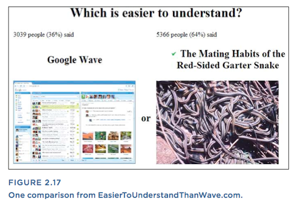
In October 2009, while still in the limited preview release, Wave was parodied online by EasierToUnderstandThanWave.com, which let visitors vote on which was easier to understand, Wave or one of a rotating parade of obtuse and humorous comparisons, from metaphysics to Sarah Palin. The popular sentiment was clear.
A Race to the Stoplight
Google had spent much of 2009 courting the developer community, and over the course of 2009 and 2010 third-party developers created dozens of Wave-compatible applications. Google released many more invitations in December 2009. In 2010 they rolled out more features and fixed some of the functional problems such as the inability to restore deleted content and the lack of e-mail notifications of updates. But by that time it was too late to make fundamental changes in the design. Wave had been under development for years and the applications that the development partners had built relied on the way Wave was designed.
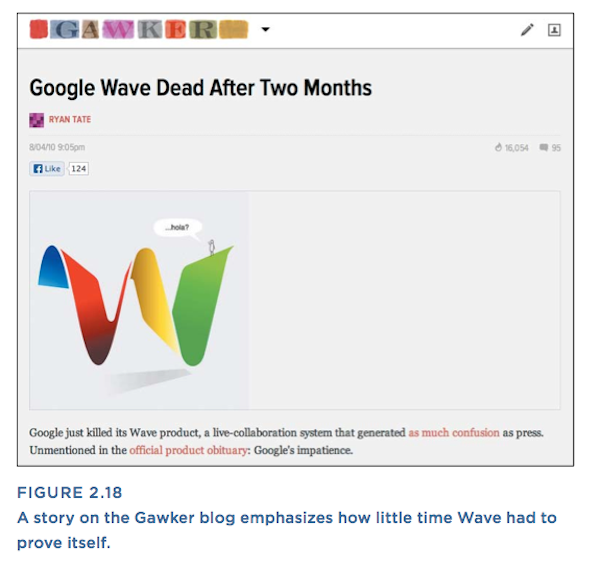
Google opened Wave to the public in May 2010, but by then Wave’s reputation as a confusing product had stuck, and the excitement to try it had faded. The lead developer said fewer than one million people actively used Wave, a small number by Google’s standards. The team had grown so large it became a significant expense and focus for the company. In August 2010, less than a year after the first invitations were sent, Google announced they would close Wave, saying, “Wave has not seen the user adoption we would have liked”
Find more holistic explorations of what teams built and why the products failed in Why We Fail: Learning from Experience Design Failures. Victor Lombardi’s book is a valuable tool for understanding the key mistakes other teams have made so you don’t repeat them, turning unavoidable failures into building blocks for success, and creating a team environment where failures are controlled and valuable. Use the promotional code UXMAGLOMBARDI for 20% off when you buy the book from Rosenfeld Media.
Victor Lombardi
This user does not have bio yet.


